CSS:水平垂直居中
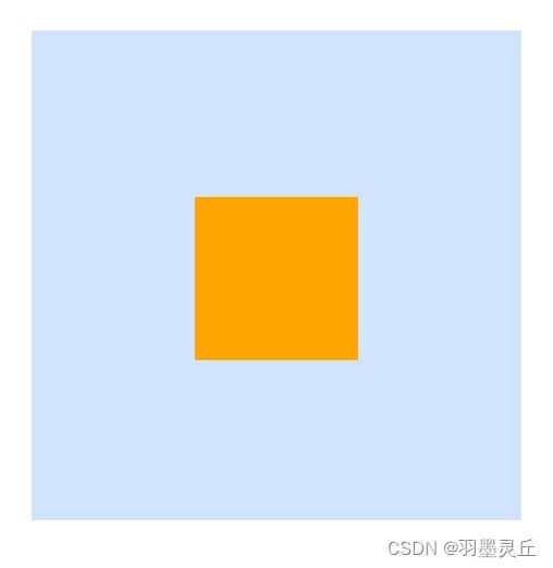
水平垂直居中效果如下:
HTML:
<div class="parent">
  <div class="child">div>
div>
公共的 CSS:
.parent {
  width: 300px;
  height: 300px;
  background-color:#d0e4fe;
}

.child {
  width: 100px;
  height: 100px;
  background-color:orange;
}
一. 行内元素
方法一:text-align + vertical-align
.parent {
  line-height: 300px;
  text-align: center;	/* 水平居中*/
}

.child {
  display: inline-block;	/* 子元素设置为行内块元素*/
  vertical-align: middle;	/* 垂直居中*/
}
二. position 定位
情况一:居中元素定宽定高
方法二:absolute + calc()
.parent {
  positon: relative;	/*使子元素相对父元素绝对定位*/
}

.child {
  position: absolute;
  top: calc(50% - 50px);	/*垂直居中*/
  left: calc(50% - 50px);	/*水平居中*/
}
注意:在 calc() 函数中,运算符前后必须要有空格,否则会导致计算错误。
方法三:absolute + 负 margin
.parent {
  positon: relative;	/*使子元素相对父元素绝对定位*/
}

.child {
  position: absolute;
  top: 50%;
  left: 50%;
  margin-top: -50px;
  margin-left: -50px;
}
margin 负值:当 margin-left 或 margin-top 属性值为负值时,元素会根据负值的大小向左或向上偏移。当 margin-right 或 margin-bottom 属性值为负值时,元素的位置不会改变,但会影响其身后的元素。这种情况相当于元素宽度或高度缩小,后续的元素会向该元素偏移。
方法四:absolute + margin auto
.parent {
  positon: relative;	/*使子元素相对父元素绝对定位*/
}

.child {
  position: absolute;
  top: 0;
  left: 0;
  right: 0;
  bottom: 0;
  margin: auto;
}
margin 设置为 auto 表示自动填充剩余空间。
由于块级元素默认宽度为父元素的宽度,默认高度为内容的高度。因此,在水平方向上,margin: auto 使得左右平分剩余空间达到水平居中的效果。但在垂直方向上,由于没有剩余空间,所以 margin:auto 不能实现垂直居中。
要想通过 margin: auto 实现垂直居中,需要将子元素设置为 position: absolute,同时需要设置 left: 0; right: 0; top: 0; bottom: 0; 来使子元素在水平和垂直方向上都填满父元素,这样再设置 margin: auto 就可以实现水平和垂直方向上都平分剩余空间,达到居中效果。
情况二:不需要子元素固定宽高
方法五:absolute + transform
.parent {
  positon: relative;
}

.child {
  position: absolute;
  top: 50%;
  left: 50%;
  transform: translate(-50%, -50%);
}
实现原理:top 和 left 表示向下和向右偏移父元素宽度或高度的 50%,translate(-50%, -50%) 表示向上和向左偏移自身宽度或高度的 50%,从而实现上下左右居中。
三. flex 布局
方法六:flex
.parent {
  display: flex;
  justify-content: center;	/* 水平居中*/
  align-items: center;		/* 垂直居中*/
}
或
.parent {
  display: flex;
}

.child {
  margin: auto;
}
四. grid 布局
方法七:grid
.parent {
  display: grid;
  justify-items: center;
  align-items: center;	/*简写为 place-items: center; */
}
或
.parent {
  display: grid;
  justify-content: center;
  align-content: center;	/*简写为 place-content: center; */
}
或
.parent {
  display: grid;
}

.child {
  justify-self: center;
  align-self: center;	/*简写为 place-self: center; */
}
或
.parent {
  display: grid;
}

.child {
  margin: auto;
}