flex弹性布局
文章目录
- 主轴与交叉轴
- flex容器与子项
-
- 轴对齐
-
- flex-direction: row-reverse;
- flex-direction: column;
- flex-direction: column-reverse;
- 换行与缩写
-
- flex-wrap: wrap;
- flex-wrap: wrap-reverse
- flex-flow: column wrap;
- 内容对齐
-
- justify-content: space-around;
- justify-content: space-between
- justify-content: space-evenly
- 交叉轴对齐
-
- align-content: space-evenly
- align-items: center;
- 内联与块的上下左右居中对齐
-
- 单行文字居中对齐
- 块级居中
- 不定项居中
- 均分列居中
- 子项分组布局
- flex子项
-
- flex-grow
- flex-shrink收缩比例
-
- flex-basis
- flex缩写
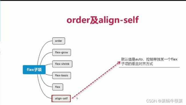
- order
- align-self
- 等高布局
- 二列或三列布局
- sticky footer布局
- 溢出项布局
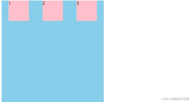
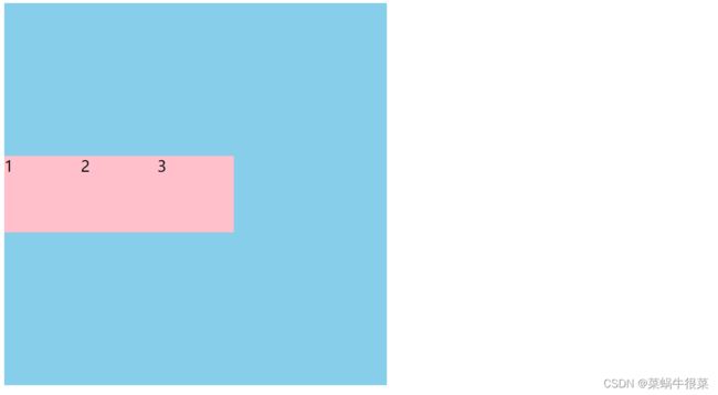
主轴与交叉轴
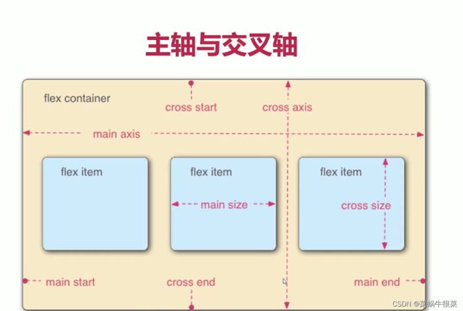
默认按主轴对齐(flex-direction: row)
<style>
        .main{
            width: 500px;
            height: 500px;
            background: skyblue;
            display: flex;
        }
        .main div{
            width: 100px;
            height: 100px;
            background: pink;
            font-size: 20px;
        }
    style>
<div class="main">
    <div>1div>
    <div>2div>
    <div>3div>
div>
结果展示
flex容器与子项

轴对齐

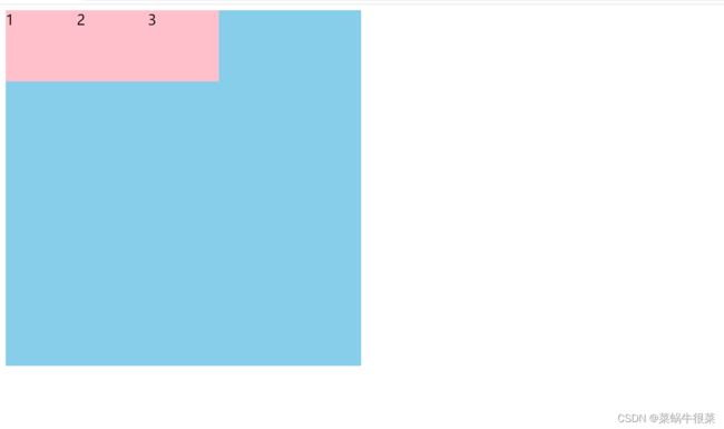
flex-direction: row-reverse;
   <style>
        .main{
            width: 500px;
            height: 500px;
            background: skyblue;
            display: flex;
            flex-direction: row-reverse;
        }
        .main div{
            width: 100px;
            height: 100px;
            background: pink;
            font-size: 20px;
        }
    style>
<div class="main">
    <div>1div>
    <div>2div>
    <div>3div>
div>
结果展示

flex-direction: column;

flex-direction: column-reverse;

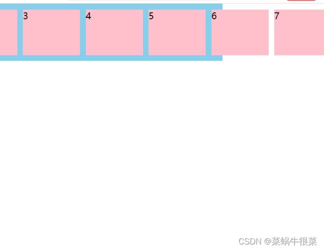
换行与缩写

flex-wrap: wrap;
默认在会在同一行展示,即便7个div的宽度超过父级div也扔在第一行显示,wrap进行换行
 <style>
        .main{
            width: 500px;
            height: 500px;
            background: skyblue;
            display: flex;
            flex-wrap: wrap;
        }
        .main div{
            width: 100px;
            height: 100px;
            background: pink;
            font-size: 20px;
        }
    style>
    <div class="main">
    <div>1div>
    <div>2div>
    <div>3div>
    <div>4div>
    <div>5div>
    <div>6div>
    <div>7div>
div>
结果展示

flex-wrap: wrap-reverse

尽量不要用弹性布局做多行多列
flex-flow: column wrap;

flex-flow将对齐方式与换行写在一起
内容对齐

justify-content: space-around;
    <style>
        .main{
            width: 500px;
            height: 500px;
            background: skyblue;
            display: flex;
            justify-content: space-around;
        }
        .main div{
            width: 100px;
            height: 100px;
            background: pink;
            font-size: 20px;
        }
    style>
<div class="main">
    <div>1div>
    <div>2div>
    <div>3div>
div>
justify-content: space-between

justify-content: space-evenly

交叉轴对齐

align-content: space-evenly
flex-wrap: wrap;
align-content: space-evenly;
要一起使用, 不折行不生效
    <style>
        .main{
            width: 500px;
            height: 500px;
            background: skyblue;
            display: flex;
            flex-wrap: wrap;
            align-content: space-evenly;
        }
        .main div{
            width: 100px;
            height: 100px;
            background: pink;
            font-size: 20px;
        }
    style>
align-items: center;
用来处理单行

内联与块的上下左右居中对齐
单行文字居中对齐
3种方式
    <style>
        /*.box{*/
            /*width: 300px;*/
            /*height: 200px;*/
            /*background: skyblue;*/
            /*display: flex;*/
            /*align-items: center;*/
        /*}*/

        /*.box{*/
            /*width: 300px;*/
            /*height: 200px;*/
            /*background: skyblue;*/
            /*display: flex;*/
            /*flex-wrap: wrap;*/
            /*align-content: center;*/
        /*}*/


        .box{
            width: 300px;
            height: 200px;
            background: skyblue;
            line-height: 200px;
        }

    style>

<div class="box">
    测试文字
div>

多行文字使用前两个弹性布局
块级居中
 <style>
        .box{
            width: 300px;
            height: 200px;
            background: skyblue;
            display: flex;
            justify-content: center;
            align-items: center;

        }

        .box div{
            width: 100px;
            height: 100px;
            background: pink;

        }

    style>
   或者另一种方法
    <style>

        .box{
            width: 300px;
            height: 200px;
            background: skyblue;
            position: relative;
        }

        .box div{
            width: 100px;
            height: 100px;
            background: pink;
            position: absolute;
            left: 50%;
            top: 50%;
            transform: translate(-50%,-50%);

        }

    style>
<div class="box">
  <div>div>
div>

不定项居中

   <style>

       .box{
           width: 300px;
           height: 150px;
           background: skyblue;
           display: flex;
           justify-content: center;
           align-items: end;
       }

       .box div{
           width: 30px;
           height: 30px;
           background: pink;
           border-radius: 50%;
           margin: 10px;

       }

   style>
均分列居中

<style>
    .main{
        height: 200px;
        background: skyblue;
        display: flex;
        justify-content: space-between;
        align-items: flex-end;
        padding: 0 20px;
    }
    .main div{
        width: 30px;
        height: 30px;
        background: pink;
        border-radius: 50%;
    }
style>


<div class="main">
    <div>div>
    <div>div>
    <div>div>
    <div>div>
div>
子项分组布局

  <style>
        .main {
            height: 200px;
            background: skyblue;
            display: flex;
            align-items: center;
        }


        .main div {
            width: 50px;
            height: 100px;
            background: pink;
            margin-right: 10px;
        }
        .main div:nth-of-type(1){
            margin-right: auto; /*从哪里开始分组*/
        }

    style>

<div class="main">
    <div >1div>
    <div >2div>
    <div >3div>

div>
flex子项

flex-grow
flex-grow: 1;比例值为1占满剩余的所有空间
<style>
        .main {
            width: 500px;
            height: 300px;
            background: skyblue;
            display: flex;
        }
        .main div{
            width: 100px;
            height: 100px;
            background: pink;
            flex-grow: 0.5;
        }


    style>
<div class="main">
    <div >1div>
div>


flex-shrink收缩比例

当子容器超出父容器默认收缩到父容器大小

 <style>
        .main {
            width: 500px;
            height: 300px;
            background: skyblue;
            display: flex;
        }

        .main div{
            width: 600px;
            height: 100px;
            background: pink;
        }


    style>

<div class="main">
    <div >1div>
div>

    <style>
        .main {
            width: 500px;
            height: 300px;
            background: skyblue;
            display: flex;
        }
        .main div{
            width: 600px;
            height: 100px;
            background: pink;
            flex-shrink: 0.5;
        }


    style>


<div class="main">
    <div >1div>
div>
flex-basis

代码
    <style>
        .main {
            width: 500px;
            height: 500px;
            background: skyblue;
            display: flex;
            flex-direction: column;
        }
        .main div{
            width: 100px;
            height: 100px;
            background: pink;
            flex-basis: 200px;
        }


    style>
<div class="main">
    <div >1div>
div>
结果展示

flex-basis: auto;/可选值 0% auto 200px 100%/
  <style>
        .main {
            width: 500px;
            height: 500px;
            background: skyblue;
            display: flex;
            align-items: flex-start;
        }
        .main div{
            background: pink;
            flex-basis: auto;/*可选值 0% auto 200px  100%*/
        }


    style>
<div class="main">
    <div >测试文字div>
div>
结果展示

flex缩写


order

代码
 <style>
        .main {
            width: 500px;
            height: 500px;
            background: skyblue;
            display: flex;
            align-items: flex-start;
        }
        .main div{
            width: 100px;
            height: 100px;
            background: pink;
        }
        .main div:nth-of-type(1){
            order: 1;
        }
        .main div:nth-of-type(4){
            order: -1;
        }

    style>
<div class="main">
    <div >1div>
    <div >2div>
    <div >3div>
    <div >4div>
div>
结果展示

align-self
代码
<style>
        .main {
            width: 500px;
            height: 500px;
            background: skyblue;
            display: flex;
            align-items: flex-start;
        }
        .main div{
            width: 100px;
            height: 100px;
            background: pink;
        }

        .main div:nth-of-type(4){
            height: 50px;
            align-self: flex-end;
        }

    style>
<div class="main">
    <div >1div>
    <div >2div>
    <div >3div>
    <div >4div>
div>
结果展示

等高布局

   <style>
        .main {
            width: 500px;
            background: skyblue;
            display: flex;
            justify-content: space-between;
        }


        .main div{
            width: 100px;
            background: pink;
        }

    style>

<div class="main">
    <div >
        <p>测试内容p>
        <p>测试内容p>
        <p>测试内容p>
        <p>测试内容p>
    div>
    <div >
        <p>测试内容p>
        <p>测试内容p>
        <p>测试内容p>
        <p>测试内容p>
        <p>测试内容p>
        <p>测试内容p>
        <p>测试内容p>
        <p>测试内容p>
        <p>测试内容p>
        <p>测试内容p>
        <p>测试内容p>
    div>
div>
二列或三列布局

二列布局
代码
 <style>
        body{
            margin: 0;
        }
        .main {
            height: 100vh;
            background: skyblue;
            display: flex;
        }


        .col1{
            width: 100px;
            background: pink;
        }
        .col2{
            flex-grow: 1;
            background: greenyellow;
        }
    style>
    <div class="main">
    <div class="col1">div>
    <div class="col2">div>
div>

三列
代码
    <style>
        body{
            margin: 0;
        }
        .main {
            height: 100vh;
            background: skyblue;
            display: flex;
        }


        .col1{
            width: 100px;
            background: pink;
        }
        .col2{
            flex-grow: 1;
            background: greenyellow;
        }
        .col3{
            width: 100px;
            background: darkseagreen;
        }
    style>
<div class="main">
    <div class="col1">div>
    <div class="col2">div>
    <div class="col3">div>
div>
结果展示

sticky footer布局

代码
<style>
        body{
            margin: 0;
        }
        .main {
            min-height: 100vh;
            display: flex;
            background: skyblue;
            flex-direction: column;
        }
        .header{
            height: 100px;
            background: pink;
        }

        .content{
            background: greenyellow;
            flex-grow: 1;
        }
        .footer{
            height: 100px;
            background: orangered;
        }


    style>


<div class="main">
    <div class="header">div>
    <div class="content">
        <p>测试文字p>
        <p>测试文字p>
        <p>测试文字p>
        <p>测试文字p>
        <p>测试文字p>
        <p>测试文字p>
        <p>测试文字p>


    div>
    <div class="footer">div>
div>
结果展示

溢出项布局

代码
<style>
    body{
        margin: 0;
    }
    .main{
        height: 100px;
        background: skyblue;
        display: flex;
        align-items: center;
    }
    .main div{
        width:100px;
        height: 80px;
        background: pink;
        margin-right: 10px;
        flex-shrink: 0;
    }
style>
<div class="main">
    <div>1div>
    <div>2div>
    <div>3div>
    <div>4div>
    <div>5div>
    <div>6div>
    <div>7div>
    <div>8div>
div>
代码展示