使用Silverlight Toolkit中的主题(Theme)
在Silverlight Tookit 中提供了大约十种主题,大家可以根据自己的喜好,很容易就在项目中实现
动态换肤效果。当然其官方还推荐了几个制作主题的插件,使用这些 Blend插件可以很方便的生成各种
风格颜色的主题。
好了,下面开始今天的正文。
首先我们要下载该Tookit并将其中的相应DLL文件:Microsoft.Windows.Controls.Theming.dll加
载到当前的示例中,另外就是相关的theme文件了,我已将10种主题文件放在了这个DEMO的themes
文件夹下:

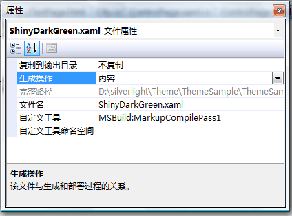
并以“内容”方式作为"生成操作"的选项,如下:
我们可以直接在XAML文件中声明使用主题的元素,比如:
 ..
..xmlns:theming ="clr-namespace:Microsoft.Windows.Controls.Theming;assembly=Microsoft.Windows.Controls.Theming"
>
<!-- ShinyDarkPurple -->
< StackPanel Width ="100"
theming:ImplicitStyleManager.ApplyMode ="Auto"
theming:ImplicitStyleManager.ResourceDictionaryUri ="themes/ExpressionLight.xaml" >
< Button Content ="Button" />
< CheckBox Content ="CheckBox" />
< RadioButton Content ="RadioButton" />
< Slider />
< ListBox />
< ProgressBar Height ="15" Value ="30" />
< controls:Expander ExpandDirection ="Down" />
</ StackPanel >
<!-- ShinyDarkGreen -->
</ UserControl >
这样在该StackPanel下的所有控件样式均应用了ExpressionLight主题。另外我们也可以在CS
文件中对指定的控件设置相应的主题,比如本DEMO中所写的代码:
{
InitializeComponent();
this .ThemeList.SelectionChanged += new SelectionChangedEventHandler(ThemeList_SelectionChanged);
this .Loaded += new RoutedEventHandler(Page_Loaded);
}
void Page_Loaded( object sender, RoutedEventArgs e)
{
ThemeList.Items.Add( new ComboBoxItem() { Name = " ExpressionDark " , Content = " ExpressionDark " , DataContext = " themes/ExpressionDark.xaml " , IsEnabled = true });
ThemeList.Items.Add( new ComboBoxItem() { Name = " ExpressionLight " , Content = " ExpressionLight " , DataContext = " themes/ExpressionLight.xaml " });
ThemeList.Items.Add( new ComboBoxItem() { Name = " RainierOrange " , Content = " RainierOrange " , DataContext = " themes/RainierOrange.xaml " });
ThemeList.Items.Add( new ComboBoxItem() { Name = " RainierPurple " , Content = " RainierPurple " , DataContext = " themes/RainierPurple.xaml " });
ThemeList.Items.Add( new ComboBoxItem() { Name = " RainierRadialBlue " , Content = " RainierRadialBlue " , DataContext = " themes/RainierRadialBlue.xaml " });
ThemeList.Items.Add( new ComboBoxItem() { Name = " ShinyBlue " , Content = " ShinyBlue " , DataContext = " themes/ShinyBlue.xaml " });
ThemeList.Items.Add( new ComboBoxItem() { Name = " ShinyDarkGreen " , Content = " ShinyDarkGreen " , DataContext = " themes/ShinyDarkGreen.xaml " });
ThemeList.Items.Add( new ComboBoxItem() { Name = " ShinyDarkPurple " , Content = " ShinyDarkPurple " , DataContext = " themes/ShinyDarkPurple.xaml " });
ThemeList.Items.Add( new ComboBoxItem() { Name = " ShinyDarkTeal " , Content = " ShinyDarkTeal " , DataContext = " themes/ShinyDarkTeal.xaml " });
ThemeList.Items.Add( new ComboBoxItem() { Name = " ShinyRed " , Content = " ShinyRed " , DataContext = " themes/ShinyRed.xaml " });
SetTheme(ThemeList.Items[ 0 ] as ComboBoxItem);
}
private void ThemeList_SelectionChanged( object sender, SelectionChangedEventArgs e)
{
SetTheme(ThemeList.SelectedItem as ComboBoxItem);
}
// 设置相应的theme
void SetTheme(ComboBoxItem comboBoxItem)
{
if (comboBoxItem != null )
{
ControlPage control = new ControlPage();
Test.Children.Clear();
Test.Children.Add(control);
Uri uri = new Uri(comboBoxItem.DataContext.ToString(), UriKind.Relative);
ImplicitStyleManager.SetResourceDictionaryUri(control, uri);
ImplicitStyleManager.SetApplyMode(control, ImplicitStylesApplyMode.Auto);
ImplicitStyleManager.Apply(control);
}
}
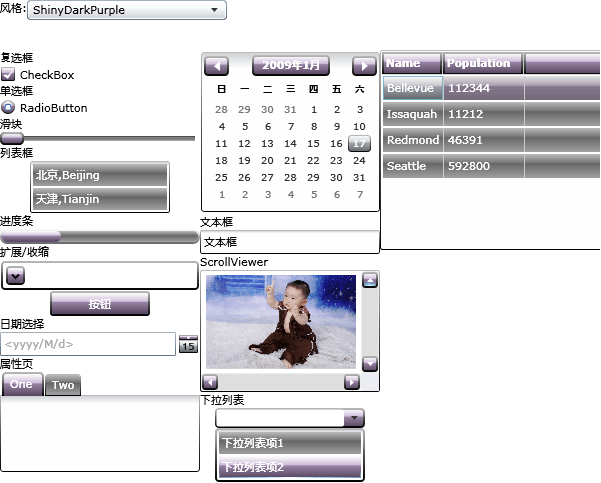
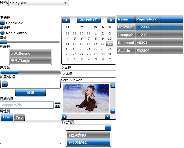
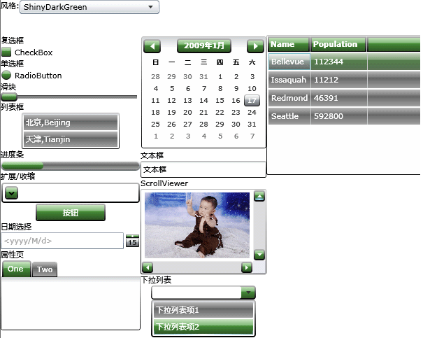
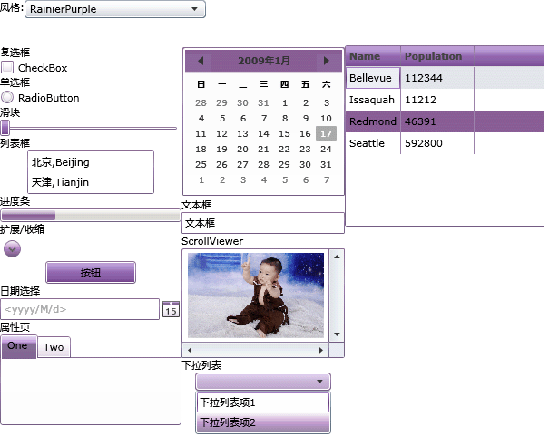
上面代码中的ControlPage 类即是我们要加载的控件页对象,在该对象上声明了一些控件,然后将这些控
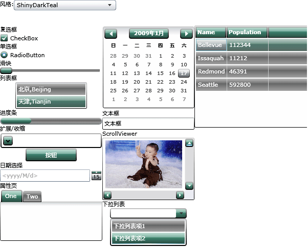
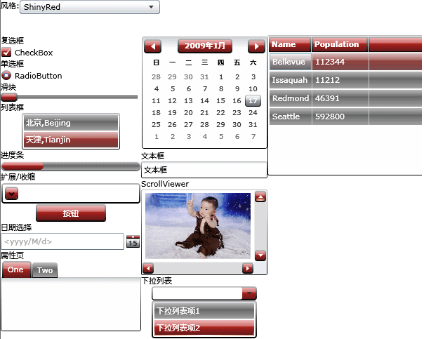
件(集合)做为子控件加载到当前PAGE页面中的Stack元素(Test)中。这样我们运行一下这个DEMO,看一下
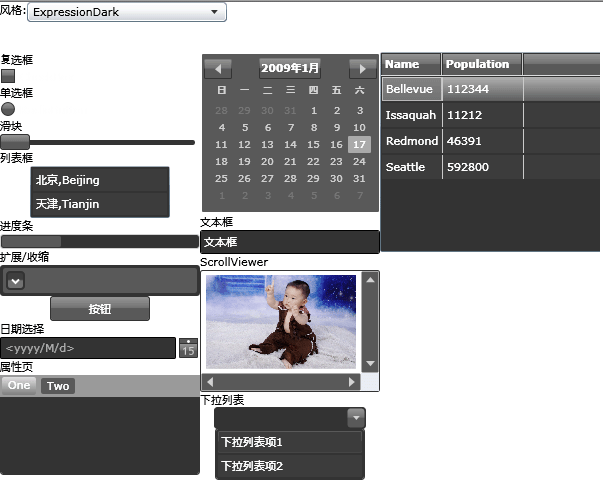
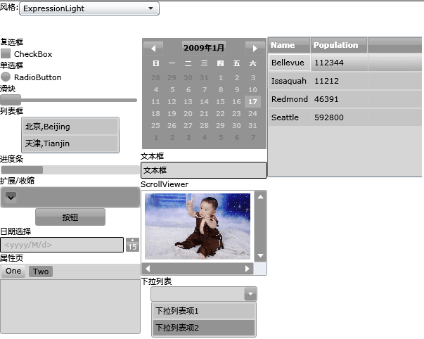
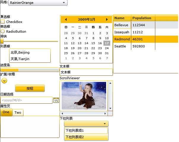
各个主题的显示效果:

当然,官方还推荐了几个主题制作插件工具,比如: Kuler,以及插件Colorful Expression。
可以从这个链接中获得一些信息:)
好了,今天的内容就先到这里了,源码下载,请点击这里。
原文链接:http://www.cnblogs.com/daizhj/archive/2009/01/19/1378090.html
作者: daizhj, 代震军
Tags: silverlight,theme, toolkit, 风格
网址: http://daizhj.cnblogs.com/
在微软的Silverlight 开源控件项目: Silverlight Toolkit