Android基础知识 - AppbarLayout
- 本篇文章完全借鉴如下博文,自己在博客里重新记录下。
https://www.jianshu.com/p/bbc703a0015e
AppbarLayout
- AppbarLayout效果展示
- AppbarLayout
-
- xml源码
- 效果
- 重点代码解释
- scrollFlags设置动作
- CollapsingToolbarLayout
- CollapsingToolbarLayout添加控件
- 沉浸式设计
AppbarLayout效果展示
- 在Toolbar的基础上,我们还要学习如何实现Toolbar的收缩和扩展效果。
- 如下效果:
- 要实现这样的效果,需要用到:CoordinatorLayout 和 AppbarLayout 的配合,以及实现了 NestedScrollView 的布局或控件。AppbarLayout 是一种支持响应滚动手势的app bar布局,CollapsingToolbarLayout 则是专门用来实现子布局内不同元素响应滚动细节的布局。
- 与 AppbarLayout 组合的滚动布局 (RecyclerView,NestedScrollView等) 需要设置
app:layout_behavior-"@string/appbar_scrolling_view_behavior",没有设置的话,AppbarLayout 将不会响应滚动布局的滚动事件。
AppbarLayout
xml源码
<androidx.coordinatorlayout.widget.CoordinatorLayout xmlns:android="http://schemas.android.com/apk/res/android"
android:layout_width="match_parent"
android:layout_height="match_parent"
xmlns:app="http://schemas.android.com/apk/res-auto">
<com.google.android.material.appbar.AppBarLayout
android:layout_width="match_parent"
android:layout_height="wrap_content">
<androidx.appcompat.widget.Toolbar
android:id="@+id/toolbar"
android:layout_width="match_parent"
android:layout_height="?attr/actionBarSize"
android:background="?attr/colorPrimary"
android:minHeight="?attr/actionBarSize"
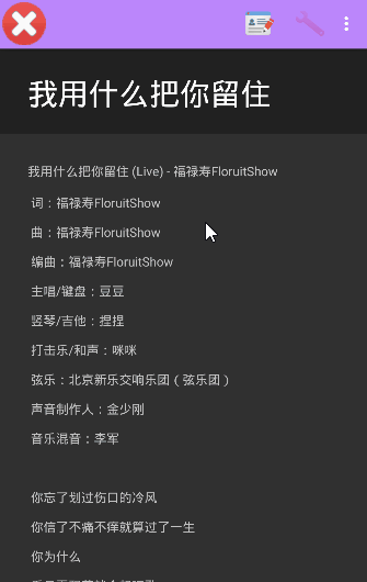
app:title="我用什么把你留住"
app:titleTextAppearance="@style/ToolbarTitle"
android:theme="@style/fhy_action"
app:popupTheme="@style/ToolbarPopupTheme"
app:layout_scrollFlags="scroll"/>
com.google.android.material.appbar.AppBarLayout>
<androidx.core.widget.NestedScrollView
android:layout_width="match_parent"
android:layout_height="match_parent"
app:layout_behavior="@string/appbar_scrolling_view_behavior">
<TextView
android:id="@+id/content"
android:layout_margin="16dp"
android:padding="16dp"
android:layout_width="match_parent"
android:layout_height="match_parent"
android:lineSpacingMultiplier="2"
android:text="@string/textContent"/>
androidx.core.widget.NestedScrollView>
androidx.coordinatorlayout.widget.CoordinatorLayout>
效果
- 可以看到
- 随着文本往上滚动,顶部的Toolbar也往上滚动,直到消失。
- 随着文本往下滚动,一直滚到文本的第一行露出来,Toolbar也逐渐露出来。
- 再解释重点代码之前,说一下自己相对于原博文Toolbar部分代码的改动,

- 共有三部分不同:
- 第一部分:增加一条属性:
app:titleTextAppearance="@style/ToolbarTitle",这是用来设置标题字体的大小和颜色的。具体查看ToolbarTitle内部代码:

- 第二部分,设置
android:theme属性为自定义主题fhy_action,具体查看fhy_action内部代码:
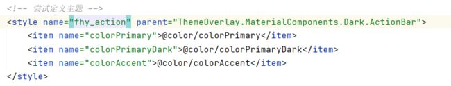
- 第三部分,设置
app:popupTheme属性为自定义主题ToolbarTitle,具体查看ToolbarTitle内部代码:主要是设置overflow按钮弹出的菜单背景颜色和位置。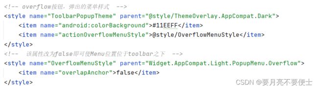
重点代码解释
- 从上面的布局中可以看到,其实在整个父布局CoordinatorLayout下面,是由2个子布局的:
- AppbarLayout
- NestedScrollView
- NestedScrollView先放一边,我们来看AppbarLayout
- AppbarLayout继承自LinearLayout,布局方向为垂直方向。所以你把它可以当做垂直布局的LinearLayout来使用。AppbarLayout是在LinearLayout上加了一些材料设计的概念,它可以让你定制当某个可滚动View的滚动手势发生变化时,其内部的子View实现何种动作。
- 注意:
- 上面提到的“某个可滚动View”,可以理解为某个ScrollView,当某个ScrollView发生滚动时,你可以定制你的“顶部栏”应该执行哪些动作(如跟着一块滚动、保持不懂等等)。
- 这里某个ScrollView就是NestedScrollView或者实现了NestedScrollView机制的其他控件,如RecylerView,它有一个布局行为 layout_behavior:
app:layout_behavior="@string/appbar_scrolling_view_behavior"- 这是一个系统behavior,从字面意思就可以看到,是为appbar设置滚动动作的一个behavior,没有这个属性的话,Appbar就是死的,有了它就有了灵魂。
- 我们可以通过给Appbar下的子View添加 app:layout_scrollFlags 来设置各子View执行的动作,scrollFlags可以设置的动作如下:
scrollFlags设置动作
- scroll :
app:layout_scrollFlags="scroll"- 值设为scroll的View会跟随滚动事件一起发生移动。就是当指定的ScrollView发生滚动时,该View也跟随一起滚动,就好像这个View也是属于这个ScrollView一样。
- 上面的效果就是设置了scroll之后的:
- 随着文本往上滚动,顶部的Toolbar也往上滚动,直到消失。
- 随着文本往下滚动,一直滚到文本的第一行露出来,Toolbar也逐渐露出来。
- enterAlways:
app:layout_scrollFlags="scroll|enterAlways"- 值设为enterAlways的View,当任何时候ScrollView往下滚动时,该View会直接往下滚动。而不用考虑ScollView是否滚动到最顶部(第一行)还是哪里。
- 效果如下:
- exitUntilCollapsed:
- 值设为exitUntilCollapsed的View,当这个View要往上逐渐“消逝”时,会一直往上滑动,直到剩下的高度达到它的最小高度后,再响应ScrollView的内部滑动事件。
- 理解的话,就是在ScrollView往上滑动时,首先是View把滑动事件“夺走”,由View去执行滑动,直到滑动最小高度后,把这个滑动事件“还”回去,让ScrollView内部去上滑。
-
<androidx.appcompat.widget.Toolbar ...... android:layout_height="?attr/actionBarSize" android:minHeight="20dp" app:layout_scrollFlags="scroll|exitUntilCollapsed"/> - 效果图:
- 看着有些不协调,Toolbar没有完全显示出来,改动下
android:layout_height属性和android:minHeight属性 -
<androidx.appcompat.widget.Toolbar ...... android:layout_height="150dp" android:minHeight="?attr/actionBarSize" app:layout_scrollFlags="scroll|exitUntilCollapsed"/> - 效果图:

- enterAlwaysCollapsed:
- 是enterAlways的附加选项,一般根enterAlways一起使用,它是指,View在往下“出现”的时候,首先是enteAlways效果,当View的高度达到最小高度时,View就暂时不去往下滚动,知道ScrollView滑动到顶部不再滑动时,View再继续往下滑动,直到滑到View的顶部结束。
-
<androidx.appcompat.widget.Toolbar ...... android:layout_height="150dp" android:minHeight="?attr/actionBarSize" app:layout_scrollFlags="scroll|enterAlways|enterAlwaysCollapsed"/> - 效果图:
- 注意: Toolbar的默认最小高度时"?attr/actionBarSize",很多时候可以不同设置,而且从gif图中可以看出,其实这里有个缺陷,就是title的位置和toolbar上的图标行脱离了。
- 后面讲解的 CollapsingToolbarLayout 可以解决这个问题,先丢出来。
- snap:
- 就是Child View滚动比例的一个吸附效果,也就是说,Child View不会存在局部显示的情况,滚动Child View的部分高度,当我们松开手指时,Child View要么向上全部滚出屏幕,要么向下全部滚进屏幕,有点类似ViewPage的左右滑动。
-
<androidx.appcompat.widget.Toolbar ...... android:layout_height="?attr/actionBarSize" app:layout_scrollFlags="scroll|snap"/> - 效果图:
CollapsingToolbarLayout
- CollapsingToolbarLayout是用来对Toolbar进行再次包装的ViewGroup,主要是用于实现折叠(其实就是看起来像伸缩)的AppBar效果。它需要放在AppBarLayout布局里面,并且作为AppBarLayout的直接子View。CollapsingToolbarLayout主要包括几个功能:
- 折叠Title(Collapsing title):当布局内容全部显示出来时,title是最大的,但是随着View逐步溢出屏幕顶部,title变得越来越小。你可以通过调用setTitle方法来设置title。
- 内容纱布(Content Scrim):根据滚动的位置是否到达一个阈值,来决定是否对View“盖上纱布”。可以通过setContentScrim(Drawable)来设置纱布的图片,默认contentScrim是colorPrimary的色值。
- 状态栏纱布(Status bar Scrim):根据滚动位置是否到达一个阈值决定是否对状态栏“盖上纱布”,你可以通过setStatusBarScrim(Drawable)来设置纱布图片,但是只能在LOLLOPOP设备上面有作用。默认statusBarScrim是colorPrimaryDark的色值。
- 视差滚动子View(Parallax scrolling children):子view可以选择在当前的布局当时是否以“视差”的方式来跟随滚动。(其实就是让这个View的滚动的速度比其他正常滚动的View速度稍微慢一些)。将布局参数app:layout_collapseMode设为:parallax。
- 将子View位置固定(Pinned position children):子View可以选择是否在全局空间上固定位置,这对于Toolbar来说非常有用,因为当布局在移动时,可以将Toolbar固定位置而不受移动的影响。将app:layout_collapseMode设为:pin。
- 更改布局如下:
<androidx.coordinatorlayout.widget.CoordinatorLayout xmlns:android="http://schemas.android.com/apk/res/android"
    android:layout_width="match_parent"
    android:layout_height="match_parent"
    xmlns:app="http://schemas.android.com/apk/res-auto">

    <com.google.android.material.appbar.AppBarLayout
        android:layout_width="match_parent"
        android:layout_height="150dp">

        <com.google.android.material.appbar.CollapsingToolbarLayout
            android:id="@+id/collapsing"
            android:layout_width="match_parent"
            android:layout_height="match_parent"
            android:theme="@style/fhy_action"
            app:layout_scrollFlags="scroll|exitUntilCollapsed">


            <androidx.appcompat.widget.Toolbar
                android:id="@+id/toolbar"
                android:layout_width="match_parent"
                android:layout_height="?attr/actionBarSize"
                android:background="?attr/colorPrimary"
                android:elevation="4dp"
                app:title="我用什么把你留住"
                app:popupTheme="@style/ToolbarPopupTheme"
                app:layout_collapseMode="parallax"/>

        com.google.android.material.appbar.CollapsingToolbarLayout>
    com.google.android.material.appbar.AppBarLayout>
    <androidx.core.widget.NestedScrollView
        android:layout_width="match_parent"
        android:layout_height="match_parent"
        app:layout_behavior="@string/appbar_scrolling_view_behavior">
        <TextView
            android:id="@+id/content"
            android:layout_margin="16dp"
            android:padding="16dp"
            android:layout_width="match_parent"
            android:layout_height="match_parent"
            android:lineSpacingMultiplier="2"
            android:text="@string/textContent"/>


    androidx.core.widget.NestedScrollView>


androidx.coordinatorlayout.widget.CoordinatorLayout>
- 将原本属于Toolbar的几个属性移动到了CollapsingToolbarLayout上,分别是:
android:theme="@style/fhy_action"、app:layout_scrollFlags="scroll|exitUntilCollapsed" - 同时给Toolbar增添了一个折叠模式属性:
app:layout_collapseMode="parallax" - 效果图如下:
- 可以看到折叠区域是默认黑色,我们可以给折叠区域加上背景色:

- 效果如下:

- 可以看到这时Toolbar区域背景色和折叠区域背景色对比鲜明。
- 可以看到折叠区域是默认黑色,我们可以给折叠区域加上背景色:
- 以上的折叠模式,导致Toolbar的顶部图标没了,我们更改下折叠模式:
app:layout_collapseMode="pin"- 效果图:
- 效果图:
- 我们继续把
layout_scrollFlags属性更改下app:layout_scrollFlags="scroll|enterAlwaysCollapsed|enterAlways"- 效果图
- 效果蛮不错的,有了点Goole Material Design的感觉了。
- 效果图
CollapsingToolbarLayout添加控件
- 上面说CollapsingToolbarLayout是个ViewGroup,那么肯定还可以添加控件,那么我们在里面添加一个ImageView来看看,更改布局如下:
<androidx.coordinatorlayout.widget.CoordinatorLayout xmlns:android="http://schemas.android.com/apk/res/android"
    android:layout_width="match_parent"
    android:layout_height="match_parent"
    xmlns:app="http://schemas.android.com/apk/res-auto">

    <com.google.android.material.appbar.AppBarLayout
        android:layout_width="match_parent"
        android:layout_height="200dp">

        <com.google.android.material.appbar.CollapsingToolbarLayout
            android:id="@+id/collapsing"
            android:layout_width="match_parent"
            android:layout_height="match_parent"
            android:background="@color/colorAccent"
            android:theme="@style/fhy_action"
            app:layout_scrollFlags="scroll|enterAlways|enterAlwaysCollapsed">
            <ImageView
                android:layout_width="match_parent"
                android:layout_height="match_parent"
                android:src="@drawable/background"
                android:scaleType="centerCrop"
                app:layout_collapseMode="parallax"/>

            <androidx.appcompat.widget.Toolbar
                android:id="@+id/toolbar"
                android:layout_width="match_parent"
                android:background="@color/colorPrimary"
                android:layout_height="?attr/actionBarSize"
                app:title="我用什么把你留住"
                app:popupTheme="@style/ToolbarPopupTheme"
                app:layout_collapseMode="pin"/>

        com.google.android.material.appbar.CollapsingToolbarLayout>
    com.google.android.material.appbar.AppBarLayout>
    <androidx.core.widget.NestedScrollView
        android:layout_width="match_parent"
        android:layout_height="match_parent"
        app:layout_behavior="@string/appbar_scrolling_view_behavior">
        <TextView
            android:id="@+id/content"
            android:layout_margin="16dp"
            android:padding="16dp"
            android:layout_width="match_parent"
            android:layout_height="match_parent"
            android:lineSpacingMultiplier="2"
            android:text="@string/textContent"/>


    androidx.core.widget.NestedScrollView>


androidx.coordinatorlayout.widget.CoordinatorLayout>
- 效果图
- 有些意思了,但不美观,Toolbar和折叠区的图片不协调,去掉Toolbar默认的背景属性

- 效果图
- 有些意思了,但不美观,Toolbar和折叠区的图片不协调,去掉Toolbar默认的背景属性
- 给
CollapsingToolbarLayout属性设置contentScrim属性- 注意,同时需要把
layout_scrollFlags属性修改下,如下所示:
app:layout_scrollFlags="scroll|exitUntilCollapsed" app:contentScrim="@color/colorPrimary" - 效果如下所示:
- 注意,同时需要把
沉浸式设计
- 现在很多APP比较喜欢采用沉浸式设计,简单点就是将状态栏和导航栏都设置成透明或半透明的。
- 我们来把状态栏statusBar设置成透明,在style主题中的AppTheme里增加一条。
- 在布局里面,将ImageView和所有它上面的父View都添加成 fitsSystemWindows 属性
<androidx.coordinatorlayout.widget.CoordinatorLayout xmlns:android="http://schemas.android.com/apk/res/android"
    ...
    android:fitsSystemWindows="true">

    <com.google.android.material.appbar.AppBarLayout
        ...
        android:fitsSystemWindows="true">

        <com.google.android.material.appbar.CollapsingToolbarLayout
            ...
            android:fitsSystemWindows="true">
            <ImageView
                ...
                android:fitsSystemWindows="true"/>

            <androidx.appcompat.widget.Toolbar
                .../>

        com.google.android.material.appbar.CollapsingToolbarLayout>
    com.google.android.material.appbar.AppBarLayout>
    <androidx.core.widget.NestedScrollView
        ...>
        <TextView
            .../>

    androidx.core.widget.NestedScrollView>
androidx.coordinatorlayout.widget.CoordinatorLayout>
- 效果图:
- 自己感觉效果表示不是明显,就不继续往下写了。
- 以上的AppbarLayout知识点已经足够自己用了。