我是一个段落
我是一个段落
我链接的是PDF文件
我类名是icon
我的title是more```
**css代码**
a[class^=icon]{ background: green; color:#fff;}
a[href$=pdf]{ background: orange; color: #fff;}
a[title*=more]{ background: blue; color: #fff;}```
结果显示:

:root选择器的演示```
**CSS代码:**
:root { background:orange;}```
演示结果:

:root{background:orange}
html {background:orange;}```

得到的效果等同。
>建议使用:root方法。
另外在IE9以下还可以借助“:root”实现hack功能。

----
结构性伪类选择器—not
:not选择器称为**否定选择器**,和jQuery中的:not选择器一模一样,**可以选择除某个元素之外的所有元素**。就拿form元素来说,比如说你想给表单中**除submit按钮之外**的input元素添加红色边框,**CSS代码**可以写成:
form {
width: 200px; margin: 20px auto;
}
div {
margin-bottom: 20px;
}
input:not([type="submit"]){ border:1px solid red;}```
相关HTML代码:
演示结果:

结构性伪类选择器—empty


    我这里有内容
div {
  min-height: 30px;
}
div:empty {
  border: 1px solid green;
}

Brand
```
**CSS代码:**
.menuSection{
display: none;
}
:target{/这里的:target就是指id="brand"的div对象/
display:block;
}```
演示结果:
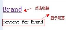
Brand
Brand
Brand
```
css代码:
上面的代码可以对不同的target对象分别设置不的样式。
CSS代码:
ol > li{ font-size:20px; font-weight: bold; margin-bottom: 10px;}
ol a { font-size: 16px; font-weight: normal;}
ol > li:first-child{ color: red;}```
**演示结果:**

----
结构性伪类选择器—last-child
“:last-child”选择器与“:first-child”选择器作用类似,不同的是“:last-child”选择器选择的是元素的最后一个子元素。例如,需要改变的是列表中的最后一个“li”的背景色,就可以使用这个选择器,
ul>li:last-child{background:blue;}```

- item1
- item2
- item3
- item4
- item5
- item6
- item7
- item8
- item9
- item10
```
**CSS代码:**
ol > li:nth-child(2n){ background: orange;}```
演示结果:
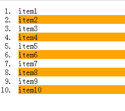
- item1
- item2
- item3
- item4
- item5
- item6
- item7
- item8
- item9
- item10
- item11
- item12
- item13
- item14
- item15
```
**CSS代码:**
ol > li:nth-last-child(5){ background: orange;}```
演示结果:
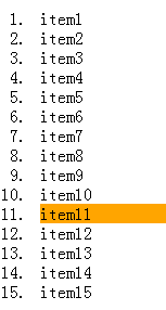
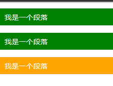
    我是一个块元素,我是.wrapper的第一个子元素
    我是一个段落元素,我是不是.wrapper的第一个子元素,但是他的第一个段落元素
    我是一个段落元素
    我是一个块元素
```
**CSS代码:**
.wrapper {
width: 500px;
margin: 20px auto;
padding: 10px;
border: 1px solid #ccc;
color: #fff;
}
.wrapper > div { background: green;}
.wrapper > p { background: blue;}/我要改变第一个段落的背景为橙色/**
.wrapper > p:first-of-type { background: orange;}```
演示结果:

    我是一个段落
    我是一个段落


    我是一个段落
```
**CSS代码:**
.post p { background: green; color: #fff; padding: 10px;}
.post p:only-child { background: orange;}```
演示结果:
```
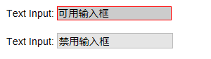
**CSS代码:**
div{ margin: 20px;}
input[type="text"]:enabled { background: #ccc; border: 2px solid red;}```
结果演示
```
**CSS代码:**
form {
border: 1px solid #ccc;
padding: 20px;
width: 300px;
margin: 30px auto;
}
.wrapper { margin-bottom: 10px;}
.box {
display: inline-block;
width: 20px;
height: 20px;
margin-right: 10px;
position: relative;
border: 2px solid orange;
vertical-align: middle;
}
.box input { opacity: 0; position: absolute; top:0; left:0;}
.box span {
position: absolute;
top: -10px;
right: 3px;
font-size: 30px;
font-weight: bold;
font-family: Arial;
-webkit-transform: rotate(30deg);
transform: rotate(30deg);
color: orange;
}
input[type="checkbox"] + span { opacity: 0;}
input[type="checkbox"]:checked + span { opacity: 1;}```
结果演示


有的时候设计要求,不使用上图那种浏览器默认的突出文本效果,需要一个与众不同的效果,此时“::selection”伪元素就非常的实用。不过在Firefox浏览器还需要添加前缀。
示例演示:
通过“::selection”选择器,将Web中选中的文本背景变成红色,文本变成绿色。
HTML代码:
“::selection”伪元素是用来匹配突出显示的文本。浏览器默认情况下,选择网站文本是深蓝的背景,白色的字体,
```
**CSS代码:**
::-moz-selection { background: red; color: green;}::selection { background: red; color: green;}```
结果演示:
注意:
1、IE9+、Opera、Google Chrome 以及 Safari 中支持 ::selection 选择器。
2、Firefox 支持替代的 ::-moz-selection。
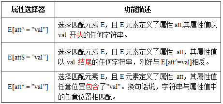
属性选择器
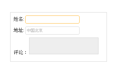
CSS代码:
form {
  width: 300px;
  padding: 10px;
  border: 1px solid #ccc;
  margin: 50px auto;
}
form > div {
  margin-bottom: 10px;
}
input[type="text"]{
  border: 1px solid orange;
  padding: 5px;
  background: #fff;
  border-radius: 5px;
}
input[type="text"]:-moz-read-only{
  border-color: #ccc;
}
input[type="text"]:read-only{
  border-color: #ccc;
}
textarea:-moz-read-only{
  border: 1px solid #ccc;
  height: 50px;
  resize: none;
  background: #eee;
}
textarea:read-only {
  border: 1px solid #ccc;
  height: 50px;
  resize: none;
  background: #eee;
}
结果演示
.clearfix::before,.clearfix::after {
    content: "."; display: block;
    height: 0; visibility: hidden;
}
.clearfix:after {clear: both;}
.clearfix {zoom: 1;}```
当然可以利用他们制作出其他更好的效果,比如右侧中的阴影效果,也是通过这个来实现的。
关键代码分析:
.effect::before, .effect::after{
content:"";
position:absolute;
z-index:-1;
-webkit-box-shadow:0 0 20px rgba(0,0,0,0.8);
-moz-box-shadow:0 0 20px rgba(0,0,0,0.8);
box-shadow:0 0 20px rgba(0,0,0,0.8);
top:50%;
bottom:0;
left:10px;
right:10px;
-moz-border-radius:100px / 10px;
border-radius:100px / 10px;
}```
上面代码作用在class名叫.effect上的div的前(before)后(after)都添加一个空元素,然后为这两个空元素添加阴影特效。