教女朋友学数据分析——可视化库Seaborn
可视化库Seaborn

学习笔记
Seaborn其实是在matplotlib的基础上进行了更高级的API封装,从而使得作图更加容易,在大多数情况下使用seaborn就能做出很具有吸引力的图,而使用matplotlib就能制作具有更多特色的图。应该把Seaborn视为matplotlib的补充,而不是替代物。
一、 整体布局风格设置
导入包,其中%matplotlib具体作用是当你调用matplotlib.pyplot的绘图函数plot()进行绘图的时候,或者生成一个figure画布的时候,可以直接在你的python console里面生成图像。
而我们在spyder或者pycharm实际运行代码的时候,可以直接注释掉这一句,也是可以运行成功的。
import seaborn as sns
import numpy as np
import matplotlib as mpl
import matplotlib.pyplot as plt
%matplotlib inline
我们利用matplotlib.pyplot绘图效果是这样的:
def sinplot(flip=1):
    x = np.linspace(0, 14, 100)
    for i in range(1, 7):
        plt.plot(x, np.sin(x + i * .5) * (7 - i) * flip)
sinplot()

利用seaborn绘图效果是这样的:
sns.set()
sinplot()

可以看到线比较细了些,上图也是seaborn的绘图默认风格,利用sns.set()可以设置整体布局风格:
5种主题风格
- darkgrid
- whitegrid
- dark
- white
- ticks
"whitegrid"风格:
sns.set_style("whitegrid")
data = np.random.normal(size=(20, 6)) + np.arange(6) / 2
sns.boxplot(data=data)

"dark"风格:
sns.set_style("dark")
sinplot()

"white"风格:
sns.set_style("white")
sinplot()

"ticks"风格:
sns.set_style("ticks")
sinplot()

去掉上、右边框:
sinplot()
sns.despine()

二、风格细节设置
利用offset参数,可以设置图离轴的距离:
#f, ax = plt.subplots()
sns.violinplot(data)
sns.despine(offset=10)

设置’left=True’可以将坐标的轴隐藏掉:
sns.set_style("whitegrid")
sns.boxplot(data=data, palette="deep")
sns.despine(left=True)

在子图操作中,不同图使用不同风格时,可以使用’with’来做,在with域内和域外风格不同:
with sns.axes_style("darkgrid"):
    plt.subplot(211)
    sinplot()
plt.subplot(212)
sinplot(-1)

利用sns.set_context可以设置plot函数中一些诸如标签,线,和其他元素的大小,sns.set_context中有三个参数:sns.set_context,font_scale,rc。
其中context有4中类型:
- paper,
- notebook,
- talk,
- poster
help(sns.set_context)
Help on function set_context in module seaborn.rcmod:

set_context(context=None, font_scale=1, rc=None)
    Set the plotting context parameters.

    This affects things like the size of the labels, lines, and other
    elements of the plot, but not the overall style. The base context
    is "notebook", and the other contexts are "paper", "talk", and "poster",
    which are version of the notebook parameters scaled by .8, 1.3, and 1.6,
    respectively.

    Parameters
    ----------
    context : dict, None, or one of {paper, notebook, talk, poster}
        A dictionary of parameters or the name of a preconfigured set.
    font_scale : float, optional
        Separate scaling factor to independently scale the size of the
        font elements.
    rc : dict, optional
        Parameter mappings to override the values in the preset seaborn
        context dictionaries. This only updates parameters that are
        considered part of the context definition.

    Examples
    --------
    >>> set_context("paper")

    >>> set_context("talk", font_scale=1.4)

    >>> set_context("talk", rc={"lines.linewidth": 2})

    See Also
    --------
    plotting_context : return a dictionary of rc parameters, or use in
                       a ``with`` statement to temporarily set the context.
    set_style : set the default parameters for figure style
    set_palette : set the default color palette for figures
"paper"风格:
sns.set()
sns.set_context("paper")
plt.figure(figsize=(8, 6))
sinplot()

"talk"风格:
sns.set_context("talk")
plt.figure(figsize=(8, 6))
sinplot()

"poster"风格:
sns.set_context("poster")
plt.figure(figsize=(8, 6))
sinplot()

"notebook"风格:
sns.set_context("notebook", font_scale=1.5, rc={"lines.linewidth": 2.5})
sinplot()

三、 调色板
import numpy as np
import seaborn as sns
import matplotlib.pyplot as plt
%matplotlib inline
sns.set(rc={"figure.figsize": (6, 6)})
- 颜色很重要
- color_palette()能传入任何Matplotlib所支持的颜色
- color_palette()不写参数则默认颜色
- set_palette()设置所有图的颜色
3.1 分类色板
current_palette = sns.color_palette()
sns.palplot(current_palette)

6个默认的颜色循环主题: deep, muted, pastel, bright, dark, colorblind
3.2 圆形画板
当你有六个以上的分类要区分时,最简单的方法就是在一个圆形的颜色空间中画出均匀间隔的颜色(这样的色调会保持亮度和饱和度不变)。这是大多数的当他们需要使用比当前默认颜色循环中设置的颜色更多时的默认方案。
最常用的方法是使用hls的颜色空间,这是RGB值的一个简单转换。
sns.palplot(sns.color_palette("hls", 8))

data = np.random.normal(size=(20, 8)) + np.arange(8) / 2
sns.boxplot(data=data,palette=sns.color_palette("hls", 8))

hls_palette()函数来控制颜色的亮度和饱和
- l-亮度 lightness
- s-饱和 saturation
sns.palplot(sns.hls_palette(8, l=.7, s=.9))

sns.palplot(sns.color_palette("Paired",8))

使用xkcd颜色来命名颜色
xkcd包含了一套众包努力的针对随机RGB色的命名。产生了954个可以随时通过xdcd_rgb字典中调用的命名颜色。
plt.plot([0, 1], [0, 1], sns.xkcd_rgb["pale red"], lw=3)
plt.plot([0, 1], [0, 2], sns.xkcd_rgb["medium green"], lw=3)
plt.plot([0, 1], [0, 3], sns.xkcd_rgb["denim blue"], lw=3)
[]

colors = ["windows blue", "amber", "greyish", "faded green", "dusty purple"]
sns.palplot(sns.xkcd_palette(colors))

3.3 连续色板
色彩随数据变换,比如数据越来越重要则颜色越来越深
sns.palplot(sns.color_palette("Blues"))

如果想要翻转渐变,可以在面板名称中添加一个_r后缀
sns.palplot(sns.color_palette("BuGn_r"))

cubehelix_palette()调色板
色调线性变换
sns.palplot(sns.color_palette("cubehelix", 8))

sns.palplot(sns.cubehelix_palette(8, start=.5, rot=-.75))

sns.palplot(sns.cubehelix_palette(8, start=.75, rot=-.150))

light_palette() 和dark_palette()调用定制连续调色板
sns.palplot(sns.light_palette("green"))

sns.palplot(sns.dark_palette("purple"))

sns.palplot(sns.light_palette("navy", reverse=True))

使用该kdeplot()函数绘制二维核密度图:
x, y = np.random.multivariate_normal([0, 0], [[1, -.5], [-.5, 1]], size=300).T
pal = sns.dark_palette("green", as_cmap=True)
sns.kdeplot(x, y, cmap=pal);

sns.palplot(sns.light_palette((210, 90, 60), input="husl"))

四、单变量分析绘图
%matplotlib inline
import numpy as np
import pandas as pd
from scipy import stats, integrate
import matplotlib.pyplot as plt
import seaborn as sns
生成随机数
sns.set(color_codes=True)
np.random.seed(sum(map(ord, "distributions")))
绘制直方图:
x = np.random.normal(size=100)
sns.distplot(x,kde=False)

设置条形图的数量为20
sns.distplot(x, bins=20, kde=False)

数据分布情况
x = np.random.gamma(6, size=200)
sns.distplot(x, kde=False, fit=stats.gamma)

注:当提示“The ‘normed’ kwarg is deprecated, and has been replaced by the ‘density’ kwarg” 时,D:\Anaconda\Lib\site-packages\seabornseaborn\distributions.py文件,约210行处:
hist_kws.setdefault(“normed”, norm_hist)
改为
hist_kws.setdefault(“density”, norm_hist)
五、多变量分析绘图
根据均值和协方差生成数据
mean, cov = [0, 1], [(1, .5), (.5, 1)]
data = np.random.multivariate_normal(mean, cov, 200)
df = pd.DataFrame(data, columns=["x", "y"])
df.head(3)
| x | y | |
|---|---|---|
| 0 | -0.966779 | 1.224554 |
| 1 | 1.326123 | 0.467515 |
| 2 | -1.233853 | 0.459449 |
观测两个变量之间的分布关系最好用散点图
sns.jointplot(x="x", y="y", data=df);

Hexbin图
直方图的双变量类比称为“hexbin”图,因为它显示了六边形区间内的观察计数。此图对于相对较大的数据集最有效。
x, y = np.random.multivariate_normal(mean, cov, 1000).T
with sns.axes_style("white"):
    sns.jointplot(x=x, y=y, kind="hex", color="k")

要在数据集中绘制多个成对的双变量分布,可以使用该pairplot()函数; 这将创建一个轴矩阵,并显示DataFrame中每对列的关系
(对角线都是自己 跟自己的分布,所有显示”单变量分布”)
其中,load_dataset()函数是从在线存储库加载数据集的(需要互联网)。
网址:https://github.com/mwaskom/seaborn-data
iris = sns.load_dataset("iris")
sns.pairplot(iris)

六、回归分析绘图
导入包
%matplotlib inline
import numpy as np
import pandas as pd
import matplotlib as mpl
import matplotlib.pyplot as plt
import seaborn as sns
加载数据"tips",该数据存储了服务员消费和一些影响因素的数据。
sns.set(color_codes=True)
np.random.seed(sum(map(ord, "regression")))
tips = sns.load_dataset("tips")
tips.head()
| total_bill | tip | sex | smoker | day | time | size | |
|---|---|---|---|---|---|---|---|
| 0 | 16.99 | 1.01 | Female | No | Sun | Dinner | 2 |
| 1 | 10.34 | 1.66 | Male | No | Sun | Dinner | 3 |
| 2 | 21.01 | 3.50 | Male | No | Sun | Dinner | 3 |
| 3 | 23.68 | 3.31 | Male | No | Sun | Dinner | 2 |
| 4 | 24.59 | 3.61 | Female | No | Sun | Dinner | 4 |
regplot()和lmplot()都可以绘制回归关系,推荐regplot()
sns.regplot(x="total_bill", y="tip", data=tips)

sns.lmplot(x="total_bill", y="tip", data=tips);

sns.regplot(data=tips,x="size",y="tip")

sns.regplot(x="size", y="tip", data=tips, x_jitter=.05)

anscombe = sns.load_dataset("anscombe")
sns.regplot(x="x", y="y", data=anscombe.query("dataset == 'I'"),
           ci=None, scatter_kws={"s": 100})

sns.lmplot(x="x", y="y", data=anscombe.query("dataset == 'II'"),
           ci=None, scatter_kws={"s": 80})

sns.lmplot(x="x", y="y", data=anscombe.query("dataset == 'II'"),
           order=2, ci=None, scatter_kws={"s": 80});

sns.lmplot(x="total_bill", y="tip", hue="smoker", data=tips);

sns.lmplot(x="total_bill", y="tip", hue="smoker", data=tips,
           markers=["o", "x"], palette="Set1");

sns.lmplot(x="total_bill", y="tip", hue="smoker", col="time", data=tips);

sns.lmplot(x="total_bill", y="tip", hue="smoker",
           col="time", row="sex", data=tips);

f, ax = plt.subplots(figsize=(5, 5))
sns.regplot(x="total_bill", y="tip", data=tips, ax=ax);

col_wrap:“Wrap” the column variable at this width, so that the column facets span multiple rows
size :Height (in inches) of each facet
sns.lmplot(x="total_bill", y="tip", col="day", data=tips,
           col_wrap=2, size=4);

sns.lmplot(x="total_bill", y="tip", col="day", data=tips,
           aspect=.8);

七、分类属性绘图
%matplotlib inline
import numpy as np
import pandas as pd
import matplotlib as mpl
import matplotlib.pyplot as plt
import seaborn as sns
sns.set(style="whitegrid", color_codes=True)
np.random.seed(sum(map(ord, "categorical")))
titanic = sns.load_dataset("titanic")
tips = sns.load_dataset("tips")
iris = sns.load_dataset("iris")
sns.stripplot(x="day", y="total_bill", data=tips);

重叠是很常见的现象,但是重叠影响我观察数据的量了
sns.stripplot(x="day", y="total_bill", data=tips, jitter=True)

sns.swarmplot(x="day", y="total_bill", data=tips)

sns.swarmplot(x="day", y="total_bill", hue="sex",data=tips)

sns.swarmplot(x="total_bill", y="day", hue="time", data=tips);

盒图
- IQR即统计学概念四分位距,第一/四分位与第三/四分位之间的距离
- N = 1.5IQR 如果一个值>Q3+N或 < Q1-N,则为离群点
sns.boxplot(x="day", y="total_bill", hue="time", data=tips);

sns.violinplot(x="total_bill", y="day", hue="time", data=tips);

sns.violinplot(x="day", y="total_bill", hue="sex", data=tips, split=True);

sns.violinplot(x="day", y="total_bill", data=tips, inner=None)
sns.swarmplot(x="day", y="total_bill", data=tips, color="w", alpha=.5)

显示值的集中趋势可以用条形图
sns.barplot(x="sex", y="survived", hue="class", data=titanic);

点图可以更好的描述变化差异
sns.pointplot(x="sex", y="survived", hue="class", data=titanic);

sns.pointplot(x="class", y="survived", hue="sex", data=titanic,
              palette={"male": "g", "female": "m"},
              markers=["^", "o"], linestyles=["-", "--"]);

宽形数据
sns.boxplot(data=iris,orient="h");

多层面板分类图
sns.factorplot(x="day", y="total_bill", hue="smoker", data=tips)

sns.factorplot(x="day", y="total_bill", hue="smoker", data=tips, kind="bar")

sns.factorplot(x="day", y="total_bill", hue="smoker",
               col="time", data=tips, kind="swarm")

sns.factorplot(x="time", y="total_bill", hue="smoker",
               col="day", data=tips, kind="box", size=4, aspect=.5)

seaborn.factorplot(x=None, y=None, hue=None, data=None, row=None, col=None, col_wrap=None, estimator=<function mean>, ci=95, n_boot=1000, units=None, order=None, hue_order=None, row_order=None, col_order=None, kind='point', size=4, aspect=1, orient=None, color=None, palette=None, legend=True, legend_out=True, sharex=True, sharey=True, margin_titles=False, facet_kws=None, **kwargs)

### Parameters: ###

* x,y,hue 数据集变量 变量名
* date 数据集 数据集名
* row,col 更多分类变量进行平铺显示 变量名
* col_wrap 每行的最高平铺数 整数
* estimator 在每个分类中进行矢量到标量的映射 矢量
* ci 置信区间 浮点数或None
* n_boot 计算置信区间时使用的引导迭代次数 整数
* units 采样单元的标识符,用于执行多级引导和重复测量设计 数据变量或向量数据
* order, hue_order 对应排序列表 字符串列表
* row_order, col_order 对应排序列表 字符串列表
* kind : 可选:point 默认, bar 柱形图, count 频次, box 箱体, violin 提琴, strip 散点,swarm 分散点
size 每个面的高度(英寸) 标量
aspect 纵横比 标量
orient 方向 "v"/"h"
color 颜色 matplotlib颜色
palette 调色板 seaborn颜色色板或字典
legend hue的信息面板 True/False
legend_out 是否扩展图形,并将信息框绘制在中心右边 True/False
share{x,y} 共享轴线 True/False
八、FacetGrid
当我们想把数据集中的很多的子集进行展示的时候,我们就可以利用FacetGrid了。
这里利用的是"tips"数据集。
%matplotlib inline
import numpy as np
import pandas as pd
import seaborn as sns
from scipy import stats
import matplotlib as mpl
import matplotlib.pyplot as plt

sns.set(style="ticks")
np.random.seed(sum(map(ord, "axis_grids")))
tips = sns.load_dataset("tips")
tips.head()
| total_bill | tip | sex | smoker | day | time | size | |
|---|---|---|---|---|---|---|---|
| 0 | 16.99 | 1.01 | Female | No | Sun | Dinner | 2 |
| 1 | 10.34 | 1.66 | Male | No | Sun | Dinner | 3 |
| 2 | 21.01 | 3.50 | Male | No | Sun | Dinner | 3 |
| 3 | 23.68 | 3.31 | Male | No | Sun | Dinner | 2 |
| 4 | 24.59 | 3.61 | Female | No | Sun | Dinner | 4 |
这里我们首先,将数据集传进来sns.FacetGrid(data,col=””)col表示我们按照什么进行分图。
我们先把位置占上,我们先将其进行实例化,之后我们就可以利用g来对其进行调用了
g = sns.FacetGrid(tips, col="time")

实例化并画图,通过map, g.map(plt.hist,””)—plt.hist表示画条形图
g = sns.FacetGrid(tips, col="time")
g.map(plt.hist, "tip");

加标注:g.add_legend(),alpha=.7表示透明程度
g = sns.FacetGrid(tips, col="sex", hue="smoker")
g.map(plt.scatter, "total_bill", "tip", alpha=.7)
g.add_legend();

在散点图中再加上回归的直线。
g = sns.FacetGrid(tips, row="smoker", col="time", margin_titles=True)
g.map(sns.regplot, "size", "total_bill", color=".1", fit_reg=False, x_jitter=.1);

还可以自己调整大小
g = sns.FacetGrid(tips, col="day", size=4, aspect=.5)
g.map(sns.barplot, "sex", "total_bill");

画图的时候,也可以自己指定顺序,这里我们想按照自己想的顺序打印,先写好一个顺序,在后续画图的过程中,将这个顺序传
进去“row_order=ordered_days”
from pandas import Categorical
ordered_days = tips.day.value_counts().index
print (ordered_days)
ordered_days = Categorical(['Thur', 'Fri', 'Sat', 'Sun'])
g = sns.FacetGrid(tips, row="day", row_order=ordered_days,
                  size=1.7, aspect=4,)
g.map(sns.boxplot, "total_bill");
CategoricalIndex(['Sat', 'Sun', 'Thur', 'Fri'], categories=['Thur', 'Fri', 'Sat', 'Sun'], ordered=False, dtype='category')

pal = dict(Lunch="seagreen", Dinner="gray")
g = sns.FacetGrid(tips, hue="time", palette=pal, size=5)
g.map(plt.scatter, "total_bill", "tip", s=50, alpha=.7, linewidth=.5, edgecolor="white")
g.add_legend();

可以自己指定形状
hue_kws={“marker”: [“^”, “v”] 指定形状
palette=”Set1″ 指定颜色
g = sns.FacetGrid(tips, hue="sex", palette="Set1", size=5, hue_kws={"marker": ["^", "v"]})
g.map(plt.scatter, "total_bill", "tip", s=100, linewidth=.5, edgecolor="white")
g.add_legend();

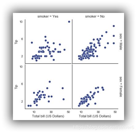
添加轴的label/轴的取值范围/子轴的距离
with sns.axes_style("white"):
    g = sns.FacetGrid(tips, row="sex", col="smoker", margin_titles=True, size=2.5)
g.map(plt.scatter, "total_bill", "tip", color="#334488", edgecolor="white", lw=.5);
g.set_axis_labels("Total bill (US Dollars)", "Tip");
g.set(xticks=[10, 30, 50], yticks=[2, 6, 10]);
g.fig.subplots_adjust(wspace=.02, hspace=.02);
#g.fig.subplots_adjust(left  = 0.125,right = 0.5,bottom = 0.1,top = 0.9, wspace=.02, hspace=.02)
我们使用iris数据集
iris = sns.load_dataset("iris")
g = sns.PairGrid(iris)
g.map(plt.scatter);

g = sns.PairGrid(iris)
g.map_diag(plt.hist)
g.map_offdiag(plt.scatter);

可以指定对角线的图的样式和非对角线的图的样式
g = sns.PairGrid(iris, hue="species")
g.map_diag(plt.hist)
g.map_offdiag(plt.scatter)
g.add_legend();

上面的图是将所有的特征进行两两对比,这里我们还可以选定部分特征进行对比。
g = sns.PairGrid(iris, vars=["sepal_length", "sepal_width"], hue="species")
g.map(plt.scatter);

g = sns.PairGrid(tips, hue="size", palette="GnBu_d")
g.map(plt.scatter, s=50, edgecolor="white")
g.add_legend();

九、Heatmap热图绘制
%matplotlib inline
import matplotlib.pyplot as plt
import numpy as np;
np.random.seed(0)
import seaborn as sns;
sns.set()
uniform_data = np.random.rand(3, 3)
print (uniform_data)
heatmap = sns.heatmap(uniform_data)
[[ 0.5488135   0.71518937  0.60276338]
 [ 0.54488318  0.4236548   0.64589411]
 [ 0.43758721  0.891773    0.96366276]]

ax = sns.heatmap(uniform_data, vmin=0.2, vmax=0.5)

normal_data = np.random.randn(3, 3)
print (normal_data)
ax = sns.heatmap(normal_data, center=0)
[[ 1.26611853 -0.50587654  2.54520078]
 [ 1.08081191  0.48431215  0.57914048]
 [-0.18158257  1.41020463 -0.37447169]]

flights = sns.load_dataset("flights")
flights.head()
| year | month | passengers | |
|---|---|---|---|
| 0 | 1949 | January | 112 |
| 1 | 1949 | February | 118 |
| 2 | 1949 | March | 132 |
| 3 | 1949 | April | 129 |
| 4 | 1949 | May | 121 |
flights = flights.pivot("month", "year", "passengers")
print (flights)
ax = sns.heatmap(flights)
year       1949  1950  1951  1952  1953  1954  1955  1956  1957  1958  1959  \
month
January     112   115   145   171   196   204   242   284   315   340   360
February    118   126   150   180   196   188   233   277   301   318   342
March       132   141   178   193   236   235   267   317   356   362   406
April       129   135   163   181   235   227   269   313   348   348   396
May         121   125   172   183   229   234   270   318   355   363   420
June        135   149   178   218   243   264   315   374   422   435   472
July        148   170   199   230   264   302   364   413   465   491   548
August      148   170   199   242   272   293   347   405   467   505   559
September   136   158   184   209   237   259   312   355   404   404   463
October     119   133   162   191   211   229   274   306   347   359   407
November    104   114   146   172   180   203   237   271   305   310   362
December    118   140   166   194   201   229   278   306   336   337   405

year       1960
month
January     417
February    391
March       419
April       461
May         472
June        535
July        622
August      606
September   508
October     461
November    390
December    432

ax = sns.heatmap(flights, annot=True,fmt="d")

ax = sns.heatmap(flights, linewidths=.5)

ax = sns.heatmap(flights, cmap="YlGnBu")

ax = sns.heatmap(flights, cbar=False)

End