matplotlib绘图实例 pyplot、pylab模块及作图参数
http://blog.csdn.net/pipisorry/article/details/40005163
Matplotlib绘图实例(使用pyplot模块)
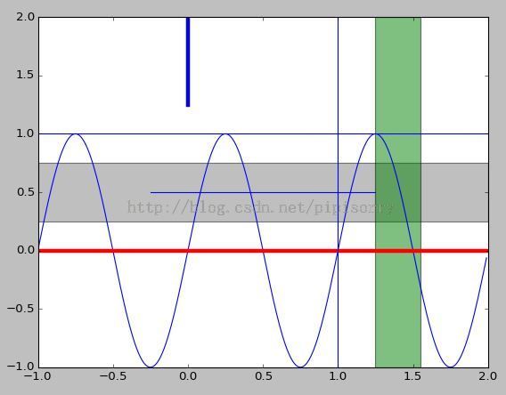
matplotlib绘制直线、条形/矩形区域
import numpy as np
import matplotlib.pyplot as plt
t = np.arange(-1, 2, .01)
s = np.sin(2 * np.pi * t)

plt.plot(t,s)
# draw a thick red hline at y=0 that spans the xrange
l = plt.axhline(linewidth=4, color='r')
plt.axis([-1, 2, -1, 2])
plt.show()
plt.close()

# draw a default hline at y=1 that spans the xrange
plt.plot(t,s)
l = plt.axhline(y=1, color='b')
plt.axis([-1, 2, -1, 2])
plt.show()
plt.close()

# draw a thick blue vline at x=0 that spans the upper quadrant of the yrange
plt.plot(t,s)
l = plt.axvline(x=0, ymin=0, linewidth=4, color='b')
plt.axis([-1, 2, -1, 2])
plt.show()
plt.close()

# draw a default hline at y=.5 that spans the the middle half of the axes
plt.plot(t,s)
l = plt.axhline(y=.5, xmin=0.25, xmax=0.75)
plt.axis([-1, 2, -1, 2])
plt.show()
plt.close()

plt.plot(t,s)
p = plt.axhspan(0.25, 0.75, facecolor='0.5', alpha=0.5)
p = plt.axvspan(1.25, 1.55, facecolor='g', alpha=0.5)
plt.axis([-1, 2, -1, 2])
plt.show()
效果图展示
另一种绘制直线的方式
plt.hlines(hline, xmin=plt.gca().get_xlim()[0], xmax=plt.gca().get_xlim()[1], linestyles=line_style, colors=color)
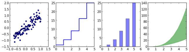
散点图、梯形图、柱状图、填充图
n = np.array([0,1,2,3,4,5])
x = np.linspace(-0.75, 1., 100)

fig, axes = plt.subplots(1, 4, figsize=(12,3))

axes[0].scatter(x, x + 0.25*np.random.randn(len(x)))

axes[1].step(n, n**2, lw=2)

axes[2].bar(n, n**2, align="center", width=0.5, alpha=0.5)

axes[3].fill_between(x, x**2, x**3, color="green", alpha=0.5);
散点图(改变颜色,大小)
import numpy as np import matplotlib.pyplot as plt
N = 50
x = np.random.rand(N)
y = np.random.rand(N)
area = np.pi * (15 * np.random.rand(N))**2 # 0 to 15 point radiuses
color = 2 * np.pi * np.random.rand(N)
plt.scatter(x, y, s=area, c=color, alpha=0.5, cmap=plt.cm.hsv)
plt.show()

fig = plt.figure()
ax = fig.add_axes([0.0, 0.0, .6, .6], polar=True)
t = linspace(0, 2 * pi, 100)
ax.plot(t, t, color='blue', lw=3);

皮皮blog
Matplotlib绘图实例(使用pylab模块)
matplotlib还提供了一个名为pylab的模块,其中包括了许多NumPy和pyplot模块中常用的函数,方便用户快速进行计算和绘图,十分适合在IPython交互式环境中使用。这里使用下面的方式载入pylab模块:
>>> import pylab as plNote:import pyplot as plt也同样可以
两种常用图类型
Line and scatter plots(使用plot()命令), histogram(使用hist()命令)
1 折线图&散点图 Line and scatter plots
折线图 Line plots(关联一组x和y值的直线)
import numpy as np
import pylab as pl
x = [1, 2, 3, 4, 5]# Make an array of x values
y = [1, 4, 9, 16, 25]# Make an array of y values for each x value
pl.plot(x, y)# use pylab to plot x and y
pl.show()# show the plot on the screen

散点图 Scatter plots
把pl.plot(x, y)改成pl.plot(x, y, 'o')

美化 Making things look pretty
线条颜色 Changing the line color
红色:把pl.plot(x, y, 'o')改成pl.plot(x, y, ’or’)
线条样式 Changing the line style
虚线:plot(x,y, '--')
marker样式 Changing the marker style
蓝色星型markers:plot(x,y, ’b*’)
具体见附录 - matplotlib中的作图参数
图和轴标题以及轴坐标限度 Plot and axis titles and limits
import numpy as np
import pylab as pl
x = [1, 2, 3, 4, 5]# Make an array of x values
y = [1, 4, 9, 16, 25]# Make an array of y values for each x value
pl.plot(x, y)# use pylab to plot x and y
pl.title(’Plot of y vs. x’)# give plot a title
pl.xlabel(’x axis’)# make axis labels
pl.ylabel(’y axis’)
pl.xlim(0.0, 7.0)# set axis limits
pl.ylim(0.0, 30.)
pl.show()# show the plot on the screen

一个坐标系上绘制多个图 Plotting more than one plot on the same set of axes
依次作图即可
import numpy as np
import pylab as pl
x1 = [1, 2, 3, 4, 5]# Make x, y arrays for each graph
y1 = [1, 4, 9, 16, 25]
x2 = [1, 2, 4, 6, 8]
y2 = [2, 4, 8, 12, 16]
pl.plot(x1, y1, ’r’)# use pylab to plot x and y
pl.plot(x2, y2, ’g’)
pl.title(’Plot of y vs. x’)# give plot a title
pl.xlabel(’x axis’)# make axis labels
pl.ylabel(’y axis’)
pl.xlim(0.0, 9.0)# set axis limits
pl.ylim(0.0, 30.)
pl.show()# show the plot on the screen

图例 Figure legends
pl.legend((plot1, plot2), (’label1, label2’),loc='best’, numpoints=1)
第三个参数loc=表示图例放置的位置:'best’‘upper right’, ‘upper left’, ‘center’, ‘lower left’, ‘lower right’.
如果在当前figure里plot的时候已经指定了label,如plt.plot(x,z,label=" cos(x2) "),直接调用plt.legend()就可以了。
import numpy as np
import pylab as pl
x1 = [1, 2, 3, 4, 5]# Make x, y arrays for each graph
y1 = [1, 4, 9, 16, 25]
x2 = [1, 2, 4, 6, 8]
y2 = [2, 4, 8, 12, 16]
plot1 = pl.plot(x1, y1, ’r’)# use pylab to plot x and y : Give your plots names
plot2 = pl.plot(x2, y2, ’go’)
pl.title(’Plot of y vs. x’)# give plot a title
pl.xlabel(’x axis’)# make axis labels
pl.ylabel(’y axis’)
pl.xlim(0.0, 9.0)# set axis limits
pl.ylim(0.0, 30.)
pl.legend([plot1, plot2], (’red line’, ’green circles’), ’best’, numpoints=1)# make legend
pl.show()# show the plot on the screen

2 直方图 Histograms
import numpy as np
import pylab as pl
# make an array of random numbers with a gaussian distribution with
# mean = 5.0
# rms = 3.0
# number of points = 1000
data = np.random.normal(5.0, 3.0, 1000)
# make a histogram of the data array
pl.hist(data)
# make plot labels
pl.xlabel(’data’)
pl.show()
如果不想要黑色轮廓可以改为pl.hist(data, histtype=’stepfilled’)

自定义直方图bin宽度 Setting the width of the histogram bins manually
增加两行
bins = np.arange(-5., 16., 1.) #浮点数版本的range
pl.hist(data, bins, histtype=’stepfilled’)

同一画板上绘制多幅子图 Plotting more than one axis per canvas
如果需要同时绘制多幅图表的话,可以是给figure传递一个整数参数指定图标的序号,如果所指定
序号的绘图对象已经存在的话,将不创建新的对象,而只是让它成为当前绘图对象。
fig1 = pl.figure(1)
pl.subplot(211)
subplot(211)把绘图区域等分为2行*1列共两个区域, 然后在区域1(上区域)中创建一个轴对象. pl.subplot(212)在区域2(下区域)创建一个轴对象。

You can play around with plotting a variety of layouts. For example, Fig. 11 is created using the following commands:
f1 = pl.figure(1)
pl.subplot(221)
pl.subplot(222)
pl.subplot(212)

当绘图对象中有多个轴的时候,可以通过工具栏中的Configure Subplots按钮,交互式地调节轴之间的间距和轴与边框之间的距离。如果希望在程序中调节的话,可以调用subplots_adjust函数,它有left, right, bottom, top, wspace, hspace等几个关键字参数,这些参数的值都是0到1之间的小数,它们是以绘图区域的宽高为1进行正规化之后的坐标或者长度。
pl.subplots_adjust(left=0.08, right=0.95, wspace=0.25, hspace=0.45)
皮皮blog
绘制圆形Circle和椭圆Ellipse
1. 调用包函数
###################################
#   coding=utf-8
#   !/usr/bin/env python
#   __author__ = 'pipi'
#   ctime 2014.10.11
#   绘制椭圆和圆形
###################################
from matplotlib.patches import Ellipse, Circle
import matplotlib.pyplot as plt

fig = plt.figure()
ax = fig.add_subplot(111)

ell1 = Ellipse(xy = (0.0, 0.0), width = 4, height = 8, angle = 30.0, facecolor= 'yellow', alpha=0.3)
cir1 = Circle(xy = (0.0, 0.0), radius=2, alpha=0.5)
ax.add_patch(ell1)
ax.add_patch(cir1)

x, y = 0, 0
ax.plot(x, y, 'ro')

plt.axis('scaled')
# ax.set_xlim(-4, 4)
# ax.set_ylim(-4, 4)
plt.axis('equal')   #changes limits of x or y axis so that equal increments of x and y have the same length

plt.show()
参见Matplotlib.pdf Release 1.3.1文档
p187
18.7 Ellipses (see arc)
p631class matplotlib.patches.Ellipse(xy, width, height, angle=0.0, **kwargs)Bases: matplotlib.patches.PatchA scale-free ellipse.xy center of ellipsewidth total length (diameter) of horizontal axisheight total length (diameter) of vertical axisangle rotation in degrees (anti-clockwise)p626class matplotlib.patches.Circle(xy, radius=5, **kwargs)
或者参见Matplotlib.pdf Release 1.3.1文档contour绘制圆
#coding=utf-8
import numpy as np
import matplotlib.pyplot as plt

x = y = np.arange(-4, 4, 0.1)
x, y = np.meshgrid(x,y)
plt.contour(x, y, x**2 + y**2, [9])     #x**2 + y**2 = 9 的圆形

plt.axis('scaled')
plt.show()
p478
Axes3D. contour(X, Y, Z, *args, **kwargs)
Create a 3D contour plot.
Argument Description
X, Y, Data values as numpy.arrays
Z
extend3d
stride
zdir
offset
Whether to extend contour in 3D (default: False)
Stride (step size) for extending contour
The direction to use: x, y or z (default)
If specified plot a projection of the contour lines on this position in plane normal to zdir
The positional and other
p1025
matplotlib.pyplot.axis(*v, **kwargs)
Convenience method to get or set axis properties.
或者参见demo【pylab_examples example code: ellipse_demo.py】
2. 直接绘制
#coding=utf-8
'''
Created on Jul 14, 2014
@author: pipi
'''
from math import pi
from numpy import cos, sin
from matplotlib import pyplot as plt

if __name__ == '__main__':
    '''plot data margin'''
    angles_circle = [i*pi/180 for i in range(0,360)]                 #i先转换成double
    #angles_circle = [i/np.pi for i in np.arange(0,360)]             # <=>
    # angles_circle = [i/180*pi for i in np.arange(0,360)]    X
    x = cos(angles_circle)
    y = sin(angles_circle)
    plt.plot(x, y, 'r')

    plt.axis('equal')
    plt.axis('scaled')
    plt.show()
[http://www.zhihu.com/question/25273956/answer/30466961?group_id=897309766#comment-61590570]
皮皮blog
绘图小技巧
控制坐标轴的显示——使x轴显示名称字符串而不是数字的两种方法
plt.xticks(range(len(list)), x, rotation='vertical')
Note:x代表一个字符串列表,如x轴上要显示的名称。
axes.set_xticklabels(x, rotation='horizontal', lod=True)
Note:这里axes是plot的一个subplot()
[控制坐标轴的显示——set_xticklabels]
获取x轴上坐标最小最大值
xmin, xmax = plt.gca().get_xlim()
其他进阶[ matplotlib绘图进阶]
附录 - matplotlib中的作图参数 a set of tables that show main properties and styles
在IPython中输入 "plt.plot?" 可以查看格式化字符串的详细配置。
颜色(color 简写为 c):
- 蓝色: 'b' (blue)
- 绿色: 'g' (green)
- 红色: 'r' (red)
- 蓝绿色(墨绿色): 'c' (cyan)
- 红紫色(洋红): 'm' (magenta)
- 黄色: 'y' (yellow)
- 黑色: 'k' (black)
- 白色: 'w' (white)
- 灰度表示: e.g. 0.75 ([0,1]内任意浮点数)
- RGB表示法: e.g. '#2F4F4F' 或 (0.18, 0.31, 0.31)
- 任意合法的html中的颜色表示: e.g. 'red', 'darkslategray'
[Colormaps]
线属性Line properties
| Property | Description | Appearance |
|---|---|---|
| alpha (or a) | alpha transparency on 0-1 scale | |
| antialiased | True or False - use antialised rendering | |
| color (or c) | matplotlib color arg | |
| linestyle (or ls) | see Line properties | |
| linewidth (or lw) | float, the line width in points | |
| solid_capstyle | Cap style for solid lines | |
| solid_joinstyle | Join style for solid lines | |
| dash_capstyle | Cap style for dashes | |
| dash_joinstyle | Join style for dashes | |
| marker | see Markers | |
| markeredgewidth (mew) | line width around the marker symbol | |
| markeredgecolor (mec) | edge color if a marker is used | |
| markerfacecolor (mfc) | face color if a marker is used | |
| markersize (ms) | size of the marker in points |
线型Line styles(简写为 ls):
- 实线: '-'
- 虚线: '--'
- 虚点线: '-.'
- 点线: ':'
- 点: '.'
| Symbol | Description | Appearance |
|---|---|---|
| - | solid line | |
| -- | dashed line | |
| -. | dash-dot line | |
| : | dotted line | |
| . | points | |
| , | pixels | |
| o | circle | |
| ^ | triangle up | |
| v | triangle down | |
| < | triangle left | |
| > | triangle right | |
| s | square | |
| + | plus | |
| x | cross | |
| D | diamond | |
| d | thin diamond | |
| 1 | tripod down | |
| 2 | tripod up | |
| 3 | tripod left | |
| 4 | tripod right | |
| h | hexagon | |
| H | rotated hexagon | |
| p | pentagon | |
| | | vertical line | |
| _ | horizontal line |
点型Markers(标记):
- 像素: ','
- 圆形: 'o'
- 上三角: '^'
- 下三角: 'v'
- 左三角: '<'
- 右三角: '>'
- 方形: 's'
- 加号: '+'
- 叉形: 'x'
- 棱形: 'D'
- 细棱形: 'd'
- 三脚架朝下: '1'(就是丫)
- 三脚架朝上: '2'
- 三脚架朝左: '3'
- 三脚架朝右: '4'
- 六角形: 'h'
- 旋转六角形: 'H'
- 五角形: 'p'
- 垂直线: '|'
- 水平线: '_'
- gnuplot 中的steps: 'steps' (只能用于kwarg中)
| Symbol | Description | Appearance |
|---|---|---|
| 0 | tick left | |
| 1 | tick right | |
| 2 | tick up | |
| 3 | tick down | |
| 4 | caret left | |
| 5 | caret right | |
| 6 | caret up | |
| 7 | caret down | |
| o | circle | |
| D | diamond | |
| h | hexagon 1 | |
| H | hexagon 2 | |
| _ | horizontal line | |
| 1 | tripod down | |
| 2 | tripod up | |
| 3 | tripod left | |
| 4 | tripod right | |
| 8 | octagon | |
| p | pentagon | |
| ^ | triangle up | |
| v | triangle down | |
| < | triangle left | |
| > | triangle right | |
| d | thin diamond | |
| , | pixel | |
| + | plus | |
| . | point | |
| s | square | |
| * | star | |
| | | vertical line | |
| x | cross | |
| r'$\sqrt{2}$' | any latex expression |
标记大小(markersize 简写为 ms):
- markersize: 实数
标记边缘宽度(markeredgewidth 简写为 mew):
- markeredgewidth:实数
标记边缘颜色(markeredgecolor 简写为 mec):
- markeredgecolor:颜色选项中的任意值
标记表面颜色(markerfacecolor 简写为 mfc):
- markerfacecolor:颜色选项中的任意值
透明度(alpha):
- alpha: [0,1]之间的浮点数
线宽(linewidth):
- linewidth: 实数
[matplotlib中的作图参数]
from:http://blog.csdn.net/pipisorry/article/details/40005163
ref:用Python做科学计算-基础篇——matplotlib-绘制精美的图表
Matplotlib 教程
matplotlib绘图手册 /subplot
matplotlib画等高线的问题
matplotlib - 2D and 3D plotting in Python
官方英文资料:
- matplotlib下载及API手册地址
- Screenshots:example figures
- Gallery:Click on any image to see full size image and source code
- matplotlib所使用的数学库numpy下载及API手册
绘制精美的图表
使用 python Matplotlib 库绘图
barChart:http://www.cnblogs.com/qianlifeng/archive/2012/02/13/2350086.html
matplotlib--python绘制图表 | PIL--python图像处理
魔法(Magic)命令 %magic - % matplotlib inline
Gnuplot的介绍
- Gnuplot简介
- IBM:gnuplot 让您的数据可视化,Linux 上的数据可视化工具
- 利用Python绘制论文图片: Gnuplot,pylab
matplotlib技巧集(绘制不连续函数的不连续点;参数曲线上绘制方向箭头;修改缺省刻度数目;Y轴不同区间使用不同颜色填充的曲线区域。)
Python:使用matp绘制不连续函数的不连续点;参数曲线上绘制方向箭头;修改缺省刻度数目;Y轴不同区间使用不同颜色填充的曲线区域。lotlib绘制图表
matplotlib图表中图例大小及字体相关问题