A tale of two viewports
A tale of two viewports — part one
This page has been translated into Russian,Chinese, and Korean.
In this mini-series I will explain how viewports and the widths of various important elements work, such as the <html> element, as well as the window and the screen.
This page is about the desktop browsers, and its sole purpose is to set the stage for a similar discussion of the mobile browsers. Most web developers will already intuitively understand most desktop concepts. On mobile we’ll find the same concepts, but more complicated, and a prior discussion on terms everybody already knows will greatly help your understanding of the mobile browsers.
Concept: device pixels and CSS pixels
The first concept you need to understand is CSS pixels, and the difference with device pixels.
Device pixels are the kind of pixels we intuitively assume to be “right.” These pixels give the formal resolution of whichever device you’re working on, and can (in general) be read out from screen.width/height.
If you give a certain element a width: 128px, and your monitor is 1024px wide, and you maximise your browser screen, the element would fit on your monitor eight times (roughly; let’s ignore the tricky bits for now).
If the user zooms, however, this calculation is going to change. If the user zooms to 200%, your element with width: 128px will fit only four times on his 1024px wide monitor.
Zooming as implemented in modern browsers consists of nothing more than “stretching up” pixels. That is, the width of the element is not changed from 128 to 256 pixels; instead the actual pixels are doubled in size. Formally, the element still has a width of 128 CSS pixels, even though it happens to take the space of 256 device pixels.
In other words, zooming to 200% makes one CSS pixel grow to four times the size of one device pixels. (Two times the width, two times the height, yields four times in total).
A few images will clarify the concept. Here are four pixels on 100% zoom level. Nothing much to see here; CSS pixels fully overlap with device pixels.

Now let’s zoom out. The CSS pixels start to shrink, meaning that one device pixel now overlaps several CSS pixels.

If you zoom in, the opposite happens. The CSS pixels start to grow, and now one CSS pixels overlaps several device pixels.

The point here is that you are only interested in CSS pixels. It’s those pixels that dictate how your style sheet is rendered.
Device pixels are almost entirely useless to you. Not to the user; the user will zoom the page in or out until he can comfortably read it. However, that zooming level doesn’t matter to you. The browser will automatically make sure that your CSS layout is stretched up or squeezed in.
100% zoom
I started the example by assuming a zoom level of 100%. It’s time to define that slightly more strictly:
At zoom level 100% one CSS pixel is exactly equal to one device pixel.
The concept of 100% zoom is very useful in the explanations that are going to follow, but you shouldn’t overly worry about it in your daily work. On desktop you will generally test your sites in 100% zoom, but even if the user zooms in or out the magic of CSS pixels will make sure that your layout retains the same ratios.
Screen size
screen.width/height
MeaningTotal size of the user’s screen.Measured inDevice pixelsBrowser errorsIE8 measures it in CSS pixels, in both IE7 and IE8 mode.Let’s take a look at some practical measurements. We’ll start with screen.widthand screen.height. They contain the total width and height of the user’s screen. These dimensions are measured in device pixels because they never change: they’re a feature of the monitor, and not of the browser.

Fun! But what do we do with this information?
Basically, nothing. The user’s monitor size is unimportant to us — well, unless you want to measure it for use in a web statistics database.
Window size
window.innerWidth/Height
MeaningTotal size of the browser window, including scrollbars.Measured inCSS pixelsBrowser errorsNot supported by IE.Opera measures it in device pixels.Instead, what you want to know is the inner dimensions of the browser window. That tells you exactly how much space the user currently has available for your CSS layout. You can find these dimensions in window.innerWidth andwindow.innerHeight.

Obviously, the inner width of the window is measured in CSS pixels. You need to know how much of your layout you can squeeze into the browser window, and that amount decreases as the user zooms in. So if the user zooms in you get less available space in the window, and window.innerWidth/Height reflect that by decreasing.
(The exception here is Opera, where window.innerWidth/Height do not decrease when the user zooms in: they’re measured in device pixels. This is annoying on desktop, but fatal on mobile, as we’ll see later.)

Note that the measured widths and heights include the scrollbars. They, too, are considered part of the inner window. (This is mostly for historical reasons.)
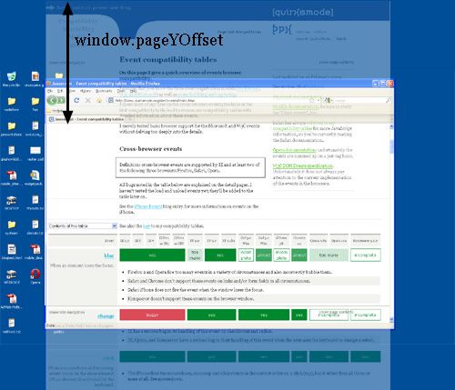
Scrolling offset
window.pageX/YOffset
MeaningScrolling offset of the page.Measured inCSS pixelsBrowser errorsNonewindow.pageXOffset and window.pageYOffset, contain the horizontal and vertical scrolling offsets of the document. Thus you can find out how much the user has scrolled.
These properties are measured in CSS pixels, too. You want to know how much of the document has already been scrolled up, whatever zoom state it’s in.
In theory, if the user scrolls up and then zooms in, window.pageX/YOffset will change. However, the browsers try to keep web pages consistent by keeping the same element at the top of the visible page when the user zooms. That doesn’t always work perfectly, but it means that in practice window.pageX/YOffsetdoesn’t really change: the number of CSS pixels that have been scrolled out of the window remains (roughly) the same.

Concept: the viewport
Before we continue with more JavaScript properties we have to introduce another concept: the viewport.
The function of the viewport is to constrain the <html> element, which is the uppermost containing block of your site.
That may sound a bit vague, so here’s a practical example. Suppose you have a liquid layout and one of your sidebars has width: 10%. Now the sidebar neatly grows and shrinks as you resize the browser window. But exactly how does that work?
Technically, what happens is that the sidebar gets 10% of the width of its parent. Let’s say that’s the <body> (and that you haven’t given it a width). So the question becomes which width the <body> has.
Normally, all block-level elements take 100% of the width of their parent (there are exceptions, but let’s ignore them for now). So the <body> is as wide as its parent, the <html> element.
And how wide is the <html> element? Why, it’s as wide as the browser window. That’s why your sidebar with width: 10% will span 10% of the entire browser window. All web developers intuitively know and use this fact.
What you may not know is how this works in theory. In theory, the width of the<html> element is restricted by the width of the viewport. The <html> element takes 100% of the width of that viewport.
The viewport, in turn, is exactly equal to the browser window: it’s been defined as such. The viewport is not an HTML construct, so you cannot influence it by CSS. It just has the width and height of the browser window — on desktop. On mobile it’s quite a bit more complicated.
Consequences
This state of affairs has some curious consequences. You can see one of them right here on this site. Scroll all the way up to the top, and zoom in two or three steps so that the content of this site spills out of the browser window.
Now scroll to the right, and you’ll see that the blue bar at the top of the site doesn’t line up properly any more.

This behaviour is a consequence of how the viewport is defined. I gave the blue bar at the top a width: 100%. 100% of what? Of the <html> element, which is as wide as the viewport, which is as wide as the browser window.
Point is: while this works fine at 100% zoom, now that we’ve zoomed in the viewport has become smaller than the total width of my site. In itself that doesn’t matter, the content now spills out of the <html> element, but that element hasoverflow: visible, which means that the spilled-out content will be shown in any case.
But the blue bar doesn’t spill out. I gave it a width: 100%, after all, and the browsers obey by giving it the width of the viewport. They don’t care that that width is now too narrow.

document width?
What I really need to know is how wide the total content of the page is, including the bits that “stick out.” As far as I know it’s not possible to find that value (well, unless you calculate the individual widths and margins of all elements on the page, but that’s error-prone, to put it mildly).
I am starting to believe that we need a JavaScript property pair that gives what I’ll call the “document width” (in CSS pixels, obviously).

And if we’re really feeling funky, why not also expose this value to CSS? I’d love to be able to make the width: 100% of my blue bar dependent on the document width, and not the <html> element’s width. (This is bound to be tricky, though, and I wouldn’t be surprised if it’s impossible to implement.)
Browser vendors, what do you think?
Measuring the viewport
document. documentElement. clientWidth/Height
MeaningViewport dimensionsMeasured inCSS pixelsBrowser errorsNoneYou might want to know the dimensions of the viewport. They can be found indocument.documentElement.clientWidth and -Height.

If you know your DOM, you know that document.documentElement is in fact the<html> element: the root element of any HTML document. However, the viewport is one level higher, so to speak; it’s the element that contains the<html> element. That might matter if you give the <html> element a width. (I don’t recommend that, by the way, but it’s possible.)
In that situation document.documentElement.clientWidth and -Height still gives the dimensions of the viewport, and not of the <html> element. (This is a special rule that goes only for this element only for this property pair. In all other cases the actual width of the element is used.)

So document.documentElement.clientWidth and -Height always gives the viewport dimensions, regardless of the dimensions of the <html> element.
Two property pairs
But aren’t the dimensions of the viewport width also given bywindow.innerWidth/Height? Well, yes and no.
There’s a formal difference between the two property pairs:document.documentElement.clientWidth and -Height doesn’t include the scrollbar, while window.innerWidth/Height does. That’s mostly a nitpick, though.
The fact that we have two property pairs is a holdover from the Browser Wars. Back then Netscape only supported window.innerWidth/Height and IE onlydocument.documentElement.clientWidth and -Height. Since then all other browsers started to support clientWidth/Height, but IE didn’t pick upwindow.innerWidth/Height.
Having two property pairs available is a minor nuisance on desktop — but it turns out to be a blessing on mobile, as we’ll see.
Measuring the <html> element
document. documentElement. offsetWidth/Height
MeaningDimensions of the <html>element (and thus of the page).Measured inCSS pixelsBrowser errorsIE measures the viewport, and not the <html> element.So clientWidth/Height gives the viewport dimensions in all cases. But where can we find the dimensions of the <html> element itself? They’re stored indocument.documentElement.offsetWidth and -Height.

These properties truly give you access to the <html> element as a block-level element; if you set a width, offsetWidth will reflect it.

Event coordinates
pageX/Y, clientX/Y, screenX/Y
Meaningsee main textMeasured insee main textBrowser errorsIE doesn’t support pageX/Y.IE and Opera calculate screenX/Y in CSS pixels.Then there are the event coordinates. When a mouse event occurs, no less than five property pairs are exposed to give you information about the exact place of the event. For our discussion three of them are important:
- pageX/Y gives the coordinates relative to the <html> element in CSS pixels.
- clientX/Y gives the coordinates relative to the viewport in CSS pixels.
- screenX/Y gives the coordinates relative to the screen in device pixels.
pageX/Y clientX/Y screenX/Y

You’ll use pageX/Y 90% of the time; usually you want to know the event position relative to the document. The other 10% of the time you’ll use clientX/Y. You never ever need to know the event coordinates relative to the screen.
Media queries
Media queries
Meaningsee main textMeasured insee main textBrowser errorsIE doesn’t support them.For device-width/height Firefox uses the values screen.width/height would have if they are measured in CSS pixels.For width/height Safari and Chrome use the values documentElement .clientWidth/Height would have if they are measured in device pixels.Finally, some words about media queries. The idea is very simple: you can define special CSS rules that are executed only if the width of the page is larger than, equal to, or smaller than a certain size. For instance:
div.sidebar {
	width: 300px;
}

@media all and (max-width: 400px) {
	// styles assigned when width is smaller than 400px;
	div.sidebar {
		width: 100px;
	}

}
Now the sidebar is 300px wide, except when the width is smaller than 400px, in which case the sidebar becomes 100px wide.
The question is of course: which width are we measuring here?
There are two relevant media queries: width/height and device-width/device-height.
- width/height uses the same values as documentElement .clientWidth/Height (the viewport, in other words). It works with CSS pixels.
- device-width/device-height uses the same values as screen.width/height(the screen, in other words). It works with device pixels.

Which should you use? That’s a no-brainer: width, of course. Web developers are not interested in the device width; it’s the width of the browser window that counts.
So use width and forget device-width — on desktop. As we’ll see, the situation is much more messy on mobile.
Conclusion
That concludes our foray into the desktop browsers’ behaviour. The second part of this series ports these concepts to mobile and highlights some important differences with the desktop.
Meta viewport
Back to the index.
Last major update on 13 April 2014.
The meta viewport was originally invented byApple for the iPhone. Since web developers started to use it a lot, other mobile browsers also implemented it, including the parts that don’t make sense.
Meanwhile W3C has reverse-engineered a specification. Although I’d love to study it more and compare it to my findings, I’m afraid it’s so densely written that I do not understand it — even now that I understand the meta viewport itself. For instance, I thinkthat W3C’s extend-to-zoom concept is the same as my ideal viewport, but I’m not totally sure. So I hope that this page will serve as an English translation of the specification, but I’m not sure it is.
My notes for this research. Not necessarily comprehensible to anyone else.
This page contains my tests for the various directives in the meta viewport tag.
The @viewport construct is not part of this research. I’ll phase it in later when I know how it should behave.
The meta viewport tag
The meta viewport tag contains instructions to the browser in the matter of viewports and zooming. In particular, it allows web developers to set the width of the layout viewport relative to which CSS declarations such as width: 20%are calculated.
The meta viewport has the following syntax:
<meta name="viewport" content="name=value,name=value">
Directives
Every name/value pair is a directive. (The word is my own invention.) There are six of them in total:
- width. Sets the width of the layout viewport.
- initial-scale. Sets the initial zoom of the page AND the width of the layout viewport.
- minimum-scale. Sets the minimum zoom level (i.e. how much the user can zoom out).
- maximum-scale. Sets the maximum zoom level (i.e. how much the user can zoom in).
- height. Is supposed to set the height of the layout viewport. It is not supported anywhere.
- user-scalable. When set to no prevents the user from zooming. This is an abomination that MUST NOT be used.
device-width value
There is one special value: device-width for the width directive. It sets the layout viewport width to the ideal viewport width.
In theory there’s a similar device-height value, but it doesn’t seem to work EXCEPT.
The three viewports
Ages ago I reported that mobile browsers have two viewports: the visual one and the layout one. Re-read this article if necessary; I assume knowledge of these two viewports in what is to follow.
The ideal viewport
See the devices page for some ideal viewport examples of the browsers on my devices.
It turns out that there’s a third viewport, which I decided to call the ideal viewport. It gives the ideal size of a web page on the device. Thus, the dimensions of the ideal viewport differ per device.
On old or cheap devices with non-retina screens the ideal viewport is equal to the physical number of pixels, but that’s not a requirement. Newer devices with higher physical pixel densities may well retain the old ideal viewport, because it’s ideally suited to the device.
Up to and including the 4S, the iPhone ideal viewport is 320x480, regardless of whether it has a retine screen or not. That’s because 320x480 is the ideal size for web pages on these iPhones.
There are two important things about the ideal viewport:
- The layout viewport can be set to ideal viewport values. The width=device-width and initial-scale=1 directives do so.
- All scale directives are relative to the ideal viewport, and not to whatever width the layout viewport has. So maximum-scale=3 means the maximum zoom is 300% of the ideal viewport.
Finding the ideal viewport dimensions
It might occasionally be useful to be able to read out the ideal viewport dimensions. Tough luck.
Well, you can do it. Give a page the following meta tag and read out document.documentElement.clientWidth/Height:
<meta name="viewport" content="width=device-width,initial-scale=1">
If that’s not an option you have no way of reading out the ideal viewport dimensions. I hoped screen.width/height might be helpful here, but only BlackBerry gives the correct information. The other browsers resort to various shades of unhelpfulness.
Open question: should screen.width/height give the ideal viewport dimensions?
Pro: the properties would at last contain useful information.
Con: ideal viewport size does not necessarily equate physical pixels on the device.
Compatibility - ideal viewport
Here is all of the above in easy table format.
Contents of this tableideal viewport sizewidth=device-widthinitial-scale=1screen.width/heightSee also the key to my compatibility tables.| Test | iPhone | iPad | Android Samsung | Android HTC | Chrome | Opera Presto | BlackBerry | IE |
|---|---|---|---|---|---|---|---|---|
|
ideal viewport size
|
320 x 480 | 768 x 1024 | 400 x 640 | 360 x 640 | 601 x 962 | 240 x 320 | 342 x 570 | 320 x 480 |
| There is no right or wrong here. The values depend on the device, and all values are reasonable. |
||||||||
|
width=device-width
Does width=device-width give the layout viewport the width of the ideal viewport? |
portrait | portrait | yes | yes | yes | yes | yes | yes |
|
||||||||
|
initial-scale=1
Does initial-scale=1 give the layout viewport the width of the ideal viewport? |
yes | yes | yes | yes | yes | yes | yes | portrait |
|
||||||||
|
screen.width/height
Do screen.width/height give the dimensions of the ideal viewport? |
portrait | portrait | no | no | width | width | yes | no |
|
Layout viewport width
Before rendering the page, the browser needs to know how wide the layout viewport is. This is the viewport relative to which CSS declarations such aswidth: 20% are calculated.
Without any further instructions the browsers pick a width themselves. In six of the eight tested browsers this is 980px, in BlackBerry and IE10 it’s 1024px. There’s no right or wrong here; this is just the browser vendors making a choice.
When you use width=400 or another numerical value in the meta viewport tag, the layout viewport’s width is set to that value. We already knew that.
However, Android WebKit’s and IE’s minimal viewport is 320px. When you go below 320px they revert to the ideal viewport width.
Then there’s the case when the layout viewport becomes equal to the ideal viewport. This happens when you do width=device-width or initial-scale=1. It’s complicated, since there are bugs in Safari and IE10 and there’s a catch to usinginitial-scale, but this is the general rule.
Minimum and maximum dimensions
The maximum width of the layout viewport is 10,000 pixels. I don’t entirely trust that number, since the browsers do not allow you to zoom out to this amount. Still, for now I accept this official value.
The minimum width of the layout viewport is about 1/10th of the ideal viewport, which is also the maximum zoom level. (I.e. the layout viewport never becomes smaller than the smallest possible visual viewport.) Exceptions: Android WebKit and IE, which never go below 320px.
Compatibility - layout viewport
Here is all of the above in easy table format.
Contents of this tableDefault layout viewportwidth=10000,minimum-scale=0.01width=5width=xSee also the key to my compatibility tables.| Test | iPhone | iPad | Android Samsung | Android HTC | Chrome | Opera Presto | BlackBerry | IE |
|---|---|---|---|---|---|---|---|---|
|
Default layout viewport
The default dimensions of the layout viewport without any meta viewport |
980 | 980 | 980 | 980 | 980 | 980 | 1024 | 1024 |
| There is no right or wrong here; any value will do. |
||||||||
|
width=10000,minimum-scale=0.01
In order to find the maximum layout viewport width |
10,000 | 10,000 | 10,000 | 10,000 | 10,000 | 10,000 | 10,000 | 1,024 |
| When a value above 10,000 is applied, all browsers stay at 10,000, except for Android WebKit, which reverts back to the 980px default. |
||||||||
|
width=5
In order to find the minimum layout viewport width |
64/96 | 154/205 | incorrect | incorrect | 120/192 | 48/64 | 68/114 | incorrect |
|
||||||||
|
width=x
Some normal width values:width=200 width=300 width=400 width=1200 |
yes | yes | incorrect below 320 | incorrect below 320 | yes | yes | yes | incorrect below 320 |
| The browser should make the layout viewport as wide as the width directive prescribes.
|
Zoom
Zoom is tricky. In theory it sounds simple: determine the zoom factors that the user can zoom in or out to. The problem is two-fold:
- We cannot directly read out the zoom factor. Instead, we have to read out the width of the visual viewport, which has an inverse relation to the zoom factor. The larger the zoom factor, the smaller the visual viewport width.
So the minimum zoom factor determines the maximum visual viewport width, and vice versa. - It turns out that all zoom factors are relative to the ideal viewport, no matter what the current size of the layout viewport is.
Then there is the matter of the name. In Apple-speak, zoom is scale, and the meta viewport directives are thus called initial-scale, minimum-scale, andmaximum-scale. The other browsers were forced to comply in order to retain compatibility with iPhone-specific websites.
The three directives expect a zoom factor, where for instance 2 means “zoom to 200% of the ideal viewport width.”
Formulas
Let’s define the formulas first:
visual viewport width = ideal viewport width / zoom factor
zoom factor = ideal viewport width / visual viewport width
Thus, with a ideal viewport width of 320px and a zoom factor of 2 we get a visual viewport width of 160px. The width of the layout viewport plays no part in this calculation.
Minimum and maximum zoom factors
I did some extra tests on the Huawei C8813, Android 4.1.1, because it has a landscape ideal viewport width of 569.
Here, too, the minimum and maximum zoom factors were 0.25 and 4. So these powers of 4 are actually a general Android WebKit rule, and not just an artifact of the specific 640px width of the Samsung and HTC test phones.
The maximum visual viewport width here is 2277px, which is about 4 x 569.
What are the minimum and maximum zoom factors the browsers support?
First, a restriction. The visual viewport can never become wider than the layout viewport, so in most practical cases the minimum zoom factor is ideal viewport width / layout viewport width.
Still, in these tests I can use absurd layout viewport widths such as 5,000. I did so, and the results are:
- Android WebKit’s minimum zoom factor is 0.25 and its maximum 4. This cannot be changed. HOWEVER, it uses 640 / 0.25 = 2,560px, which is correct for landscape, even in portrait mode.
- IE’s maximum visual viewport width is 1024px. Its maximum zoom factor is 6 in portrait and 6 and 2/3 in landscape. This cannot be changed.
- In the other browsers, without any zoom directives, the minimum zoom factor is about 0.25 and the maximum about 5.
- Adding directives such as a huge layout viewport width or a huge maximum-scale causes the minimum factor to go to about 0.1 and the maximum to about 10.
There are slight differences in these factors; see the table below.
So in theory the iPhone’s visual viewport width can be anything between 32px (zoom factor 10) and 3200px (zoom factor 0.1).
Compatibility - zoom
Here is all of the above in easy table format.
Contents of this tableMaximum zoomMaximum zoom factor without directivesMinimum zoom factor without directivesMaximum zoom factor with directivesMinimum zoom factor with directivesSee also the key to my compatibility tables.| Test | iPhone | iPad | Android Samsung | Android HTC | Chrome | Opera Presto | BlackBerry | IE |
|---|---|---|---|---|---|---|---|---|
|
Maximum zoom
The width of the visual viewport at maximum zoom (zoomed in), without any scale directives.Try also width=device-width |
p: 65 l: 97 |
p: 154 l: 206 |
p: 100 l: 160 |
p: 90 l: 160 |
p: 121 l: 193 |
p: 48 l: 64 |
p: 70 l: 116 |
p: 48 l: 80 |
|
||||||||
|
Maximum zoom factor without directives
ideal viewport size / mimimum visual viewport size |
5 | 5 | 4 | 4 | about 5 | 5 | about 5 | about 6 |
| Opera and BlackBerry have two factors: one with and one without width=device-width.
|
||||||||
|
Minimum zoom factor without directives
width=5000 without any other instructions. Thus we can zoom out until we’ve reached the minimum factor. |
0.25 | 0.25 | 0.25 of landscape | 0.25 of landscape | 0.25 | 0.2 | about 0.25 | untestable |
|
||||||||
|
Maximum zoom factor with directives
maximum-scale=20 without any other instructions. Browsers stay well below the 20. |
10 | 10 | 4 | 4 | 10 | 10 | 10 | about 6 |
|
||||||||
|
Minimum zoom factor with directives
width=10000,minimum-scale=0.01In order to find the absolute minimum zoom factor the browser supports. Browsers stay well above the 0.01. |
0.1 | 0.14 | 0.25 of landscape | 0.25 of landscape | 0.1 | 0.1 | 0.111 | untestable |
|
initial-scale
Setting he initial-scale directive actually does two things:
- It sets the initial zoom factor of the page to the defined value, calculated relative to the ideal viewport. Thus it generates a visual viewport width.
- It sets the layout viewport width to the visual viewport width it just calculated.
So let’s say we have an iPhone in portrait mode and give it an initial-scale=2without any further instructions. By now, it shouldn’t surprise you that this sets the visual viewport width to 160px (= 320 / 2). That’s how the scaling directives work.
However, it also sets the width of the layout viewport to 160px. So we now have an 160px wide page in minimum zoom. (The visual viewport cannot become larger than the layout viewport, so zooming out is not possible.)
And no, this doesn’t make the slightest bit of sense. If asked for my candid opinion I’d probably mumble something like “completely fucking batshit insane.” Still, there’s no doubt that browsers behave like this.
Browser bugs
Except for Android WebKit. Obviously. Android WebKit allows initial-scale to set the layout viewport width only if the value is 1 AND there is no widthdirective. So only initial-scale=1 without any other directives works.
As to IE, it applies the wrong ideal viewport (320x320 instead of 320x480), and also pretends any value is 1. So the value you give to the initial-scale doesn’t matter in IE.
Conflicting width directives
Since initial-scale sets the layout viewport width, you can now create conflicting directives:
<meta name="viewport" content="initial-scale=1,width=400">
What happens now? The browser gets conflicting orders. Let’s return to the iPhone 4S once more:
- initial-scale=1 tells it to set the layout viewport width to 320px portrait and 480px landscape.
- width=400 tells it to set the layout viewport width to 400px in both portrait and landscape.
The browser solves the problem by obeying the largest width in portrait or landscape. In our example the portrait layout viewport width becomes 400px (the larger of 320 and 400), and the landscape layout viewport width 480px (the larger of 480 and 400).
Makes sense? Actually it doesn’t, but browsers do it anyway.
In any case, what we have here is a min-width for the layout viewport. The meta tag above sets the min-width to 400px, but allows the browser to grow the layout viewport beyond that if device size and orientation require it.
I’m not sure if there’s any practical use for a min-width for the layout viewport, but if you need one, hey, it’s there!
Browser bugs
Android WebKit does not follow these rules. If the width equals device-width or is smaller than 320, Android WebKit always applies the ideal viewport width to the layout viewport. Above 320 it always obeys the width directive.
IE does not follow these rules above width=480, when it sets the layout viewport width to 1024px.
Compatibility - initial scale and width
Here is all of the above in easy table format.
Contents of this tableinitial-scaleinitial-scaleinitial-scaleinitial-scaleSee also the key to my compatibility tables.| Test | iPhone | iPad | Android Samsung | Android HTC | Chrome | Opera Presto | BlackBerry | IE |
|---|---|---|---|---|---|---|---|---|
|
initial-scale
Without any other instructionsinitial-scale=1 initial-scale=0.5 initial-scale=2 |
yes | yes | incomplete | incomplete | yes | yes | yes | buggy |
| When you set initial-scale to any value, the browser scales the ideal viewport to that value, and then resizes the layout viewport to those values. So initial-scale=2 on an iPhone gives a landscape width of 240 (480/2), which becomes the width of the layout viewport.
|
||||||||
|
initial-scale
With width=device-width or a width of 320 or smallerwidth=device-width initial-scale=1 initial-scale=0.5 initial-scale=2 width=300 initial-scale=1 initial-scale=0.5 initial-scale=2 |
yes | yes | dips | dips | yes | yes | yes | no scale |
| Rule: the browser compares the width directive and the outcome of the initial-scale directive, and applies the highest resulting width to the layout viewport. This is done independently for portrait and landscape.
|
||||||||
|
initial-scale
With a width between 321 and 480width=400 initial-scale=1 initial-scale=0.5 initial-scale=2 |
yes | yes | width | width | yes | yes | yes | no scale |
| Rule: the browser compares the width directive and the outcome of the initial-scale directive, and applies the highest resulting width to the layout viewport. This is done independently for portrait and landscape.
|
||||||||
|
initial-scale
With a width of 481 or higherwidth=750 initial-scale=1 initial-scale=0.5 initial-scale=2 width=1200 initial-scale=1 initial-scale=0.5 initial-scale=2 |
yes | yes | width | width | yes | yes | yes | no scale; 1024 |
| Rule: the browser compares the width directive and the outcome of the initial-scale directive, and applies the highest resulting width to the layout viewport. This is done independently for portrait and landscape.
|
Minor iPhone bug
I found a minor bug in the iPhone, but not the iPad:
- If a combination of width and initial-scale causes the browser to automatically zoom in in landscape mode (i.e. visual viewport is smaller than layout viewport)
- AND the user zooms out in landscape mode and then switches to portrait mode
- the minimum-scale for portrait equals the minimum-scale for landscape (i.e. the viewport width) times the portrait/landscape ratio. (So a landscape viewport width of 400 causes a portrait minimum-scale of 268.)
- Solution: zoom in as much as possible in portrait. The bug disappears.
Try it here. Hold your iPhone in landscape, go to the page, and follow the instructions above.
minimum- and maximum-scale
I did only one small series of tests for minimum-scale and maximum-scale. They generally seem to work quite well, except on Android WebKit, which doesn’t support minimum-scale, and IE, which makes a horrific mess of things — so badly, in fact, that I’ve given up trying to understand what’s going on.
What’s supposed to happen in the tests below is that the layout viewport width is calculated as described above, and after that zooming is restricted to between 50% and 200%, i.e. the visual viewport can become from twice as large to twice as small as the ideal viewport.
One exception: the visual viewport can never become smaller than the layout viewport.
Contents of this tableminimum-scale=0.5,maximum-scale=2See also the key to my compatibility tables.| Test | iPhone | iPad | Android Samsung | Android HTC | Chrome | Opera Presto | BlackBerry | IE |
|---|---|---|---|---|---|---|---|---|
|
minimum-scale=0.5,maximum-scale=2
no other instructionswidth=device-width width=400 width=750 width=400,initial-scale=1 width=400,initial-scale=2 minimum-scale=1,maximum-scale=2 no other instructions width=750 |
yes | yes | only max | only max | almost | yes | yes | no! buggy! terrible! |
| Expected result: the layout viewport width is calculated as above, and zooming is restricted to between 50% and 200% of the ideal viewport width. Exception: zooming out is only possible until the width of the layout viewport.
|
Browsers
[an error occurred while processing this directive]
A tale of two viewports — part two
Related files:
- Part one of this article, about desktop browsers.
- Compatibility tables. The full list of browsers can also be found here.
- Test page.
Many thanks to Grace Kloba (Google), David Storey and Anne van Kesteren (Opera), Mike O'Malley (Microsoft), Kartikaya Gupta and George Staikos (RIM), and Mark Finkle (Mozilla) for reviewing earlier versions of this piece and providing me with valuable feedback.
This article has been translated into Russian,Chinese, and Korean.
In this mini-series I will explain how viewports and the widths of various important elements work, such as the <html> element, as well as the window and the screen.
On this page we’re going to talk about the mobile browsers. If you’re totally new to mobile I advise you to read part one about the desktop browsers first, in order to set the stage in a familiar environment.
The problem of mobile browsers
When we compare the mobile browsers to the desktop ones, the most obvious difference is screen size. Mobile browsers display significantly less of a desktop-optimised website than desktop browsers; either by zooming out until the text is unreadably small, or by showing only the small part of the site that fits in the screen.
A mobile screen is far smaller than a desktop screen; think about 400px wide at maximum, and sometimes a lot less. (Some phones report larger widths, but they’re lying — or at the very least giving us useless information.)
An intermediate layer of tablet devices such as the iPad or the rumoured HP webOS-based one will bridge the gap between desktop and mobile, but that doesn’t change the fundamental problem. Sites must work on mobile devices, too, so we have to get them to display well on a small screen.
The most important problems center on CSS, especially the dimensions of the viewport. If we’d copy the desktop model one-to-one, our CSS would start to misfire horrendously.
Let’s go back to our sidebar with width: 10%. If mobile browsers would do exactly the same as desktop browsers, they’d make the element about 40px wide at most, and that’s far too narrow. Your liquid layout would look horribly squashed.
One way of solving the problem is building a special website for mobile browsers. Even apart from the fundamental question of whether you should do that at all, the practical problem is that only very few site owners are sufficiently clued-in to cater specifically to mobile devices.
Mobile browser vendors want to offer their clients the best possible experience, which right now means “as much like desktop as possible.” Hence some sleight of hand was necessary.
The two viewports
So the viewport is too narrow to serve as a basis for your CSS layout. The obvious solution is to make the viewport wider. That, however, requires it to be split into two: the visual viewport and the layout viewport.
George Cummins explains the basic concept best here at Stack Overflow:
Imagine the layout viewport as being a large image which does not change size or shape. Now image you have a smaller frame through which you look at the large image. The small frame is surrounded by opaque material which obscures your view of all but a portion of the large image. The portion of the large image that you can see through the frame is the visual viewport. You can back away from the large image while holding your frame (zoom out) to see the entire image at once, or you can move closer (zoom in) to see only a portion. You can also change the orientation of the frame, but the size and shape of the large image (layout viewport) never changes.
See also this explanation by Chris.
The visual viewport is the part of the page that’s currently shown on-screen. The user may scroll to change the part of the page he sees, or zoom to change the size of the visual viewport.

However, the CSS layout, especially percentual widths, are calculated relative to the layout viewport, which is considerably wider than the visual viewport.
Thus the <html> element takes the width of the layout viewport initially, and your CSS is interpreted as if the screen were significantly wider than the phone screen. This makes sure that your site’s layout behaves as it does on a desktop browser.
How wide is the layout viewport? That differs per browser. Safari iPhone uses 980px, Opera 850px, Android WebKit 800px, and IE 974px.
Some browsers have special behaviour:
- Symbian WebKit tries to keep the layout viewport equal to the visual viewport, and yes, that means that elements with a percentual width may behave oddly. However, if the page doesn’t fit into the visual viewport due to absolute widths the browser stretches up the layout viewport to a maximum of 850px.
- Samsung WebKit (on bada) makes the layout viewport as wide as the widest element.
- On BlackBerry the layout viewport equals the visual viewport at 100% zoom. This does not change.
Zooming
Both viewports are measured in CSS pixels, obviously. But while the visual viewport dimensions change with zooming (if you zoom in, less CSS pixels fit on the screen), the layout viewport dimensions remain the same. (If they didn’t your page would constantly reflow as percentual widths are recalculated.)
Understanding the layout viewport
In order to understand the size of the layout viewport we have to take a look at what happens when the page is fully zoomed out. Many mobile browsers initially show any page in fully zoomed-out mode.
The point is: browsers have chosen their dimensions of the layout viewport such that it completely covers the screen in fully zoomed-out mode (and is thus equal to the visual viewport).

Thus the width and the height of the layout viewport are equal to whatever can be shown on the screen in the maximally zoomed-out mode. When the user zooms in these dimensions stay the same.

The layout viewport width is always the same. If you rotate your phone, the visual viewport changes, but the browser adapts to this new orientation by zooming in slightly so that the layout viewport is again as wide as the visual viewport.

This has consequences for the layout viewport’s height, which is now substantially less than in portrait mode. But web developers don’t care about the height, only about the width.

Measuring the layout viewport
We now have two viewports that we want to measure. Therefore it’s very lucky that the Browser Wars gave us two property pairs.
document. documentElement. clientWidth/Height
MeaningLayout viewport dimensionsMeasured inCSS pixelsFull supportOpera, iPhone, Android, Symbian, Bolt, MicroB, Skyfire, ObigoProblemsVisual viewport dimensions in IrisSamsung WebKit reports the correct values when a <meta viewport> tag is applied to the page; the dimensions of the <html> element otherwise.Screen dimensions in device pixels in FirefoxIE returns 1024x768. However, it stores the information indocument. body.clientWidth/Height. This is consistent with IE6 desktop.NetFront’s values are only correct at 100% zoom.Symbian WebKit 1 (older S60v3 devices) does not support these properties.Not supportedBlackBerrydocument.documentElement.clientWidth and -Height contain the layout viewport’s dimensions.

The orientation matters for the height, but not for the width.

Measuring the visual viewport
window.innerWidth/Height
MeaningVisual viewport dimensionsMeasured inCSS pixelsFull supportiPhone, Symbian, BlackBerryProblemsOpera and Firefox return the screen width in device pixels.Android, Bolt, MicroB, and NetFront return the layout viewport dimensions in CSS pixels.Not supportedIE, but it gives the visual viewport dimension in document. documentElement. offsetWidth/Height.Samsung WebKit reports either the dimensions of the layout viewport or of the <html>, depending on whether a<meta viewport> tag has been applied to the page or not.GibberishIris, Skyfire, ObigoAs to the visual viewport, it is measured by window.innerWidth/Height. Obviously the measurements change when the user zooms out or in, since more or fewer CSS pixels fit into the screen.

Unfortunately this is an area of incompatibilities; many browsers still have to add support for the measurement of the visual viewport. Still, no browser stores this measurment in any other property pair, so I guesswindow.innerWidth/Height is a standard, albeit a badly supported one.
The screen
screen.width and screen.height
MeaningScreen sizeMeasured inDevice pixelsFull supportOpera Mini, Android, Symbian, Iris, Firefox, MicroB, IE, BlackBerryProblemsOpera Mobile on Windows Mobile only gives the landscape size. Opera Mobile on S60 gets it right.Samsung WebKit reports either the dimensions of the layout viewport or of the <html>, depending on whether a<meta viewport> tag has been applied to the page or not.iPhone and Obigo only give portrait sizes.NetFront only gives landscape sizes.GibberishBolt, SkyfireAs on desktop, screen.width/height give the screen size, in device pixels. As on the desktop, you never need this information as a web developer. You’re not interested in the physical size of the screen, but in how many CSS pixels currently fit on it.

The zoom level
Reading out the zoom level directly is not possible, but you can get it by dividingscreen.width by window.innerWidth. Of course that only works if both properties are perfectly supported.
Fortunately the zoom level is not important. What you need to know is how many CSS pixels currently fit on the screen. And you can get that information from window.innerWidth — if it’s supported correctly.Scrolling offset
window.pageX/YOffset
MeaningScrolling offset; which is the same as the visual viewport’s offset relative to the layout viewport.Measured inCSS pixelsFull supportiPhone, Android, Symbian, Iris, MicroB, Skyfire, Obigo.ProblemsOpera, Bolt, Firefox, and NetFront always return 0.Samsung WebKit reports correct values only if a <meta viewport> is applied to the page.Not supportedIE, BlackBerry. IE stores the values in document. documentElement. scrollLeft / TopWhat you also need to know is the current position of the visual viewport relative to the layout viewport. This is the scrolling offset, and, just as on desktop, it’s stored in window.pageX/YOffset.

<html> element
document. documentElement. offsetWidth / Height
MeaningTotal size of the <html> element.Measured inCSS pixelsFull supportOpera, iPhone, Android, Symbian, Samsung, Iris, Bolt, Firefox, MicroB, Skyfire, BlackBerry, Obigo.ProblemsNetFront’s values are only correct at 100% zoom.IE uses this propery pair to store the dimensions of the visual viewport. In IE, see document. body. clientWidth/Height for the correct values.Just as on desktop, document.documentElement.offsetWidth/Height gives the total size of the <html> element in CSS pixels.

Media queries
Media queries
MeaningMeasure <html> element width (CSS pixels) or device width (device pixels).Full supportOpera, iPhone, Android, Symbian, Samsung, Iris, Bolt, Firefox, MicroB.Not supportedSkyfire, IE, BlackBerry, NetFront, Obigo.NoteWhat I test here is whether the browsers take their data from the correct property pairs. Whether these property pairs give correct information is not part of this particular test.Media queries work the same as on desktop. width/height uses the layout viewport as its reference and is measured in CSS pixels, device-width/heightuses the device screen and is measured in device pixels.
In other words, width/height mirrors the values of document. documentElement. clientWidth/Height, while device-width/height mirrors the values ofscreen.width/height. (They actually do so in all browsers, even if the mirrored values are incorrect.)

Now which measurement is more useful to us web developers? Point is, I don’t know.
I started out thinking that the device-width was the most important one, since it gives us some information about the device that we might be able to use. For instance, you could vary the width of your layout to accomodate the width of the device. However, you could also do that by using a <meta viewport>; it’s not absolutely necessary to use the device-width media query.
So is width the more important media query after all? Maybe; it gives some clue as to what the browser vendor thinks is a good width for a website on this device. But that’s rather vague, and the width media query doesn’t really give any other information.
So I’m undecided. For the moment I think that media queries are important to figure out whether you’re on a desktop, a tablet, or a mobile device, but not so very useful for distinguishing between the various tablet or mobile devices.
Or something.
Event coordinates
Event coordinates
MeaningSee main text.Measured inSee main text.Full supportSymbian, IrisProblemsOpera Mobile gives pageX/Y in all three property pairs, but something goes wrong when you scroll a lot.On iPhone, Firefox, and BlackBerry clientX/Y is equal to pageX/YOn Android and MicroB screenX/Y is equal to clientX/Y (in CSS pixels, in other words)On Firefox screenX/Y is wrong.IE, BlackBerry, and Obigo don’t support pageX/Y.In NetFront all three are screenX/Y.In Obigo clientX/Y is screenX/Y.Samsung WebKit always reports pageX/Y.Not tested inOpera Mini, Bolt, SkyfireEvent coordinates work more or less as on desktop. Unfortunately, of the twelve tested browsers only two, Symbian WebKit and Iris, get all three exactly right. All other browsers have more or less serious problems.
pageX/Y is still relative to the page in CSS pixels, and this is by far the most useful of the three property pairs, just as it is on desktop.

clientX/Y is relative to the visual viewport in CSS pixels. This makes sense, although I’m not entirely certain what it’s good for.
screenX/Y is relative to the screen in device pixels. Of course, this is the same reference that clientX/Y uses, and device pixels are useless. So we do not need to worry about screenX/Y; it’s every bit as useless as on desktop.

Meta viewport
Meta viewport
MeaningSet the layout viewport’s width.Measured inCSS pixelsFull supportOpera Mobile, iPhone, Android, Iris, IE, BlackBerry, ObigoNot supportedOpera Mini, Symbian, Bolt, Firefox, MicroB, NetFrontProblemsSkyfire can’t handle my test page.If the <meta viewport> is applied to the page in Samsung WebKit, several other properties change meaning.Opera Mobile, iPhone, Samsung, and BlackBerry do not allow the user to zoom out.Finally, let’s discuss the <meta name="viewport" content="width=320">; originally an Apple extension but meanwhile copied by many more browsers. It is meant to resize the layout viewport. In order to understand why that’s necessary, let’s take one step back.
Suppose you build a simple page and give your elements no width. Now they stretch up to take 100% of the width of the layout viewport. Most browsers zoom out to show the entire layout viewport on the screen, giving an effect like this:

All users will immediately zoom in, which works, but most browsers keep the width of the elements intact, which makes the text hard to read.

(The significant exception here is Android WebKit, which actually reduces the size of text-containing elements so that they fit on the screen. This is absolutely brilliant, and I feel all other browsers should copy this behaviour. I will document it fully later.)
Now what you could try is setting html {width: 320px}. Now the <html> element shrinks, and with it all other elements, which now take 100% of 320px. This works when the user zooms in, but not initially, when the user is confronted with a zoomed-out page that mostly contains nothing.

It is in order to get around this problem that Apple invented the meta viewport tag. When you set <meta name="viewport" content="width=320"> you set the width of the layout viewport to 320px. Now the initial state of the page is also correct.

You can set the layout viewport’s width to any dimension you want, includingdevice-width. That last one takes screen.width (in device pixels) as its reference and resizes the layout viewport accordingly.
There’s a catch here, though. Sometimes the formal screen.width does not make much sense because the pixel count is just too high. For instance, the Nexus One has a formal width of 480px, but Google engineers have decided that giving the layout viewport a width of 480px when using device-width is just too much. They shrank it to 2/3rds, so that device-width gives you a width of 320px, just as on the iPhone.
If, as is rumoured, the new iPhone will sport a larger pixel count (which does not necessarily equal a larger screen!), I wouldn’t be surprised if Apple copies this behaviour. Maybe in the end device-width will just mean 320px.
Related research
Several related topics have to be researched further:
- position: fixed. A fixed element, as we know, is positioned relative to the viewport. But relative to which viewport?
I’ve done this research meanwhile. - Other media queries: dpi, orientation, aspect-ratio. dpi, especially, is a disaster area, not only because all browsers report 96dpi, which is usually false, but also because I’m not yet totally sure which value is most interesting for web developers.
- What happens when an element is wider than the layout viewport/HTML element? Say I insert an element with width: 1500px into one of my test pages? The element will stick out of the HTML element (overflow: visible), but that means that the actual viewport can become wider than the layout viewport. Besides, an old Android (Nexus One) enlarged the HTML element when this happens. Is that a good idea?
This site is sponsored by: