javascript控件开发之工具栏控件
在前几篇的基础上,本篇将开发工具栏控件,工具栏控件一般包括三部份,
1、toolBar控件,简单说就是工具栏容器,
2、toolButton控件,即工具栏上的按钮控件,该按钮控件包括图标和文字两部份,
3、则是分隔符控件,一般分隔符控件也是在toolButton控件基础上引申出来的,
为了简单易学,我们这里直接用上一篇的控件作为toolBar控件使用,也就是我们这次编写出来的toolButton控件直按放一Panel控件上,
首先在component\ui\文件夹下添加控件文件,com.ui.toolButton.js 如下,
定义com.ui.toolButton控件类,继承com.ui.panel控件。
渲染函数如下,把渲染方式默认为“alLeft”,添加一个type属性,用于区别split控件或button控件,分别进行渲染。
1. split控件,则直接创建一个div,设置样式,然后宽度设置为8px;
2. button控件 则创建一个table,分三层次, 第一层用于设置高度,第二层用于放图标,第三层次用于放文字,图标与文字都通过配置方式获得。
函数中用到几个画边框的样式,把他们都添加到com.comStyle.css文件中,如下:
下面继续添加按钮的相关鼠标事件、大小变化事件(doResize)和修改文字内容方法,
思路类似前前一篇的按钮控件,
到此,控件已编写完成,下面我们用它来编写例子,如test.html文件,
其中test.html文件目录下添加image文件夹,并把图标放在文件夹下面,
效果如上图,
可直接下载附件查看源码。
请关注下一篇, javascript控件开发之流动条控件
1、toolBar控件,简单说就是工具栏容器,
2、toolButton控件,即工具栏上的按钮控件,该按钮控件包括图标和文字两部份,
3、则是分隔符控件,一般分隔符控件也是在toolButton控件基础上引申出来的,
为了简单易学,我们这里直接用上一篇的控件作为toolBar控件使用,也就是我们这次编写出来的toolButton控件直按放一Panel控件上,
首先在component\ui\文件夹下添加控件文件,com.ui.toolButton.js 如下,
定义com.ui.toolButton控件类,继承com.ui.panel控件。
/**
 * 按钮控件类.
 * 创建: QZZ
 * 日期: 2014-04-06
 */
(function(undefined) {

	nameSpace("com.ui");

	com.ui.toolButton = Extend(com.ui.panel, {
	    /**
		 * 创建函数.
		 */
	    create:function(){
		    this.base();
			this.className = "com.ui.toolButton";
			this.logInfo("create");
	    },
		/**
		 * 渲染函数.
		 */
	    render:function() {

	    }
	});
})();
渲染函数如下,把渲染方式默认为“alLeft”,添加一个type属性,用于区别split控件或button控件,分别进行渲染。
1. split控件,则直接创建一个div,设置样式,然后宽度设置为8px;
2. button控件 则创建一个table,分三层次, 第一层用于设置高度,第二层用于放图标,第三层次用于放文字,图标与文字都通过配置方式获得。
		/**
		 * 渲染函数.
		 */
		render:function(){
		    this.base();
			this.setAlign("alLeft");
			if(this.option.type === "split") {
			    this.setWidth(8);
				this.setStyle(this.win, "toolButtonSplitStyle");
				var splitDiv = this.createElement("div");
				this.setStyle(splitDiv,"toolSplitStyle");
				this.win.appendChild(splitDiv);
			} else {
				//初始化caption
				this.caption = this.win.innerHTML;
				if(this.option.icon != null) {
				    this.tabIcon = this.createElement("table");
					this.setStyle(this.tabIcon, "toolIconTabStyle");
					this.topCol = this.tabIcon.insertRow(0).insertCell(0);
					this.topCol.style.height = "1px";
					var col = this.tabIcon.insertRow(1).insertCell(0)
				    col.innerHTML = '<img src="'+this.option.icon
				        +'" style="width: 18px; height: 18px;"></img>';
					this.setStyle(col, "toolIconTdStyle");
					col = this.tabIcon.insertRow(2).insertCell(0);
					col.innerHTML = this.caption;
					this.setStyle(col, "toolIconTdStyle");
					this.win.innerHTML = "";
					this.win.appendChild(this.tabIcon);
				}
				this.setStyle(this.win, "toolButtonCommonStyle");
			}
		},
函数中用到几个画边框的样式,把他们都添加到com.comStyle.css文件中,如下:
.toolButtonSplitStyle {
    border-top:0px solid #EEEEEE;
	border-left:0px solid #EEEEEE;
	border-right:0px solid #555555;
	border-bottom:0px solid #555555;
	padding-left:4px;
	position:relative;
}

.toolSplitStyle {
    border-top:0px solid #EEEEEE;
	border-left:0px solid #EEEEEE;
	border-right:1px solid #EEEEEE;
	border-bottom:0px solid #555555;
	height:40px;
	top:10px;
	width:1px;
	background-color:#555555;
	margin:auto;
	position:relative;
}

.toolIconTabStyle{
    margin:auto;
	top:10px;
}

.toolIconTdStyle {
    text-align:center;
	height:16px;
}

.toolButtonCommonStyle {
    border-top:0px solid #EEEEEE;
	border-left:0px solid #EEEEEE;
	border-right:0px solid #555555;
	border-bottom:0px solid #555555;
	position:relative;
	text-align:center;
	cursor:pointer;
}

.toolButtonOverStyle {
    border-top:1px solid #EEEEEE;
	border-left:1px solid #EEEEEE;
	border-right:1px solid #555555;
	border-bottom:1px solid #555555;
	position:relative;
	text-align:center;
	cursor:pointer;
}

.toolButtonDownStyle {
    border-top:1px solid #555555;
	border-left:1px solid #555555;
	border-right:1px solid #EEEEEE;
	border-bottom:1px solid #EEEEEE;
	position:relative;
	text-align:center;
	cursor:pointer;
}
下面继续添加按钮的相关鼠标事件、大小变化事件(doResize)和修改文字内容方法,
思路类似前前一篇的按钮控件,
		//设置显示属性
		setCaption:function(caption) {
		    this.caption = caption;
		    if(this.tabIcon != null) {
		        this.tabIcon.rows[1].cells[0].innerHTML = '<img src="'+this.option.icon+'" style="width: 18px; height: 18px;"></img>';
				this.tabIcon.rows[2].cells[0].innerHTML = this.caption;
		    } else {
		        this.win.innerHTML = this.imgStr + this.caption;
			}
		},
		/**
		 * 大小重置函数.
		 */
		_doResize:function(el) {
		    this.base(el);
			if(this.option.icon == null) {
			    this.win.style.lineHeight = this.option.height + "px";
			}
		},
		/**
		 * 鼠标划过事件.
		 * ev 事件对象
		 */
		doMouseOver:function(ev) {
			if(this.option.type === "split") {
			    return;
			}
		    this.setStyle(this.win, "toolButtonOverStyle");
			this.hasSelect = true;
			this.focus = true;
			this.mouseOver = true;
		},
		/**
		 * 鼠标划出事件.
		 * ev 事件对象
		 */
		doMouseOut:function(ev) {
		    if(this.option.type === "split") {
			    return;
			}
		    this.setStyle(this.win, "toolButtonCommonStyle");
			this.hasSelect = false;
			this.focus = false;
			this.mouseOver = false;
		},
		/**
		 * 鼠标按下事件.
		 * ev 事件对象
		 */
		doMouseDown:function(ev) {
		    if(this.option.type === "split") {
			    return;
			}
		    this.setStyle(this.win, "toolButtonDownStyle");
			this.topCol.style.height = "2px";
		},
		/**
		 * 鼠标弹起事件.
		 * ev 事件对象
		 */
		doMouseUp:function(ev) {
		    if(this.option.type === "split") {
			    return;
			}
		    if(this.mouseOver) {
				this.setStyle(this.win, "toolButtonOverStyle");
				this.topCol.style.height = "1px";
				if(typeof this.onClick == "function") {
					//执行onclick事件
					this.onClick(ev);
				}
			}
		}
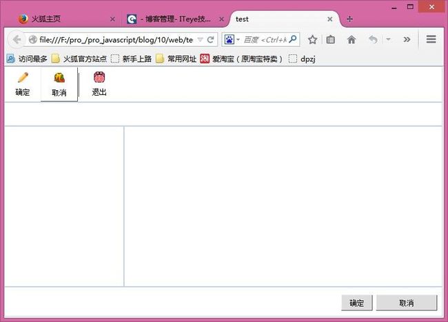
到此,控件已编写完成,下面我们用它来编写例子,如test.html文件,
<!DOCTYPE html>
  <head><title>test</title>
    <script src="../script/common/init.js" type="text/javascript"></script>
  </head>
  <body code="controllor/test.js" scroll="no" style="overflow:hidden">
    <div id='test6' code='com.ui.panel' option='{"align":"alTop","height":"60","width":"200","borderWidth":1,"padding":1}'>
	    <div id='test8' code='com.ui.toolButton' option='{"height":"60","width":"60","icon":"image/test3.ico"}'>确定</div>
		<div id='test9' code='com.ui.toolButton' option='{"height":"60","width":"60","icon":"image/test2.ico"}'>取消</div>
		<div id='test10' code='com.ui.toolButton' option='{"height":"60","width":"60","type":"split"}'></div>
		<div id='test11' code='com.ui.toolButton' option='{"height":"60","width":"60","icon":"image/test1.ico"}'>退出</div>
	</div>
	<div id='test1' code='com.ui.panel' option='{"align":"alTop","height":"40","width":"200","borderWidth":1,"padding":1}'></div>
	<div id='test4' code='com.ui.panel' option='{"align":"alBottom","height":"50","width":"200","borderWidth":1,"padding":1}'>
		<div id='test2' code='com.ui.button' option='{"height":"25","width":"100","top":"12","right":"116"}'></div>
	    <div id='test3' code='com.ui.button' option='{"height":"25","width":"100","top":"12","right":"8"}'></div>
	</div>
	<div id='test7' code='com.ui.panel' option='{"align":"alLeft","height":"100","width":"200","borderWidth":1,"padding":1}'></div>
	<div id='test5' code='com.ui.panel' option='{"align":"alClient","height":"100","width":"200","borderWidth":1,"padding":1}'></div>

  </body>
</html>
其中test.html文件目录下添加image文件夹,并把图标放在文件夹下面,
效果如上图,
可直接下载附件查看源码。
请关注下一篇, javascript控件开发之流动条控件