- HTTP 请求已超过分配的超时。为此操作分配的时间可能是较长超时的一部分
SilverLight调用WEBSERVICE时对HTTP请求已超过分配的超时。为此操作分配的时间可能是较长超时的一部分。解决方案:在SilverLight的ServiceReferences.ClientConfig中对超时进行设置。openTimeout="00:10:00"receiveTimeout="00:10:00"sendTimeout="00:10:00"closeTimeout=
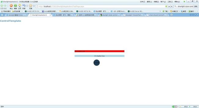
- WPF两种绑定方式的分析
zzyzxb
WPFwpf
一、两种绑定方式的分析你提供的代码展示了两种不同的属性绑定实现方式:传统的CLR属性配合INotifyPropertyChanged接口,以及WPF依赖属性(DependencyProperty)系统。相同点目的相同:两种方式都是为了实现属性值变化时通知UI更新数据绑定支持:都可以用于WPF/Silverlight/Xamarin等支持数据绑定的UI框架基本功能:都能实现单向绑定和双向绑定的基本功
- Silverlight中OneTime,OneWay,TwoWay及INotifyPropertyChanged 接口的理解
大然Ryan
.NET&C#silverlightbuttontextboxbindingobjectstring
今天有时间把Silverlight中OneTime,OneWay,TwoWay及INotifyPropertyChanged接口的理解等数据绑定方面的东西理解学习了下!下面是我的笔记。(一)前台代码:(二)后台代码publicpartialclassMainPage:UserControl{Bookbook=newBook();publicMainPage(){InitializeComponen
- WPF/Silverlight深度解决方案:(八)誓将内存释放到底
alamiye010
WPF/Silverlightsilverlight浏览器objectfunction网页游戏firefox
WPF/Silverlight应用程序长时间运行后会产生非常多的内存垃圾(内存泄露例外),特别是在经常需要进行Remove操作的粒子、动画、游戏等方面的应用,国外高手们提出的方案我归纳了一下主要有:1)UIElement控件实例=null2)定时调用GC.Collect()3)让控件继承Idisposable接口,并实现相应逻辑这三种方法都有一定的作用,但是实际使用中均往往难以达到预期效果。特别是
- Vue常见面试题(持续更新)
Hello-Mr.Wang
vue.js前端javascript
Vue面试题1.谈谈你对MVVM开发模式的理解MVVM(Model-View-ViewModel)是一种软件架构设计模式,特别适用于构建现代的用户界面应用程序,尤其是在前端开发领域中广为采用。它起源于微软WPF和Silverlight技术栈,后来在JavaScript世界中的框架如Vue.js、AngularJS/Angular以及React(通过Redux等状态管理库结合使用)得到了广泛应用。组
- Silverlight/Windows8/WPF/WP7/HTML5周学习导读(9月3日-9月9日)
weixin_33970449
c#c/c++数据库
Silverlight/Windows8/WPF/WP7/HTML5周学习导读(9月3日-9月9日)本周Silverlight学习资源更新Silverlight删除数据表格中的数据,表格头部定义全选按钮,批量删除飛雲若雪利用自定义属性定义枚举值的详细文本(兼容Silverlight)feiyangSliverlightDataGrid合并表头feiyangSilverlight如何获取控件的屏幕坐
- 分享Silverlight/WPF/Windows Phone一周学习导读(06月20日-06月26日)
weixin_33901843
操作系统前端javascriptViewUI
分享Silverlight/WPF/WindowsPhone一周学习导读本周Silverlight学习资源更新:SilverLight日历控件如何获得多语言的支持银光中国网Silverlight中LISTBOX嵌套布局问题银光中国网Silverlight4子窗口新增数据后,DataGrid中没有显示的问题银光中国网SilverlightTextBox控件的Watermark问题变通解决方法fan.
- c# List与ObservableCollection
lidandan2016
WPFc#
在WPF,silverlight,WP7中经常会用到List和ObservableCollection。这里简单讲一下他们之间的相互转换。1.List的简单介绍:List代表的是强类型的Ojbect集合,可以通过索引访问并且提供了查找、排序以及操作此集合的方法。List基本上和ArrayList相同,它用数组的方式实现了接口IList并且他的大小可以根据需要来自动增加。List的缺点在使用ASP.
- POI导入Excel附件上传
[email protected]
javaPOIExcel导入附件上传
-------------------------------------------前台页面---------------------------------------------------$(function(){varuploader=newplupload.Uploader({runtimes:'html5,flash,silverlight,html4',//触发文件选择对话框的按钮
- Silverlight发展历程(微软2021年已经停止支持Silverlight 5)
冰茶_
microsoftc#学习
MicrosoftSilverlight发展历程引言MicrosoftSilverlight是微软在Web多媒体和富互联网应用(RIA)领域的一次重要尝试,它从诞生到消亡的过程折射出了Web技术发展的变迁和行业格局的演变。本文将详细回顾Silverlight的完整发展历程,探讨其技术特点、应用场景、成功与失败的原因,以及它在互联网技术发展史上的地位和影响。起源与背景(2006-2007)互联网技术
- mysql wpf根据触发器刷新数据_wpf 给数据触发器绑定数据库
囡囡团团圆圆
mysqlwpf根据触发器刷新数据
关于开发WPF的一些感想开发的技术细节本文就不谈了,作者只想从感性上谈谈学习和实际开发WPF的感想。首先祝大家新年快乐,小生给大家拜个晚年!两年前暑假,从百度百科上第一次了解WPF,被它的强大特性所吸引,当然最让我着迷和期待的就是“绚丽”二字。两年来,放弃了曾经的Winform开发知识,全面...文章沙漠之鹰1232016-04-214757浏览量分享Silverlight/WPF/Windows
- MVVM(Model-View-ViewModel)详解
山水CAD筑梦人
WPF入门(C#)c#
MVVM(Model-View-ViewModel)是一种软件架构模式,常用于构建客户端应用程序,特别是在WPF(WindowsPresentationFoundation)和Silverlight应用中,它将应用程序分为三个主要部分:1.Model(模型):表示应用程序的数据和业务逻辑。它包含数据对象和处理这些数据的业务规则,与用户界面无关。2.View(视图):负责用户界面的呈现,如WPF中的
- [UWP]实用的Shape指南
weixin_34195364
c#ui
在UWPUI系统中,使用Shape是绘制2D图形最简单的方式,小到图标,大到图表都用到Shape的派生类,可以说有举足轻重的地位。幸运的是从Silverlight以来Shape基本没有什么大改动,简直是UWP中的一股清流。上图来自ProSilverlight5inC#,可见Silverlight中的Shape和UWP的Shape基本架构一致。Shape的API从WPF以来就几乎没变,对熟悉WPF/
- Silverlight for Windows Phone 7:Hello Windows P...
chengyixian7877
前言WindowsPhone7是一个崭新的移动电话操作系统,在应用程序的开发上跟先前也有些许的不同;首先在应用程序的开发上,不再支持使用Nativecode做为开发使用的语言,只支持managedcode的开发,而开发上的支持的framework为Silverlight以及XNA,两种framework主要的差异是XNA是Loop-based的应用程序,Silverlight是event-driv
- C#面:MVC同时适用于Windows应用和Web应用吗?
那个那个鱼
C#面试题c#c#mvc.net
相比Windows应用,MVC架构更适用于Web应用。对于Windows应⽤,MVP(ModelViewPresenter)架构更好⼀点。如果使用WPF和Silverlight,MVVM更适合。MVC(Model-View-Controller)模式可以同时适用于Windows应用和Web应用。MVC是一种软件设计模式,它将应用程序分为三个主要部分:模型(Model)、视图(View)和控制器(C
- 前端上传组件Plupload使用指南
梦想的征途
其他
Plupload有以下功能和特点:1、拥有多种上传方式:HTML5、flash、silverlight以及传统的。Plupload会自动侦测当前的环境,选择最合适的上传方式,并且会优先使用HTML5的方式。所以你完全不用去操心当前的浏览器支持哪些上传方式,Plupload会自动为你选择最合适的方式。2、支持以拖拽的方式来选取要上传的文件3、支持在前端压缩图片,即在图片文件还未上传之前就对它进行压缩
- 转载 #if DEBUG用法解析
Bug丶Maker
#ifDEBUGC#C++
转载自https://www.cnblogs.com/flyking/archive/2011/03/04/1971321.html#ifDEBUG,这个东东其实以前刚开始学习C#的时候就知道了,也知道怎么用,但就是没有使用过。随想,很多人估计也都没有用过吧(嘿,自我安慰下)。最近看MVVMLight的代码时看到#ifSILVERLIGHT的东东,于是想起来#ifdebug来了,于是在代码中疯狂的
- Word控件Spire.Doc 【超链接】教程(2):在 Silverlight 中插入 Word 超链接
慧都小妮子
Spire.Docfor.net教程(完)wordpythonc#pdfspire.doc
Spire.Docfor.NET是一款专门对Word文档进行操作的.NET类库。在于帮助开发人员无需安装MicrosoftWord情况下,轻松快捷高效地创建、编辑、转换和打印MicrosoftWord文档。拥有近10年专业开发经验Spire系列办公文档开发工具,专注于创建、编辑、转换和打印Word/PDF/Excel等格式文件处理,小巧便捷。Word超链接可以引导用户获取内容的其他相关信息。它可以
- Html5开发的在线画板涂鸦,使用html5 canvas制作涂鸦画板
人行有师
Html5开发的在线画板涂鸦
HTML5的canvas元素是HTML5新特性中最有用的元素之一。通过html5canvas,我们可以做图像处理、绘图、保存、恢复层和渲染图像等等操作,而不用依赖像AdobeFlashplayer和silverlight之类的外部插件。在这篇文章中,我们将编写一个Javascript插件来使大家可以在canvas上随意涂写和绘画,就像一块涂鸦画板一样。另外再添加一些额外的小功能,如选择线条的宽度和
- 【C#】MVVM架构
Z_W_H_
C#c#WPF
示例结果展示前提了解MVVM是Model-View-ViewModel的缩写形式,它通常被用于WPF或Silverlight开发。Model——可以理解为带有字段,属性的类。例如学校类,教师类,学生类等View——可以理解为我们所看到的UI。前端界面。ViewModel在View和Model之间,起到连接的作用,并且使得View和Model层分离。ViewModel不仅仅是Model的包装,它还包
- DYCom多平台聊天室Sample
内Cool超人
聊天平台silverlightmobilewindows2010
本示例演示了如何通过DYcom开发一个多平台的简单聊天室。本演示包括了一个silverlight客户端,一个Win客户端和一个windowMobile客户端。以下是应用截图:登陆后可从本文下载源代码。运行本示例前请先确定连接ip地址与你本机的地址一致。本示例两含两个项目。一个项目使用vs2010篇写,另一个windowsmobile项目使用的是vs2008篇写,请各位注意。谢谢。欢迎您参与更多关于
- 还有什么不能做?——细谈在C#中读写Excel系列文章之四
ddjq1044
作为这一系列文章的最后一篇,向大家介绍下如何在Silverlight中解压和创建ExcelOpenXmlZIP压缩包。由于Silverlight对本地客户端文件系统访问的安全级别要求比较高,不太容易像Windows应用程序那样可以随意地读写目录和文件,我们不得不考虑使用一些其它的办法。如使用Silverlight的OOB(OutofBrowser)模式,可以允许Silverlight程序读写本地的
- 如何写了一个silverlight显示在blog的公共栏上
shansheng
silverlightblogblendpathobject
Silverlight现在正流行,看了一些资料后,终于动手搞个简单的HelloWord似的程序。用Blend2创建一个Silverlight应用程序,在画布上添加了几个汉字,由于silverlight显示汉字有问题,所以把汉字转化为path即可。选中汉字点击object菜单里面有个path转化。ok。下面就是创建一个简单的动画了。添加一个timeline,生成几个关键帧后Bllend自动形成动画。
- .NET报表控件ActiveReports 教程:应用系统中如何完成各种报表系统的需求
不如温暖过生活
界面开发教程.NETActiveReports报表开发
在开始专题内容之前,我们还是了解一下ActiveReports是一款什么产品:ActiveReports是一款在全球范围内应用非常广泛的报表控件,以提供.NET报表所需的全部报表设计功能领先于同类报表控件,包括对交互式报表的强大支持、丰富的数据可视化形式、与VisualStudio的完美集成、以及对WPF/WinForm/ASP.NET/Silverlight和WindowsAzure的多平台支持
- 浅谈Windows 8, WinRT, XAML 和Silverlight
李明杨
Windows8C#SilverlightMetroWinRTXamlsilverlightwindowsjavascriptapi编程c#
相信大家都很关注即将出世的Windows8,2月29日(也就是明天)的全球移动通信大会(MWC)上,微软将带来Windows8消费者预览版(ConsumerPreview),让我们来先睹为快,了解下windows8给我们带来了哪些新特性。桌面与MetroWindows8有两种模式,分别是“桌面”和“Metro”。这些名字都是暂时的,很可能在系统发布前改变。Silverlight和WPF将继续运行在
- 昂捷-ERP GetSignList sql注入
Hxdih
安全web安全mysql
介绍:昂捷信息,以软件开发为核心,聚焦于零售行业数字化赋能,为超市、便利店、百货、购物中心、专营专卖等各零售业态提供全面的数字化解决方案和咨询服务,是业界领先的全链路数字化解决方案服务商,旗下的办公自动化管理信息系统存在SQL漏洞FOFAFOFA语句:body="CheckSilverlightInstalled"漏洞复现:接口:/EnjoyRMIS_WS/WS/OA/CWSOffice.asmx
- MVVM
泡杯感冒灵
摘自:https://www.cnblogs.com/iovec/p/7840228.htmlModel–View–ViewModel(MVVM)是一个软件架构设计模式,由微软WPF和Silverlight的架构师KenCooper和TedPeters开发,是一种简化用户界面的事件驱动编程方式。由JohnGossman(同样也是WPF和Silverlight的架构师)于2005年在他的博客上发表。
- prism项目搭建 wpf_关于c#:使用MVVM,Prism,WPF和MEF的模块化应用程序-示例/教程...
weixin_39953481
prism项目搭建wpf
我正在开发模块化应用程序,因此决定重新启动Prism并将其集成到我要创建的内容中,而不是尝试重新创建轮子。要求:易于更新的新功能(UI/服务)WPF(不是Silverlight,尤其是因为MS表示不再更新:()共享库,其中包含常见任务/服务能够阻止对基于AD组的DLL导入/方法的访问与AvalonDock之类的东西兼容例如:普通用户:查看,创建,修改特殊工具的权限1超级用户:可以查看,创建,修改,
- Prism 框架解读之一系列
weixin_30649641
uishell游戏
名词解释1.什么是IOCIOC是InversionofControl的缩写,多数书籍翻译成“控制反转”。IOC和依赖注入(DI)所谓依赖注入,就是由IOC容器在运行期间,动态地将某种依赖关系注入到对象之中。2.Bootstrapper:在程序中使用框架需要找到一个切入点,将框架植入进去,将一部分功能委托给框架来实现。在Silverlight中使用Prism的切入点就是App.xaml.cs中的Ap
- Silverlight/Windows8/WPF/WP7/HTML5周学习导读(9月10日-9月16日)
jv9
Windows8SilverlightHtml5WPFWindowsPhonewindowsphonewpfsilverlightwindowshtml5charts
Silverlight/Windows8/WPF/WP7/HTML5周学习导读(9月10日-9月16日)本周Silverlight学习资源更新Silverlight实用窍门系列:75.Silverlight中DataGrid制作复杂表头程兴亮解决SilverlightF5刷新问题浪子の无悔Silverlight4、5单元测试lianchangshuaiSilverlightdatagrid冻结或锁
- LeetCode[Math] - #66 Plus One
Cwind
javaLeetCode题解AlgorithmMath
原题链接:#66 Plus One
要求:
给定一个用数字数组表示的非负整数,如num1 = {1, 2, 3, 9}, num2 = {9, 9}等,给这个数加上1。
注意:
1. 数字的较高位存在数组的头上,即num1表示数字1239
2. 每一位(数组中的每个元素)的取值范围为0~9
难度:简单
分析:
题目比较简单,只须从数组
- JQuery中$.ajax()方法参数详解
AILIKES
JavaScriptjsonpjqueryAjaxjson
url: 要求为String类型的参数,(默认为当前页地址)发送请求的地址。
type: 要求为String类型的参数,请求方式(post或get)默认为get。注意其他http请求方法,例如put和 delete也可以使用,但仅部分浏览器支持。
timeout: 要求为Number类型的参数,设置请求超时时间(毫秒)。此设置将覆盖$.ajaxSetup()方法的全局
- JConsole & JVisualVM远程监视Webphere服务器JVM
Kai_Ge
JVisualVMJConsoleWebphere
JConsole是JDK里自带的一个工具,可以监测Java程序运行时所有对象的申请、释放等动作,将内存管理的所有信息进行统计、分析、可视化。我们可以根据这些信息判断程序是否有内存泄漏问题。
使用JConsole工具来分析WAS的JVM问题,需要进行相关的配置。
首先我们看WAS服务器端的配置.
1、登录was控制台https://10.4.119.18
- 自定义annotation
120153216
annotation
Java annotation 自定义注释@interface的用法 一、什么是注释
说起注释,得先提一提什么是元数据(metadata)。所谓元数据就是数据的数据。也就是说,元数据是描述数据的。就象数据表中的字段一样,每个字段描述了这个字段下的数据的含义。而J2SE5.0中提供的注释就是java源代码的元数据,也就是说注释是描述java源
- CentOS 5/6.X 使用 EPEL YUM源
2002wmj
centos
CentOS 6.X 安装使用EPEL YUM源1. 查看操作系统版本[root@node1 ~]# uname -a Linux node1.test.com 2.6.32-358.el6.x86_64 #1 SMP Fri Feb 22 00:31:26 UTC 2013 x86_64 x86_64 x86_64 GNU/Linux [root@node1 ~]#
- 在SQLSERVER中查找缺失和无用的索引SQL
357029540
SQL Server
--缺失的索引
SELECT avg_total_user_cost * avg_user_impact * ( user_scans + user_seeks ) AS PossibleImprovement ,
last_user_seek ,
- Spring3 MVC 笔记(二) —json+rest优化
7454103
Spring3 MVC
接上次的 spring mvc 注解的一些详细信息!
其实也是一些个人的学习笔记 呵呵!
- 替换“\”的时候报错Unexpected internal error near index 1 \ ^
adminjun
java“\替换”
发现还是有些东西没有刻子脑子里,,过段时间就没什么概念了,所以贴出来...以免再忘...
在拆分字符串时遇到通过 \ 来拆分,可是用所以想通过转义 \\ 来拆分的时候会报异常
public class Main {
/*
- POJ 1035 Spell checker(哈希表)
aijuans
暴力求解--哈希表
/*
题意:输入字典,然后输入单词,判断字典中是否出现过该单词,或者是否进行删除、添加、替换操作,如果是,则输出对应的字典中的单词
要求按照输入时候的排名输出
题解:建立两个哈希表。一个存储字典和输入字典中单词的排名,一个进行最后输出的判重
*/
#include <iostream>
//#define
using namespace std;
const int HASH =
- 通过原型实现javascript Array的去重、最大值和最小值
ayaoxinchao
JavaScriptarrayprototype
用原型函数(prototype)可以定义一些很方便的自定义函数,实现各种自定义功能。本次主要是实现了Array的去重、获取最大值和最小值。
实现代码如下:
<script type="text/javascript">
Array.prototype.unique = function() {
var a = {};
var le
- UIWebView实现https双向认证请求
bewithme
UIWebViewhttpsObjective-C
什么是HTTPS双向认证我已在先前的博文 ASIHTTPRequest实现https双向认证请求
中有讲述,不理解的读者可以先复习一下。本文是用UIWebView来实现对需要客户端证书验证的服务请求,网上有些文章中有涉及到此内容,但都只言片语,没有讲完全,更没有完整的代码,让人困扰不已。但是此知
- NoSQL数据库之Redis数据库管理(Redis高级应用之事务处理、持久化操作、pub_sub、虚拟内存)
bijian1013
redis数据库NoSQL
3.事务处理
Redis对事务的支持目前不比较简单。Redis只能保证一个client发起的事务中的命令可以连续的执行,而中间不会插入其他client的命令。当一个client在一个连接中发出multi命令时,这个连接会进入一个事务上下文,该连接后续的命令不会立即执行,而是先放到一个队列中,当执行exec命令时,redis会顺序的执行队列中
- 各数据库分页sql备忘
bingyingao
oraclesql分页
ORACLE
下面这个效率很低
SELECT * FROM ( SELECT A.*, ROWNUM RN FROM (SELECT * FROM IPAY_RCD_FS_RETURN order by id desc) A ) WHERE RN <20;
下面这个效率很高
SELECT A.*, ROWNUM RN FROM (SELECT * FROM IPAY_RCD_
- 【Scala七】Scala核心一:函数
bit1129
scala
1. 如果函数体只有一行代码,则可以不用写{},比如
def print(x: Int) = println(x)
一行上的多条语句用分号隔开,则只有第一句属于方法体,例如
def printWithValue(x: Int) : String= println(x); "ABC"
上面的代码报错,因为,printWithValue的方法
- 了解GHC的factorial编译过程
bookjovi
haskell
GHC相对其他主流语言的编译器或解释器还是比较复杂的,一部分原因是haskell本身的设计就不易于实现compiler,如lazy特性,static typed,类型推导等。
关于GHC的内部实现有篇文章说的挺好,这里,文中在RTS一节中详细说了haskell的concurrent实现,里面提到了green thread,如果熟悉Go语言的话就会发现,ghc的concurrent实现和Go有点类
- Java-Collections Framework学习与总结-LinkedHashMap
BrokenDreams
LinkedHashMap
前面总结了java.util.HashMap,了解了其内部由散列表实现,每个桶内是一个单向链表。那有没有双向链表的实现呢?双向链表的实现会具备什么特性呢?来看一下HashMap的一个子类——java.util.LinkedHashMap。
- 读《研磨设计模式》-代码笔记-抽象工厂模式-Abstract Factory
bylijinnan
abstract
声明: 本文只为方便我个人查阅和理解,详细的分析以及源代码请移步 原作者的博客http://chjavach.iteye.com/
package design.pattern;
/*
* Abstract Factory Pattern
* 抽象工厂模式的目的是:
* 通过在抽象工厂里面定义一组产品接口,方便地切换“产品簇”
* 这些接口是相关或者相依赖的
- 压暗面部高光
cherishLC
PS
方法一、压暗高光&重新着色
当皮肤很油又使用闪光灯时,很容易在面部形成高光区域。
下面讲一下我今天处理高光区域的心得:
皮肤可以分为纹理和色彩两个属性。其中纹理主要由亮度通道(Lab模式的L通道)决定,色彩则由a、b通道确定。
处理思路为在保持高光区域纹理的情况下,对高光区域着色。具体步骤为:降低高光区域的整体的亮度,再进行着色。
如果想简化步骤,可以只进行着色(参看下面的步骤1
- Java VisualVM监控远程JVM
crabdave
visualvm
Java VisualVM监控远程JVM
JDK1.6开始自带的VisualVM就是不错的监控工具.
这个工具就在JAVA_HOME\bin\目录下的jvisualvm.exe, 双击这个文件就能看到界面
通过JMX连接远程机器, 需要经过下面的配置:
1. 修改远程机器JDK配置文件 (我这里远程机器是linux).
- Saiku去掉登录模块
daizj
saiku登录olapBI
1、修改applicationContext-saiku-webapp.xml
<security:intercept-url pattern="/rest/**" access="IS_AUTHENTICATED_ANONYMOUSLY" />
<security:intercept-url pattern=&qu
- 浅析 Flex中的Focus
dsjt
htmlFlexFlash
关键字:focus、 setFocus、 IFocusManager、KeyboardEvent
焦点、设置焦点、获得焦点、键盘事件
一、无焦点的困扰——组件监听不到键盘事件
原因:只有获得焦点的组件(确切说是InteractiveObject)才能监听到键盘事件的目标阶段;键盘事件(flash.events.KeyboardEvent)参与冒泡阶段,所以焦点组件的父项(以及它爸
- Yii全局函数使用
dcj3sjt126com
yii
由于YII致力于完美的整合第三方库,它并没有定义任何全局函数。yii中的每一个应用都需要全类别和对象范围。例如,Yii::app()->user;Yii::app()->params['name'];等等。我们可以自行设定全局函数,使得代码看起来更加简洁易用。(原文地址)
我们可以保存在globals.php在protected目录下。然后,在入口脚本index.php的,我们包括在
- 设计模式之单例模式二(解决无序写入的问题)
come_for_dream
单例模式volatile乱序执行双重检验锁
在上篇文章中我们使用了双重检验锁的方式避免懒汉式单例模式下由于多线程造成的实例被多次创建的问题,但是因为由于JVM为了使得处理器内部的运算单元能充分利用,处理器可能会对输入代码进行乱序执行(Out Of Order Execute)优化,处理器会在计算之后将乱序执行的结果进行重组,保证该
- 程序员从初级到高级的蜕变
gcq511120594
框架工作PHPandroidhtml5
软件开发是一个奇怪的行业,市场远远供不应求。这是一个已经存在多年的问题,而且随着时间的流逝,愈演愈烈。
我们严重缺乏能够满足需求的人才。这个行业相当年轻。大多数软件项目是失败的。几乎所有的项目都会超出预算。我们解决问题的最佳指导方针可以归结为——“用一些通用方法去解决问题,当然这些方法常常不管用,于是,唯一能做的就是不断地尝试,逐个看看是否奏效”。
现在我们把淫浸代码时间超过3年的开发人员称为
- Reverse Linked List
hcx2013
list
Reverse a singly linked list.
/**
* Definition for singly-linked list.
* public class ListNode {
* int val;
* ListNode next;
* ListNode(int x) { val = x; }
* }
*/
p
- Spring4.1新特性——数据库集成测试
jinnianshilongnian
spring 4.1
目录
Spring4.1新特性——综述
Spring4.1新特性——Spring核心部分及其他
Spring4.1新特性——Spring缓存框架增强
Spring4.1新特性——异步调用和事件机制的异常处理
Spring4.1新特性——数据库集成测试脚本初始化
Spring4.1新特性——Spring MVC增强
Spring4.1新特性——页面自动化测试框架Spring MVC T
- C# Ajax上传图片同时生成微缩图(附Demo)
liyonghui160com
1.Ajax无刷新上传图片,详情请阅我的这篇文章。(jquery + c# ashx)
2.C#位图处理 System.Drawing。
3.最新demo支持IE7,IE8,Fir
- Java list三种遍历方法性能比较
pda158
java
从c/c++语言转向java开发,学习java语言list遍历的三种方法,顺便测试各种遍历方法的性能,测试方法为在ArrayList中插入1千万条记录,然后遍历ArrayList,发现了一个奇怪的现象,测试代码例如以下:
package com.hisense.tiger.list;
import java.util.ArrayList;
import java.util.Iterator;
- 300个涵盖IT各方面的免费资源(上)——商业与市场篇
shoothao
seo商业与市场IT资源免费资源
A.网站模板+logo+服务器主机+发票生成
HTML5 UP:响应式的HTML5和CSS3网站模板。
Bootswatch:免费的Bootstrap主题。
Templated:收集了845个免费的CSS和HTML5网站模板。
Wordpress.org|Wordpress.com:可免费创建你的新网站。
Strikingly:关注领域中免费无限的移动优
- localStorage、sessionStorage
uule
localStorage
W3School 例子
HTML5 提供了两种在客户端存储数据的新方法:
localStorage - 没有时间限制的数据存储
sessionStorage - 针对一个 session 的数据存储
之前,这些都是由 cookie 完成的。但是 cookie 不适合大量数据的存储,因为它们由每个对服务器的请求来传递,这使得 cookie 速度很慢而且效率也不
 代码
代码