CSS 之 动态九宫格效果
一、简介
今天给大家分享的是纯CSS实现的动态九宫格布局效果,即:九个元素排列成三乘三的九宫格布局,当鼠标 hover 到某个元素时,该元素会被放大,而其他元素则会被挤压缩小,从而维持整个外层父元素的大小不变。具体效果如下面的gif图所示。
只要你对效果中使用到的: CSS自定义属性、 :has()伪类选择器、trasition过渡等CSS知识点熟料掌握,那么该效果实现起来可以说是相当简单。
该效果可以应用在图片画廊、产品展览等页面场景中,突出显示hover的那个元素,以提供更好的视觉焦点,显示更多的细节信息。
:has() 伪类选择器介绍:
当其内部包含的选择器被匹配时,其前面的选择器才会被匹配,样式块中的内容是针对其前面选择器所设置的,匹配后,对应的样式将会起效。
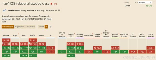
浏览器兼容性:
案例效果:
二、具体实现
1、实现思路
① 首先通过 grid 布局实现元素九宫格布局。
② 在父元素中声明六个CSS自定义属性,设置九宫格对应的三个行高和三个列宽,方便后续动态调整。
③ 在父元素的选择器上使用 :has() 伪类选择器 结合 nth-child() 和 :hover,实现当特定的子元素触发hover时,修改父元素中的CSS自定义属性。
④ 根据子元素所在行和列,修改对应的自定义属性,从而修改对应的行高和列宽。
⑤ 给父元素增加 trasition 过渡效果,当行高和列宽发生变化时,实现过渡动画。
2、具体代码
HTML:
<div class="box">
   <div class="item">1div>
   <div class="item">2div>
   <div class="item">3div>
   <div class="item">4div>
   <div class="item">5div>
   <div class="item">6div>
   <div class="item">7div>
   <div class="item">8div>
   <div class="item">9div>
div>
CSS:
.box {
  /* 定义父元素的框 */
  width: 300px;
  height: 300px;
  /* 使用 grid 布局 */
  display: grid;
  /* 声明三个自定义属性 表示布局中三行的行高 */
  --row1: 1fr;
  --row2: 1fr;
  --row3: 1fr;
  /* 使用三个自定义属性 设置对应的行高 */
  grid-template-rows: var(--row1) var(--row2) var(--row3);
  /* 声明三个自定义属性 表示布局中三列的列宽 */
  --col1: 1fr;
  --col2: 1fr;
  --col3: 1fr;
  /* 使用三个自定义属性 设置对应的列宽 */
  grid-template-columns: var(--col1) var(--col2) var(--col3);
  /* 设置间距 */
  grid-gap: 5px;
  background: #ccc;
  /* 设置过渡动画效果 */
  transition: all 0.25s linear;
}
/* 设置每个单元格的样式 */
.item {
  display: flex;
  align-items: center;
  justify-content: center;
  background: green;
  color: #000;
  cursor: pointer;
}
/* 设置不同的背景颜色 以作区分 */
.item:nth-child(2n) {
  background-color: pink;
}
/* 使用 :has() 伪类选择器 结合 nth-child() 和 :hover */
/* 实现当特定的子元素触发hover时 修改父元素中的样式 */
/* 此处修改的是自定义属性的值 根据元素所在的行、列 修改不同的自定属性 影响对应的行高和列宽 */
/* 再加上父元素设置的过渡属性 形成了动态九宫格效果 */
.box:has(.item:nth-child(1):hover) {
  --row1: 2fr;
  --col1: 2fr;
}
.box:has(.item:nth-child(2):hover) {
  --row1: 2fr;
  --col2: 2fr;
}
.box:has(.item:nth-child(3):hover) {
  --row1: 2fr;
  --col3: 2fr;
}
.box:has(.item:nth-child(4):hover) {
  --row2: 2fr;
  --col1: 2fr;
}
.box:has(.item:nth-child(5):hover) {
  --row2: 2fr;
  --col2: 2fr;
}
.box:has(.item:nth-child(6):hover) {
  --row2: 2fr;
  --col3: 2fr;
}
.box:has(.item:nth-child(7):hover) {
  --row3: 2fr;
  --col1: 2fr;
}
.box:has(.item:nth-child(8):hover) {
  --row3: 2fr;
  --col2: 2fr;
}
.box:has(.item:nth-child(9):hover) {
  --row3: 2fr;
  --col3: 2fr;
}
Sass 简化版:
.box {
  /* 定义父元素的框 */
  width: 300px;
  height: 300px;
  /* 使用 grid 布局 */
  display: grid;
  /* 声明三个自定义属性 表示布局中三行的行高 */
  --row1: 1fr;
  --row2: 1fr;
  --row3: 1fr;
  /* 使用三个自定义属性 设置对应的行高 */
  grid-template-rows: var(--row1) var(--row2) var(--row3);
  /* 声明三个自定义属性 表示布局中三列的列宽 */
  --col1: 1fr;
  --col2: 1fr;
  --col3: 1fr;
  /* 使用三个自定义属性 设置对应的列宽 */
  grid-template-columns: var(--col1) var(--col2) var(--col3);
  /* 设置间距 */
  grid-gap: 5px;
  background: #ccc;
  /* 设置过渡动画效果 */
  transition: all 0.25s linear;
}
/* 设置每个单元格的样式 */
.item {
  display: flex;
  align-items: center;
  justify-content: center;
  background: green;
  color: #000;
  cursor: pointer;
}
/* 设置不同的背景颜色 以作区分 */
.item:nth-child(2n) {
  background-color: pink;
}
/* 使用 Sass 提供的 循环语法  */
@for $i from 1 through 9 {
  /* 使用 :has() 伪类选择器 结合 nth-child() 和 :hover 设置9个选择器 */
  /* 实现当特定的子元素触发hover时 修改父元素中的样式 */
  .box:has(.item:nth-child(#{$i}):hover) {
    /* 计算当前hover的子元素 所在的行 */
    $rowIndex: floor(calc(($i - 1) / 3) + 1);
    /* 计算当前hover的子元素 坐在的列 */
    $colIndex: ($i - 1) % 3 + 1;
    /* 修改对应的自定义属性 从而修改对应的行高和列宽 */
    /* 再加上父元素设置的过渡属性 形成了动态九宫格效果 */
    --row#{$rowIndex}: 2fr;
    --col#{$colIndex}: 2fr;
  }
}