Windows Phone 7 创建自定义的控件
创建自定义的控件:
需要从控件(或 ContentControl)派生,至少,为了继承基本的控件功能,该控件类应从 Silverlight System.Windows.Controls.Control 类派生。但是,它也可以从
ContentControl 和 ItemsControl 等 Control 派生类派生。许多内置控件可以直接或间接从添加了 Content 属性的 ContentControl 派生,而该属性允许对控件的内容(如按压
按钮表面上的内容)进行自定义。ListBox 控件则从 ItemsControl 派生,ItemsControl 可以实现用来向用户提供项目集合的控件的基本行为。因为我们要实现按钮,所以将从
ContentControl 派生。
代码结构如下:
namespace SimpleButtonDemo
{
public class SimpleButton : ContentControl
{
}
}
此时,您已实现了单纯的自定义控件,该控件可在 XAML 文档中通过声明进行实例化。为了说明此问题,将下列语句添加到 Page.xaml:
<local:SimpleButton />
为了使 Silverlight 可以识别此声明,您还需要将以下属性添加到 Page.xaml 的根 UserControl 元素:
xmlns:local="clr-namespace:SimpleButtonDemo;"
您可以看到,clr-namespace 能够识别在其中定义 SimpleButton 类的命名空间,而程序集可以识别包含此控件的程序集。
在xaml中就可以调用该控件了,代码结构如下:
<Grid x:Name="LayoutRoot" Background="White">
<local:SimpleButton />
</Grid>
实例:
NaiveGradientButton类
     using

      System;


     using

      System.Windows;


     using

      System.Windows.Controls;


     using

      System.Windows.Media;


     namespace

      NaiveGradientButtonDemo
{


     public


     class

      NaiveGradientButton : Button
 {
 GradientStop gradientStop1, gradientStop2;


     public

      NaiveGradientButton()
 {
 LinearGradientBrush brush

     =


     new

      LinearGradientBrush();
 brush.StartPoint

     =


     new

      Point(

     0

     ,

     0

     );
 brush.EndPoint

     =


     new

      Point(

     1

     ,

     0

     );

 gradientStop1

     =


     new

      GradientStop();
 gradientStop1.Offset

     =


     0

     ;
 brush.GradientStops.Add(gradientStop1);

 gradientStop2

     =


     new

      GradientStop();
 gradientStop2.Offset

     =


     1

     ;
 brush.GradientStops.Add(gradientStop2);

 Foreground

     =

      brush;
 }


     public

      Color Color1
 {


     set

      { gradientStop1.Color

     =

      value; }


     get

      {

     return

      (Color)gradientStop1.Color; }
 }


     public

      Color Color2
 {


     set

      { gradientStop2.Color

     =

      value; }


     get

      {

     return

      (Color)gradientStop2.Color; }
 }
 }
}
xaml中添加引用
xmlns:local="clr-namespace:NaiveGradientButtonDemo"
<!--
LayoutRoot is the root grid where all page content is placed
-->
<
Grid
x:Name
="LayoutRoot"
Background
="Transparent"
>
<
Grid.RowDefinitions
>
<
RowDefinition
Height
="Auto"
/>
<
RowDefinition
Height
="*"
/>
</
Grid.RowDefinitions
>
<!--
TitlePanel contains the name of the application and page title
-->
<
StackPanel
x:Name
="TitlePanel"
Grid.Row
="0"
Margin
="12,17,0,28"
>
<
TextBlock
x:Name
="ApplicationTitle"
Text
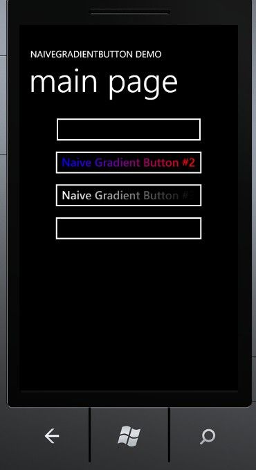
="NAIVEGRADIENTBUTTON DEMO"
Style
="
{StaticResource PhoneTextNormalStyle}
"
/>
<
TextBlock
x:Name
="PageTitle"
Text
="main page"
Margin
="9,-7,0,0"
Style
="
{StaticResource PhoneTextTitle1Style}
"
/>
</
StackPanel
>
<!--
ContentPanel - place additional content here
-->
<
Grid
x:Name
="ContentPanel"
Grid.Row
="1"
Margin
="12,0,12,0"
>
<
StackPanel
>
<
local:NaiveGradientButton
Content
="Naive Gradient Button #1"
HorizontalAlignment
="Center"
/>
<
local:NaiveGradientButton
Content
="Naive Gradient Button #2"
Color1
="Blue"
Color2
="Red"
HorizontalAlignment
="Center"
/>
<
local:NaiveGradientButton
Content
="Naive Gradient Button #3"
Color1
="
{StaticResource PhoneForegroundColor}
"
Color2
="
{StaticResource PhoneBackgroundColor}
"
HorizontalAlignment
="Center"
/>
<
local:NaiveGradientButton
Content
="Naive Gradient Button #4"
Style
="
{StaticResource gradientButtonStyle}
"
/>
</
StackPanel
>
</
Grid
>
</
Grid
>