echarts-stat直方图分布,XY轴没有与主图对应的问题
echarts-stat直方图分布,XY轴没有与主图对应的问题
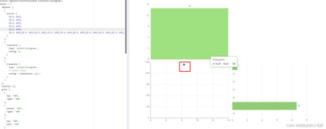
https://echarts.apache.org/examples/en/editor.html?c=bar-histogram
官方示例
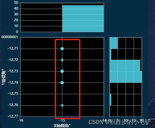
效果图:

散点图比较离散的情况下,效果很好
- 做一些假数据,数据比较密集,集中的情况下,XY轴与散点图不对应
- 根据官方给的自定义renderItem进行方案修改
https://blog.51cto.com/u_15294184/3052567
注意点:
- 分布图的X,Y轴的type均为value
- XY轴需要与散点图的XY轴min,max,interval相同
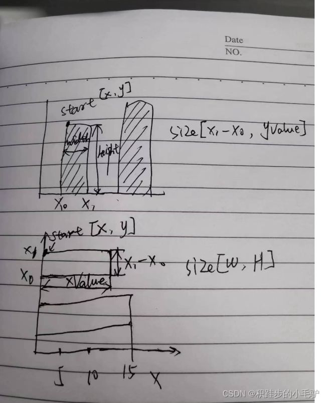
- 难点:Y轴分布图自定义RECT的算法
具体代码:
    getOptions() {
      let data = Array.from(DataArray, item => [
        Number(item[0]),
        Number(item[1]),
      ])
      let xDatas = []
      let yDatas = []
      data.forEach(i => {
        xDatas.push(i[0])
        yDatas.push(i[1])
      })
      // X轴分布
      let xbins = histogram(xDatas)
      let Xinterval
      var xmin = Infinity
      var xmax = -Infinity
      var xdataArr = echarts.util.map(xbins.data, function (item, index) {
        // 左刻度
        var x0 = xbins.bins[index].x0
        // 右刻度
        var x1 = xbins.bins[index].x1
        Xinterval = x1 - x0
        // 获得数据集中最值
        xmin = Math.min(xmin, x0)
        xmax = Math.max(xmax, x1)
        // item[0]代表刻度的中间值,item[1]代表出现的次数
        return [x0, x1, item[1], item[4]]
      })
      // y轴分布
      let ybins = histogram(yDatas)
      let Yinterval
      var ymin = Infinity
      var ymax = -Infinity
      var ydataArr = echarts.util.map(ybins.data, function (item, index) {
        // 左刻度
        var x0 = ybins.bins[index].x0
        // 右刻度
        var x1 = ybins.bins[index].x1
        Yinterval = x1 - x0
        // 获得数据集中最值
        ymin = Math.min(ymin, x0)
        ymax = Math.max(ymax, x1)
        // item[0]代表刻度的中间值,item[1]代表出现的次数
        return [x0, x1, item[1], item[4]]
      })
      this.chartData = {
        dataset: [
          {
            source: data // this.mockdata()
            //sourceHeader: true // 表明第一行(列)开始就直接是数据。
          }
        ],
        tooltip: {},
        title: {},
        grid: [
          {
            // 左下
            top: '30%',
            right: '30%',
            left: '13%',
            bottom: 50,
            show: true,
            backgroundColor: '#000',
            borderColor: '#aaa'
          },
          {
            // 左上
            bottom: '74%',
            right: '30%',
            top: 20,
            left: '13%',
            show: true,
            backgroundColor: '#000',
            borderColor: '#aaa'
          },
          {
            // 右下
            top: '30%',
            left: '74%',
            bottom: 50,
            right: 20,
            show: true,
            backgroundColor: '#000',
            borderColor: '#aaa'
          }
        ],
        xAxis: [
          {
            name: 'X轴倾角°',
            nameLocation: 'center',
            nameGap: 25,
            nameTextStyle: {
              color: '#fff',
              fontSize: 14
            },
            scale: true,
            gridIndex: 0,
            axisLabel: {
              show: true,
              color: '#fff'
            },
            splitLine: {
              lineStyle: {
                color: '#aaa'
              }
            },
            min: xmin,
            max: xmax,
            interval: Xinterval
          },
          {
            type: 'value',
            // scale: true,
            axisTick: { show: false },
            axisLabel: { show: false },
            axisLine: { show: false },
            gridIndex: 1,
            min: xmin,
            max: xmax,
            interval: Xinterval,
            splitLine: {
              lineStyle: {
                color: '#aaa'
              }
            }
          },
          {
            type: 'value',
            //  scale: true,
            gridIndex: 2,
            //position: 'top',
            axisLabel: {
              show: true,
              color: '#fff'
            },
            splitLine: {
              lineStyle: {
                color: '#aaa'
              }
            }
          }
        ],
        yAxis: [
          {
            name: 'Y轴倾角°',
            nameLocation: 'center',
            nameGap: 50,
            nameRotate: 90,
            nameTextStyle: {
              color: '#fff',
              fontSize: 14
            },
            gridIndex: 0,
            axisLabel: {
              show: true,
              color: '#fff'
            },
            splitLine: {
              lineStyle: {
                color: '#aaa'
              }
            },
            min: ymin,
            max: ymax,
            interval: Yinterval
          },
          {
            type: 'value',
            gridIndex: 1,
            axisLabel: {
              show: true,
              color: '#fff'
            },
            splitLine: {
              lineStyle: {
                color: '#aaa'
              }
            }
          },
          {
            type: 'value',
            // type: 'category',
            axisTick: { show: false },
            axisLabel: { show: false },
            axisLine: { show: false },
            gridIndex: 2,
            splitLine: {
              lineStyle: {
                color: '#aaa'
              }
            },
            min: ymin,
            max: ymax,
            interval: Yinterval
          }
        ],
        series: [
          {
            name: 'x、y倾角',
            type: 'scatter',
            xAxisIndex: 0,
            yAxisIndex: 0,
            encode: {
              x: 0,
              y: 1,
              tooltip: [0, 1, 2]
            },
            datasetIndex: 0,
            tooltip: {
              formatter(params) {
                return (
                  params.value[2] +
                  '' +
                  params.marker +
                  'x: ' +
                  params.value[0] +
                  ' y: ' +
                  params.value[1]
                )
              }
            }
          },
          {
            name: 'x分布',
            type: 'custom',
            xAxisIndex: 1,
            yAxisIndex: 1,
            renderItem: function (params, api) {
              // 这个根据自己的需求适当调节
              var yValue = api.value(2)
              var start = api.coord([api.value(0), yValue])
              var size = api.size([api.value(1) - api.value(0), yValue])
              var style = api.style()
              return {
                // 矩形及配置
                type: 'rect',
                shape: {
                  x: start[0] + 1,
                  y: start[1],
                  width: size[0] - 2,
                  height: size[1]
                },
                style: style
              }
            },
            barWidth: '99.3%',
            label: {
              show: false,
              position: 'top'
            },
            encode: { x: [0, 1], y: 2, itemName: 3 },
            // datasetIndex: 1,
            data: xdataArr
          },
          {
            name: 'y分布',
            type: 'custom',
            xAxisIndex: 2,
            yAxisIndex: 2,
            barWidth: '99.3%',
            label: {
              show: false,
              position: 'right'
            },
            renderItem: function (params, api) {
              // 这个根据自己的需求适当调节
              var xValue = api.value(2)
              var start = api.coord([0, api.value(1)])
              var size = api.size([xValue, api.value(1) - api.value(0)])
              var style = api.style()
              return {
                // 矩形及配置
                type: 'rect',
                shape: {
                  x: start[0],
                  y: start[1],
                  width: size[0],
                  height: size[1]
                },
                style: style
              }
            },
            // encode: { x: 1, y: 0, itemName: 4 },
            encode: { y: [0, 1], x: 2, itemName: 3 },
            data: ydataArr
            // datasetIndex: 2
          }
        ]
      }
    }
自定义分布图(画柱子)
效果图: