html从零开始8:css3新特性、动画、媒体查询、雪碧图、字体图标【搬代码】
css3新特性
DOCTYPE html>
<html lang="en">
<head>
<meta charset="UTF-8">
<meta http-equiv="X-UA-Compatible" content="IE=edge">
<meta name="viewport" content="width=device-width, initial-scale=1.0">
<title>title>
<style>
div{
width: 200px;
height: 200px;
background-color: aqua;
position: relative;
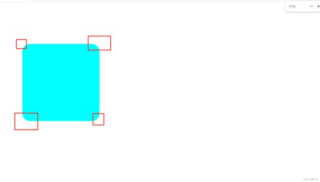
border-radius: 20px;/*圆角属性,100%就变成圆形了*/
left: 50px;
top: 100px;
}
style>
head>
<body>
<div>div>
body>
html>
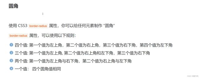
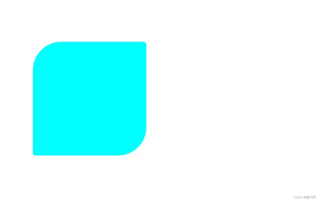
两个值
border-radius: 50px 5px;
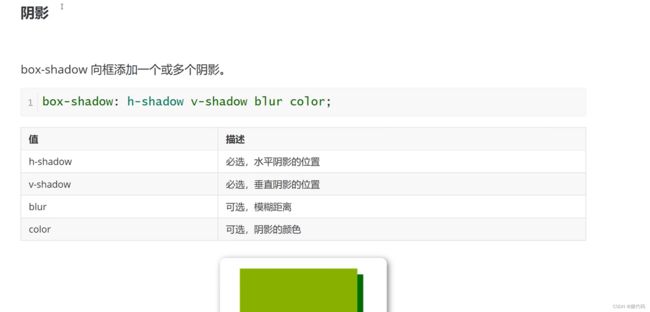
阴影
DOCTYPE html>
<html lang="en">
<head>
<meta charset="UTF-8">
<meta http-equiv="X-UA-Compatible" content="IE=edge">
<meta name="viewport" content="width=device-width, initial-scale=1.0">
<title>title>
<style>
div{
width: 200px;
height: 200px;
background-color: aqua;
position: relative;
border-radius: 50px 5px;/*圆角属性*/
left: 50px;
top: 100px;
}
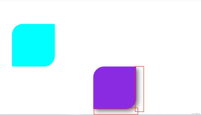
.box1{
width: 200px;
height: 200px;
background-color: blueviolet;
margin: 0 auto;/*将div放到中间,左右空袭平均分配*/
box-shadow: 10px 10px 20px rgba(0, 0, 0, 0.5);/*px也可以变成负数,那就是对角方向变成阴影*/
}
style>
head>
<body>
<div>div>
<div class="box1">div>
body>
html>
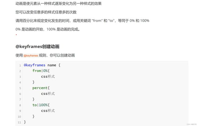
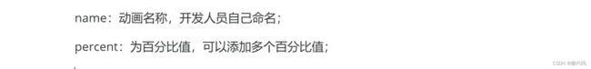
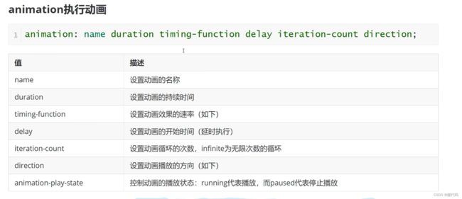
动画

DOCTYPE html>
<html lang="en">
<head>
    <meta charset="UTF-8">
    <meta http-equiv="X-UA-Compatible" content="IE=edge">
    <meta name="viewport" content="width=device-width, initial-scale=1.0">
    <title>title>
    <style>
        div{
            width: 200px;
            height: 200px;
            background-color: brown;
            animation: myAnmin 3s linear 0s infinite ;
            /* animation: name duration timing-function delay iteration-count direction fill-mode;

            */
        }
        /*鼠标滑倒该元素上就触发*/
        div:hover{
            /* background-color: blanchedalmond; */
            animation-play-state: paused;
        }
        @keyframes myAnmin {
            0%{
                width: 100px;
                height: 200px;
                background-color: antiquewhite;
            }
            25%{
                width: 300px;
                height: 200px;
                background-color: aqua;
            }
            50%{
                width: 600px;
                height: 200px;
                background-color: bisque;
            }
            75%{
                width: 1000px;
                height: 200px;
                background-color: black;
            }
            100%{
                background-color: blue;
            }
            75%{
                width: 1000px;
                height: 200px;
                background-color: black;
            }
            50%{
                width: 600px;
                height: 200px;
                background-color: bisque;
            }
            25%{
                width: 300px;
                height: 200px;
                background-color: aqua;
            }
        }
    style>
head>
<body>

    <div>div>
body>
html>
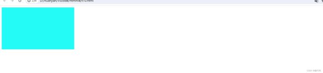

呼吸效果
DOCTYPE html>
<html lang="en">
<head>
    <meta charset="UTF-8">
    <meta http-equiv="X-UA-Compatible" content="IE=edge">
    <meta name="viewport" content="width=device-width, initial-scale=1.0">
    <title>title>
    <style>
        .box{
            width: 500px;
            height: 400px;
            margin: 40px auto;
            background-color: cadetblue;
            border-radius: 5px;
            box-shadow: 0 1px 2px;
            animation: breathe 2.7s ease-in-out infinite alternate;
        }
        @keyframes breathe {
            0%{
                opacity: 0.2;
                box-shadow: 0 1px 2px rgba(255, 255, 255, 0.1);
            }
            50%{
                opacity: 0.5;
                box-shadow: 0 1px 2px rgba(18, 190, 84, 0.76);
            }
            100%{
                opacity: 1;
                box-shadow: 0 1px 30px rgba(59, 255, 255, 1);
            }
        }
    style>
head>
<body>
    <div class="box">div>
body>
html>

媒体查询

DOCTYPE html>
<html lang="en">
<head>
    <meta charset="UTF-8">
    <meta http-equiv="X-UA-Compatible" content="IE=edge">
    <meta name="viewport" content="width=device-width, initial-scale=1.0">
    <title>title>
    <style>
        .box1{
            width: 300px;
            height: 300px;
        }
        @media screen and (max-width: 768px) {/*max-width: 768px屏幕宽度768手机*/
            .box1{
                background-color: aqua;
            }
            .p1{
                display: none;
            }
            .p2{
                display: none;
            }
        }
        @media screen and (min-width: 768px) and (max-width: 996px) {/*max-width: 768px屏幕宽度996平板*/
            .box1{
                background-color: blue;
            }
            .p1{
                display: none;
            }
            .p2{
                display: block;/*block显示,none不显示*/
            }
        }
        @media screen and (min-width:996px) {/*max-width: 768px屏幕宽度996电脑*/
            .box1{
                background-color: brown;
            }
            .p1{
                display: block;
            }
            .p2{
                display: block;/*block显示,none不显示*/
            }

        }
    style>
head>
<body>
    <div class="box1">div>
    <p class="p1">嘎嘎嘎p>
    <p class="p2">哈哈哈p>
body>
html>
图1
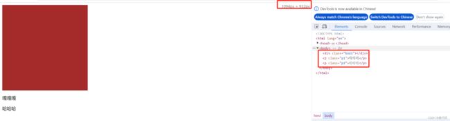
2
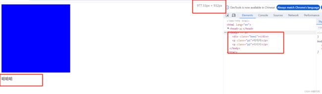
3

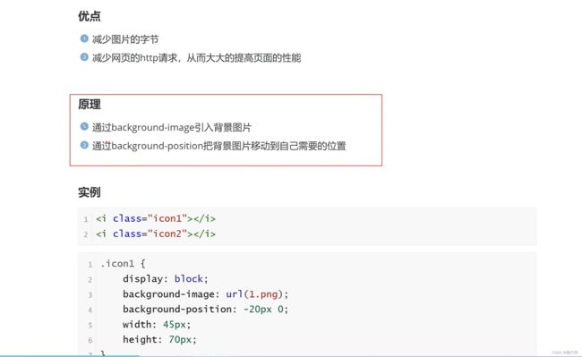
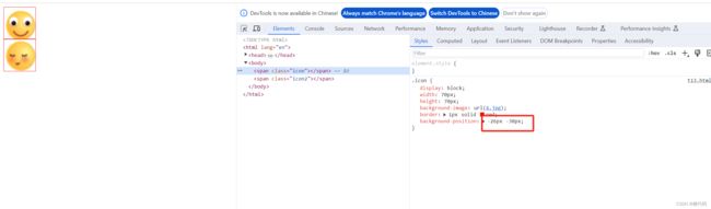
雪碧图

DOCTYPE html>
<html lang="en">
<head>
    <meta charset="UTF-8">
    <meta http-equiv="X-UA-Compatible" content="IE=edge">
    <meta name="viewport" content="width=device-width, initial-scale=1.0">
    <title>title>
    <style>
        .icon{
            display: block;/*block把一个行内元素变化成一个块级元素;inline变成一个行内元素*/
            width: 70px;
            height: 70px;
            background-image: url(4.jpg);
            border: 1px solid red;
            background-position: -26px -30px;/*参数是xy轴*/
        }
        .icon2{
            display: block;/*block把一个行内元素变化成一个块级元素;inline变成一个行内元素*/
            width: 70px;
            height: 70px;
            background-image: url(4.jpg);
            border: 1px solid red;
            background-position: -26px -140px;/*参数是xy轴*/
        }
    style>
head>
<body>
    <span class="icon">span>
    <span class="icon2">span>
body>
html>
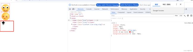
字体图标
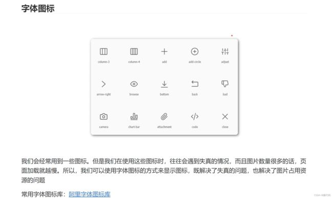
下载可以使用的图标代码,iconfont.cn

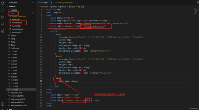
DOCTYPE html>
<html lang="en">
<head>
    <meta charset="UTF-8">
    <meta http-equiv="X-UA-Compatible" content="IE=edge">
    <meta name="viewport" content="width=device-width, initial-scale=1.0">
    <link rel="stylesheet" href="./font/iconfont.css">
    <title>title>
    <style>
        .icon{
            display: block;/*block把一个行内元素变化成一个块级元素;inline变成一个行内元素*/
            width: 70px;
            height: 70px;
            background-image: url(4.jpg);
            border: 1px solid red;
            background-position: -26px -30px;/*参数是xy轴*/
        }
        .icon2{
            display: block;/*block把一个行内元素变化成一个块级元素;inline变成一个行内元素*/
            width: 70px;
            height: 70px;
            background-image: url(4.jpg);
            border: 1px solid red;
            background-position: -26px -140px;/*参数是xy轴*/
        }
        .xing{
            font-size: 40px;
            color: brown;/*color可以设置图标颜色*/
        }
    style>
head>
<body>
    <span class="icon">span>
    <span class="icon2">span>
    <span class="iconfont icon-xing xing">span>
body>
html>