微信小程序封装vant 下拉框select 多选组件
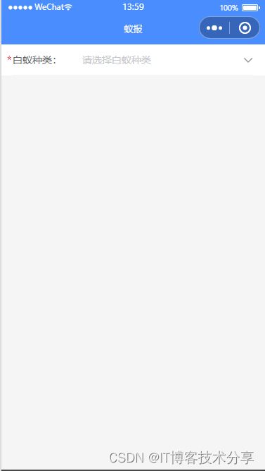
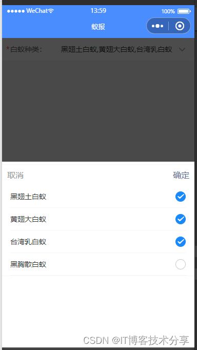
老规矩先上效果图:
本组件主要由小程序vant ui组件,vant 小程序ui网址:vant-weapp
主要代码如下:
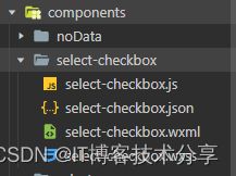
先封装子组件: select-checkbox 放在 components 文件夹里面
select-checkbox.wxml:
            取消
            确定
select-checkbox.wxss:
/* pages/select-checkbox/select-checkbox.wxss */
.van-cell__value {
  text-align: left !important;
}
.cityheader {
  width: 100%;
  z-index: 5;
}
.city-cancel {
  float: left;
  margin: 20rpx;
  color: #969799;
  z-index: 11;
  position: relative;
}
.city-true {
  float: right;
  margin: 20rpx;
  color: #576b95;
  z-index: 11;
  position: relative;
}
select-checkbox.js:
// pages/select-checkbox/select-checkbox.js
Component({
    /**
     * 组件的属性列表
     */
    properties: {
        label: String, // 输入框标签
        place: String, // 输入框提示
        list: Array, // 选择器 选项
        checkSelected: { // 选择器 选项数组中 对象的value的默认key
            type: String,
            value: 'text'
        }
    },
    // 监听传入的变量,当传入的值发生变化时,触发方法
    // observers: {
    //     'checkSelected': function (val) {
    //         // val=> 就是父组件传入组件中的 tabsList 数据
    //         console.log('???:', val)
    //     }
    // },
    /**
     * 页面的初始数据
     */
    data: {
        icon:'arrow-down',  // 下拉箭头
        show: false,
        result: [],
    },
    /**
    * 组件的方法列表
    */
    methods: {
       // 取消
        cancel() {
            this.setData({ show: false })
        },
        // 确定
        confirm() {
            this.setData({ show: false })
            this.triggerEvent('sync', {  // 传递到组件外事件 , 返回当前选中项 对象
                value: this.data.checkSelected
            })
        },

        showPopup() {
            this.setData({ show: true })
        },
        onClose() {
            this.setData({ show: false })
        },
        onChange(event) {
            // console.log('event:', event)
            this.setData({
                result: event.detail,
                checkSelected: event.detail.join(',')
            })
            // console.log('this.data.checkSelected:', this.data.checkSelected)
        },
        toggle(event) {
            const { index } = event.currentTarget.dataset
            const checkbox = this.selectComponent(`.checkboxes-${index}`)
            checkbox.toggle()
        },
        noop() {},
    },
    attached: function () {
        console.log("父组件传过来:", this.properties.checkSelected) // 可以获取父组件传过来的值
    },
})
select-checkbox.json:
{
    "component": true,
    "usingComponents": {
        "van-field": "@vant/weapp/field/index",
        "van-popup": "@vant/weapp/popup/index",
        "van-cell": "@vant/weapp/cell/index",
        "van-cell-group": "@vant/weapp/cell-group/index",
        "van-checkbox": "@vant/weapp/checkbox/index",
        "van-checkbox-group": "@vant/weapp/checkbox-group/index"
    }
}
父组件调用:
data: {
        checkSelected: '',
        list: ['黑翅土白蚁', '黄翅大白蚁', '台湾乳白蚁', '黑胸散白蚁' ],
    },
    // 获取选中的值
    getSelectBox: function(e) {
        // 打印选中项
        console.log("11111111:", e.detail.value)
        this.setData({
            checkSelected: e.detail.value
        })
    },
{
"usingComponents": {
"select-checkbox": "/components/select-checkbox/select-checkbox"
}
}本组件只要用 vant-checkbox 组件,外套用了 点击弹出vant-popup 弹层,然后封装成组件的模板,全局调用。