Compose中更灵活易用的TextField以及密码输入框
前言
Jetpack Compose中的TextField简单用起来很方便,但如果要自定义ui就不好实现了,我们看一下效果:
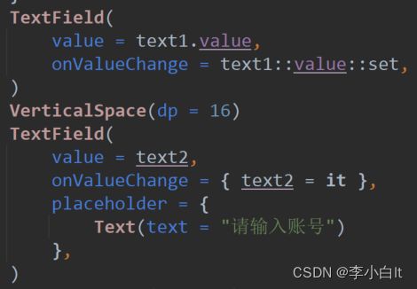
TextField:
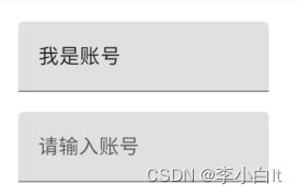
类似的还有OutlinedTextField:
他们都有共同的api和特点,简单使用很方便,但是其有很大的内边距不好调整,且其背景ui也不太好调整(背景可以改成透明,但间距我查看源码也没改成...)
幸亏Compose中预留了基础的输入框实现:BasicTextField
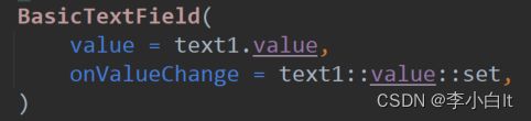

没有边距,没有背景,很适合我们自定义ui,所以我就根据BasicTextField封装了一下,使ui更简单易用
正文
先看一下怎么使用的和效果


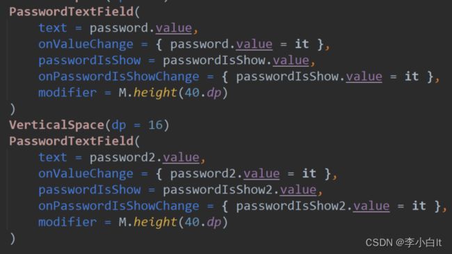
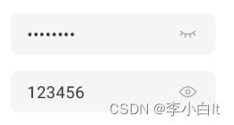
然后还有根据GoodTextField封装的适用于密码输入的PasswordTextField
然后api基本和普通的TextFild没什么区别,就简单讲一下额外提供的api
/**
 * 更方便易用的TextField(文本输入框)
 * [value]输入框中的文字
 * [onValueChange]输入框中文字的变化回调
 * [modifier]修饰
 * [hint]输入框没有文字时展示的内容
 * [maxLines]最多能展示多少行文字
 * [fontSize]text和hint的字体大小
 * [fontColor]text的字体颜色
 * [maxLength]最多能展示多少个文字,ps:由于会截断文字,会导致截断时重置键盘状态(TextField特性)
 * [contentAlignment]text和hint对其方式
 * [leading]展示在左边的组件
 * [trailing]展示在右边的组件
 * [background]背景
 * [horizontalPadding]横向的内间距
 * [enabled]是否可输入,false无法输入和复制
 * [readOnly]是否可输入,true无法输入,但可复制,获取焦点,移动光标
 * [textStyle]字体样式
 * [keyboardOptions]键盘配置
 * [keyboardActions]键盘回调
 * [visualTransformation]文本展示的转换
 * [onTextLayout]计算新文本布局时执行的回调
 * [interactionSource]状态属性
 * [cursorBrush]光标绘制
 */
@Composable
fun GoodTextField(
    value: String,
    onValueChange: (String) -> Unit,
    modifier: Modifier = Modifier,
    hint: HintComposeWithTextField? = null,
    @IntRange(from = 1L) maxLines: Int = 1,
    fontSize: TextUnit = 16.sp,
    fontColor: Color = Color333,
    maxLength: Int = Int.MAX_VALUE,
    contentAlignment: Alignment.Vertical = Alignment.CenterVertically,
    leading: (@Composable RowScope.() -> Unit)? = null,
    trailing: (@Composable RowScope.() -> Unit)? = null,
    background: BackgroundComposeWithTextField? = BackgroundComposeWithTextField.DEFAULT,
    horizontalPadding: Dp = 16.dp,
    enabled: Boolean = true,
    readOnly: Boolean = false,
    textStyle: TextStyle = LocalTextStyle.current,
    keyboardOptions: KeyboardOptions = KeyboardOptions.Default,
    keyboardActions: KeyboardActions = KeyboardActions.Default,
    visualTransformation: VisualTransformation = VisualTransformation.None,
    onTextLayout: (TextLayoutResult) -> Unit = {},
    interactionSource: MutableInteractionSource = remember { MutableInteractionSource() },
    cursorBrush: Brush = SolidColor(MaterialTheme.colors.primary),
){}
其中background属性提供了自定义背景的能力
hint属性就类似于EditText的hint属性,但是其更灵活,可以使用任何Compose组件
maxLength属性可以控制最多能输入多少个字
引入项目
在根项目的build.gradle文件中加入:
allprojects {
    repositories {
        maven { url 'https://jitpack.io' }
        ...
    }
}
app的build.gradle中加上,最新版本参考:https://jitpack.io/#ltttttttttttt/ComposeViews
dependencies{
    ...
    implementation 'com.github.ltttttttttttt:ComposeViews:1.1.4'
}
然后就可以愉快的使用GoodTextField和PasswordTextField了
项目已开源,欢迎star:GitHub - ltttttttttttt/ComposeViews
并且项目中不止有GoodTextField,还有更多好用的Compose组件,比如:
Compose中的ViewPager:ComposePager
Banner
FlowLayout
后续还会添加更多的Compose组件
end
对Kotlin或KMP感兴趣的同学可以进Q群 101786950
如果这篇文章对您有帮助的话
可以扫码请我喝瓶饮料或咖啡(如果对什么比较感兴趣可以在备注里写出来)