低代码-添加按钮组件设计
效果图
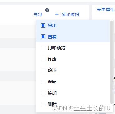
可拆分为以下细节
- 按钮列表
- 支持拖拽排序
- 删除( 两个操作需同步删除 )
- 点击外侧删除
- 点击复选框删除
- 添加:点击复选框添加
示例代码
技术栈: vue3+arco.design + ts + less + tailwindcss
<template>
  <div class="flex ">
    <draggable
      :list="props.bindButton"
      :animation="200"
    >
      <template #item="{element,index}">
        <a-badge
          :offset="[-6, 0]"
          :dot-style="{ height: '16px', width: '16px', fontSize: '14px' }"
        >
          <template #content>
            <icon-close-circle-fill
              :size="16"
              class="cursor-pointer"
              :style="{ verticalAlign: 'middle', color: 'var(--color-text-2)' }"
              @click="()=>props.bindButton.splice(index,1)"
            />
          template>
          <a-button
            class="mr-2"
            :size="element.buttonProperties?.size"
            :type="element.buttonProperties?.type||'text'"
            :status="element.buttonProperties?.status||'normal'"
            :shape="element.buttonProperties?.shape"
            @click.stop="handleSelectButton(element)"
          >
            {{ element.buttonName }}
          a-button>
        a-badge>
      template>
    draggable>

    <a-trigger
      trigger="click"
      :unmount-on-close="false"
      class="w-[200px]"
    >
      <a-button
        type="text"
      >
        <template #icon>
          <icon-plus />
        template>
        添加按钮
      a-button>

      <template #content>
        <div>
          <a-checkbox-group
            v-if="buttonList.length"
            :model-value="useFieldNames"
            class="my-checkbox-group"
          >
            <a-checkbox
              v-for="(item, pIdx) in buttonList"
              :key="item['code']"
              :value="item['code']"
              class="checkbox-item"
              @click="checkboxClick(item, pIdx)"
            >
              <template #checkbox="{ checked }">
                <div
                  class="custom-checkbox-card"
                  :class="{ 'custom-checkbox-card-checked': checked }"
                >
                  <div className="custom-checkbox-card-mask">
                    <div className="custom-checkbox-card-mask-dot" />
                  div>
                  <div className="custom-checkbox-card-title">
                    {{ item['buttonName'] }}
                  div>
                div>
              template>
            a-checkbox>
          a-checkbox-group>
          <div v-else>
            <a-empty />
          div>
        div>
      template>
    a-trigger>
  div>
template>

<script lang='ts' setup>
import { computed, ref } from 'vue'
import draggable from 'vuedraggable'

const emit = defineEmits('changeSelectItem')

const props = defineProps({
  buttonList: {
    type: Array,
    required: true,
  },
  bindButton: {
    type: Array,
    required: true,
  },
})

const useFields = computed(() => props.useFields)
const buttonList:any = computed(() => props.buttonList)

// 使用的字段名称
const useFieldNames = ref([])

const handleSelectButton = (btn: any) => {
  btn.type = 'buttonItem'
  btn.key = 'buttonItem'
  btn.label = btn.buttonName
  // btn.eventList = events.value
  btn.buttonProperties.size = btn.buttonProperties.size ? btn.buttonProperties.size : 'medium'
  btn.buttonProperties.type = btn.buttonProperties.type ? btn.buttonProperties.type : 'text'
  btn.buttonProperties.shape = btn.buttonProperties.shape ? btn.buttonProperties.shape : ''
  btn.buttonProperties.status = btn.buttonProperties.status ? btn.buttonProperties.status : 'normal'


  emit('changeSelectItem', btn)
}

// 点击字段
const checkboxClick = (item:any, index) => {
  const isDel = props.bindButton.includes(item.code)
  if (isDel) delSelectField(item, index)
  else SelectField(item, index)
}
const SelectField = (item, index) => {
  props.bindButton.push(item)
  useFieldNames.value.push(item.code)
}
const delSelectField = (item, index) => {
  useFieldNames.value.splice(index, 1)
}
script>

<style scoped lang='less'>
.my-checkbox-group{
  overflow-x: hidden;
  overflow-y: overlay;
  width: 250px;
  max-height: 300px;
  background-color: #FFF;
  border: 1px solid rgb(229,230,235);
  border-radius: 4px;
  box-shadow: 0 4px 10px #0000001a;
}
.custom-checkbox-card {
  display: flex;
  align-items: center;
  padding: 10px 16px;
  border-radius: 4px;
  width: 250px;
  box-sizing: border-box;
}

.checkbox-item {
  margin-right: 0 !important;
  padding-left: 0;
  border: none;
}

.custom-checkbox-card-mask {
  height: 14px;
  width: 14px;
  display: inline-flex;
  align-items: center;
  justify-content: center;
  border-radius: 2px;
  border: 1px solid var(--color-border-2);
  box-sizing: border-box;
}

.custom-checkbox-card-mask-dot {
  width: 8px;
  height: 8px;
  border-radius: 2px;
}

.custom-checkbox-card-title {
  color: var(--color-text-1);
  font-size: 14px;
  font-weight: bold;
  margin-left: 8px;
}

.custom-checkbox-card:hover,
.custom-checkbox-card-checked,
.custom-checkbox-card:hover .custom-checkbox-card-mask,
.custom-checkbox-card-checked .custom-checkbox-card-mask {
  border-color: rgb(var(--primary-6));
}

.custom-checkbox-card-checked {
  background-color: var(--color-primary-light-1);
}

.custom-checkbox-card:hover .custom-checkbox-card-title,
.custom-checkbox-card-checked .custom-checkbox-card-title {
  color: rgb(var(--primary-6));
}

.custom-checkbox-card-checked .custom-checkbox-card-mask-dot {
  background-color: rgb(var(--primary-6));
}
style>
上述代码发现点击外侧,无法同步删除复选框这种的按钮,排查:
复选框绑定值useFieldNames的来源为SelectField函数,而SelectField仅由checkboxClick触发。checkboxClick为绑定在复选框上的函数,因此当外部使用props.bindButton.splice(index,1)删除按钮时,无法触发useFieldNames更新。
- 优化后的代码如下
<template>
  <div class="flex">
    <draggable
      :list="props.bindButton"
      :animation="200"
    >
      <template #item="{element,index}">
        <a-badge
          :offset="[-6, 0]"
          :dot-style="{ height: '16px', width: '16px', fontSize: '14px' }"
        >
          <template #content>
            <icon-close-circle-fill
              :size="16"
              class="cursor-pointer"
              :style="{ verticalAlign: 'middle', color: 'var(--color-text-2)' }"
              @click="deleteBtn(index)"
            />
          template>
          <a-button
            class="mr-2"
            :size="element.buttonProperties?.size"
            :type="element.buttonProperties?.type||'text'"
            :status="element.buttonProperties?.status||'normal'"
            :shape="element.buttonProperties?.shape"
            @click.stop="handleSelectButton(element)"
          >
            {{ element.buttonName }}
          a-button>
        a-badge>
      template>
    draggable>

    <a-trigger
      trigger="click"
      :unmount-on-close="false"
      class="w-[200px]"
    >
      <a-button
        type="text"
      >
        <template #icon>
          <icon-plus />
        template>
        添加按钮
      a-button>

      <template #content>
        <div>
          <a-checkbox-group
            v-if="buttonList.length"
            :model-value="useFieldNames"
            class="my-checkbox-group"
          >
            <a-checkbox
              v-for="item in buttonList"
              :key="item['code']"
              :value="item['code']"
              class="checkbox-item"
              @click="checkboxClick(item)"
            >
              <template #checkbox="{ checked }">
                <div
                  class="custom-checkbox-card"
                  :class="{ 'custom-checkbox-card-checked': checked }"
                >
                  <div className="custom-checkbox-card-mask">
                    <div className="custom-checkbox-card-mask-dot" />
                  div>
                  <div className="custom-checkbox-card-title">
                    {{ item['buttonName'] }}
                  div>
                div>
              template>
            a-checkbox>
          a-checkbox-group>
          <div v-else>
            <a-empty />
          div>
        div>
      template>
    a-trigger>
  div>
template>

<script lang='ts' setup>
import { ref } from 'vue'
import draggable from 'vuedraggable'

const emit = defineEmits(['changeSelectItem'])
const props = defineProps({
  buttonList: {
    type: Array as any,
    required: true,
  },
  bindButton: {
    type: Array,
    required: true,
  },
})

// 使用的字段名称
const useFieldNames = ref<string []>([])

const handleSelectButton = (btn: any) => {
  btn.type = 'buttonItem'
  btn.key = 'buttonItem'
  btn.label = btn.buttonName
  // btn.eventList = events.value
  btn.buttonProperties.size = btn.buttonProperties.size ? btn.buttonProperties.size : 'medium'
  btn.buttonProperties.type = btn.buttonProperties.type ? btn.buttonProperties.type : 'text'
  btn.buttonProperties.shape = btn.buttonProperties.shape ? btn.buttonProperties.shape : ''
  btn.buttonProperties.status = btn.buttonProperties.status ? btn.buttonProperties.status : 'normal'


  emit('changeSelectItem', btn)
}

// 删除按钮
function deleteBtn(index:number) {
  props.bindButton.splice(index, 1)
  useFieldNames.value = props.bindButton.map((iv:any) => iv.code)
}

/**
 * 点击复选框选中/删除按钮
 * @param item 点击的按钮
 * @param index 点击的按钮索引
 */
const checkboxClick = (item:any) => {
  const isDel = useFieldNames.value.includes(item.code)
  isDel ? delSelectField(item) : SelectField(item)
}

const SelectField = (item) => {
  props.bindButton.push(item)
}

// 不能根据index删除,
const delSelectField = (item) => {
  const index = props.bindButton.findIndex((iv:any) => iv.code === item.code)
  props.bindButton.splice(index, 1)
}

// 监听 bindButton 的变化,并在变化时更新 useFieldNames
watch(() => props.bindButton, (newBindButton) => {
  useFieldNames.value = newBindButton.map((item:{
    code:string
  }) => item.code)
}, {
  deep: true,
})
script>

<style scoped lang='less'>
.my-checkbox-group{
  overflow-x: hidden;
  overflow-y: overlay;
  width: 250px;
  max-height: 300px;
  background-color: #FFF;
  border: 1px solid rgb(229,230,235);
  border-radius: 4px;
  box-shadow: 0 4px 10px #0000001a;
}
.custom-checkbox-card {
  display: flex;
  align-items: center;
  padding: 10px 16px;
  border-radius: 4px;
  width: 250px;
  box-sizing: border-box;
}

.checkbox-item {
  margin-right: 0 !important;
  padding-left: 0;
  border: none;
}

.custom-checkbox-card-mask {
  height: 14px;
  width: 14px;
  display: inline-flex;
  align-items: center;
  justify-content: center;
  border-radius: 2px;
  border: 1px solid var(--color-border-2);
  box-sizing: border-box;
}

.custom-checkbox-card-mask-dot {
  width: 8px;
  height: 8px;
  border-radius: 2px;
}

.custom-checkbox-card-title {
  color: var(--color-text-1);
  font-size: 14px;
  font-weight: bold;
  margin-left: 8px;
}

.custom-checkbox-card:hover,
.custom-checkbox-card-checked,
.custom-checkbox-card:hover .custom-checkbox-card-mask,
.custom-checkbox-card-checked .custom-checkbox-card-mask {
  border-color: rgb(var(--primary-6));
}

.custom-checkbox-card-checked {
  background-color: var(--color-primary-light-1);
}

.custom-checkbox-card:hover .custom-checkbox-card-title,
.custom-checkbox-card-checked .custom-checkbox-card-title {
  color: rgb(var(--primary-6));
}

.custom-checkbox-card-checked .custom-checkbox-card-mask-dot {
  background-color: rgb(var(--primary-6));
}
style>
- 采用watch监听props.bindButton,确保初始化能更新到下拉列表,需要开启
deep: true配置,否则props.bindButton.splice(index, 1)无法触发watch函数 - 优化点击复选框删除按钮函数
// 不能根据index删除,
const delSelectField = (item) => {
  const index = props.bindButton.findIndex((iv:any) => iv.code === item.code)
  props.bindButton.splice(index, 1)
}
值得注意的一点是需要删除的是绑定的列表,而不是去查找按钮列表,否则删除会出现删除了别的按钮的场景