eacharts和eacharts-gl、3d饼图、3d柱状图加折线图、下载gl报错解决
eacharts-gl下载时版本一定要和eacharts版本对应。否则不出效果!!目前已知可以生效有:
第一种1:
npm install [email protected] --save
npm install [email protected] --save
第二种2:
npm install [email protected] --save
npm install [email protected] --save
下载后在页面上引入然后像使用eacharts一样的流程就行
import * as echarts from "echarts";
import "echarts-gl";
// 渐变进度条加进度背景实现:
效果:

//实现: dom结构:
注意定宽高
//方法
getrightcontentchart2() {
      let myChart = echarts.init(this.$refs.rightcontentchart);
      // var salvProName =["安徽省","河南省","浙江省","湖北省","贵州省","江西省","江苏省","四川省","云南省","湖南省"];
      var salvProName = this.rightswoptions;
      var salvProValue = [239, 181, 154,103];
      var salvProMax = []; //背景按最大值
      for (let i = 0; i < salvProValue.length; i++) {
        salvProMax.push(salvProValue[0]);
      }
      var attackSourcesColor = [
        new echarts.graphic.LinearGradient(0, 1, 1, 1, [
          { offset: 0, color: "#008AFB" },
          { offset: 1, color: "#71B1FF" }
        ]),
        new echarts.graphic.LinearGradient(0, 1, 1, 1, [
          { offset: 0, color: "#00BFB0" },
          { offset: 1, color: "#00DCE3" }
        ]),
        new echarts.graphic.LinearGradient(0, 1, 1, 1, [
          { offset: 0, color: "#E2EC00" },
          { offset: 1, color: "#DCF87A" }
        ]),
        new echarts.graphic.LinearGradient(0, 1, 1, 1, [
          { offset: 0, color: "#7B65E9" },
          { offset: 1, color: "#9F9BE1" }
        ])
      ];
      // 渐变颜色
      function attackSourcesDataFmt(sData) {
        var sss = [];
        sData.forEach(function(item, i) {
          let itemStyle = {
            color: i > 3 ? attackSourcesColor[3] : attackSourcesColor[i]
          };
          sss.push({
            value: item,
            itemStyle: itemStyle
          });
        });
        return sss;
      }
     let option = {
        // backgroundColor: "#003366",
        grid: {
          left: "2%",
          right: "2%",
          bottom: "2%",
          top: "2%",
          containLabel: true
        },
        tooltip: {
          trigger: "axis",
          axisPointer: {
            type: "none"
          },
          formatter: function(params) {
            return params[0].name + " : " + params[0].value;
          }
        },
        xAxis: {
          show: false,
          type: "value"
        },
        yAxis: [
          {
            type: "category",
            inverse: true,
            axisLabel: {
              show: true,
              textStyle: {
                color: "#fff"
              }
            },
            splitLine: {
              show: false
            },
            axisTick: {
              show: false
            },
            axisLine: {
              show: false
            },
            data: salvProName
          },
          {
            type: "category",
            inverse: true,
            axisTick: "none",
            axisLine: "none",
            show: true,
            axisLabel: {
              textStyle: {
                color: "#ffffff",
                fontSize: "12"
              }
            },
            data: salvProValue
          }
        ],
        series: [
          {
            name: "值",
            type: "bar",
            zlevel: 1,
            itemStyle: {
              normal: {
                barBorderRadius: 30,
                color: new echarts.graphic.LinearGradient(0, 0, 1, 0, [
                  {
                    offset: 0,
                    color: "#7f6fe3"
                  },
                  {
                    offset: 1,
                    color: "#dcf56b"
                  }
                ])
              }
            },
            // 柱状宽度
            barWidth: 15,
            // salvProValue 数值,保证颜色渐变效果
            data: attackSourcesDataFmt(salvProValue)
          },
          {
            name: "背景",
            type: "bar",
            // 背景宽度
            barWidth: 15,
            barGap: "-100%",
            data: salvProMax,
            itemStyle: {
              normal: {
                color: "#305067",
                barBorderRadius: 30
              }
            }
          }
        ]
      };
      window.addEventListener("resize", () => echart.resize(), false);
      option && myChart.setOption(option);
    },
//最后在mounted中调用这个方法
柱状图折线图x轴y轴显示不全解决:在对应的x或y轴中设置
axisLabel: {
interval:0, //0代表全部显示
},
3d柱状图加折线图,含折线拐点样式
效果:

传递的数据结构如下:
y可以不传,在y轴定min和max值就可以

3d饼图:实心饼图、环形饼图
3d饼图效果实心表面凹凸不平(1)会根据数值的大小厚度会改变

3d饼图效果实心表面平整,鼠标移入凸出(2)
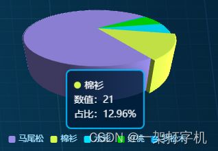
3d 环形图效果

根据传参不同就可以实现具体看下方
父组件
例: <子组件名:optionData='optionsdata' :num='num' :distance=270 :hiSame='false' :id='lefteachartssid'>
数组结构:
optionsdata: [
{
name: "国有",
value: 20,
itemStyle: {
opacity: 1,
color: "#00E3FF"
}
},
{
name: "集体",
value: 19,
itemStyle: {
opacity: 1,
color: "#968DE3"
}
},
{
name: "个人",
value: 12,
itemStyle: {
opacity: 1,
color: "#D6F94E"
}
}
],
num:0,