微信小程序自定义提示框组件并使用插槽 tooltip
创建tooltip组件引用
-
创建一个自定义组件,例如命名为 tooltip
- tooltip.wxml:用于定义组件的结构;
{{content}}
- tooltip.wxss:用于定义组件的样式;
.tooltip-wrapper {
  position: absolute;
  display: flex;
  align-items: center;
  justify-content: center;
  background-color: #000;
  color: #fff;
  padding: 8rpx;
  border-radius: 4rpx;
}

.tooltip-content {
  font-size: 20rpx;
  line-height: 20rpx;
}
- tooltip.js:用于编写组件的逻辑。
Component({
  properties: {
    content: {
      type: String,
      value: ''
    },
    useSlot: {
      type: Boolean,
      value: false
    },
    hidden: {
      type: Boolean,
      value: true
    },
    left: {
      type: Number,
      value: 0
    },
    top: {
      type: Number,
      value: 0
    }
  },
});
- tooltip.json:
{
  "component": true,  // 组件 中默认有这个属性  表示这是个组件
  "usingComponents": {}
}
组件引用
在需要使用 tooltip 的页面中引入自定义组件,并设置相应的属性和事件监听。
- 页面引用
- 主页面的 wxml 文件:
我是{{tooltipContent}}
-
**data-tooltip:**设置 data-tooltip 属性传递提示信息
-
**data-classname:**如果一个页面多个元素需要提示框,这个属性用来获取元素的类名
-
**data-useSlot:**判断是否使用插槽显示提示框
-
catchtap: 是一个事件捕获的触摸事件,它可以用于阻止事件冒泡。当使用 catchtap 绑定事件时,如果事件被触发,它不会向上级元素传递,而是在当前组件上处理。
-
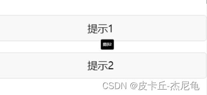
使用插槽的提示

- 主页面的 wxss 文件:
/* pages/other/other.wxss */
page {
  height: 100%;
  width: 100%;
}
.wrapper {
  height: 100%;
  width: 100%;
}
.tooltip-hover {
  position: relative;
}
button {
  margin-top: 40rpx;
}


.content {
  font-size: 20rpx;
  color: #fff;
  line-height: 20rpx;

}
- 主页面的 js 文件:
Page({
  data: {
    useSlot:false,
    position: 'bottom', // 默认显示在下方
    tooltipContent: '',  // 提示信息
    tooltipHidden: true,  // 是否隐藏 tooltip
    tooltipLeft: 0,  // tooltip 距离页面左边缘的距离
    tooltipTop: 0,  // tooltip 距离页面上边缘的距离
  },

  onTapButton(event) {
    let className = event.currentTarget.dataset.classname
    let useSlot = event.currentTarget.dataset.useslot
    const query = wx.createSelectorQuery();
    query.select(`.${className}`).boundingClientRect((rect) => {
      console.log(rect)
      const { left, top, width,height } = rect;
      const tooltipContent = event.currentTarget.dataset.tooltip;
      this.setData({
        tooltipContent,
        tooltipLeft: left + (width / 2),
        tooltipTop: top - (height/2),
        tooltipHidden: false,
        useSlot: useSlot==1
      });
    }).exec();
  },
  handleHiddenInfo() {
    this.setData({
      tooltipContent:'',
      tooltipHidden: true
    })
  },
});
- 主页面的 json 文件:
{
    "usingComponents": {
      "tooltip":"../../components/tooltip/tooltip"
    }
}