移动端1px问题解决方案
产生的原因:
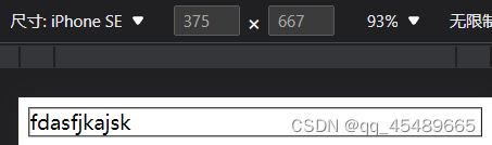
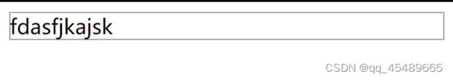
写代码时一般使用设备独立像素来对页面布局。而在设备像素比大于1的屏幕上,我们写的1px实际上是被多个物理像素渲染,这就会出现1px在有些屏幕上看起来很粗的现象:
解决方法:
1.小数值px
设备像素比devicePixelRadio=2=物理像素/css像素=1px/0.5px,物理像素为1px,设置设备像素比=2,css像素设为0.5px,详情如下:

缺点:
        兼容性差,目前之余IOS8+才支持,在IOS7及其以下、安卓系统都是显示0px。
2.background-image,多背景渐变
设置1px的渐变背景


3.CSS3,box-shadow
.shadow {
	-wedit-box-shadow:0 1px 1px -1px rgba(255, 0, 0 ,0.5);
	box-shadow: 0 1px 1px -1px rgba(255, 0, 0 ,0.5)
}
缺点:
	颜色不好配置
4,viewport与rem结合
当设备像素比=2,(中和一下,使物理像素=设备独立像素)
<meta name="viewport" content="initial-scale=0.5,maximum-scale=0.5,minimum-scale=0.5,user-scalable=no">

当设备像素比=3,将页面缩放1/3倍,
<meta name="viewport" content="initial-scale=0.3333333333333333, maximum-scale=0.3333333333333333, minimum-scale=0.3333333333333333, user-scalable=no">
任意设备像素比
 const scale = 1 / window.devicePixelRatio;
	        const viewport = document.querySelector('meta[name="viewport"]');
	        if (!viewport) {
	            viewport = document.createElement('meta');
	            viewport.setAttribute('name', 'viewport');
	            window.document.head.appendChild(viewport);
	        }
	        viewport.setAttribute('content', 'width=device-width,user-scalable=no,initial-scale=' + scale + ',maximum-scale=' + scale + ',minimum-scale=' + scale);
意味着所有页面都需要用物理像素写,不现实,可以用flexible,vm,vh来帮助适配
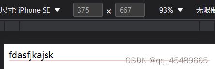
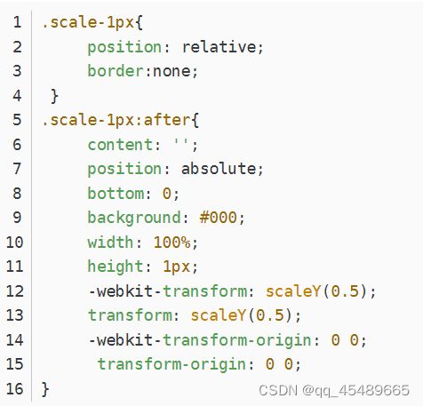
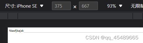
5.:before,:after,transform(建议使用)
原理:先把原来的border去掉,然后用:before,:after重做border,并 transform 的 scale 缩小一半,原先的元素相对定位,新做的 border 绝对定位。单条border样式:
四条border样式:

优点:
        所有场景都能满足
        支持圆角
缺点:
        对于已经使用伪类的元素,可能需要多层嵌套
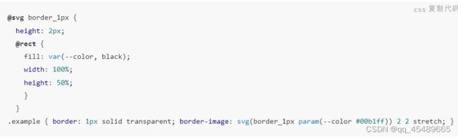
6,svg(推荐使用)
借助PostCSS的postcss-write-svg我们能直接使用border-image和background-image创建svg的1px边框
7,border-image
准备一张符合要求的border-image

通常手机端的页面设计稿都是放大一倍的,如:为适应iphone retina,设计稿会设计成750*1334的分辨率,图片按照2倍大小切出来,在手机端看着就不会虚化,非常清晰。 同样,在使用border-image时,将border设计为物理1px,如下:
.border-image-1px {
	border-width: 0 0 1px 0;
	border-image:url(linenew.png) 0 0 2 0 stretch;
}
上文是把border设置在边框的底部,所以使用的图片是2px高,上部的1px颜色为透明,下部的1px使用视觉规定的border的颜色。
如果边框底部和顶部同时需要border,可以使用下面的border-image:

.border-image-1px {
	border-width: 1px 0;
	-wekit-border-image:url(linenew.png) 2 0 stretch;
	border-image:url(linenew.png) 2 0 stretch;
}
在非视网膜屏上会出现border显示不出来的情况,需要做一下兼容:
.border-image-1px {
	border-bottom: 1px solid #666;
}
@media only screen and (-wekit-min-device-pixel-radio:2){
	.border-image-1px {
		border-bottom: none;
		border-width: 0 0 1px 0;
		-wekit-border-image:url(linenew.png) 0 0 2 0 stretch;
		border-image:url(linenew.png) 0 0 2 0 stretch;
	}
}
优点:
	可以设置单条,多条边框,没有性能瓶颈的问题
缺点:
	修改颜色麻烦, 需要替换图片;圆角需要特殊处理,并且边缘会模糊
8,background-image
与上类似,只不过将border模拟在背景上
.background-image-1px {
	background: url(linenew.png) repeat-x left bottom;
	-wekit-background-size: 100% 1px;
	background-size: 100% 1px;
}
优点:
	可以设置单条,多条边框,没有性能瓶颈的问题。
缺点:
	修改颜色麻烦, 需要替换图片;圆角需要特殊处理,并且边缘会模糊。