前端——》vue框架之使用vuetify组件库
使用心得
按照老习惯,先看效果图
效果图
首页
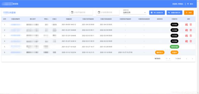
列表页面
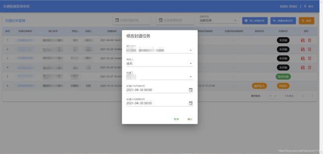
弹出层
一点点心得
上面这个效果图就是使用vuetify框架来实现的,因为大部分的管理系统都是左侧 有竖向的菜单栏,顶部有导航栏,所以这样的风格乍一看还有点小清新。这也是用这个框架的原因之一。
之前用vue写前端基本都用的是element框架,这次换成vuetify框架的原因之一是vuetify框架能够更好的支持页面的 自定义布局,能够不用写什么css样式就能达到很好的效果。
知识点总结
表格与单元格
表格效果图如上所示。这里介绍一下vuetify框架和element框架在表格上的一些差异:
首先来看一段element实现表格的代码:
element表格实现代码
<template>
    <div>
        <div class="container">
            <div class="handle-box">
                <el-input v-model="query.name" placeholder="输入名称" class="handle-input mr10"></el-input>
                <el-input v-model="query.code" placeholder="输入code" class="handle-input mr10"></el-input>
                <el-button type="primary" icon="el-icon-search" @click="handleSearch"  class="tableHeadOption">搜索</el-button>
                <el-button type="primary" icon="el-icon-circle-plus" @click="handleAdd()"  class="tableHeadOption">添加</el-button>
            </div>
            <el-table :data="tableData"
                border
                class="table"
                ref="multipleTable"
                header-cell-class-name="table-header"
            >
                <el-table-column prop="companyName" label="客户全称" :show-overflow-tooltip="true"></el-table-column>
                <el-table-column prop="shortName" label="客户简称" :show-overflow-tooltip="true"></el-table-column>
                <el-table-column prop="companyCode" label="客户代码" :show-overflow-tooltip="true"></el-table-column>
                <el-table-column prop="createTime" label="创建时间" :show-overflow-tooltip="true"></el-table-column>
                <el-table-column label="操作" width="180" align="center">
                    <template slot-scope="scope">
                        <el-button type="text"  icon="el-icon-edit" @click="handleEdit(scope.$index, scope.row)" style="font-size: 13px;">编辑</el-button>
                    </template>
                </el-table-column>
            </el-table>
            <div class="pagination">
                <el-pagination
                    background
                    layout="total,sizes, prev, pager, next"
                    :current-page="query.pageIndex"
                    :page-size="query.pageSize"
                    :total="pageTotal"
                    :page-sizes="[10, 20, 50, 100]"
                    @size-change="handleSizeChange"
                    @current-change="handlePageChange"
                ></el-pagination>
            </div>
        </div>


    </div>
</template>

<script>
/*封装了axios请求*/
import request from '../../utils/request';
export default {
    name: 'ownerCompany',
    data() {
        return {
            /*这里定义表格筛选条件*/
            query: {
                code: '',
                name: '',
                pageIndex: 1,
                pageSize: 10
            },
            /*表格数据*/
            tableData: [],
            /*表格页数*/
            pageTotal: 0,
        };
    },

    /*页面渲染时请求后台列表数据*/
    created() {
        this.getData();
    },

    methods: {
        /*获取后台数据*/
        getData() {
            request({
                url: 'xxx/list',
                method: 'post',
                params: {
                    page:this.query.pageIndex,
                    limit:this.query.pageSize,
                    companyName: this.query.name,
                    companyCode: this.query.code,
                }
            }).then(res => {
                this.tableData = res.data;
                this.pageTotal = res.count || 0;
            });
        },
        /*分页导航*/
        handlePageChange(val) {
            this.$set(this.query, 'pageIndex', val);
            this.getData();
        },
        /*触发搜索按钮*/
        handleSearch() {
            this.$set(this.query, 'pageIndex', 1);
            this.getData();
        },
    }
};
</script>
一般element框架的表格差不多就是上面这样的方式实现的。
现在我们来看下vuetify表格的实现方式
vuetify表格实现代码
<template xmlns:v-slot="http://www.w3.org/1999/XSL/Transform">
    <v-card :loading="loading">
        <!--条件搜索栏-->
        <v-toolbar flat>
            <v-select
                    label="任务状态"
                    v-model="searchFilter.status"
                    :items="searchFilter.statusOptions"
                    style="max-width: 200px;margin-right: 10px;margin-top: 20px;"
            ></v-select>
        </v-toolbar>

        <!--表格-->
        <v-data-table
                :headers="headers"
                :items="items"
                :options.sync="options"
                :server-items-length="total"
                :search="searchFilter.status"
                :footer-props=" { 'disable-items-per-page': true }"
        >

        </v-data-table>
    </v-card>
</template>

<script>
    export default {
        data: () => ({
            loading: false,
            headers: [{
                text: '序号',
                align: 'center',
                value: 'index',
                sortable: false
            }, {
                text: '任务编号',
                align: 'center',
                value: 'taskNo',
                sortable: false
            }, {
                text: '路口名字',
                align: 'center',
                value: 'roadName',
                sortable: false
            }, {
                text: '领导',
                align: 'center',
                value: 'leaderName',
                sortable: false
            }, {
                text: '工人',
                align: 'center',
                value: 'staffName',
                sortable: false
            }, {
                text: '创建时间',
                align: 'center',
                value: 'createTime',
                sortable: false
            }, {
                text: '状态',
                align: 'center',
                value: 'status',
                sortable: false
            }],
            items: [],
            total: 0,
            options: {},
            searchFilter: {
                statusOptions: [
                    {value: "history", text: "历史任务"},
                    {value: "now", text: "当前任务",}
                ],
                startTime: '',
                endTime: '',
                status: "now"
            },
        }),
        methods: {
            requestData() {
                this.loading = true;
                let {page} = this.options;
                let roadListRequest = {
                    status: this.searchFilter.status,
                    current: page,
                };
                this.$axios.post('/web/xxx/xxx', roadListRequest).then(res => {
                    if (res.status === 200 && res.data) {
                        this.items = res.data.records.map((item, index) => ({
                            index: index + 1 + (res.data.current - 1) * res.data.size,
                            ...item
                        }));
                        this.total = res.data.total
                    }
                }).finally(() => {
                    this.loading = false
                })
            },
            watch: {
            	/*监听表格翻页等操作*/
                options: {
                    handler() {
                        this.requestData();
                    },
                    /*deep:true表示深度监听,能检测到data内部的数据变化*/
                    deep: true
                },
                /*监听表格搜索条件变化*/
                searchFilter: {
                    handler() {
                        this.requestData();
                    },
                    deep: true
                }
            }
        }
    }
</script>
以上是一个基础vuetify表格的代码,即不带各种花里胡哨的单元格格式和操作栏。由于vuetify这个项目中的axios未封装,所以axios请求的时候看起来有点杂乱,这个不重要。从这两块代码中,可以看到明显的差别:
- 单元格的写法:在element表格中,单元格是用 el-table-column 标签来包装的,在 el-table-column 标签中,通过prop属性取值,如prop=“shortName”;而在vuetify表格中,只需要在data中定义一个list表头和列表值,如上面所示的headers和items,然后在 v-data-table标签中定义 :headers=“headers” :items=“items”,就可以完成数据的展示(当然前提是headers中的value值要与items中的key对应)。可以看出,在不做花里胡哨的单元格操作的时候,vuetify是简单很多的,直接通过在data中定义的lis就可以展示,不需要在写其他的展示代码。
- 搜索:这是个很牛批的功能,vuetify的表格搜索能匹配到当前页的所有列的值,一个搜索框实现所有列的搜索,也可以自定义哪些字段可以被搜索到,哪些不搜索,这个在vuetify官网可以看到。
选择器
时间选择器
element的日期时间选择器
<el-date-picker
     type="datetime"
     placeholder="选择开始时间"
     v-model="query.startTime"
     default-time="00:00:00"
     value-format="yyyy-MM-dd HH:mm:ss"
     style="width: 90%;margin-top: 5px"
></el-date-picker>
vuetify的日期时间选择器
<v-menu
                    ref="menu"
                    v-model="menu"
                    :close-on-content-click="false"
                    transition="scale-transition"
                    offset-y
            >
                <template v-slot:activator="{ on, attrs }">
                    <v-text-field
                            v-model="searchFilter.startTime"
                            placeholder="开始时间"
                            solo
                            hide-details
                            prepend-inner-icon="mdi-calendar"
                            readonly
                            clearable
                            v-bind="attrs"
                            v-on="on"
                            style="max-width: 200px;margin-right: 30px;margin-bottom: 5px"
                    ></v-text-field>
                </template>
                <v-date-picker
                        v-model="searchFilter.startTime"
                        no-title
                        scrollable
                        @input="menu = false"
                >
                </v-date-picker>
            </v-menu>
可以看出来这个vuetify这个组件的代码比较庞大,而element的代码比较简洁。目前对于vuetify也还在深入的研究中,后续会持续更新vuetify使用时的一些技巧与差别。