CSS中的vertical-align属性
vertical-align
1.CSS属性 - vertical-align

2.深入理解vertical-align – line boxes
This property affects the vertical positioning inside a line box of the boxes generated by an inline-levelelement.
官方文档的翻译:vertical-align会影响 行内块级元素 在一个 行盒 中垂直方向的位置
思考:一个div没有设置高度的时候,会不会有高度?
- 没有内容,没有高度
- 有内容,内容撑起来高度
但是内容撑起来高度的本质是什么呢?
- 内容有行高(line-height),撑起来了div的高度
行高为什么可以撑起div的高度?
- 这是因为line boxes的存在,并且line-boxes有一个特性,包裹每行的inline level
- 而其中的文字是有行高的,必须将整个行高包裹进去,才算包裹这个line-level
那么,进一步思考:
- 如果这个div中有图片,文字,inline-block,甚至他们设置了margin这些属性呢?
DOCTYPE html>
<html lang="en">
<head>
  <meta charset="UTF-8">
  <meta http-equiv="X-UA-Compatible" content="IE=edge">
  <meta name="viewport" content="width=device-width, initial-scale=1.0">
  <title>Documenttitle>
  <style>
    /* 当前box有没有高度: 会有高度 */
    /* 为什么有高度: 由内容的撑起来 */
    /* 本质: 内容的行高撑起来 */
    .box {
      background-color: orange;
    }

    .small {
      display: inline-block;
      width: 100px;
      height: 100px;
      background-color: #f00;
    }
  style>
head>
<body>

  <div class="box">
    我是div元素 <span class="small">span>
    虽然说,现在想吃什么用什么海外产品,都能代购,但是自己去购买,感觉还是不同。
    一个人在路上,心情也会不同,路上的行程,可以听书看书,到达后,疯狂的游玩。书的种类很多,旅行的书本真的不少,常常看到人们去各地游玩,自己心中也跟着想去。有时间,可以试着一个人去旅行,那是一种享受一种幸福。女人不必限制于单身生活,才会各地旅行,婚后的女性,有时间,也可以一个人去旅行,那是一种不同的感受,有些人也可以带小孩老公一起去旅行。独自游玩是一种幸福,家庭一起去旅行,也是一种幸福。单身的女性,可以一个人独游。婚后的女性,也可以一个人独游。当然,婚后若是自己一个人不方便,那就全家人旅行。
  div>

body>
html>
3.深入理解vertical-align – 不同情况分析
◼ 情况一:只有文字时,line boxes如何包裹内容?(注意:红色是包裹的div,下面也都一样)
◼ 情况二:有图片,有文字时,line-boxes如何包裹内容?

◼ 情况三:有图片,有文字,有inline-block(比图片要大)如何包裹内容?

◼ 情况四:有图片,有文字,有inline-block(比图片要大)而且设置了margin-bottom,如何包裹内容?

◼ 情况五:有图片、文字、inline-block(比图片要大)而且设置了margin-bottom并且有文字,如何包裹内容?
DOCTYPE html>
<html lang="en">
<head>
  <meta charset="UTF-8">
  <meta http-equiv="X-UA-Compatible" content="IE=edge">
  <meta name="viewport" content="width=device-width, initial-scale=1.0">
  <title>Documenttitle>
  <style>
    .box {
      background-color: orange;
    }

    .box img {
      width: 200px;
    }

    .box .small {
      display: inline-block;
      width: 100px;
      height: 200px;
      background-color: #f00;
    }
  style>
head>
<body>

  <div class="box">
    我是普通的文本, 323fdafdafxxxx322
    <img src="../images/kobe01.jpg" alt="">
    <span class="small">span>
  div>

body>
html>
4.vertical-align的baseline
◼ 结论:line-boxes一定会想办法包裹住当前行中所有的内容。
◼ 但是,但是为什么对齐方式千奇百怪呢?
- 你认为的千奇百怪,其实有它的内在规律
- 答案就是
baseline对齐
◼ 我们来看官方vertical-align的默认值:没错,就是baseline

◼ 但是baseline都是谁呢?
- 文本的baseline是字母x的下方
- Inline-block默认的baseline是
margin-bottom的底部(没有,就是盒子的底部) - Inline-block有文本时,baseline是最后一行文本的x的下方
◼ 一切都解释通了
DOCTYPE html>
<html lang="en">
<head>
  <meta charset="UTF-8">
  <meta http-equiv="X-UA-Compatible" content="IE=edge">
  <meta name="viewport" content="width=device-width, initial-scale=1.0">
  <title>Documenttitle>
  <style>
    .box {
      background-color: orange;
    }

    .box img {
      width: 200px;
    }

    .box .small {
      display: inline-block;
      width: 100px;
      height: 200px;
      background-color: #f00;
    }
  style>
head>
<body>

  <div class="box">
    我是普通的文本, 323fdafdafxqgxxx322
    <img src="../images/kobe01.jpg" alt="">
    <span class="small">aaaaaafadf发放大法发货哈发放大法daspan>
  div>

body>
html>

5.vertical-align的其他值
◼ 现在,对于不同的取值就非常容易理解了
baseline(默认值):基线对齐(你得先明白什么是基线)top:把行内级盒子的顶部跟line boxes顶部对齐middle:行内级盒子的中心点与父盒基线加上 x-height 一半的线对齐 (不能用来垂直居中)

- bottom:把行内级盒子的底部跟line box底部对齐
◼ 解决图片下边缘的间隙方法:
-
方法一: 设置成top/middle/bottom
-
方法二: 将图片设置为block元素
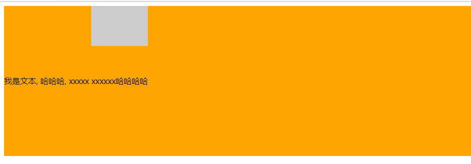
6.行内块元素的文本内容与块分离的现象
DOCTYPE html>
<html lang="en">
<head>
  <meta charset="UTF-8">
  <meta http-equiv="X-UA-Compatible" content="IE=edge">
  <meta name="viewport" content="width=device-width, initial-scale=1.0">
  <title>Documenttitle>
  <style>
    .box {
      height: 300px;
      line-height: 300px;
      background-color: orange;
    }

    .box .small {
      display: inline-block;
      background-color: #ccc;
      height: 80px;
      /* line-height: 80px; */
    }
  style>
head>
<body>

  <div class="box">
    我是文本, 哈哈哈, xxxxx

    <span class="small">xxxxxx哈哈哈哈span>

  div>

body>
html>
通过在行内块元素中添加文本,实现行内块垂直居中
DOCTYPE html>
<html lang="en">
<head>
  <meta charset="UTF-8">
  <meta http-equiv="X-UA-Compatible" content="IE=edge">
  <meta name="viewport" content="width=device-width, initial-scale=1.0">
  <title>Documenttitle>
  <style>
    .box {
      height: 300px;
      line-height: 300px;
      background-color: orange;
    }

    .box .small {
      display: inline-block;
      background-color: #ccc;
      height: 80px;
      /* 让文本在小盒子里垂直居中,然后将小盒子放入大盒子中,小盒子的文本会自动与大盒子文本基线对齐,如果这时候大盒子文本是垂直居中的,那么与大盒子文本基线对齐的小盒子也会是垂直居中的 */
      line-height: 80px;
    }
  style>
head>
<body>

  <div class="box">
    我是文本, 哈哈哈, xxxxx

    <span class="small">xxxxxx哈哈哈哈span>

  div>

body>
html>
