3 CSS基础常识
css即层叠样式表,它是一种用来表现html或xml等文件样式的计算机语言;
3.2 CSS常用的几种写法
内部样式表:css代码写入到head标签里面style标签里面
DOCTYPE html > < html> < head> < metacharset = " utf-8" > < metaname = " keywords" content = " test,test1" > < metaname = " description" content = " 这个练习使用的标签" > < style>
p {
color : blue;
}
style > head > < body> < p> p > body > html > DOCTYPE html > < html> < head> < metacharset = " utf-8" > < metaname = " keywords" content = " test,test1" > < metaname = " description" content = " 这个练习使用的标签" > head > < body> < pstyle = " color : red; " > p > body > html >
外部样式表:通过link将css资源写入;
后定义的会把先定义的覆盖掉;
优点:
css和html分离有利于维护和阅读;
解决页面样式重复的问题;
页面缓存,提高了加载速度;
格式:
DOCTYPE html > < html> < head> < metacharset = " utf-8" > < metaname = " keywords" content = " test,test1" > < metaname = " description" content = " 这个练习使用的标签" > < linkrel = " stylesheet" href = " CSS文件的路径" > head > < body> < p> p > body > html > 3.3 常用的几种选择器
3.3.1 元素(标签)选择器
通过标签名来获取元素;
这种选择器的范围广,一般放在层级选择器中;
示例:
DOCTYPE html > < html> < head> < metacharset = " utf-8" > < metaname = " keywords" content = " test,test1" > < metaname = " description" content = " 这个练习使用的标签" > < style>
p {
color : rgb ( 211, 29, 90) ;
}
ul,table {
color : rgb ( 34, 121, 92) ;
}
style > head > < body> < p> p > < ul> < li> li > < li> li > < li> li > < li> li > ul > < tableborder = " 5px" > < tr> < th> th > < th> th > tr > < tr> < td> td > < td> td > tr > < tr> < td> td > < td> td > tr > table > body > html > 3.3.2 类选择器
通过类class定位选择器,一个元素可以有多个类,一个类也可以应用多个元素;
单个类选择器;
DOCTYPE html > < html> < head> < metacharset = " utf-8" > < metaname = " keywords" content = " test,test1" > < metaname = " description" content = " 这个练习使用的标签" > < style>
.abc {
color : rgb ( 46, 21, 231) ;
}
style > head > < body> < pclass = " abc" > p > < ul> < li> li > < li> li > < li> li > < li> li > ul > < tableborder = " 5px" > < tr> < th> th > < th> th > tr > < tr> < td> td > < td> td > tr > < tr> < td> td > < td> td > tr > table > body > html > DOCTYPE html > < html> < head> < metacharset = " utf-8" > < metaname = " keywords" content = " test,test1" > < metaname = " description" content = " 这个练习使用的标签" > < style>
p.study {
color : rgb ( 46, 21, 231) ;
}
style > head > < body> < pclass = " study" > p > < pclass = " abc" > p > body > html > DOCTYPE html > < html> < head> < metacharset = " utf-8" > < metaname = " keywords" content = " test,test1" > < metaname = " description" content = " 这个练习使用的标签" > < styletype = " text/css" >
.adv.adf {
color : red;
background-color : black
}
style > head > < body> < divclass = " adv" > < p> p > div > < divclass = " adf" > < p> p > div > body > html > DOCTYPE html > < html> < head> < metacharset = " utf-8" > < metaname = " keywords" content = " test,test1" > < metaname = " description" content = " 这个练习使用的标签" > < styletype = " text/css" >
.adv.adf {
color : red;
background-color : black
}
style > head > < body> < divclass = " adv" > < p> p > div > < divclass = " adf" > < p> p > div > body > html > 3.3.3 id 选择器
DOCTYPE html > < html> < head> < metacharset = " utf-8" > < metaname = " keywords" content = " test,test1" > < metaname = " description" content = " 这个练习使用的标签" > < style>
#adc {
color : rgb ( 55, 208, 68) ;
}
style > head > < body> < pid = " adc" > p > body > html > 3.3.4 通配符选择器
DOCTYPE html > < html> < head> < metacharset = " utf-8" > < metaname = " keywords" content = " test,test1" > < metaname = " description" content = " 这个练习使用的标签" > < style>
* {
color : rgb ( 55, 208, 68) ;
}
style > head > < body> < pid = " adc" > p > < pid = " adc" > p > body > html > 3.3.5 派生选择器
后代派生器
第一个参数和第二个参数之间无论有多少层级都不会影响
格式:
DOCTYPE html > < html> < head> < metacharset = " utf-8" > < metaname = " keywords" content = " test,test1" > < metaname = " description" content = " 这个练习使用的标签" > < style>
div strong {
color : rgb ( 55, 208, 68) ;
}
style > head > < body> < div> < h1> < strong> strong > h1 > < p> p > < strong> strong > < strong> strong > div > body > html > DOCTYPE html > < html> < head> < metacharset = " utf-8" > < metaname = " keywords" content = " test,test1" > < metaname = " description" content = " 这个练习使用的标签" > < style>
div>p {
color : rgb ( 55, 208, 68) ;
}
style > head > < body> < div> < h1> < strong> strong > h1 > < p> p > < strong> strong > < strong> strong > < table> < tr> < td> < p> p > td > tr > table > div > body > html >
相邻兄弟选择器
相邻兄弟选择器会选择某一元素紧随其后的元素,但是前提是他们拥有相同的父级 ;
DOCTYPE html > < html> < head> < metacharset = " utf-8" > < metaname = " keywords" content = " test,test1" > < metaname = " description" content = " 这个练习使用的标签" > < style>
p+strong {
color : rgb ( 55, 208, 68) ;
}
style > head > < body> < div> < h1> < strong> strong > h1 > < p> p > < strong> strong > < strong> strong > div > body > html > 3.4 特殊的几种选择器
3.4.1 伪类选择器
3.4.1.1动态伪类选择器
link:匹配未被点击的超链接;
visited 匹配已经被点击过超链接;
hover 鼠标悬浮在某个元素上;
active 鼠标点击某个元素;
foucs 聚集某个焦点;
DOCTYPE html > < html> < head> < metacharset = " utf-8" > < metaname = " keywords" content = " test,test1" > < metaname = " description" content = " 这个练习使用的标签" > < style>
a:link {
color : rgb ( 158, 214, 38) ;
}
a:visited {
color : bisque;
}
h1:hover {
color : aqua;
}
h2:active {
color : blue;
}
input:focus {
color : rgb ( 234, 11, 11) ;
}
style > head > < body> < ahref = " https://blog.csdn.net/" target = " blank" > a > < h1> h1 > < h2> h2 > < h3> h3 > < form> < inputtype = " text" > form > body > html > 3.4.1.2 UI元素伪类选择器
UI元素状态伪类选择器主要是针对于HTML中的Form元素进行操作,最常见的比如我们"type="text"有enable和disabled两种状态,前者为可写状态后者为不可状态;另外"type="radio"和"type=“checkbox”"有"checked"和"unchecked"两种状态。
DOCTYPE html > < html> < head> < metacharset = " utf-8" > < metaname = " keywords" content = " test,test1" > < metaname = " description" content = " 这个练习使用的标签" > < style>
input[type="text"]:disabled {
color : rgb ( 242, 13, 13) ;
font-size : 50px;
}
input[type="text"]:enabled {
color : rgb ( 124, 242, 13) ;
font-size : 50px;
}
input[type="checkbox"]:unchecked {
color : rgb ( 242, 13, 13) ;
}
style > head > < body> < form> < inputtype = " text" name = " 姓名" value = " 小王" disabled > < inputtype = " text" name = " 姓名" value = " 小李" enabled > < br> < inputtype = " checkbox" name = " kemu" value = " 语文" checked = " unchecked" > < inputtype = " checkbox" name = " kemu" value = " 语文" checked = " unchecked" > < inputtype = " checkbox" name = " kemu" value = " 语文" checked = " unchecked" > form > body > html > 3.4.1.3 结构伪类选择器
结构伪类选择器,可以根据元素在文档中所处的位置,来动态选择元素;
< ! DOCTYPE html>
< html>
< head>
< meta charset = "utf-8" >
< meta name = "keywords" content = "test,test1" >
< meta name = "description" content = "这个练习使用的标签" >
< style>
/* 参数n为选择的第几行 */
p:nth-child( 5 ) {
color: aqua;
}
/* 匹配第一行参数 */
p:first-child {
color: rgb( 167 , 57 , 57 ) ;
}
/* 匹配奇数项 */
p:nth-child( 2n+1) {
color: rgb( 54 , 28 , 207 ) ;
}
/* 匹配到偶数项 */
p:nth-child( 2n) {
color: aquamarine;
}
/* 匹配到最后一项 */
p:last-child {
color: rgb( 13 , 116 , 82 ) ;
}
< /style>
< /head>
< body>
< p> 第一段< /p>
< p> 第二段< /p>
< p> 第三段< /p>
< p> 第四段< /p>
< p> 第五段< /p>
< p> 第六段< /p>
< /body>
< /html>
3.4.2 伪元素选择器
伪元素选择器可以帮助我们利用CSS创建新标签元素,而不需要HTML标签,从而简化HTML结构。
::first-letter 匹配第一个汉字或者第一个字母;
::first-line 在区块中匹配第一行;
seletion 用户选中的高亮显示;
before:匹配被选元素的内容前面插入内容,可以与 content 配合使用
after:匹配被选元素的内容后前面插入内容,可以与 content 配合使用
< ! DOCTYPE html>
< html>
< head>
< meta charset = "utf-8" >
< meta name = "keywords" content = "test,test1" >
< meta name = "description" content = "这个练习使用的标签" >
< style>
p::first-letter {
color: rgb( 74 , 219 , 55 ) ;
}
p::first-line {
color: rgb( 137 , 55 , 219 ) ;
}
p::selection {
color: rgb( 219 , 55 , 55 ) ;
}
p::after {
color: rgb( 219 , 55 , 55 ) ;
content: "领着我们上前去" ;
}
p::before {
color: rgb( 159 , 55 , 219 ) ;
content: "盼望着,盼望着" ;
}
< /style>
< /head>
< body>
< h5 >< /h5 >< p> 盼望着,盼望着,东风来了,春天的脚步近了。 一切都像刚睡醒的样子,欣欣然张开了眼。山朗润起来了,水涨起来了,太阳的脸红起来了。 小草偷偷地从土里钻出来,嫩嫩的,绿绿的。园子里,田野里,瞧去,一大片一大片满是的。坐着,躺着,打两个滚,踢几脚球,赛几趟跑,捉几回迷藏。风轻悄悄的,草绵软软的。 桃树、杏树、梨树,你不让我,我不让你,都开满了花赶趟儿。红的像火,粉的像霞,白的像雪。花里带着甜味儿;闭了眼,树上仿佛已经满是桃儿、杏儿、梨儿。花下成千成百的蜜蜂嗡嗡地闹着,大小的蝴蝶飞来飞去。野花遍地是:杂样儿,有名字的,没名字的,散在花丛里,像眼睛,像星星,还眨呀眨的。
“吹面不寒杨柳风”,不错的,像母亲的手抚摸着你。风里带来些新翻的泥土的气息,混着青草味儿,还有各种花的香,都在微微润湿的空气里酝酿。鸟儿将巢安在繁花嫩叶当中,高兴起来了,呼朋引伴地卖弄清脆的喉咙,唱出宛转的曲子,跟轻风流水应和着。牛背上牧童的短笛,这时候也成天嘹亮地响着。 雨是最寻常的,一下就是三两天。可别恼。看,像牛毛,像花针,像细丝,密密地斜织着,人家屋顶上全笼着一层薄烟,树叶儿却绿得发亮,小草也青得逼你的眼。傍晚时候,上灯了,一点点黄晕的光,烘托出一片安静而和平的夜。在乡下,小路上,石桥边,有撑起伞慢慢走着的人;地里还有工作的农民,披着蓑戴着笠。他们的房屋,稀稀疏疏的在雨里静默着。
天上风筝渐渐多了,地上孩子也多了。城里乡下,家家户户,老老小小,也赶趟儿似的,一个个都出来了。舒活舒活筋骨,抖擞抖擞精神,各做各的一份儿事去,“一年之计在于春”;刚起头儿,有的是工夫,有的是希望。 春天像刚落地的娃娃,从头到脚都是新的,它生长着。 春天像小姑娘,花枝招展的,笑着,走着。 春天像健壮的青年,有铁一般的胳膊和腰脚,领着我们上前去。
< /p>
< /body>
< /html>
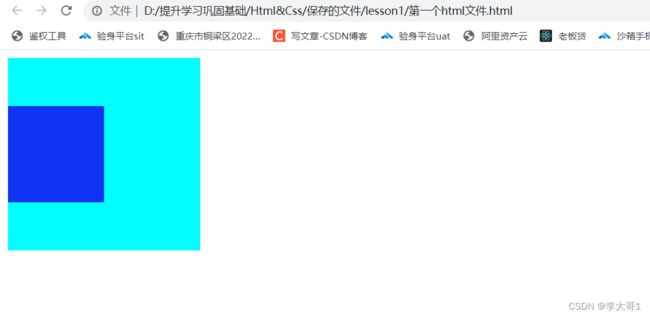
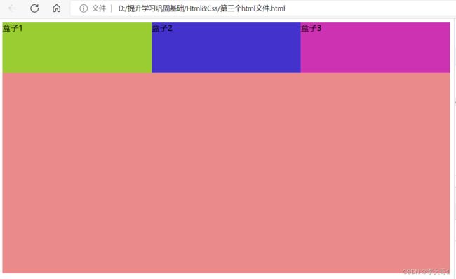
3.5 盒子模型
3.5.1 什么是盒子模型
所有的html元素都可以看作是一个盒子
盒子的组成:
content 盒子的内容;
padding 盒子的内边距,内容和边框之间的距离;
border 盒子的边框指的是边框的宽度;
margin 盒子的外边距,最外界和边框的距离;
盒子的大小:设置内边距
< ! DOCTYPE html>
< html>
< head>
< meta charset = "utf-8" >
< meta name = "keywords" content = "test,test1" >
< meta name = "description" content = "这个练习使用的标签" >
< style>
div {
/* 设置背景颜色 */
background-color: aqua;
/* 设置内边距一种方式*/
/* padding-left: 50px;
padding-right: 50px;
padding-top: 60px;
padding-bottom: 60px; */
/* 设置边距的第二种方式 顺时针方式 上 左 下 右*/
/* padding: 10px 20px 30px 40px; */
/* 设置边距的第三种方式 上下 左右*/
/* padding: 10px 20px; */
/* 设置边距的第四种方式 上 左右 下*/
/* padding: 10px 20px 10px; */
/* 设置边距的第五种方式 */
padding: 60px;
}
< /style>
< /head>
< body>
< div>
朱自清
< /div>
< /body>
< /html>
设置边框
< ! DOCTYPE html>
< html>
< head>
< meta charset = "utf-8" >
< meta name = "keywords" content = "test,test1" >
< meta name = "description" content = "这个练习使用的标签" >
< style>
div {
/* 设置背景颜色 */
background-color: aqua;
/* 设置边框一种方式*/
/* border-left: 50px solid rgb( 226 , 9 , 63 ) ;
border-right: 50px solid rgb( 226 , 9 , 63 ) ;
border-top: 60px solid rgb( 226 , 9 , 63 ) ;
border-bottom: 60px solid rgb( 226 , 9 , 63 ) ; */
/* 设置边框的第二种方式 */
border: 60px solid rgb( 226 , 9 , 63 ) ;
}
< /style>
< /head>
< body>
< div>
朱自清
< /div>
< /body>
< /html>
设置外边距
< ! DOCTYPE html>
< html>
< head>
< meta charset = "utf-8" >
< meta name = "keywords" content = "test,test1" >
< meta name = "description" content = "这个练习使用的标签" >
< style>
div {
/* 设置背景颜色 */
background-color: aqua;
/* 设置外边距一种方式*/
/* margin-left: 50px;
margin-right: 50px;
margin-top: 60px;
margin-bottom: 60px; */
/* 设置外边距的第二种方式 顺时针方式 上 左 下 右*/
/* margin: 10px 20px 30px 40px; */
/* 设置外边距的第三种方式 上下 左右*/
/* margin: 10px 20px; */
/* 设置外边距的第四种方式 上 左右 下*/
/* margin: 10px 20px 10px; */
/* 设置外边距的第五种方式 */
margin: 60px;
}
< /style>
< /head>
< body>
< div>
朱自清
< /div>
< /body>
< /html>
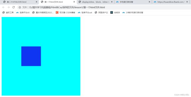
3.5.2 怪异盒子模型
标准盒子模型’:采用的W3C标准,盒子的width宽度和height高度的content内容决定,添加padding内边距或border外边框后,宽高都会进行相应增长;
怪异盒模型也称为IE盒模型,是IE浏览器设计元素时遵循的规则。怪异盒模型的宽高在div盒子初次设置时就已经规定,添加padding或者border,会从中减少content内容的占据区域,来为padding和border制造空间,宽高不会相对应的进行增长。
标准盒子和怪异盒子的转换
box-sizing:content-box; 盒模型设置为w3c标准盒子模型
box-sizing:border-box; 盒模型设置为怪异(IE)盒子模型
< ! DOCTYPE html>
< html>
< head>
< meta charset = "utf-8" >
< meta name = "keywords" content = "test,test1" >
< meta name = "description" content = "这个练习使用的标签" >
< style>
div.abc {
/* 设置背景颜色 */
background-color: aqua;
padding: 60px;
border: 70px;
margin: 80px;
}
.ibox1 {
background-color: rgb( 255 , 166 , 0 ) ;
padding: 60px;
border: 70px;
margin: 200px;
box-sizing: content-box
}
.ibox2 {
background-color: rgb( 89 , 0 , 255 ) ;
padding: 60px;
border: 70px;
margin: 80px;
box-sizing: border-box
}
< /style>
< /head>
< body>
< div class = "abc" >
< div class = "ibox1" > 小曾< /div>
< div class = "ibox2" > 小李< /div>
< /div>
< /body>
< /html>
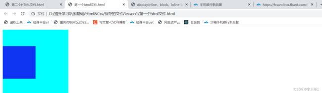
3.5.3 外边距重叠
3.5.3.1外边距重叠演示
什么是外边距重叠 :外边距重叠又叫外边距塌陷,设置外边距时,两条垂直的外边距重合,外边距的长度取两条重合的外边距长的外边距(外边距取长的,两边都为负取小的,一正一负相加)代码演示外边距重叠1
< ! DOCTYPE html>
< html>
< head>
< meta charset = "utf-8" >
< meta name = "keywords" content = "test,test1" >
< meta name = "description" content = "这个练习使用的标签" >
< style>
background-color: aqua;
width: 200px;
height: 200px;
}
background-color: rgb( 16 , 53 , 242 ) ;
width: 100px;
height: 100px;
}
< /style>
< /head>
< body>
< div id = "first" >
< div id = "two" > < /div>
< /div>
< /body>
< /html>
代码演示外边距重叠2
给子盒子增加外边距50px可以看到父盒子和子盒子同时下移了50px,实际上是我需要的是父盒子不移动,子盒子下移50px;代码:
< ! DOCTYPE html>
< html>
< head>
< meta charset = "utf-8" >
< meta name = "keywords" content = "test,test1" >
< meta name = "description" content = "这个练习使用的标签" >
< style>
background-color: aqua;
width: 200px;
height: 200px;
}
background-color: rgb( 16 , 53 , 242 ) ;
width: 100px;
height: 100px;
margin-top: 50px;
}
< /style>
< /head>
< body>
< div id = "first" >
< div id = "two" > < /div>
< /div>
< /body>
< /html>
3.5.3.2 解决方法
< ! DOCTYPE html>
< html>
< head>
< meta charset = "utf-8" >
< meta name = "keywords" content = "test,test1" >
< meta name = "description" content = "这个练习使用的标签" >
< style>
background-color: aqua;
width: 200px;
height: 200px;
}
background-color: rgb( 16 , 53 , 242 ) ;
width: 100px;
height: 100px;
margin-top: 50px;
display: inline-block;
}
< /style>
< /head>
< body>
< div id = "first" >
< div id = "two" > < /div>
< /div>
< /body>
< /html>
< ! DOCTYPE html>
< html>
< head>
< meta charset = "utf-8" >
< meta name = "keywords" content = "test,test1" >
< meta name = "description" content = "这个练习使用的标签" >
< style>
background-color: aqua;
width: 200px;
height: 200px;
border: 50px solid transparent;
}
background-color: rgb( 16 , 53 , 242 ) ;
width: 100px;
height: 100px;
margin-top: 50px;
}
< /style>
< /head>
< body>
< div id = "first" >
< div id = "two" > < /div>
< /div>
< /body>
< /html>
< ! DOCTYPE html>
< html>
< head>
< meta charset = "utf-8" >
< meta name = "keywords" content = "test,test1" >
< meta name = "description" content = "这个练习使用的标签" >
< style>
background-color: aqua;
width: 200px;
height: 200px;
padding: 100px;
}
background-color: rgb( 16 , 53 , 242 ) ;
width: 100px;
height: 100px;
margin-top: 50px;
}
< /style>
< /head>
< body>
< div id = "first" >
< div id = "two" > < /div>
< /div>
< /body>
< /html>
第四种方法:给父元素加上overflow:hidden
< ! DOCTYPE html>
< html>
< head>
< meta charset = "utf-8" >
< meta name = "keywords" content = "test,test1" >
< meta name = "description" content = "这个练习使用的标签" >
< style>
background-color: aqua;
width: 200px;
height: 200px;
overflow: hidden;
}
background-color: rgb( 16 , 53 , 242 ) ;
width: 100px;
height: 100px;
margin-top: 50px;
}
< /style>
< /head>
< body>
< div id = "first" >
< div id = "two" > < /div>
< /div>
< /body>
< /html>
< ! DOCTYPE html>
< html>
< head>
< meta charset = "utf-8" >
< meta name = "keywords" content = "test,test1" >
< meta name = "description" content = "这个练习使用的标签" >
< style>
background-color: aqua;
width: 200px;
height: 200px;
overflow: hidden;
}
background-color: rgb( 16 , 53 , 242 ) ;
width: 100px;
height: 100px;
margin-top: 50px;
position: relative;
}
< /style>
< /head>
< body>
< div id = "first" >
< div id = "two" > < /div>
< /div>
< /body>
< /html>
< ! DOCTYPE html>
< html>
< head>
< meta charset = "utf-8" >
< meta name = "keywords" content = "test,test1" >
< meta name = "description" content = "这个练习使用的标签" >
< style>
background-color: aqua;
width: 200px;
height: 200px;
overflow: hidden;
}
display: table;
content: "" ;
}
background-color: rgb( 16 , 53 , 242 ) ;
width: 100px;
height: 100px;
margin-top: 50px;
}
< /style>
< /head>
< body>
< div id = "first" >
< div id = "two" > < /div>
< /div>
< /body>
< /html>
3.6 CSS的常用属性
3.6.1 文字属性
font-size 文字的大小;
font-weight 加粗,常用值bold、bolder、normal或者设置参数值100-900;
font-family 设置字体;
font-style 设置斜体,italic、oblique、normal;
text-align设置水平对齐方式:
center 居中;
left 居左;
right 居右;
justify 两端对齐
text-decoration 文字修饰 underline下划线,overline上划线,line-thought删除线;
text-spacing 字间距;
text-transform 大小写转换:
capitalize 首字母大写;
lowercase 小写;
uppercase 大写;
text-indent 首行缩进;
line-weight 行高;
font 缩写 font-style,font-weight,font-size/line-weight font-family
< ! DOCTYPE html>
< html>
< head>
< meta charset = "utf-8" >
< meta name = "keywords" content = "test,test1" >
< meta name = "description" content = "这个练习使用的标签" >
< style>
font-size: larger;
font-family: 'Courier New' , Courier, monospace;
color: rgb( 240 , 11 , 11 ) ;
font-style: oblique;
font-weight: 600 ;
text-align: justify;
text-decoration: underline;
text-transform: capitalize;
text-indent: 2em;
letter-spacing: 0cm;
}
< /style>
< /head>
< body>
< div id = "first" >
adc燕子去了,有再来的时候;杨柳枯了,有再青的时候;桃花谢了,有再开的时候。但是,聪明的,你告诉我,我们的日子为什么一去不复返呢?——是有人偷了他们罢:那是谁?又藏在何处呢?是他们自己逃走了罢:如今(现在 [ 2 ] )又到了哪里呢? [ 3 ] 我不知道他们给了我多少日子,但我的手确乎(1)是渐渐空虚(2)了。在默默里算着,八千多日子已经从我手中溜去,像针尖上一滴水滴在大海里,我的日子滴在时间的流里,没有声音,也没有影子。我不禁头涔涔(3)而泪潸潸(4)了。 去的尽管去了,来的尽管来着;去来的中间,又怎样地匆匆呢?早上我起来的时候,小屋里射进两三方斜斜的太阳。太阳他有脚啊,轻轻悄悄地挪移了;我也茫茫然跟着旋转。于是——洗手的时候,日子从水盆里过去;吃饭的时候,日子从饭碗里过去;默默时,便从凝然的双眼前过去。我觉察他去的匆匆了,伸出手遮挽时,他又从遮挽着的手边过去,天黑时,我躺在床上,他便伶伶俐俐(5)地从我身上跨过,从我脚边飞去了。等我睁开眼和太阳再见,这算又溜走了一日。我掩着面叹息。但是新来的日子的影儿又开始在叹息里闪过了。
在逃去如飞的日子里,在千门万户的世界里的我能做些什么呢?只有徘徊(6)罢了(7),只有匆匆罢了;在八千多日的匆匆里,除徘徊外,又剩些什么呢?过去的日子如轻烟,被微风吹散了,如薄雾,被初阳蒸融了;我留着些什么痕迹呢?我何曾留着像游丝(8)样的痕迹呢?我赤裸裸来到这世界,转眼间也将赤裸裸的回去罢?但不能平的,为什么偏要白白走这一遭啊? 你聪明的,告诉我,我们的日子为什么一去不复返呢? [ 4 -5]
< /div>
< /body>
< /html>
3.6.2 CSS的列表属性
list-style-type 列表的标记:dis实心圆;circle空心圆;square正方体;none去除标记;
list-style-image 以图片为列表标记,格式list-style-image:url();
list-style-position:outside 项目标记在项目外;
list-style-position:inside 项目标记在项目内;示例:
< ! DOCTYPE html>
< html>
< head>
< meta charset = "utf-8" >
< meta name = "keywords" content = "test,test1" >
< meta name = "description" content = "这个练习使用的标签" >
< style>
/* 列表项是石心圆 */
ul.test1 {
list-style-type: disc;
}
/* 列表项是空心圆 */
ul.test2 {
list-style-type: circle;
}
/* 列表项是正方形 */
ul.test3 {
list-style-type: square;
}
/*无列表项 */
ul.test4 {
list-style-type: none;
}
/*列表项标记在表格外*/
ul.test5 {
list-style-position: outside;
}
/*列表项标记在表格内*/
ul.test6 {
list-style-position: inside;
}
/*列表项标记在表格内*/
ul.test7 {
list-style-image: url( https://photo.16pic.com/00/13/41/16pic_1341625_b.jpg) ;
}
< /style>
< /head>
< body>
< ul class = "test1" >
< li> 小王< /li>
< li> 小明< /li>
< li> 小红< /li>
< /ul>
< ul class = "test2" >
< li> 小王< /li>
< li> 小明< /li>
< li> 小红< /li>
< /ul>
< ul class = "test3" >
< li> 小王< /li>
< li> 小明< /li>
< li> 小红< /li>
< /ul>
< ul class = "test4" >
< li> 小王< /li>
< li> 小明< /li>
< li> 小红< /li>
< /ul>
< ul class = "test5" >
< li> 小王< /li>
< li> 小明< /li>
< li> 小红< /li>
< /ul>
< ul class = "test6" >
< li> 小王< /li>
< li> 小明< /li>
< li> 小红< /li>
< /ul>
< ul class = "test7" >
< li> 小王< /li>
< li> 小明< /li>
< li> 小红< /li>
< /ul>
< /body>
< /html>
3.6.3 背景属性
background-color 背景颜色;
background-repeat 背景平铺;
参数值:
repeat 图片平铺;
no-repeat 图片不平铺;
repeat-x 图片沿着x轴平铺;
repeat-y 图片沿着y轴平铺;
background-image
background-position
参数值:
精确数值定位x轴 y轴第一个数值为 x 第二个数值为y的坐标,如果只有一个数值第一个是x的坐标,第二个为默认居中对齐;
方位值:top bouttom right left center;
数值和方位混合使用 第一个值x的坐标,第二个值为y坐标;
background-attachment 背景图像固定
fixed 背景图像固定不会随着内容;
scroll 背景图像随着内容一起滑动;
简写: background:图像背景颜色,图像背景地址,图像铺平,图像固定,图像位置;
< ! DOCTYPE html>
< html>
< head>
< meta charset = "UTF-8" >
< meta name = "key" content = "测试 测试1" >
< meta name = "description" content = "测试网页" >
< style>
div.test1 {
background-color: rgba( 0 , 0 , 0 , 0.5 ) ;
;
padding: 500px;
margin: 500px;
background-image: url( 'https://img0.baidu.com/it/u=1692311172,2998053149&fm=253&fmt=auto&app=138&f=JPEG?w=752&h=500' ) ;
background-repeat: no-repeat;
background-position: center;
background-attachment: fixed;
}
< /style>
< /head>
< body>
< div class = "test1" >
< /div>
< /body>
< /html>
3.6.4 css层叠和选择器优先级
3.6.4.1 css层叠
css层叠:一个属性被多次定义的时候,会根据优先级和定义的顺序来计算使用什么样式。
< ! DOCTYPE html>
< html>
< head>
< meta charset = "UTF-8" >
< meta name = "key" content = "测试 测试1" >
< meta name = "description" content = "测试网页" >
< style>
.test1 {
padding: 100px;
background-color: rgba( 0 , 0 , 0 , 0.5 ) ;
}
.test1 {
padding: 100px;
background-color: rgba( 241 , 20 , 20 , 0.5 ) ;
}
< /style>
< /head>
< body>
< div class = "test1" >
< p> 测试测试< /p>
< /div>
< /body>
< /html>
3.6.4.2 css选择器的优先级
选择器顺序高低(从高到底)
!important 最高级,一般不使用;
行内样式;
id选择器;
类选择器;
标签选择器;
通配符选择器;
代码是按照从上到下执行
DOCTYPE html > < htmllang = " en" > < head> < metacharset = " UTF-8" > < title> title > < style>
* {
color : red;
}
p {
color : black !important ;
}
.test {
color : green;
}
id选择器
#002 {
color : palegoldenrod;
}
style > head > < body> < pclass = " test" id = " 002" style = " color : lightcoral" > p > body > html > 3.6.5 css的可继承的属性
什么是继承:是继承父类的属性,简化代码,利于维护;
常继承的属性
DOCTYPE html > < htmllang = " en" > < head> < metacharset = " UTF-8" > < title> title > < style>
div.accordion002 {
color : palegoldenrod;
font-family : Calibri;
font-size : 100px;
font-weight : bolder;
font-style : italic;
text-align : justify;
text-decoration : underline;
text-ident : 20px;
text-spece : 20px;
text-transform : capitalize;
}
style > head > < body> < divclass = " accordion002" > < div> < div> div > div > div > body > html > 3.7 CSS 布局
3.7.1 CSS布局的前置知识
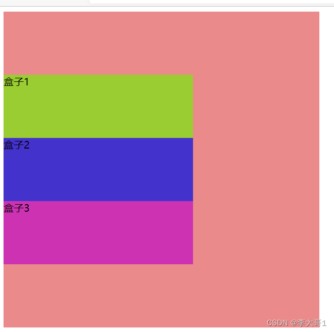
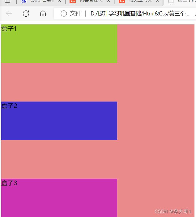
块级元素的宽度和父级元素的宽度相同,其高度由内容决定;
行内元素的高度和宽度都由内容决定,不能设置高度和宽度,但是可以加上属性display:‘‘bloack’’ ;
什么是文档流:块级元素占一行按照窗口按照顺序从上到下排列,行内元素按照从左往右的方式排列,一行满后自动换行;
什么是行内块级元素:拥有行内元素和块级元素的特性,不换行但是可以设置宽度;
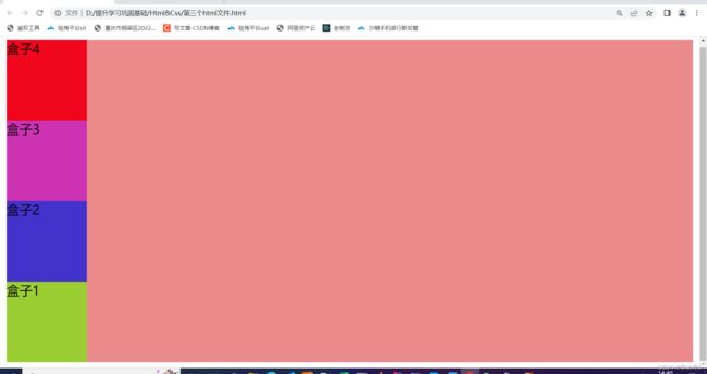
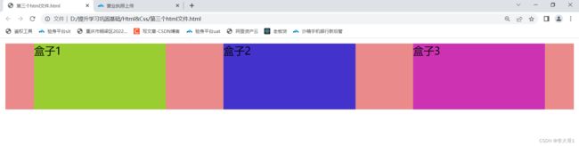
3.7.2 folat 布局
3.7.2.1 folat格式
float: none; //默认值,元素不浮动
float: left; //元素像左浮动
float: right; //元素像右浮动
3.7.2.2 特点
特点一:浮动的元素的不会占用文档流;
特点二:浮动的元素会按照从左到右依次排列;
DOCTYPE html > < html> < head> < metacharset = " utf-8" > < metaname = " keywords" content = " test,test1" > < metaname = " description" content = " 这个练习使用的标签" > < style>
div.test1 {
background : green;
width : 100px;
height : 100px;
float : left;
}
div.test2 {
background : red;
width : 200px;
height : 200px;
}
div.test4 {
background : red;
width : 600px;
height : 200px;
float : left;
}
div.test5 {
background : red;
width : 600px;
height : 200px;
float : left;
}
div.test6 {
background : red;
width : 600px;
height : 200px;
float : left;
}
style > head > < body> < p> < p> < divclass = " test1" > div > < divclass = " test2" > div > < p> < p> < divclass = " test4" > div > < divclass = " test5" > div > < divclass = " test6" > div > body > html >
特点三:前面的元素的不为浮动元素,浮动元素无法上移;
特点四:块级元素和行内元素被浮动属性修饰后,会变成块级元素;
DOCTYPE html > < html> < head> < metacharset = " utf-8" > < metaname = " keywords" content = " test,test1" > < metaname = " description" content = " 这个练习使用的标签" > < style>
div.test1 {
background : green;
width : 100px;
height : 100px;
}
div.test2 {
background : red;
width : 200px;
height : 200px;
float : left;
}
spn.test3 {
width : 300px;
height : 300px;
float : left;
background : greenyellow;
}
style > head > < body> < p> < p> < divclass = " test1" > div > < divclass = " test2" > div > < p> < p> < spnclass = " test3" > spn > body > html >
DOCTYPE html > < html> < head> < metacharset = " utf-8" > < metaname = " keywords" content = " test,test1" > < metaname = " description" content = " 这个练习使用的标签" > < style>
div.test1 {
background : green;
width : 100px;
height : 100px;
float : left;
}
style > head > < body> < p> < p> < divclass = " test1" > div > < spn> spn > body > html >
3.7.2.3 清除float浮动
为什么要清理float浮动布局:高度坍塌(拥有多级层级标记,父元素的高度自适应,没有设置高度,子元素浮动,浮动标签不占用文档流,就会导致父标签被压缩成一条线);示例:高度坍塌
DOCTYPE html > < html> < head> < metacharset = " UTF-8" > < metaname = " key" content = " 测试 测试1" > < metaname = " description" content = " 测试网页" > < style>
.test1 {
background-color : rgba ( 0, 0, 0, 0.5) ;
border : 10px solid red;
}
.test2 {
width : 100px;
height : 100px;
background : yellowgreen;
float : left;
style > head > < body> < divclass = " test1" > < divclass = " test2" > div > div > body > html >
clear:"both";
display:"block";
content:"";
DOCTYPE html > < html> < head> < metacharset = " UTF-8" > < metaname = " key" content = " 测试 测试1" > < metaname = " description" content = " 测试网页" > < style>
.test1 {
background-color : rgba ( 0, 0, 0, 0.5) ;
border : 10px solid red;
}
.test2 {
width : 100px;
height : 100px;
background : yellowgreen;
float : left;
}
.test1::after {
content : "" ;
display : block;
clear : both;
}
style > head > < body> < divclass = " test1" > < divclass = " test2" > div > div > body > html > 3.7.2 flex布局
3.7.2.1 flex的基本概念
flex全称是flexible box 是弹性布局;
使用flex的元素的标签,被称为flex容器(flex container ),flex容器下的子元素是称为flex的项目;
声明方式:
块级元素的声明flex
display:flex;
行内块级元素声明flex
display:online-flex;
使用webkit内核浏览器声明flex
在flex容器中存在着一条水平轴(main axis)和交叉轴(cross axis) 水平轴和边框的交点起始位置称为main start 结束位置称为main end,交叉轴和边框的交叉点成为起始位置cross start 结束位置cross end ,按照水平轴排列的项目称为main size,按照交叉轴排列的顺序为cross size。
3.7.2.2 容器的属性
3.7.2.2.1 flex-dirtection:项目在轴的排列方式
DOCTYPE html > < html> < head> < metacharset = " UTF-8" > < metaname = " key" content = " 测试 测试1" > < metaname = " description" content = " 测试网页" > < style>
.test {
background-color : rgba ( 213, 21, 21, 0.5) ;
display : flex;
flex-direction : row;
}
.test1 {
width : 100px;
height : 100px;
background : yellowgreen;
}
.test2 {
width : 100px;
height : 100px;
background : rgb ( 68, 50, 205) ;
}
.test3 {
width : 100px;
height : 100px;
background : rgb ( 205, 50, 179) ;
}
.test4 {
width : 100px;
height : 100px;
background : rgb ( 240, 6, 29) ;
}
style > head > < body> < divclass = " test" > < divclass = " test1" > div > < divclass = " test2" > div > < divclass = " test3" > div > < divclass = " test4" > div > div > body > html >
row-reverse按照水平轴的方向从右往左排列;
DOCTYPE html > < html> < head> < metacharset = " UTF-8" > < metaname = " key" content = " 测试 测试1" > < metaname = " description" content = " 测试网页" > < style>
.test {
background-color : rgba ( 213, 21, 21, 0.5) ;
display : flex;
flex-direction : row-reverse;
}
.test1 {
width : 100px;
height : 100px;
background : yellowgreen;
}
.test2 {
width : 100px;
height : 100px;
background : rgb ( 68, 50, 205) ;
}
.test3 {
width : 100px;
height : 100px;
background : rgb ( 205, 50, 179) ;
}
.test4 {
width : 100px;
height : 100px;
background : rgb ( 240, 6, 29) ;
}
style > head > < body> < divclass = " test" > < divclass = " test1" > div > < divclass = " test2" > div > < divclass = " test3" > div > < divclass = " test4" > div > div > body > html >
DOCTYPE html > < html> < head> < metacharset = " UTF-8" > < metaname = " key" content = " 测试 测试1" > < metaname = " description" content = " 测试网页" > < style>
.test {
background-color : rgba ( 213, 21, 21, 0.5) ;
display : flex;
flex-direction : column;
}
.test1 {
width : 100px;
height : 100px;
background : yellowgreen;
}
.test2 {
width : 100px;
height : 100px;
background : rgb ( 68, 50, 205) ;
}
.test3 {
width : 100px;
height : 100px;
background : rgb ( 205, 50, 179) ;
}
.test4 {
width : 100px;
height : 100px;
background : rgb ( 240, 6, 29) ;
}
style > head > < body> < divclass = " test" > < divclass = " test1" > div > < divclass = " test2" > div > < divclass = " test3" > div > < divclass = " test4" > div > div > body > html >
colum-resever 按照交叉轴的方向从下到上排列;
DOCTYPE html > < html> < head> < metacharset = " UTF-8" > < metaname = " key" content = " 测试 测试1" > < metaname = " description" content = " 测试网页" > < style>
.test {
background-color : rgba ( 213, 21, 21, 0.5) ;
display : flex;
flex-direction : column-reverse;
}
.test1 {
width : 100px;
height : 100px;
background : yellowgreen;
}
.test2 {
width : 100px;
height : 100px;
background : rgb ( 68, 50, 205) ;
}
.test3 {
width : 100px;
height : 100px;
background : rgb ( 205, 50, 179) ;
}
.test4 {
width : 100px;
height : 100px;
background : rgb ( 240, 6, 29) ;
}
style > head > < body> < divclass = " test" > < divclass = " test1" > div > < divclass = " test2" > div > < divclass = " test3" > div > < divclass = " test4" > div > div > body > html >
3.7.2.2.2 flex-wrap 项目在水平轴上的一行,排列不下的换行方式
DOCTYPE html > < html> < head> < metacharset = " UTF-8" > < metaname = " key" content = " 测试 测试1" > < metaname = " description" content = " 测试网页" > < style>
.test {
background-color : rgba ( 213, 21, 21, 0.5) ;
display : flex;
flex-wrap : nowrap;
}
.test1 {
width : 200px;
height : 100px;
background : yellowgreen;
}
.test2 {
width : 200px;
height : 100px;
background : rgb ( 68, 50, 205) ;
}
.test3 {
width : 200px;
height : 100px;
background : rgb ( 205, 50, 179) ;
}
.test4 {
width : 200px;
height : 100px;
background : rgb ( 240, 6, 29) ;
}
.test5 {
width : 200px;
height : 100px;
background : rgb ( 19, 218, 122) ;
}
.test6 {
width : 200px;
height : 100px;
background : rgb ( 240, 6, 29) ;
}
.test7 {
width : 200px;
height : 100px;
background : rgb ( 129, 12, 145) ;
}
.test8 {
width : 200px;
height : 100px;
background : rgb ( 240, 6, 68) ;
}
style > head > < body> < divclass = " test" > < divclass = " test1" > div > < divclass = " test2" > div > < divclass = " test3" > div > < divclass = " test4" > div > < divclass = " test5" > div > < divclass = " test6" > div > < divclass = " test7" > div > < divclass = " test8" > div > div > body > html >
DOCTYPE html > < html> < head> < metacharset = " UTF-8" > < metaname = " key" content = " 测试 测试1" > < metaname = " description" content = " 测试网页" > < style>
.test {
background-color : rgba ( 213, 21, 21, 0.5) ;
display : flex;
flex-wrap : wrap;
}
.test1 {
width : 200px;
height : 100px;
background : yellowgreen;
}
.test2 {
width : 200px;
height : 100px;
background : rgb ( 68, 50, 205) ;
}
.test3 {
width : 200px;
height : 100px;
background : rgb ( 205, 50, 179) ;
}
.test4 {
width : 200px;
height : 100px;
background : rgb ( 240, 6, 29) ;
}
.test5 {
width : 200px;
height : 100px;
background : rgb ( 19, 218, 122) ;
}
.test6 {
width : 200px;
height : 100px;
background : rgb ( 240, 6, 29) ;
}
.test7 {
width : 200px;
height : 100px;
background : rgb ( 129, 12, 145) ;
}
.test8 {
width : 200px;
height : 100px;
background : rgb ( 240, 6, 68) ;
}
style > head > < body> < divclass = " test" > < divclass = " test1" > div > < divclass = " test2" > div > < divclass = " test3" > div > < divclass = " test4" > div > < divclass = " test5" > div > < divclass = " test6" > div > < divclass = " test7" > div > < divclass = " test8" > div > div > body > html >
DOCTYPE html > < html> < head> < metacharset = " UTF-8" > < metaname = " key" content = " 测试 测试1" > < metaname = " description" content = " 测试网页" > < style>
.test {
background-color : rgba ( 213, 21, 21, 0.5) ;
display : flex;
flex-wrap : wrap-reverse;
}
.test1 {
width : 200px;
height : 100px;
background : yellowgreen;
}
.test2 {
width : 200px;
height : 100px;
background : rgb ( 68, 50, 205) ;
}
.test3 {
width : 200px;
height : 100px;
background : rgb ( 205, 50, 179) ;
}
.test4 {
width : 200px;
height : 100px;
background : rgb ( 240, 6, 29) ;
}
.test5 {
width : 200px;
height : 100px;
background : rgb ( 19, 218, 122) ;
}
.test6 {
width : 200px;
height : 100px;
background : rgb ( 240, 6, 29) ;
}
.test7 {
width : 200px;
height : 100px;
background : rgb ( 129, 12, 145) ;
}
.test8 {
width : 200px;
height : 100px;
background : rgb ( 240, 6, 68) ;
}
style > head > < body> < divclass = " test" > < divclass = " test1" > div > < divclass = " test2" > div > < divclass = " test3" > div > < divclass = " test4" > div > < divclass = " test5" > div > < divclass = " test6" > div > < divclass = " test7" > div > < divclass = " test8" > div > div > body > html >
3.7.2.2.3 justify-content 水平轴的对齐方式
DOCTYPE html > < html> < head> < metacharset = " UTF-8" > < metaname = " key" content = " 测试 测试1" > < metaname = " description" content = " 测试网页" > < style>
.test {
background-color : rgba ( 213, 21, 21, 0.5) ;
display : flex;
justify-content : flex-start;
}
.test1 {
width : 200px;
height : 100px;
background : yellowgreen;
}
.test2 {
width : 200px;
height : 100px;
background : rgb ( 68, 50, 205) ;
}
.test3 {
width : 200px;
height : 100px;
background : rgb ( 205, 50, 179) ;
}
style > head > < body> < divclass = " test" > < divclass = " test1" > div > < divclass = " test2" > div > < divclass = " test3" > div > div > body > html >
DOCTYPE html > < html> < head> < metacharset = " UTF-8" > < metaname = " key" content = " 测试 测试1" > < metaname = " description" content = " 测试网页" > < style>
.test {
background-color : rgba ( 213, 21, 21, 0.5) ;
display : flex;
justify-content : flex-end;
}
.test1 {
width : 200px;
height : 100px;
background : yellowgreen;
}
.test2 {
width : 200px;
height : 100px;
background : rgb ( 68, 50, 205) ;
}
.test3 {
width : 200px;
height : 100px;
background : rgb ( 205, 50, 179) ;
}
style > head > < body> < divclass = " test" > < divclass = " test1" > div > < divclass = " test2" > div > < divclass = " test3" > div > div > body > html >
DOCTYPE html > < html> < head> < metacharset = " UTF-8" > < metaname = " key" content = " 测试 测试1" > < metaname = " description" content = " 测试网页" > < style>
.test {
background-color : rgba ( 213, 21, 21, 0.5) ;
display : flex;
justify-content : center;
}
.test1 {
width : 200px;
height : 100px;
background : yellowgreen;
}
.test2 {
width : 200px;
height : 100px;
background : rgb ( 68, 50, 205) ;
}
.test3 {
width : 200px;
height : 100px;
background : rgb ( 205, 50, 179) ;
}
style > head > < body> < divclass = " test" > < divclass = " test1" > div > < divclass = " test2" > div > < divclass = " test3" > div > div > body > html >
DOCTYPE html > < html> < head> < metacharset = " UTF-8" > < metaname = " key" content = " 测试 测试1" > < metaname = " description" content = " 测试网页" > < style>
.test {
background-color : rgba ( 213, 21, 21, 0.5) ;
display : flex;
justify-content : space-between;
}
.test1 {
width : 200px;
height : 100px;
background : yellowgreen;
}
.test2 {
width : 200px;
height : 100px;
background : rgb ( 68, 50, 205) ;
}
.test3 {
width : 200px;
height : 100px;
background : rgb ( 205, 50, 179) ;
}
style > head > < body> < divclass = " test" > < divclass = " test1" > div > < divclass = " test2" > div > < divclass = " test3" > div > div > body > html >
space-around 项目之间的间隔相等,项目之间的间隔是边框的2倍;
DOCTYPE html > < html> < head> < metacharset = " UTF-8" > < metaname = " key" content = " 测试 测试1" > < metaname = " description" content = " 测试网页" > < style>
.test {
background-color : rgba ( 213, 21, 21, 0.5) ;
display : flex;
justify-content : space-around;
}
.test1 {
width : 200px;
height : 100px;
background : yellowgreen;
}
.test2 {
width : 200px;
height : 100px;
background : rgb ( 68, 50, 205) ;
}
.test3 {
width : 200px;
height : 100px;
background : rgb ( 205, 50, 179) ;
}
style > head > < body> < divclass = " test" > < divclass = " test1" > div > < divclass = " test2" > div > < divclass = " test3" > div > div > body > html >
3.7.2.2.4 align-items 交叉轴的对齐方式;
DOCTYPE html > < html> < head> < metacharset = " UTF-8" > < metaname = " key" content = " 测试 测试1" > < metaname = " description" content = " 测试网页" > < style>
.test {
background-color : rgba ( 213, 21, 21, 0.5) ;
width : 800px;
height : 800px;
display : flex;
align-items : flex-start;
}
.test1 {
width : 200px;
height : 100px;
background : yellowgreen;
}
.test2 {
width : 200px;
height : 100px;
background : rgb ( 68, 50, 205) ;
}
.test3 {
width : 200px;
height : 100px;
background : rgb ( 205, 50, 179) ;
}
style > head > < body> < divclass = " test" > < divclass = " test1" > div > < divclass = " test2" > div > < divclass = " test3" > div > div > body > html >
DOCTYPE html > < html> < head> < metacharset = " UTF-8" > < metaname = " key" content = " 测试 测试1" > < metaname = " description" content = " 测试网页" > < style>
.test {
background-color : rgba ( 213, 21, 21, 0.5) ;
width : 800px;
height : 800px;
display : flex;
align-items : flex-end;
}
.test1 {
width : 200px;
height : 100px;
background : yellowgreen;
}
.test2 {
width : 200px;
height : 100px;
background : rgb ( 68, 50, 205) ;
}
.test3 {
width : 200px;
height : 100px;
background : rgb ( 205, 50, 179) ;
}
style > head > < body> < divclass = " test" > < divclass = " test1" > div > < divclass = " test2" > div > < divclass = " test3" > div > div > body > html >
DOCTYPE html > < html> < head> < metacharset = " UTF-8" > < metaname = " key" content = " 测试 测试1" > < metaname = " description" content = " 测试网页" > < style>
.test {
background-color : rgba ( 213, 21, 21, 0.5) ;
width : 800px;
height : 800px;
display : flex;
align-items : center;
}
.test1 {
width : 200px;
height : 100px;
background : yellowgreen;
}
.test2 {
width : 200px;
height : 100px;
background : rgb ( 68, 50, 205) ;
}
.test3 {
width : 200px;
height : 100px;
background : rgb ( 205, 50, 179) ;
}
style > head > < body> < divclass = " test" > < divclass = " test1" > div > < divclass = " test2" > div > < divclass = " test3" > div > div > body > html >
baseline 按照文档流基准线排列
DOCTYPE html > < html> < head> < metacharset = " UTF-8" > < metaname = " key" content = " 测试 测试1" > < metaname = " description" content = " 测试网页" > < style>
.test {
background-color : rgba ( 213, 21, 21, 0.5) ;
width : 800px;
height : 800px;
display : flex;
align-items : baseline;
}
.test1 {
line-height : 50px;
width : 200px;
height : 100px;
background : yellowgreen;
}
.test2 {
width : 200px;
height : 100px;
background : rgb ( 68, 50, 205) ;
}
.test3 {
width : 200px;
height : 100px;
background : rgb ( 205, 50, 179) ;
}
style > head > < body> < divclass = " test" > < divclass = " test1" > div > < divclass = " test2" > div > < divclass = " test3" > div > div > body > html >
stretch 在项目没有设置高度的情况,子项目的高度会被拉伸到窗口一致;
DOCTYPE html > < html> < head> < metacharset = " UTF-8" > < metaname = " key" content = " 测试 测试1" > < metaname = " description" content = " 测试网页" > < style>
.test {
background-color : rgba ( 213, 21, 21, 0.5) ;
width : 800px;
height : 800px;
display : flex;
align-items : stretch;
}
.test1 {
width : 200px;
background : yellowgreen;
}
.test2 {
width : 200px;
height : 100px;
background : rgb ( 68, 50, 205) ;
}
.test3 {
width : 200px;
height : 100px;
background : rgb ( 205, 50, 179) ;
}
style > head > < body> < divclass = " test" > < divclass = " test1" > div > < divclass = " test2" > div > < divclass = " test3" > div > div > body > html >
3.7.2.2.5 align-content 用来设置在自由盒内各个项目的垂直排列方式;
必须在父元素上设置(只有多行才能展示效果):
display:flex;
flex-direction:row;
flex-wrap:wrap;
flex-start 去除项目因为换行的空白交叉轴的起点垂直排列;
DOCTYPE html > < html> < head> < metacharset = " UTF-8" > < metaname = " key" content = " 测试 测试1" > < metaname = " description" content = " 测试网页" > < style>
.test {
background-color : rgba ( 213, 21, 21, 0.5) ;
width : 500px;
height : 500px;
display : flex;
flex-direction : row;
flex-wrap : wrap;
align-content : flex-start;
}
.test1 {
width : 300px;
height : 100px;
background : yellowgreen;
}
.test2 {
width : 300px;
height : 100px;
background : rgb ( 68, 50, 205) ;
}
.test3 {
width : 300px;
height : 100px;
background : rgb ( 205, 50, 179) ;
}
style > head > < body> < divclass = " test" > < divclass = " test1" > div > < divclass = " test2" > div > < divclass = " test3" > div > div > body > html >
flex-end 去除项目之间的空白,以交叉轴终点垂直排列;
DOCTYPE html > < html> < head> < metacharset = " UTF-8" > < metaname = " key" content = " 测试 测试1" > < metaname = " description" content = " 测试网页" > < style>
.test {
background-color : rgba ( 213, 21, 21, 0.5) ;
width : 500px;
height : 500px;
display : flex;
flex-direction : row;
flex-wrap : wrap;
align-content : flex-end;
}
.test1 {
width : 300px;
height : 100px;
background : yellowgreen;
}
.test2 {
width : 300px;
height : 100px;
background : rgb ( 68, 50, 205) ;
}
.test3 {
width : 300px;
height : 100px;
background : rgb ( 205, 50, 179) ;
}
style > head > < body> < divclass = " test" > < divclass = " test1" > div > < divclass = " test2" > div > < divclass = " test3" > div > div > body > html >
DOCTYPE html > < html> < head> < metacharset = " UTF-8" > < metaname = " key" content = " 测试 测试1" > < metaname = " description" content = " 测试网页" > < style>
.test {
background-color : rgba ( 213, 21, 21, 0.5) ;
width : 500px;
height : 500px;
display : flex;
flex-direction : row;
flex-wrap : wrap;
align-content : center;
}
.test1 {
width : 300px;
height : 100px;
background : yellowgreen;
}
.test2 {
width : 300px;
height : 100px;
background : rgb ( 68, 50, 205) ;
}
.test3 {
width : 300px;
height : 100px;
background : rgb ( 205, 50, 179) ;
}
style > head > < body> < divclass = " test" > < divclass = " test1" > div > < divclass = " test2" > div > < divclass = " test3" > div > div > body > html >
space-around按照交叉轴垂直排列,项目之间的距离是是边框之间的距离的2倍;
DOCTYPE html > < html> < head> < metacharset = " UTF-8" > < metaname = " key" content = " 测试 测试1" > < metaname = " description" content = " 测试网页" > < style>
.test {
background-color : rgba ( 213, 21, 21, 0.5) ;
width : 500px;
height : 500px;
display : flex;
flex-direction : row;
flex-wrap : wrap;
align-content : space-around;
}
.test1 {
width : 300px;
height : 100px;
background : yellowgreen;
}
.test2 {
width : 300px;
height : 100px;
background : rgb ( 68, 50, 205) ;
}
.test3 {
width : 300px;
height : 100px;
background : rgb ( 205, 50, 179) ;
}
style > head > < body> < divclass = " test" > < divclass = " test1" > div > < divclass = " test2" > div > < divclass = " test3" > div > div > body > html >
DOCTYPE html > < html> < head> < metacharset = " UTF-8" > < metaname = " key" content = " 测试 测试1" > < metaname = " description" content = " 测试网页" > < style>
.test {
background-color : rgba ( 213, 21, 21, 0.5) ;
width : 500px;
height : 500px;
display : flex;
flex-direction : row;
flex-wrap : wrap;
align-content : space-between;
}
.test1 {
width : 300px;
height : 100px;
background : yellowgreen;
}
.test2 {
width : 300px;
height : 100px;
background : rgb ( 68, 50, 205) ;
}
.test3 {
width : 300px;
height : 100px;
background : rgb ( 205, 50, 179) ;
}
style > head > < body> < divclass = " test" > < divclass = " test1" > div > < divclass = " test2" > div > < divclass = " test3" > div > div > body > html >
Stretch 以交叉轴方向拉伸项目,向容器底部方向拉伸;
DOCTYPE html > < html> < head> < metacharset = " UTF-8" > < metaname = " key" content = " 测试 测试1" > < metaname = " description" content = " 测试网页" > < style>
.test {
background-color : rgba ( 213, 21, 21, 0.5) ;
width : 500px;
height : 500px;
display : flex;
flex-direction : row;
flex-wrap : wrap;
align-content : stretch;
}
.test1 {
background : yellowgreen;
}
.test2 {
background : rgb ( 68, 50, 205) ;
}
.test3 {
background : rgb ( 205, 50, 179) ;
}
style > head > < body> < divclass = " test" > < divclass = " test1" > div > < divclass = " test2" > div > < divclass = " test3" > div > div > body > html >
3.7.2.3 项目属性
3.7.2.3.1 order 项目的排列顺序,数值越小排列越靠前;
DOCTYPE html > < html> < head> < metacharset = " UTF-8" > < metaname = " key" content = " 测试 测试1" > < metaname = " description" content = " 测试网页" > < style>
.test {
background-color : rgba ( 213, 21, 21, 0.5) ;
width : 500px;
height : 500px;
display : flex;
flex-direction : row;
}
.test1 {
width : 300px;
height : 100px;
background : yellowgreen;
order : 2;
}
.test2 {
width : 300px;
height : 100px;
background : rgb ( 68, 50, 205) ;
order : 1;
}
.test3 {
width : 300px;
height : 100px;
background : rgb ( 205, 50, 179) ;
order : 0;
}
style > head > < body> < divclass = " test" > < divclass = " test1" > div > < divclass = " test2" > div > < divclass = " test3" > div > div > body > html >
3.7.2.3.2 flex-grow项目扩大至剩余的空间
0 默认,不扩大 ;1 扩大至2倍;
如果容器没有空间则不扩大;
DOCTYPE html > < html> < head> < metacharset = " UTF-8" > < metaname = " key" content = " 测试 测试1" > < metaname = " description" content = " 测试网页" > < style>
.test {
background-color : rgba ( 213, 21, 21, 0.5) ;
width : 500x;
height : 500px;
display : flex;
flex-direction : row;
}
.test1 {
width : 100px;
height : 100px;
background : yellowgreen;
flex-grow : 1;
}
.test2 {
width : 100px;
height : 100px;
background : rgb ( 68, 50, 205) ;
}
.test3 {
width : 100px;
height : 100px;
background : rgb ( 205, 50, 179) ;
}
style > head > < body> < divclass = " test" > < divclass = " test1" > div > < divclass = " test2" > div > < divclass = " test3" > div > div > body > html >
3.7.2.3.3 flex-shrink 设置项目在容器缩小;
0 默认 不缩小;1 缩小;
只有空间不足的才会缩小;
DOCTYPE html > < html> < head> < metacharset = " UTF-8" > < metaname = " key" content = " 测试 测试1" > < metaname = " description" content = " 测试网页" > < style>
.test {
background-color : rgba ( 213, 21, 21, 0.5) ;
width : 500x;
height : 500px;
display : flex;
flex-direction : row;
}
.test1 {
width : 400px;
height : 100px;
background : yellowgreen;
flex-shrink : 1;
}
.test2 {
width : 400px;
height : 100px;
background : rgb ( 68, 50, 205) ;
flex-shrink : 1;
}
.test3 {
width : 400px;
height : 100px;
background : rgb ( 205, 50, 179) ;
}
style > head > < body> < divclass = " test" > < divclass = " test1" > div > < divclass = " test2" > div > < divclass = " test3" > div > div > body > html >
3.7.2.3.4 flex-basis设置项目的宽度;
如果basis和width同时设置basis的优先级比width高;
DOCTYPE html > < html> < head> < metacharset = " UTF-8" > < metaname = " key" content = " 测试 测试1" > < metaname = " description" content = " 测试网页" > < style>
.test {
background-color : rgba ( 213, 21, 21, 0.5) ;
width : 500x;
height : 500px;
display : flex;
flex-direction : row;
}
.test1 {
width : 100px;
height : 100px;
background : yellowgreen;
flex-basis : 200px;
}
.test2 {
width : 100px;
height : 100px;
background : rgb ( 68, 50, 205) ;
flex-shrink : 1;
}
.test3 {
width : 100px;
height : 100px;
background : rgb ( 205, 50, 179) ;
}
style > head > < body> < divclass = " test" > < divclass = " test1" > div > < divclass = " test2" > div > < divclass = " test3" > div > div > body > html >
3.7.2.3.5 flex 是flex-grow 、flex-shrink、flex-basis 的简写
flex:1,1,100px;
3.7.2.3.6 align-self 设置子项目与其他项目不同的对齐方式;
DOCTYPE html > < html> < head> < metacharset = " UTF-8" > < metaname = " key" content = " 测试 测试1" > < metaname = " description" content = " 测试网页" > < style>
.test {
background-color : rgba ( 213, 21, 21, 0.5) ;
width : 500x;
height : 500px;
display : flex;
flex-direction : row;
}
.test1 {
width : 100px;
height : 100px;
background : yellowgreen;
align-self : center;
}
.test2 {
width : 100px;
height : 100px;
background : rgb ( 68, 50, 205) ;
flex-shrink : 1;
}
.test3 {
width : 100px;
height : 100px;
background : rgb ( 205, 50, 179) ;
}
style > head > < body> < divclass = " test" > < divclass = " test1" > div > < divclass = " test2" > div > < divclass = " test3" > div > div > body > html >
你可能感兴趣的:(html,css,前端)
移动端城市区县二级联动选择功能实现包
good2know
本文还有配套的精品资源,点击获取简介:本项目是一套为移动端设计的jQuery实现方案,用于简化用户在选择城市和区县时的流程。它包括所有必需文件:HTML、JavaScript、CSS及图片资源。通过动态更新下拉菜单选项,实现城市到区县的联动效果,支持数据异步加载。开发者可以轻松集成此功能到移动网站或应用,并可基于需求进行扩展和优化。1.jQuery移动端解决方案概述jQuery技术简介jQuery
day15|前端框架学习和算法
universe_01
前端 算法 笔记
T22括号生成先把所有情况都画出来,然后(在满足什么情况下)把不符合条件的删除。T78子集要画树状图,把思路清晰。可以用暴力法、回溯法和DFS做这个题DFS深度搜索:每个边都走完,再回溯应用:二叉树搜索,图搜索回溯算法=DFS+剪枝T200岛屿数量(非常经典BFS宽度把树状转化成队列形式,lambda匿名函数“一次性的小函数,没有名字”setup语法糖:让代码更简洁好写的语法ref创建:基本类型的
SpringMVC的执行流程
1、什么是MVCMVC是一种设计模式。MVC的原理图如下所示M-Model模型(完成业务逻辑:有javaBean构成,service+dao+entity)V-View视图(做界面的展示jsp,html……)C-Controller控制器(接收请求—>调用模型—>根据结果派发页面2、SpringMVC是什么SpringMVC是一个MVC的开源框架,SpringMVC=Struts2+Spring,
js操作样式
郝加升
DOM样式属性和方法:指定的元素,它的style有这么几个属性和方法:cssText:通过这个属性可以访问到元素的特性style设置的属性,并且可以直接赋值设置。removeProperty(属性名称):从样式中删除给定属性。setProperty(属性名称,值,权重):可以通过这个方法设置给定样式的同时设置其权重,可以传入”important”或者一个空字符串。获取计算后样式:window.ge
Selenium 特殊控件操作与 ActionChains 实践详解
小馋喵知识杂货铺
selenium 测试工具
1.下拉框单选操作(a)使用SeleniumSelect类(标准HTML标签)Selenium提供了内置的Select类用于操作标准下拉框,这种方式简单且直观。fromselenium.webdriver.support.uiimportSelect#定位下拉框dropdown=Select(driver.find_element("id","dropdown_id"))#通过以下三种方式选择单个
微信公众号回调java_处理微信公众号消息回调
weixin_39607620
微信公众号回调java
1、背景在上一节中,咱们知道如何接入微信公众号,可是以后公众号会与咱们进行交互,那么微信公众号如何通知到咱们本身的服务器呢?咱们知道咱们接入的时候提供的url是GET/mp/entry,那么公众号以后产生的事件将会以POST/mp/entry发送到咱们本身的服务器上。html2、代码实现,此处仍是使用weixin-java-mp这个框架实现一、引入weixin-java-mpcom.github.
人工智能应用研究快讯 2021-11-30
峰谷皆平
[HTML]ArtificialIntelligenceforSkinCancerDetection:ScopingReviewATakiddin,JSchneider,YYang,AAbd-Alrazaq...JournalofMedicalInternet...,2021ABSTACT:Background:Skincanceristhemostcommoncancertypeaffectin
【Jupyter】个人开发常见命令
TIM老师
# Pycharm & VSCode python Jupyter
1.查看python版本importsysprint(sys.version)2.ipynb/py文件转换jupyternbconvert--topythonmy_file.ipynbipynb转换为mdjupyternbconvert--tomdmy_file.ipynbipynb转为htmljupyternbconvert--tohtmlmy_file.ipynbipython转换为pdfju
用代码生成艺术字:设计个性化海报的秘密
本文围绕“用代码生成艺术字:设计个性化海报的秘密”展开,先概述代码生成艺术字在海报设计中的独特价值,接着介绍常用的代码工具(如HTML、CSS、JavaScript等),详细阐述从构思到实现的完整流程,包括字体样式设计、动态效果添加等,还分享了提升艺术字质感的技巧及实际案例。最后总结代码生成艺术字的优势,为设计师提供打造个性化海报的实用指南,助力提升海报设计的独特性与吸引力,符合搜索引擎SEO标准
vue element 封装表单
影子信息
vue vue.js javascript 前端
背景:在前端系统开发中,系统页面涉及到的表单组件比较多,所以进行了简单的封装。封装的包括一些Form表单组件,如下:input输入框、select下拉框、等实现效果:理论知识:表单组件官方链接:点击跳转封装组件:封装组件的思路:不封装element组件,每一个input组件绑定一个form对象,例如官网。简单封装element组件,利用for循环生成form表单的每一项el-form-item。进
前端面试每日 3+1 —— 第39天
浪子神剑
今天的面试题(2019.05.25)——第39天[html]title与h1、b与strong、i与em的区别分别是什么?[css]写出你知道的CSS水平和垂直居中的方法[js]说说你对模块化的理解[软技能]公钥加密和私钥加密是什么?《论语》,曾子曰:“吾日三省吾身”(我每天多次反省自己)。前端面试每日3+1题,以面试题来驱动学习,每天进步一点!让努力成为一种习惯,让奋斗成为一种享受!欢迎在Iss
GDP经济社会人文民生栅格数据下载网站汇总
疯狂学习GIS
本文为“GIS数据获取整理”专栏(https://blog.csdn.net/zhebushibiaoshifu/category_10857546.html)中第八篇独立博客,因此本文全部标题均由“8”开头。本文对目前主要的GDP、社会与经济数据获取网站加以整理与介绍,若需其它GIS领域数据(如遥感影像数据、气象数据、土地土壤数据、农业数据等),大家可以点击上方专栏查看,也可以看这一篇汇总文
【MySQL】MySQL数据库如何改名
武昌库里写JAVA
面试题汇总与解析 spring boot vue.js sql java 学习
MySQL建库授权语句https://www.jianshu.com/p/2237a9649ceeMySQL数据库改名的三种方法https://www.cnblogs.com/gomysql/p/3584881.htmlMySQL安全修改数据库名几种方法https://blog.csdn.net/haiross/article/details/51282417MySQL重命名数据库https://
前端数据库:IndexedDB从基础到高级使用指南
文章目录前端数据库:IndexedDB从基础到高级使用指南引言一、IndexedDB概述1.1什么是IndexedDB1.2与其他存储方案的比较二、基础使用2.1打开/创建数据库2.2基本CRUD操作添加数据读取数据更新数据删除数据三、高级特性3.1复杂查询与游标3.2事务高级用法3.3性能优化技巧四、实战案例:构建离线优先的待办事项应用4.1数据库设计4.2同步策略实现五、常见问题与解决方案5.
【Java Web实战】从零到一打造企业级网上购书网站系统 | 完整开发实录(三)
笙囧同学
java 前端 状态模式
核心功能设计用户管理系统用户管理是整个系统的基础,我设计了完整的用户生命周期管理:用户注册流程验证失败验证通过验证失败验证通过用户名已存在用户名可用失败成功用户访问注册页面填写注册信息前端表单验证显示错误提示提交到后端后端数据验证返回错误信息用户名唯一性检查提示用户名重复密码加密处理保存用户信息保存成功?显示系统错误注册成功跳转登录页面登录认证机制深度解析我实现了一套企业级的多层次安全认证机制:认
从零到一:打造基于GigaChat AI的艺术创作平台 | 笙囧同学的全栈开发实战
作者简介:笙囧同学,中科院计算机大模型方向硕士,全栈开发爱好者联系方式:
[email protected] 各大平台账号:笙囧同学座右铭:偷懒是人生进步的阶梯前言在AI技术飞速发展的今天,如何将前沿的大模型技术与实际应用相结合,一直是我们开发者关注的焦点。今天,笙囧同学将带大家从零开始,构建一个基于GigaChatAI的艺术创作平台,实现React前端+Django后端的完整全栈解决方案。这不仅仅是
14.tornado操作之应用Websocket协议实现聊天室功能
孤寒者
Tornado框架从入门到实战 websocket tornado 聊天室功能实现 python
目录:每篇前言:1.什么是WebSocket(1)定义(2)优点(3)和HTTP对比(4)适用场景2.WebSocket关键方法3.本tornado项目中使用WebSocket(1)准备一个聊天室的页面:第一步:编写视图:第二步:编写接口:(app.py中加入以下接口!)第三步:编写前端页面:测试接口——响应OK!(2)使用WebSocket:(3)聊天室的聊天功能的最终实现:第一步:战前准备第二
为什么学习Web前端一定要掌握JavaScript?
web前端学习指南
为什么学习Web前端一定要掌握JavaScript?在前端的世界里,没有什么是JavaScript实现不了的,关于JS有一句话:凡是可以用JavaScript来写的应用,最终都会用JavaScript,JavaScript可运行在所有主要平台的所有主流浏览器上,也可运行在每一个主流操作系统的服务器端上。现如今我们在为网站写任何一个主要功能的时候都需要有懂能够用JavaScript写前端的开发人员。
小架构step系列25:错误码
秋千码途
架构 java
1概述一个系统中,可能产生各种各样的错误,对这些错误进行编码。当错误发生时,通过这个错误码就有可能快速判断是什么错误,不一定需要查看代码就可以进行处理,提高问题处理效率。有了统一的错误码,还可以标准化错误信息,方便把错误信息纳入文档管理和对错误信息进行国际化等。没有错误码的管理,开发人员就会按自己的理解处理这些错误。有些直接把堆栈直接反馈到前端页面上,使用看不懂这些信息体验很差,也暴露了堆栈信息有
Java朴实无华按天计划从入门到实战(强化速战版-66天)
岫珩
Java 后端 java 开发语言 学习 Java 时间安排 学习计划
致敬读者感谢阅读笑口常开生日快乐⬛早点睡觉博主相关博主信息博客首页专栏推荐活动信息文章目录Java朴实无华按天计划从入门到实战(强化速战版-66天)1.基础(18)1.1JavaSE核心(5天)1.2数据库与SQL(5天)1.3前端基础(8天)2.进阶(17天)2.1JavaWeb核心(5天)2.2Mybatis与Spring全家桶(6天)2.3中间件入门(4天)2.4实践项目(2天)3.高阶(1
《跨域资源共享CORS的深层逻辑与前端实践精要》
不同源头的资源交互已成为常态,而跨域资源共享(CORS)正是支撑这种交互的隐形架构。现代Web安全体系中平衡开放与防护的精妙设计。理解CORS的深层逻辑,不仅能解决实际开发中的跨域难题,更能触及网络安全与资源流通的核心矛盾,为前端工程师构建稳健的应用提供底层认知支撑。跨域资源共享的诞生,源于网络安全与应用发展的必然冲突。浏览器的同源策略,作为早期网络安全的基石,通过限制不同源文档的交互,有效阻挡了
深入了解 Kubernetes(k8s):从概念到实践
目录一、k8s核心概念二、k8s的优势三、k8s架构组件控制平面组件节点组件四、k8s+docker运行前后端分离项目的例子1.准备前端项目2.准备后端项目3.创建k8s部署配置文件4.部署应用到k8s集群在当今云计算和容器化技术飞速发展的时代,Kubernetes(简称k8s)已成为容器编排领域的事实标准。无论是互联网巨头、传统企业还是初创公司,都在广泛采用k8s来管理和部署容器化应用。本文将带
移动端适配rem方案
简单的码农
1.rem+动态html的font-size1.rem单位是相对于html元素的font-size来设置的,那么如果我们需要在不同的屏幕下有不同的尺寸,可以动态的修改html的font-size尺寸。2.比如如下案例:设置一个盒子的宽度是2rem;设置不同的屏幕上html的font-size不同;image这样在开发中,我们只需要考虑两个问题:问题一:针对不同的屏幕,设置html不同的font-s
Vue CSR 到 Nuxt 3 SSR 迁移:技术实现与问题解决实录
二倍速播放
前端 vue.js
1.迁移动机与技术选型1.1CSR架构的局限性基于Vue3和Vite构建的客户端渲染(CSR)单页应用(SPA)提供了良好的开发体验和用户交互流畅性。但是其核心局限在于:搜索引擎优化(SEO):初始HTML响应仅包含一个根div元素,实际内容由JavaScript在浏览器端动态生成。虽然主流搜索引擎(如Google)能够执行部分JavaScript,但其抓取效率和稳定性不如直接获取完整HTML。非
redis反弹shell时kali无法接收回弹的解决方法
显哥无敌
shell redis
无法接受回谈大概率是bash命令写的不对,那个crontab中间的星号个数是有意义的,不是随便加的,下面贴一下crontab的基本用法https://www.cnblogs.com/zhoading/p/11572630.html{minute}{hour}{day-of-month}{month}{day-of-week}{full-path-to-shell-script}如果是要cronta
native.js设置可缩放的webview并隐藏缩放控件
Nanayai
需求明确:webview页面可以手指缩放,并且不要那个原生控件;实现思路:1.使用h5+封装好的方法:设置scalable属性,并在html中设置meta标签:user-scalable=yes或不设置,minimum-scale和maximum-scale需要注意不要都设为1:mui.openWindow({url:"someThing",id:"someThing",styles:{scala
大厂都在用的前端缓存策略,你掌握了吗?
AI架构全栈开发实战笔记
前端 缓存 ai
大厂都在用的前端缓存策略,你掌握了吗?关键词:前端缓存、HTTP缓存、ServiceWorker、CDN缓存、缓存策略、性能优化、浏览器缓存摘要:本文将深入探讨前端开发中常用的缓存策略,从浏览器缓存到ServiceWorker,从HTTP缓存头到CDN缓存,全面解析大厂都在使用的高效缓存技术。通过生动的比喻和实际代码示例,帮助开发者理解并掌握这些提升Web应用性能的关键技术。背景介绍目的和范围本文
Redis反弹Shell
波吉爱睡觉
web安全 #未授权访问漏洞 #SSRF redis 网络安全 web安全
这里我来总结几种Redis反弹Shell的方法一、利用Redis写WebShell前提条件开了web服务器,并且知道路径,还需要有文件读写增删改查的权限条件比较苛刻,但是满足条件上传就会简单一点,我们直接将文件写入www目录下,完了使用工具连接即可。语句:redis:6379>configsetdir/var/www/html/redis:6379>configsetdbfilenameshell
26. 什么是雪碧图,作用和原理了解吗
yqcoder
前端面试-CSS css 前端 html
总结小图合成一张,使用background来使用,减少资源请求一、什么是雪碧图?雪碧图(CSSSprite)是一种前端优化技术,指的是将多个小图标合并成一张大图,通过CSS控制显示其中的某一部分。它常用于网站中图标、按钮等小图较多的场景。二、雪碧图的作用作用说明✅减少HTTP请求次数合并多个图片为一张图,减少请求资源数✅提升页面加载速度尤其在图片较多时效果明显✅避免图片加载闪烁鼠标悬停切换图片时不
H5UI微信小程序前端框架实战指南
ai
本文还有配套的精品资源,点击获取简介:H5UI是一个为微信小程序开发设计的前端框架,基于H5技术,提供简洁高效的组件库。框架集成了丰富的UI元素,如按钮、表格、导航栏等,简化了界面布局和交互的实现。通过安装、引入、使用组件和事件绑定四个步骤,开发者可以轻松构建功能齐全的应用。了解性能优化等注意事项对于高效开发同样重要。1.微信小程序前端开发框架介绍微信小程序概述微信小程序是微信官方推出的一种无需下
分享100个最新免费的高匿HTTP代理IP
mcj8089
代理IP 代理服务器 匿名代理 免费代理IP 最新代理IP
推荐两个代理IP网站:
1. 全网代理IP:http://proxy.goubanjia.com/
2. 敲代码免费IP:http://ip.qiaodm.com/
120.198.243.130:80,中国/广东省
58.251.78.71:8088,中国/广东省
183.207.228.22:83,中国/
mysql高级特性之数据分区
annan211
java 数据结构 mongodb 分区 mysql
mysql高级特性
1 以存储引擎的角度分析,分区表和物理表没有区别。是按照一定的规则将数据分别存储的逻辑设计。器底层是由多个物理字表组成。
2 分区的原理
分区表由多个相关的底层表实现,这些底层表也是由句柄对象表示,所以我们可以直接访问各个分区。存储引擎管理分区的各个底层
表和管理普通表一样(所有底层表都必须使用相同的存储引擎),分区表的索引只是
JS采用正则表达式简单获取URL地址栏参数
chiangfai
js 地址栏参数获取
GetUrlParam:function GetUrlParam(param){
var reg = new RegExp("(^|&)"+ param +"=([^&]*)(&|$)");
var r = window.location.search.substr(1).match(reg);
if(r!=null
怎样将数据表拷贝到powerdesigner (本地数据库表)
Array_06
powerDesigner
==================================================
1、打开PowerDesigner12,在菜单中按照如下方式进行操作
file->Reverse Engineer->DataBase
点击后,弹出 New Physical Data Model 的对话框
2、在General选项卡中
Model name:模板名字,自
logbackのhelloworld
飞翔的马甲
日志 logback
一、概述
1.日志是啥?
当我是个逗比的时候我是这么理解的:log.debug()代替了system.out.print();
当我项目工作时,以为是一堆得.log文件。
这两天项目发布新版本,比较轻松,决定好好地研究下日志以及logback。
传送门1:日志的作用与方法:
http://www.infoq.com/cn/articles/why-and-how-log
上面的作
新浪微博爬虫模拟登陆
随意而生
新浪微博
转载自:http://hi.baidu.com/erliang20088/item/251db4b040b8ce58ba0e1235
近来由于毕设需要,重新修改了新浪微博爬虫废了不少劲,希望下边的总结能够帮助后来的同学们。
现行版的模拟登陆与以前相比,最大的改动在于cookie获取时候的模拟url的请求
synchronized
香水浓
java thread
Java语言的关键字,可用来给对象和方法或者代码块加锁,当它锁定一个方法或者一个代码块的时候,同一时刻最多只有一个线程执行这段代码。当两个并发线程访问同一个对象object中的这个加锁同步代码块时,一个时间内只能有一个线程得到执行。另一个线程必须等待当前线程执行完这个代码块以后才能执行该代码块。然而,当一个线程访问object的一个加锁代码块时,另一个线程仍然
maven 简单实用教程
AdyZhang
maven
1. Maven介绍 1.1. 简介 java编写的用于构建系统的自动化工具。目前版本是2.0.9,注意maven2和maven1有很大区别,阅读第三方文档时需要区分版本。 1.2. Maven资源 见官方网站;The 5 minute test,官方简易入门文档;Getting Started Tutorial,官方入门文档;Build Coo
Android 通过 intent传值获得null
aijuans
android
我在通过intent 获得传递兑现过的时候报错,空指针,我是getMap方法进行传值,代码如下 1 2 3 4 5 6 7 8 9
public
void
getMap(View view){
Intent i =
apache 做代理 报如下错误:The proxy server received an invalid response from an upstream
baalwolf
response
网站配置是apache+tomcat,tomcat没有报错,apache报错是:
The proxy server received an invalid response from an upstream server. The proxy server could not handle the request GET /. Reason: Error reading fr
Tomcat6 内存和线程配置
BigBird2012
tomcat6
1、修改启动时内存参数、并指定JVM时区 (在windows server 2008 下时间少了8个小时)
在Tomcat上运行j2ee项目代码时,经常会出现内存溢出的情况,解决办法是在系统参数中增加系统参数:
window下, 在catalina.bat最前面
set JAVA_OPTS=-XX:PermSize=64M -XX:MaxPermSize=128m -Xms5
Karam与TDD
bijian1013
Karam TDD
一.TDD
测试驱动开发(Test-Driven Development,TDD)是一种敏捷(AGILE)开发方法论,它把开发流程倒转了过来,在进行代码实现之前,首先保证编写测试用例,从而用测试来驱动开发(而不是把测试作为一项验证工具来使用)。
TDD的原则很简单:
a.只有当某个
[Zookeeper学习笔记之七]Zookeeper源代码分析之Zookeeper.States
bit1129
zookeeper
public enum States {
CONNECTING, //Zookeeper服务器不可用,客户端处于尝试链接状态
ASSOCIATING, //???
CONNECTED, //链接建立,可以与Zookeeper服务器正常通信
CONNECTEDREADONLY, //处于只读状态的链接状态,只读模式可以在
【Scala十四】Scala核心八:闭包
bit1129
scala
Free variable A free variable of an expression is a variable that’s used inside the expression but not defined inside the expression. For instance, in the function literal expression (x: Int) => (x
android发送json并解析返回json
ronin47
android
package com.http.test;
import org.apache.http.HttpResponse;
import org.apache.http.HttpStatus;
import org.apache.http.client.HttpClient;
import org.apache.http.client.methods.HttpGet;
import
一份IT实习生的总结
brotherlamp
PHP php资料 php教程 php培训 php视频
今天突然发现在不知不觉中自己已经实习了 3 个月了,现在可能不算是真正意义上的实习吧,因为现在自己才大三,在这边撸代码的同时还要考虑到学校的功课跟期末考试。让我震惊的是,我完全想不到在这 3 个月里我到底学到了什么,这是一件多么悲催的事情啊。同时我对我应该 get 到什么新技能也很迷茫。所以今晚还是总结下把,让自己在接下来的实习生活有更加明确的方向。最后感谢工作室给我们几个人这个机会让我们提前出来
据说是2012年10月人人网校招的一道笔试题-给出一个重物重量为X,另外提供的小砝码重量分别为1,3,9。。。3^N。 将重物放到天平左侧,问在两边如何添加砝码
bylijinnan
java
public class ScalesBalance {
/**
* 题目:
* 给出一个重物重量为X,另外提供的小砝码重量分别为1,3,9。。。3^N。 (假设N无限大,但一种重量的砝码只有一个)
* 将重物放到天平左侧,问在两边如何添加砝码使两边平衡
*
* 分析:
* 三进制
* 我们约定括号表示里面的数是三进制,例如 47=(1202
dom4j最常用最简单的方法
chiangfai
dom4j
要使用dom4j读写XML文档,需要先下载dom4j包,dom4j官方网站在 http://www.dom4j.org/目前最新dom4j包下载地址:http://nchc.dl.sourceforge.net/sourceforge/dom4j/dom4j-1.6.1.zip
解开后有两个包,仅操作XML文档的话把dom4j-1.6.1.jar加入工程就可以了,如果需要使用XPath的话还需要
简单HBase笔记
chenchao051
hbase
一、Client-side write buffer 客户端缓存请求 描述:可以缓存客户端的请求,以此来减少RPC的次数,但是缓存只是被存在一个ArrayList中,所以多线程访问时不安全的。 可以使用getWriteBuffer()方法来取得客户端缓存中的数据。 默认关闭。 二、Scan的Caching 描述: next( )方法请求一行就要使用一次RPC,即使
mysqldump导出时出现when doing LOCK TABLES
daizj
mysql mysqdump 导数据
执行 mysqldump -uxxx -pxxx -hxxx -Pxxxx database tablename > tablename.sql
导出表时,会报
mysqldump: Got error: 1044: Access denied for user 'xxx'@'xxx' to database 'xxx' when doing LOCK TABLES
解决
CSS渲染原理
dcj3sjt126com
Web
从事Web前端开发的人都与CSS打交道很多,有的人也许不知道css是怎么去工作的,写出来的css浏览器是怎么样去解析的呢?当这个成为我们提高css水平的一个瓶颈时,是否应该多了解一下呢?
一、浏览器的发展与CSS
《阿甘正传》台词
dcj3sjt126com
Part Ⅰ:
《阿甘正传》Forrest Gump经典中英文对白
Forrest: Hello! My names Forrest. Forrest Gump. You wanna Chocolate? I could eat about a million and a half othese. My momma always said life was like a box ochocol
Java处理JSON
dyy_gusi
json
Json在数据传输中很好用,原因是JSON 比 XML 更小、更快,更易解析。
在Java程序中,如何使用处理JSON,现在有很多工具可以处理,比较流行常用的是google的gson和alibaba的fastjson,具体使用如下:
1、读取json然后处理
class ReadJSON
{
public static void main(String[] args)
win7下nginx和php的配置
geeksun
nginx
1. 安装包准备
nginx : 从nginx.org下载nginx-1.8.0.zip
php: 从php.net下载php-5.6.10-Win32-VC11-x64.zip, php是免安装文件。
RunHiddenConsole: 用于隐藏命令行窗口
2. 配置
# java用8080端口做应用服务器,nginx反向代理到这个端口即可
p
基于2.8版本redis配置文件中文解释
hongtoushizi
redis
转载自: http://wangwei007.blog.51cto.com/68019/1548167
在Redis中直接启动redis-server服务时, 采用的是默认的配置文件。采用redis-server xxx.conf 这样的方式可以按照指定的配置文件来运行Redis服务。下面是Redis2.8.9的配置文
第五章 常用Lua开发库3-模板渲染
jinnianshilongnian
nginx lua
动态web网页开发是Web开发中一个常见的场景,比如像京东商品详情页,其页面逻辑是非常复杂的,需要使用模板技术来实现。而Lua中也有许多模板引擎,如目前我在使用的lua-resty-template,可以渲染很复杂的页面,借助LuaJIT其性能也是可以接受的。
如果学习过JavaEE中的servlet和JSP的话,应该知道JSP模板最终会被翻译成Servlet来执行;而lua-r
JZSearch大数据搜索引擎
颠覆者
JavaScript
系统简介:
大数据的特点有四个层面:第一,数据体量巨大。从TB级别,跃升到PB级别;第二,数据类型繁多。网络日志、视频、图片、地理位置信息等等。第三,价值密度低。以视频为例,连续不间断监控过程中,可能有用的数据仅仅有一两秒。第四,处理速度快。最后这一点也是和传统的数据挖掘技术有着本质的不同。业界将其归纳为4个“V”——Volume,Variety,Value,Velocity。大数据搜索引
10招让你成为杰出的Java程序员
pda158
java 编程 框架
如果你是一个热衷于技术的
Java 程序员, 那么下面的 10 个要点可以让你在众多 Java 开发人员中脱颖而出。
1. 拥有扎实的基础和深刻理解 OO 原则 对于 Java 程序员,深刻理解 Object Oriented Programming(面向对象编程)这一概念是必须的。没有 OOPS 的坚实基础,就领会不了像 Java 这些面向对象编程语言
tomcat之oracle连接池配置
小网客
oracle
tomcat版本7.0
配置oracle连接池方式:
修改tomcat的server.xml配置文件:
<GlobalNamingResources>
<Resource name="utermdatasource" auth="Container"
type="javax.sql.DataSou
Oracle 分页算法汇总
vipbooks
oracle sql 算法 .net
这是我找到的一些关于Oracle分页的算法,大家那里还有没有其他好的算法没?我们大家一起分享一下!
-- Oracle 分页算法一
select * from (
select page.*,rownum rn from (select * from help) page
-- 20 = (currentPag