使用Silverlight Toolkit绘制图表(下)--饼图,折线图,散点图
在
上一篇文章中,介绍了如何使用Silverlight Toolkit提供的Chart控件绘制柱状图(Column,Bar),今天会继续
使用上文中所创建的代码,我们只要做很少的修改就可以让柱状图显示变成饼图,折线图或散点图。
好了,开始今天的正文。
然后我们拷贝相应的ColumnSample.xaml,ColumnSample.xaml.cs中的相应代码到: PieSample.xaml 和 Pie-
Sample.xaml.cs文件中。接着我们修改PieSample.xaml.cs文件中的dataServiceClient_GetEmployeeListCompleted
方法,修改后的结果如下:
现在,我们运行一下这个DEMO,看一下效果:
当然如果大家对Chart控件中的数据显示颜色不满意,也可以按我们自己的想法“自定义颜色”,比如我们在
Xaml中定义下面的类型
注意:StylePalette类型声明如下:
这样,当我们就可以在cs文件中使用该样式信息了,如下:
现在我们再看一下其运行效果:
可以看出,我们只要将ColumnSeries换成PieSeries,其它的代码一行不动,就将柱状图显示成了饼图,
是不是很方便,呵呵。
当然在饼图中也支持直接在Xaml中进行属性声明绑定,比如:
另外就是饼图支持鼠标选择事件,比如当我们使用鼠标选中饼图中的某一显示区域时,我们可以将该区
域的详细信息显示出来。为了实现这个效果,我们将下面的代码加入了PieSample.Xaml中:
这里,我们只要在PieSample.Xaml.cs文件中编写事件BarSeries_SelectionChanged处理代码即可:
下面看一下运行效果:
这样当我们参照之前讲过的将柱状图转成饼图的方法将所有的ColumnSeries修改为“PieSeries”之后,
我们会看到下面的显示效果:
其实看到这里,相信大家会举一返三了,下面要说的“折线图”,“散点图”要如何绘制了。不错,对
于折线图使用的Series为“LineSeries”,而散点图使用的是“ScatterSeries”。不过有一点就是这两个
图中的X,Y轴的数据绑定类型要做一下转换,因为之前我们使用的X轴是EmployeeName,Y轴使用的是
Salary.我们要修改的是X轴,新绑定的是EmployeeID,原因我猜是这两种图表要求XY两个轴只能是数
值型或日期型所致。
下面以dataServiceClient_GetEmployeeListCompleted方法为例,看一下最终的修改结果:
这样当我们运行该DEMO(LineSample.xaml)时,显示的效果如下图:
当然“折线图”也支持多数据源绑定,比如下面的代码就演示了同时绑定数据源WidgetPopularity,
GizmoPopularity的图表:
显示如下图:
当做完所有必要的修改之后,最终LineSample.xaml的运行效果:
同时,参考将“柱状图”转成“折线图”的过程,我们将“柱状图”转成“散点图”,这里不再多做说明了,做
完相应转换后,我们运行一下源码包中的ScatterSample.xaml,看一下效果:
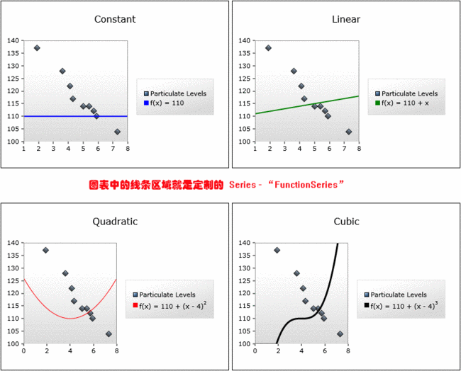
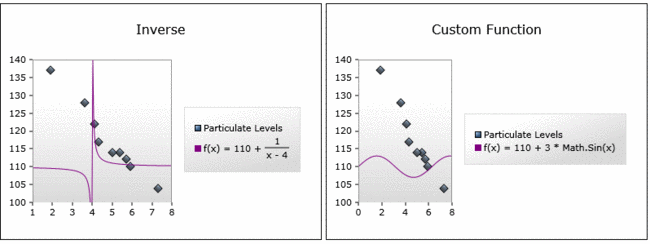
看到这里,相信有一些朋友要说了,通过将现有的Series替换成另一种Series就可以对图表做出一番变化,那我
能不能定制自己的Series呢?答案是肯定的,在Toolkit的Sample代码中就有这个示例,为了让大家阅读方便,我已将
这块代码复制到了本DEMO示例中,大家看一下CustomSeries下的两个文件SampleFunctionTypeConverter.cs
和FunctionSeries.cs,即可。
最终的运行效果(CustomSeriesSample.xaml)如下:
好了,今天的内容就先到这里了,源码下载,请点击这里。
原文链接: http://www.cnblogs.com/daizhj/archive/2009/01/15/1376295.html
作者: daizhj, 代震军
Tags: silverlight,chart,图表,柱状图,Column,Bar,饼图,Pie,折线图,Line,散点图,Scatter
网址: http://daizhj.cnblogs.com/
在微软的Silverlight 开源控件项目: Silverlight Toolkit
使用上文中所创建的代码,我们只要做很少的修改就可以让柱状图显示变成饼图,折线图或散点图。
好了,开始今天的正文。
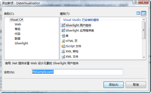
首先,我们要新创建一个饼图的"Silverlight 控件",并将其命名为:PieSample.xaml
然后我们拷贝相应的ColumnSample.xaml,ColumnSample.xaml.cs中的相应代码到: PieSample.xaml 和 Pie-
Sample.xaml.cs文件中。接着我们修改PieSample.xaml.cs文件中的dataServiceClient_GetEmployeeListCompleted
方法,修改后的结果如下:
void
dataServiceClient_GetEmployeeListCompleted(
object
sender, GetEmployeeListCompletedEventArgs e)
{
ObservableCollection < EmployeeInfo > employeeList = e.Result;
Action < Chart > chartModifier = (chart) =>
{
Axis dateAxis = new Axis { Orientation = AxisOrientation.Horizontal, Title = " 雇员名称 " , FontStyle = FontStyles.Normal, FontSize = 12f, ShowGridLines = true };
EmployeeChart.Axes.Add(dateAxis);
Axis valueAxis = new Axis { Orientation = AxisOrientation.Vertical, Title = " 薪水 " , Minimum = - 1000 , Maximum = 3000 , ShowGridLines = true };
EmployeeChart.Axes.Add(valueAxis);
};
chartModifier(EmployeeChart);
PieSeries series = new PieSeries();
series.ItemsSource = employeeList;
series.IndependentValueBinding = new System.Windows.Data.Binding( " EmployeeName " );
series.DependentValueBinding = new System.Windows.Data.Binding( " Salary " );
series.AnimationSequence = AnimationSequence.LastToFirst;
EmployeeChart.Series.Add(series);
}
{
ObservableCollection < EmployeeInfo > employeeList = e.Result;
Action < Chart > chartModifier = (chart) =>
{
Axis dateAxis = new Axis { Orientation = AxisOrientation.Horizontal, Title = " 雇员名称 " , FontStyle = FontStyles.Normal, FontSize = 12f, ShowGridLines = true };
EmployeeChart.Axes.Add(dateAxis);
Axis valueAxis = new Axis { Orientation = AxisOrientation.Vertical, Title = " 薪水 " , Minimum = - 1000 , Maximum = 3000 , ShowGridLines = true };
EmployeeChart.Axes.Add(valueAxis);
};
chartModifier(EmployeeChart);
PieSeries series = new PieSeries();
series.ItemsSource = employeeList;
series.IndependentValueBinding = new System.Windows.Data.Binding( " EmployeeName " );
series.DependentValueBinding = new System.Windows.Data.Binding( " Salary " );
series.AnimationSequence = AnimationSequence.LastToFirst;
EmployeeChart.Series.Add(series);
}
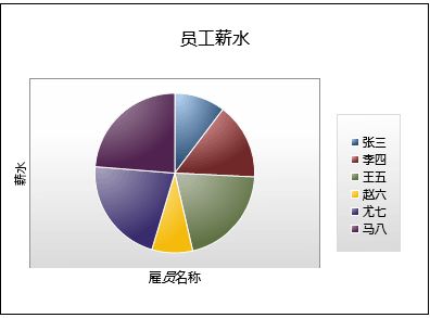
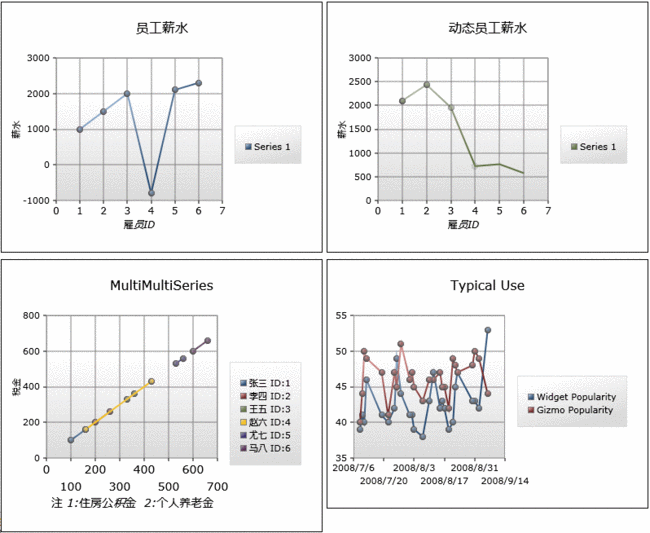
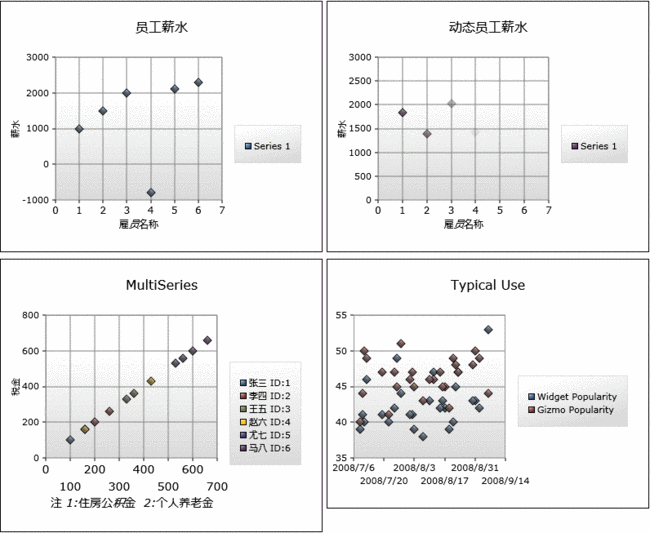
现在,我们运行一下这个DEMO,看一下效果:
当然如果大家对Chart控件中的数据显示颜色不满意,也可以按我们自己的想法“自定义颜色”,比如我们在
Xaml中定义下面的类型
<
UserControl.Resources
>

< samples:StylePalette x:Key ="ColorCustomStyle" >
< Style TargetType ="Control" >
< Setter Property ="Background" Value ="Yellow" />
< Setter Property ="BorderBrush" Value ="Black" />
</ Style >
< Style TargetType ="Control" >
< Setter Property ="Background" Value ="Purple" />
< Setter Property ="BorderBrush" Value ="Black" />
</ Style >
</ samples:StylePalette >
</ UserControl.Resources >
注意:StylePalette类型声明如下:
public
partial
class
StylePalette : Collection
<
Style
>
{
public StylePalette(){}
}
{
public StylePalette(){}
}
这样,当我们就可以在cs文件中使用该样式信息了,如下:
PieSeries series
=
new
PieSeries();
series.ItemsSource = employeeList;
series.IndependentValueBinding = new System.Windows.Data.Binding( " EmployeeName " );
series.DependentValueBinding = new System.Windows.Data.Binding( " Salary " );
// 绑定了该样式
series.StylePalette = this .Resources[ " ColorCustomStyle " ] as Collection < Style > ;
series.AnimationSequence = AnimationSequence.LastToFirst;
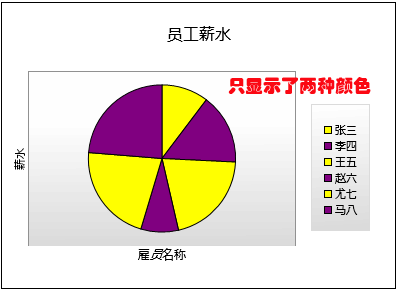
现在我们再看一下其运行效果:
可以看出,我们只要将ColumnSeries换成PieSeries,其它的代码一行不动,就将柱状图显示成了饼图,
是不是很方便,呵呵。
当然在饼图中也支持直接在Xaml中进行属性声明绑定,比如:
<
charting:Chart
Title
="Xaml绑定"
x:Name
="FunctionSeriesSample"
BorderBrush
="Gray"
Margin
="5"
>
< charting:Chart.Series >
< charting:PieSeries
ItemsSource =" {Binding PugetSound, Source={StaticResource City}} "
IndependentValueBinding =" {Binding Name} "
DependentValueBinding =" {Binding Population} "
IsSelectionEnabled ="True"
SelectionChanged ="BarSeries_SelectionChanged" StylePalette =" {StaticResource ColorCustomStyle} "
Template =" {StaticResource CustomTemplate} " >
</ charting:PieSeries >
</ charting:Chart.Series >
</ charting:Chart >
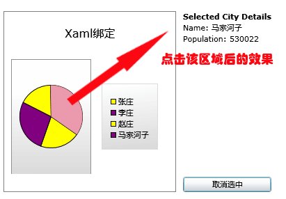
另外就是饼图支持鼠标选择事件,比如当我们使用鼠标选中饼图中的某一显示区域时,我们可以将该区
域的详细信息显示出来。为了实现这个效果,我们将下面的代码加入了PieSample.Xaml中:
<
controls:DockPanel
LastChildFill
="False"
controls:DockPanel.Dock
="Right"
>
< StackPanel x:Name ="InformationPanel" controls:DockPanel.Dock ="Top" Margin ="5" >
< TextBlock Text ="Selected City Details" FontWeight ="Bold" />
< StackPanel Orientation ="Horizontal" >
< TextBlock Text ="Name: " />
< TextBlock Text =" {Binding Name} " />
</ StackPanel >
< StackPanel Orientation ="Horizontal" >
< TextBlock Text ="Population: " />
< TextBlock Text =" {Binding Population} " />
</ StackPanel >
</ StackPanel >
< Button Content ="取消选中" Click ="Unselect_Click" Margin ="5" controls:DockPanel.Dock ="Bottom" />
</ controls:DockPanel >
这里,我们只要在PieSample.Xaml.cs文件中编写事件BarSeries_SelectionChanged处理代码即可:
private
void
BarSeries_SelectionChanged(
object
sender, SelectionChangedEventArgs e)
{
InformationPanel.DataContext = ( 1 <= e.AddedItems.Count) ? e.AddedItems[ 0 ] : null ;
}
private void Unselect_Click( object sender, System.Windows.RoutedEventArgs e)
{
(FunctionSeriesSample.Series[ 0 ] as PieSeries).SelectedItem = null ;
}
{
InformationPanel.DataContext = ( 1 <= e.AddedItems.Count) ? e.AddedItems[ 0 ] : null ;
}
private void Unselect_Click( object sender, System.Windows.RoutedEventArgs e)
{
(FunctionSeriesSample.Series[ 0 ] as PieSeries).SelectedItem = null ;
}
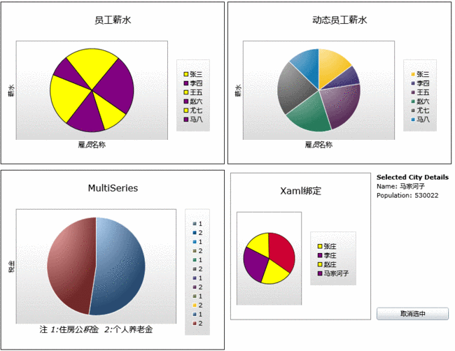
下面看一下运行效果:
这样当我们参照之前讲过的将柱状图转成饼图的方法将所有的ColumnSeries修改为“PieSeries”之后,
我们会看到下面的显示效果:
其实看到这里,相信大家会举一返三了,下面要说的“折线图”,“散点图”要如何绘制了。不错,对
于折线图使用的Series为“LineSeries”,而散点图使用的是“ScatterSeries”。不过有一点就是这两个
图中的X,Y轴的数据绑定类型要做一下转换,因为之前我们使用的X轴是EmployeeName,Y轴使用的是
Salary.我们要修改的是X轴,新绑定的是EmployeeID,原因我猜是这两种图表要求XY两个轴只能是数
值型或日期型所致。
下面以dataServiceClient_GetEmployeeListCompleted方法为例,看一下最终的修改结果:
void
dataServiceClient_GetEmployeeListCompleted(
object
sender, GetEmployeeListCompletedEventArgs e)
{
ObservableCollection < EmployeeInfo > employeeList = e.Result;
Action < Chart > chartModifier = (chart) =>
{
Axis dateAxis = new Axis { Orientation = AxisOrientation.Horizontal, Title = " 雇员名称 " , FontStyle = FontStyles.Normal, FontSize = 12f, ShowGridLines = true };
EmployeeChart.Axes.Add(dateAxis);
Axis valueAxis = new Axis { Orientation = AxisOrientation.Vertical, Title = " 薪水 " , Minimum = - 1000 , Maximum = 3000 , ShowGridLines = true };
EmployeeChart.Axes.Add(valueAxis);
};
chartModifier(EmployeeChart);
LineSeries series = new LineSeries();
series.ItemsSource = employeeList;
series.IndependentValueBinding = new System.Windows.Data.Binding( " EmployeeID " );
series.DependentValueBinding = new System.Windows.Data.Binding( " Salary " );
EmployeeChart.Series.Add(series);
}
{
ObservableCollection < EmployeeInfo > employeeList = e.Result;
Action < Chart > chartModifier = (chart) =>
{
Axis dateAxis = new Axis { Orientation = AxisOrientation.Horizontal, Title = " 雇员名称 " , FontStyle = FontStyles.Normal, FontSize = 12f, ShowGridLines = true };
EmployeeChart.Axes.Add(dateAxis);
Axis valueAxis = new Axis { Orientation = AxisOrientation.Vertical, Title = " 薪水 " , Minimum = - 1000 , Maximum = 3000 , ShowGridLines = true };
EmployeeChart.Axes.Add(valueAxis);
};
chartModifier(EmployeeChart);
LineSeries series = new LineSeries();
series.ItemsSource = employeeList;
series.IndependentValueBinding = new System.Windows.Data.Binding( " EmployeeID " );
series.DependentValueBinding = new System.Windows.Data.Binding( " Salary " );
EmployeeChart.Series.Add(series);
}
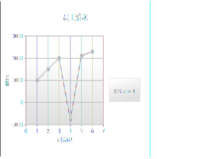
这样当我们运行该DEMO(LineSample.xaml)时,显示的效果如下图:
当然“折线图”也支持多数据源绑定,比如下面的代码就演示了同时绑定数据源WidgetPopularity,
GizmoPopularity的图表:
<
charting:Chart
Title
="Typical Use"
>
< charting:Chart.Series >
< charting:LineSeries IsSelectionEnabled ="True" Title ="Widget Popularity"
ItemsSource =" {StaticResource WidgetPopularity} " IndependentValueBinding =" {Binding Date} "
DependentValueBinding =" {Binding Percent} " />
< charting:LineSeries IsEnabled ="True" Title ="Gizmo Popularity"
ItemsSource =" {StaticResource GizmoPopularity} " IndependentValueBinding =" {Binding Date} "
DependentValueBinding =" {Binding Percent} " />
</ charting:Chart.Series >
</ charting:Chart >
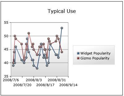
显示如下图:
当做完所有必要的修改之后,最终LineSample.xaml的运行效果:
同时,参考将“柱状图”转成“折线图”的过程,我们将“柱状图”转成“散点图”,这里不再多做说明了,做
完相应转换后,我们运行一下源码包中的ScatterSample.xaml,看一下效果:
看到这里,相信有一些朋友要说了,通过将现有的Series替换成另一种Series就可以对图表做出一番变化,那我
能不能定制自己的Series呢?答案是肯定的,在Toolkit的Sample代码中就有这个示例,为了让大家阅读方便,我已将
这块代码复制到了本DEMO示例中,大家看一下CustomSeries下的两个文件SampleFunctionTypeConverter.cs
和FunctionSeries.cs,即可。
最终的运行效果(CustomSeriesSample.xaml)如下:
好了,今天的内容就先到这里了,源码下载,请点击这里。
原文链接: http://www.cnblogs.com/daizhj/archive/2009/01/15/1376295.html
作者: daizhj, 代震军
Tags: silverlight,chart,图表,柱状图,Column,Bar,饼图,Pie,折线图,Line,散点图,Scatter
网址: http://daizhj.cnblogs.com/
在微软的Silverlight 开源控件项目: Silverlight Toolkit