使用Silverlight Toolkit绘制图表(上)--柱状图
Silverlight Toolkit提供了绘制柱状图(Column,Bar),饼图(Pie),折线图(Line), 散点图(Scatter)等控件。
我们可以很方便的将已有的数据源绑定到相应图形控件上,设置好相应的X,Y轴显示样式和数据字段之后就大功告
成了,同时其还支持图形的定时加载刷新,图形的动态加载动画效果。今天就先以柱状图为例,简要的总结一下如
何使用该控件来显示我们的数据。
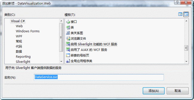
首先,我们需要创建一个Silverlight项目,命名为:DataVisualization。
然后我们使用WCF方式发布数据源信息,这里我们创建一个"Silverlight功能的WCF",并将其命名为:
DataService.svc
接着将下面的代码拷贝到该类文件中:
{
public int EmployeeID { set ; get ; }
public string EmployeeName { set ; get ; }
public int Salary { set ; get ; }
public int [] Cost { get ; set ; }
public string City { set ; get ; }
}
[ServiceContract(Namespace = "" )]
[AspNetCompatibilityRequirements(RequirementsMode = AspNetCompatibilityRequirementsMode.Allowed)]
public class DataService
{
[OperationContract]
public List < EmployeeInfo > GetEmployeeList()
{
List < EmployeeInfo > employeeList = new List < EmployeeInfo > ();
employeeList.Add( new EmployeeInfo { EmployeeID = 1 , EmployeeName = " 张三 " , Salary = 1000 , City = " 合肥 " });
employeeList.Add( new EmployeeInfo { EmployeeID = 2 , EmployeeName = " 李四 " , Salary = 1500 , City = " 天津 " });
employeeList.Add( new EmployeeInfo { EmployeeID = 3 , EmployeeName = " 王五 " , Salary = 2000 , City = " 上海 " });
employeeList.Add( new EmployeeInfo { EmployeeID = 4 , EmployeeName = " 赵六 " , Salary = - 800 , City = " 北京 " });
employeeList.Add( new EmployeeInfo { EmployeeID = 5 , EmployeeName = " 尤七 " , Salary = 2100 , City = " 武汉 " });
employeeList.Add( new EmployeeInfo { EmployeeID = 6 , EmployeeName = " 马八 " , Salary = 2300 , City = " 海口 " });
return employeeList;
}
}
这里数据源我们就创建完成了,它将会返回6个雇员信息。
下面我们往该Silverlight应用的Xaml文件上拖(或手工声明)一个Chart控件,如下:
我们看到在该控件上我们指定了Title信息,该信息会显示在图表的最上方。
下面开始编写CS代码。
1.首先我们向该Silverlight应用中添加对刚才声明的WCF的引用。
2.使用WCF生成的客户端类来获取相应的数据源,代码如下:
{
dataServiceClient.GetEmployeeListCompleted += new EventHandler < GetEmployeeListCompletedEventArgs > (dataServiceClient_GetEmployeeListCompleted);
dataServiceClient.GetEmployeeListAsync();
}
3.将WCF返回的数据源信息绑定到相应的图形控件上,并初始化该控件的相应信息,如下:
{
ObservableCollection < EmployeeInfo > employeeList = e.Result;
Action < Chart > chartModifier = (chart) =>
{
Axis dateAxis = new Axis { Orientation = AxisOrientation.Horizontal, Title = " 雇员名称 " , FontStyle = FontStyles.Normal, FontSize = 12f, ShowGridLines = true };
EmployeeChart.Axes.Add(dateAxis);
Axis valueAxis = new Axis { Orientation = AxisOrientation.Vertical, Title = " 薪水 " , Minimum = - 1000 , Maximum = 3000 , ShowGridLines = true };
EmployeeChart.Axes.Add(valueAxis);
};
chartModifier(EmployeeChart);
ColumnSeries series = new ColumnSeries();
series.ItemsSource = employeeList;
series.IndependentValueBinding = new System.Windows.Data.Binding( " EmployeeName " );
series.DependentValueBinding = new System.Windows.Data.Binding( " Salary " );
series.Title = " 薪水 " ;
EmployeeChart.Series.Add(series);
}
在上面的代码中我们创建了Axis对象用以将X,Y轴的描述信息绑定到指定的图形控件上,然后将我们的指定数据
源绑定到该图形控件的ItemsSource属性上,最后再绑定两个座标轴要显示的相应数据:
X轴: series.IndependentValueBinding = new System.Windows.Data.Binding("EmployeeName");
Y轴: series.DependentValueBinding = new System.Windows.Data.Binding("Salary");
下面我们来看一下最终的显示效果,如下图所示:
大家看到,在Y轴上我们既显示了正轴也显示了负轴,这就是通过Minimum = -1000, Maximum = 3000这一行
设置实现的。
还不错了,到这里我们只是简要的领略了一个图形控件的基本功能。接着我们再了解一下它还有那些更高级的使
用技巧。
首先是图形的定时加载刷新,要实现这个演示,我们需要一个实时变化的数据源,以便当我们定时刷新控件时能
显示不同的数据信息。所以我们要在WCF中创建一个这样的数据源:
public List < EmployeeInfo > GetEmployeeDynamicList()
{
Random random = new Random();
List < EmployeeInfo > employeeList = new List < EmployeeInfo > ();
employeeList.Add( new EmployeeInfo { EmployeeID = 1 , EmployeeName = " 张三 " , Salary = random.Next( 500 , 3000 ), City = " 合肥 " });
employeeList.Add( new EmployeeInfo { EmployeeID = 2 , EmployeeName = " 李四 " , Salary = random.Next( 500 , 3000 ), City = " 天津 " });
employeeList.Add( new EmployeeInfo { EmployeeID = 3 , EmployeeName = " 王五 " , Salary = random.Next( 500 , 3000 ), City = " 上海 " });
employeeList.Add( new EmployeeInfo { EmployeeID = 4 , EmployeeName = " 赵六 " , Salary = random.Next( 500 , 3000 ), City = " 北京 " });
employeeList.Add( new EmployeeInfo { EmployeeID = 5 , EmployeeName = " 尤七 " , Salary = random.Next( 500 , 3000 ), City = " 武汉 " });
employeeList.Add( new EmployeeInfo { EmployeeID = 6 , EmployeeName = " 马八 " , Salary = random.Next( 500 , 3000 ), City = " 海口 " });
return employeeList;
}
大家看到,这里使用了Random来模拟一个动态数据源信息,其生成的随机数介于500-3000之间,那么接下来,我
们再Silverlight的XAML上创建这样一个Chart对象,用以显示该动态数据源信息,如下:
接着就是相应的CS代码了,这里为了方便起见,这里直接使用DispatcherTimer来定时(3秒)获取相应的数据源信
息,如下:
{
System.Windows.Threading.DispatcherTimer dispatcherTimer = new System.Windows.Threading.DispatcherTimer();
dispatcherTimer.Interval = TimeSpan.FromSeconds( 3 );
dispatcherTimer.Tick += delegate
{
dataServiceClient.GetEmployeeDynamicListCompleted += new EventHandler < GetEmployeeDynamicListCompletedEventArgs > (dataServiceClient_GetEmployeeDynamicListCompleted);
dataServiceClient.GetEmployeeDynamicListAsync();
};
dispatcherTimer.Start();
}
接着就是初始化相应的图形控件并绑定相应的数据源了,代码与上面的CS代码相似,如下:
{
ObservableCollection < EmployeeInfo > employeeList = e.Result;
DynamicEmployeeChart.Axes.Clear();
DynamicEmployeeChart.Series.Clear();
Action < Chart > chartModifier = (chart) =>
{
Axis dateAxis = new Axis { Orientation = AxisOrientation.Horizontal, Title = " 雇员名称 " , FontStyle = FontStyles.Normal, FontSize = 12f, ShowGridLines = true };
DynamicEmployeeChart.Axes.Add(dateAxis);
Axis valueAxis = new Axis { Orientation = AxisOrientation.Vertical, Title = " 薪水 " , Minimum = 0 , Maximum = 3000 , ShowGridLines = true };
DynamicEmployeeChart.Axes.Add(valueAxis);
};
chartModifier(DynamicEmployeeChart);
ColumnSeries series = new ColumnSeries();
series.ItemsSource = employeeList;
series.IndependentValueBinding = new System.Windows.Data.Binding( " EmployeeName " );
series.DependentValueBinding = new System.Windows.Data.Binding( " Salary " );
series.Title = " 薪水 " ;
DynamicEmployeeChart.Series.Add(series);
}
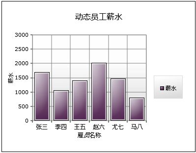
好了,这里我们看一下最终的运行效果,首先是刚启动运行时的截图:
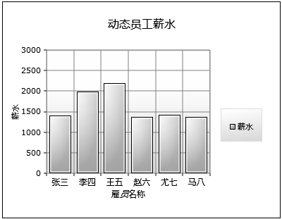
然后是三秒之后的运行截图:
到这里还不算完,因为该控件还支持数据的分组显示,比如说如果我们的数据中有数组类型的字段信息,
该控件是以数组为单位(数组长度就是图表的列信息)。这个有些难以理解,下面就以一个示例来加以说明。
首先,我们要创建一个具有数组类型字段的数据源,如下:
public List < EmployeeInfo > GetMultiSeriesEmployeeList()
{
List < EmployeeInfo > employeeList = new List < EmployeeInfo > ();
employeeList.Add( new EmployeeInfo { EmployeeID = 1 , EmployeeName = " 张三 " , Salary = 1000 , Cost = new int [] { 100 , 160 } });
employeeList.Add( new EmployeeInfo { EmployeeID = 2 , EmployeeName = " 李四 " , Salary = 1500 , Cost = new int [] { 260 , 200 } });
employeeList.Add( new EmployeeInfo { EmployeeID = 3 , EmployeeName = " 王五 " , Salary = 2000 , Cost = new int [] { 360 , 330 } });
employeeList.Add( new EmployeeInfo { EmployeeID = 4 , EmployeeName = " 赵六 " , Salary = 800 , Cost = new int [] { 160 , 430 } });
employeeList.Add( new EmployeeInfo { EmployeeID = 5 , EmployeeName = " 尤七 " , Salary = 2100 , Cost = new int [] { 560 , 530 } });
employeeList.Add( new EmployeeInfo { EmployeeID = 6 , EmployeeName = " 马八 " , Salary = 2300 , Cost = new int [] { 660 , 600 } });
return employeeList;
}
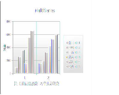
大家看到了,在该数据源中的Cost属性即是数据类型字段,该字段记录了雇员的交费信息:第一项为
“住房公积金”,第二项为“个人养老金”。
下面我们就来看一下该如何绑定这类数据源信息。
首先在XAML中创建该图表控件,如下:
大家看到这里我们还绑定了鼠标单击事件,该事件主要用于稍后演示图表的动态效果,这里先行略过:)
接着就是我们的CS代码了,首先是获取数据源:
{
dataServiceClient.GetMultiSeriesEmployeeListCompleted += new EventHandler < GetMultiSeriesEmployeeListCompletedEventArgs > (dataServiceClient_GetMultiSeriesEmployeeListCompleted);
dataServiceClient.GetMultiSeriesEmployeeListAsync();
}
然后是相应的控件初始化和数据绑定代码:
{
ObservableCollection < EmployeeInfo > employeeList = e.Result;
Action < Chart > chartModifier = (chart) =>
{
Axis dateAxis = new Axis { Orientation = AxisOrientation.Horizontal, Title = " 注 1:住房公积金 2:个人养老金 " , FontStyle = FontStyles.Normal, FontSize = 14f, ShowGridLines = true };
MultiSeries.Axes.Add(dateAxis);
Axis valueAxis = new Axis { Orientation = AxisOrientation.Vertical, Title = " 税金 " , Minimum = 0 , Maximum = 800 , ShowGridLines = true };
MultiSeries.Axes.Add(valueAxis);
};
chartModifier(MultiSeries);
foreach (EmployeeInfo itemsSource in employeeList)
{
ColumnSeries series = new ColumnSeries();
series.ItemsSource = itemsSource.Cost;
series.DependentValueBinding = null ;
series.IndependentValueBinding = null ;
series.Title = itemsSource.EmployeeName + " ID: " + itemsSource.EmployeeID;
series.AnimationSequence = AnimationSequence.FirstToLast;
MultiSeries.Series.Add(series);
}
}
这里我们看到在控件的数据源绑定上与前两个DEMO存在一定的差异。因为每个雇员的交费字段本身就是一个数
组(整形),所以这里将该交费字段直接绑定到了ColumnSeries的ItemsSource属性上。同时将ColumnSeries 的属
性 DependentValueBinding,IndependentValueBinding分别设置为null。这里给该ColumnSeries的动态显示效果
设置成了AnimationSequence.FirstToLast。下面我们会看到显示效果,而相应的鼠标单击事件代码摘自TOOKIT的
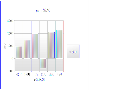
代码示例包,这里就不多加解释了。下面是相应的显示效果:
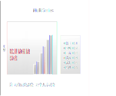
当我们在图表上单击鼠标时,显示效果如下:
等图表全被隐去时,这时我们再单击鼠标,图表会依次再显示出来。
除了数据动态加载,Chart还支持数据的静态绑定,如下面的XAML代码即是初始并绑定一个已存在的数据源:
< charting:Chart.Series >
< charting:ColumnSeries
Title ="人口" AnimationSequence ="FirstToLast"
ItemsSource =" {Binding PugetSound, Source={StaticResource City}} "
IndependentValueBinding =" {Binding Name} "
DependentValueBinding =" {Binding Population} " />
</ charting:Chart.Series >
< charting:Chart.Axes >
< charting:Axis AxisType ="Category" Title ="城市" Orientation ="Horizontal" FontStyle ="Italic" />
< charting:Axis AxisType ="Linear" Title ="人口" Orientation ="Vertical" Minimum ="0" Maximum ="600000" Interval ="100000" ShowGridLines ="True" FontStyle ="Italic" />
</ charting:Chart.Axes >
</ charting:Chart >
而数据源是在程序中直接写死的,如下:
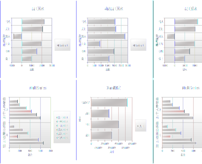
到这里,有关柱状图的主要功能介绍的差不多了,但如果开发过相应图表功能的朋友会发现,之前的
DEMO显示的都是垂直的柱状图,但很多的网站上显示的都是水平方向的柱状图,比如说投票功能等,其实
Chart实现这个功能非常简要,只要在我们原有的CS代码基础上做很少的改动即可实现,这里以上面的第
一个DEMO为例,看一下如何进行改造:
下面是其dataServiceClient_GetEmployeeListCompleted方法的改造后的代码:
{
ObservableCollection < EmployeeInfo > employeeList = e.Result;
Action < Chart > chartModifier = (chart) =>
{
Axis dateAxis = new Axis { Orientation = AxisOrientation.Vertical, Title = " 雇员名称 " , FontStyle = FontStyles.Normal, FontSize = 12f, ShowGridLines = true };
EmployeeChart.Axes.Add(dateAxis);
Axis valueAxis = new Axis { Orientation = AxisOrientation.Horizontal, Title = " 薪水 " , Minimum = - 1000 , Maximum = 3000 , ShowGridLines = true };
EmployeeChart.Axes.Add(valueAxis);
};
chartModifier(EmployeeChart);
BarSeries series = new BarSeries();
series.ItemsSource = employeeList;
series.IndependentValueBinding = new System.Windows.Data.Binding( " EmployeeName " );
series.DependentValueBinding = new System.Windows.Data.Binding( " Salary " );
EmployeeChart.Series.Add(series);
}
在这里,我们看到了之前所设置的X,Y轴在AxisOrientation属性上被做了交换设置。而接着的ColumnSeries对象
也被替换成了BarSeries。这样我们就完成了相应的改造(更多信息参见DEMO源码BarSample)。
其它的DEMO只要参照一下上面所说的替换方式替换一下即可,最终我们看一个显示效果,如下图所示:
好了,今天的内容就先到这里了,源码下载,请点击这里。
原文链接:http://www.cnblogs.com/daizhj/archive/2009/01/15/1376181.html
作者: daizhj, 代震军
Tags: silverlight,chart,图表,柱状图,Column,Bar,饼图,Pie,折线图,Line,散点图,Scatter
网址: http://daizhj.cnblogs.com/
在微软的Silverlight 开源控件项目: Silverlight Toolkit