css实现平角切角和弧形切角
本文中效果的实现需要依赖CSS3的gradient属性。
平角切角
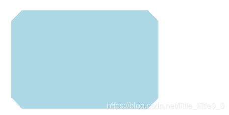
html代码:
<div class="clip">div>
css代码:
.clip {
  width: 300px;
  height: 200px;
  background: linear-gradient(135deg, transparent 15px, lightblue 0) top left,
	      linear-gradient(-135deg, transparent 15px, lightblue 0) top right,
	      linear-gradient(-45deg, transparent 15px, lightblue 0) bottom right,
	      linear-gradient(45deg, transparent 15px, lightblue 0) bottom left;
  background-size: 50% 50%;
  background-repeat: no-repeat;
}
弧形切角
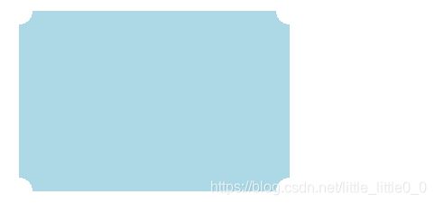
html同上,css代码如下:
.clip{
  width: 300px;
  height: 200px;
  background: radial-gradient(circle at bottom right,transparent 15px,lightblue 0) bottom right,
  	      radial-gradient(circle at bottom left,transparent 15px,lightblue 0) bottom left,
  	      radial-gradient(circle at top left,transparent 15px,lightblue 0) top left,
  	      radial-gradient(circle at top right,transparent 15px,lightblue 0) top right;
  background-size: 50% 50%;
  background-repeat: no-repeat;}
切平角
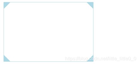
.clip {
  width: 300px;
  height: 200px;
  background: linear-gradient(135deg, lightblue 15px, transparent 0) top left,
	      linear-gradient(-135deg, lightblue 15px, transparent 0) top right,
	      linear-gradient(-45deg, lightblue 15px, transparent 0) bottom right,
	      linear-gradient(45deg, lightblue 15px, transparent 0) bottom left;
  background-size: 50% 50%;
  background-repeat: no-repeat;