React-Native 验证码输入框(TextInput)
参考:
React-Native 验证码输入框(TextInput)
测试:
import React, {Component} from 'react';
import {Button, StyleSheet, Text, TextInput, View} from 'react-native';
import PropTypes from 'prop-types';

export default class Test extends React.Component {

    render() {
        return (
            <View style={{flex: 1}}>
                {/*//默认value是 6*/}
                <VerificationCodeInput inputSize={4}/>
            </View>
        );
    }
}

//https://www.jianshu.com/p/3bd764988bdf

class VerificationCodeInput extends React.Component {


    constructor(props) {
        super(props);
        this.state = {
            isFocused: true,
            textString: '',
        };
    }

    /**
     * 默认value
     */
    static defaultProps = {
        inputSize: 6,
    };


    static propTypes = {
        inputSize: PropTypes.number,
    };

    _onChangeText(text) {
        let _that = this;
        this.setState({
            textString: text,
        }, () => {
            if (_that.state.textString.length === _that.props.inputSize) {
                alert(this.state.textString);
                _that.setState({
                    textString: '',
                });
            }
        });
    }

    /**
     *   初始化 text
     */
    renderText(callback) {
        let inputs = [];
        for (let i = 0; i < this.props.inputSize; i++) {
            inputs.push(
                <Text style={[styles.text,
                    this.state.textString.length === i ? styles.focusText : null]}>
                    {this.state.textString[i]}
                </Text>,
            );
        }

        return inputs;
    }

    render() {
        return (
            <View style={[styles.viewBox]}>

                <Text style={{height: 80, color: 'white', fontSize: 24}}>请输入验证码</Text>

                <View>
                    {/**text*/}
                    <View style={[styles.textBox, {flexDirection: 'row', justifyContent: 'center'}]}>
                        {this.renderText()}
                    </View>


                    {/**input*/}
                    <TextInput
                        ref="input"
                        style={styles.intextInputStyle}
                        value={this.state.textString}
                        onChangeText={(text) => {
                            this._onChangeText(text);
                        }}
                        underlineColorAndroid="transparent"
                        maxLength={this.props.inputSize}
                        autoFocus={true}
                        keyboardType="numeric"
                        caretHidden={true}
                    />
                </View>
            </View>
        );
    }


}

const styles = StyleSheet.create({

    viewBox: {
        alignItems: 'center',
        justifyContent: 'center',
        flex: 1,
        backgroundColor: '#000000',
    },
    textBox: {
        position: 'absolute',
        left: 20,
        right: 36,
    },
    text: {
        height: 40,
        width: 40,
        lineHeight: 40,
        borderWidth: 2,
        borderColor: '#ff0000',
        color: 'white',
        fontSize: 25,
        marginLeft: 16,
        textAlign: 'center',
    },
    focusText: {
        borderColor: '#ffff00',
    },
    inputItem: {
        lineHeight: 20,
        width: 80,
        textAlign: 'center',
        height: 40,
    },
    intextInputStyle: {
        width: 400,
        height: 40,
        fontSize: 25,
        color: 'transparent',
    },
});
注意:
caretHidden={true} : 隐藏光标
underlineColorAndroid=“transparent” : 隐藏下划线
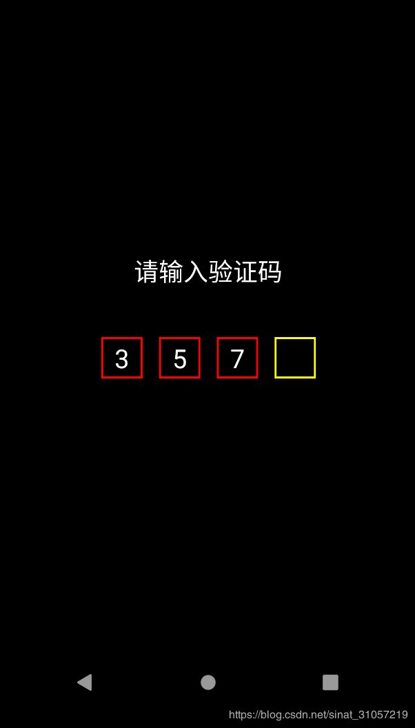
效果图: