Seaborn包 画出好看的分布图(Python)
参考:http://www.open-open.com/lib/view/open1434182977754.html
http://blog.csdn.net/pipisorry/article/details/49515745
Seaborn介绍
官方文档: https://pypi.python.org/pypi/seaborn/
Matplotlib是Python主要的绘图库。但是不建议你直接使用它,原因与不推荐你使用NumPy是一样的。虽然Matplotlib很强大,它本身就很复杂,你的图经过大量的调整才能变精致。因此,作为替代推荐一开始使用Seaborn。
Seaborn本质上使用Matplotlib作为核心库(就像Pandas对NumPy一样)。
Some of the features that seaborn offers are
- Several built-in themes that improve on the default matplotlib aesthetics
- Tools for choosing color palettes to make beautiful plots that reveal patterns in your data
- Functions for visualizing univariate and bivariate distributions or for comparing them between subsets of data
- Tools that fit and visualize linear regression models for different kinds of independent and dependent variables
- Functions that visualize matrices of data and use clustering algorithms to discover structure in those matrices
- A function to plot statistical timeseries data with flexible estimation and representation of uncertainty around the estimate
- High-level abstractions for structuring grids of plots that let you easily build complex visualizations
seaborn的优点:
- 默认情况下就能创建赏心悦目的图表。(只有一点,默认不是jet colormap)
- 创建具有统计意义的图
- 能理解pandas的DataFrame类型,所以它们一起可以很好地工作。
安装pip install seaborn
就算你不用seaborn绘图,只要在matplotlib绘图中加上seaborn的import语句,就会以seaborn的图形方式展示图片,具有seaborn的效果。如:
import seaborn
import matplotlib.pyplot as plt
注意要显示出图形,需要引入matplotlib并plt.show()出来。
Seaborn使用
Style functions: API | Tutorial
Color palettes: API | Tutorial
Distribution plots: API | Tutorial
Regression plots: API | Tutorial
Categorical plots: API | Tutorial
Axis grid objects: API | Tutorial
分布图绘制Distribution plots
jointplot(x, y[, data, kind, stat_func, ...]) |
Draw a plot of two variables with bivariate and univariate graphs. |
pairplot(data[, hue, hue_order, palette, ...]) |
Plot pairwise relationships in a dataset. |
distplot(a[, bins, hist, kde, rug, fit, ...]) |
Flexibly plot a univariate distribution of observations. |
kdeplot(data[, data2, shade, vertical, ...]) |
Fit and plot a univariate or bivariate kernel density estimate. |
rugplot(a[, height, axis, ax]) |
Plot datapoints in an array as sticks on an axis. |
单变量绘制distplot
seaborn.distplot(a, bins=None, hist=True, kde=True, rug=False, fit=None, hist_kws=None, kde_kws=None, rug_kws=None, fit_kws=None, color=None, vertical=False, norm_hist=False, axlabel=None, label=None, ax=None)
Note:
1 如果想显示统计个数而不是概率,需要同时设置norm_hist=False, kde=False。
2 自己指定fit的函数from scipy import stats ... fit=stats.norm
>>> import seaborn as sns, numpy as np
>>> sns.set(rc={"figure.figsize": (8, 4)}); np.random.seed(0)
>>> x = np.random.randn(100)
>>> ax = sns.distplot(x)
双变量+单变量统一绘制jointplot

使用matplotlib重新绘制这幅图的话需要相当多的(丑陋)代码,包括调用scipy执行线性回归并手动利用线性回归方程绘制直线(我甚至想不出怎么在边界绘图,怎么计算置信区间)。
与Pandas的DataFrame很好地工作
数据有自己的结构。通常我们感兴趣的包含不同的组或类(这种情况下使用pandas中groupby的功能会让人感到很神奇)。比如tips(小费)的数据集是这样的:
Out[9]:
| total_bill | tip | sex | smoker | day | time | size | |
|---|---|---|---|---|---|---|---|
| 0 | 16.99 | 1.01 | Female | No | Sun | Dinner | 2 |
| 1 | 10.34 | 1.66 | Male | No | Sun | Dinner | 3 |
| 2 | 21.01 | 3.50 | Male | No | Sun | Dinner | 3 |
| 3 | 23.68 | 3.31 | Male | No | Sun | Dinner | 2 |
| 4 | 24.59 | 3.61 | Female | No | Sun | Dinner | 4 |
我们可能想知道吸烟者给的小费是否与不吸烟的人不同。没有seaborn的话,这需要使用pandas的groupby功能,并通过复杂的代码绘制线性回归直线。使用seaborn的话,我们可以给col参数提供列名,按我们的需要划分数据:
回归图绘制Regression plots
lmplot(x, y, data[, hue, col, row, palette, ...]) |
Plot data and regression model fits across a FacetGrid. |
regplot(x, y[, data, x_estimator, x_bins, ...]) |
Plot data and a linear regression model fit. |
residplot(x, y[, data, lowess, x_partial, ...]) |
Plot the residuals of a linear regression. |
interactplot(x1, x2, y[, data, filled, ...]) |
Visualize a continuous two-way interaction with a contour plot. |
coefplot(formula, data[, groupby, ...]) |
Plot the coefficients from a linear model. |
sns . lmplot ( "total_bill" , "tip" , tips , col = "smoker" ) ;

%matplotlib inline
Populating the interactive namespace from numpy and matplotlib


import seaborn as sns
import numpy as np
from numpy.random import randn
import matplotlib as mpl
import matplotlib.pyplot as plt
from scipy import stats


# style set 这里只是一些简单的style设置
sns.set_palette('deep', desat=.6)
sns.set_context(rc={'figure.figsize': (8, 5) } )
np.random.seed(1425)
# figsize是常用的参数.
最简单的hist (直方图)
最简单的hist是使用一列数据(series)作为输入, 也不用考虑其它的参数.
data = randn(75)
plt.hist(data)


(array([  2.,   5.,   4.,  10.,  12.,  16.,   7.,   7.,   6.,   6.]),
 array([-2.04713616, -1.64185099, -1.23656582, -0.83128065, -0.42599548,
        -0.02071031,  0.38457486,  0.78986003,  1.1951452 ,  1.60043037,
         2.00571554]),
) 
# 增加一些参数, 就能画出别样的风采
data = randn(100)
plt.hist(data, bins=12, color=sns.desaturate("indianred", .8), alpha=.4)


(array([  2.,   3.,   3.,  11.,  10.,  15.,  10.,  17.,  10.,   8.,   7.,
          4.]),
 array([-2.56765228, -2.1665249 , -1.76539753, -1.36427015, -0.96314278,
        -0.5620154 , -0.16088803,  0.24023935,  0.64136672,  1.0424941 ,
         1.44362147,  1.84474885,  2.24587623]),
) 
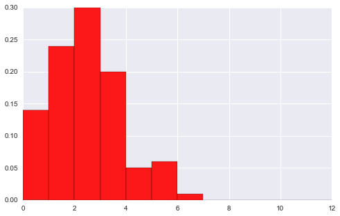
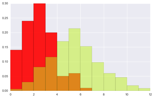
# 以上数据是单总体, 双总体的hist

data1 = stats.poisson(2).rvs(100)
data2 = stats.poisson(5).rvs(500)

max_data = np.r_[data1, data2].max()
bins = np.linspace(0, max_data, max_data+1)
#plt.hist(data1) #
# 首先将2个图形分别画到figure中
plt.hist(data1, bins, normed=True, color="#FF0000", alpha=.9)
plt.figure()
plt.hist(data2, bins, normed=True, color="#C1F320", alpha=.5)


(array([ 0.006,  0.03 ,  0.082,  0.116,  0.17 ,  0.214,  0.152,  0.098,
         0.06 ,  0.046,  0.018,  0.008]),
 array([  0.,   1.,   2.,   3.,   4.,   5.,   6.,   7.,   8.,   9.,  10.,
         11.,  12.]),
) 
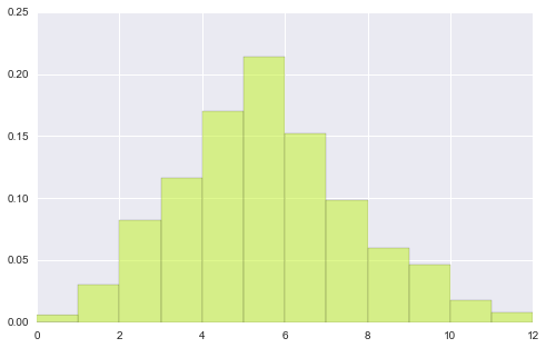
# 观察下面图形 可以看出nomed参数的作用 --
# 首先还是各自绘出自己的分布hist, 然后将二者重合部分用第三颜色加以区别.
plt.hist(data1, bins, normed=True, color="#FF0000", alpha=.9)
plt.hist(data2, bins, normed=True, color="#C1F320", alpha=.5)


(array([ 0.006,  0.03 ,  0.082,  0.116,  0.17 ,  0.214,  0.152,  0.098,
         0.06 ,  0.046,  0.018,  0.008]),
 array([  0.,   1.,   2.,   3.,   4.,   5.,   6.,   7.,   8.,   9.,  10.,
         11.,  12.]),
) 
# hist 其它参数
x = stats.gamma(3).rvs(5000);
#plt.hist(x, bins=80) # 每个bins都有分界线
# 若想让图形更连续化 (去除中间bins线) 用histtype参数
plt.hist(x, bins=80, histtype="stepfilled", alpha=.8)


(array([  19.,   27.,   53.,   97.,  103.,  131.,  167.,  176.,  196.,
         215.,  214.,  202.,  197.,  153.,  202.,  214.,  181.,  160.,
         175.,  179.,  148.,  148.,  117.,  130.,  125.,  122.,  100.,
         102.,   80.,   85.,   66.,   67.,   58.,   51.,   56.,   42.,
          52.,   36.,   37.,   26.,   29.,   19.,   26.,   21.,   26.,
          19.,   16.,   12.,   12.,   17.,   12.,    9.,   10.,    4.,
           4.,    6.,    4.,    7.,    3.,    6.,    1.,    3.,    3.,
           1.,    1.,    2.,    0.,    0.,    1.,    2.,    3.,    1.,
           2.,    3.,    1.,    2.,    1.,    0.,    0.,    2.]),
 array([  0.13431232,   0.28186933,   0.42942633,   0.57698333,
          0.72454033,   0.87209734,   1.01965434,   1.16721134,
          1.31476834,   1.46232535,   1.60988235,   1.75743935,
          1.90499636,   2.05255336,   2.20011036,   2.34766736,
          2.49522437,   2.64278137,   2.79033837,   2.93789538,
          3.08545238,   3.23300938,   3.38056638,   3.52812339,
          3.67568039,   3.82323739,   3.9707944 ,   4.1183514 ,
          4.2659084 ,   4.4134654 ,   4.56102241,   4.70857941,
          4.85613641,   5.00369341,   5.15125042,   5.29880742,
          5.44636442,   5.59392143,   5.74147843,   5.88903543,
          6.03659243,   6.18414944,   6.33170644,   6.47926344,
          6.62682045,   6.77437745,   6.92193445,   7.06949145,
          7.21704846,   7.36460546,   7.51216246,   7.65971947,
          7.80727647,   7.95483347,   8.10239047,   8.24994748,
          8.39750448,   8.54506148,   8.69261849,   8.84017549,
          8.98773249,   9.13528949,   9.2828465 ,   9.4304035 ,
          9.5779605 ,   9.7255175 ,   9.87307451,  10.02063151,
         10.16818851,  10.31574552,  10.46330252,  10.61085952,
         10.75841652,  10.90597353,  11.05353053,  11.20108753,
         11.34864454,  11.49620154,  11.64375854,  11.79131554,  11.93887255]),
) 
# 上面的多总体hist 还是独立作图, 并没有将二者结合,
# 使用jointplot就能作出联合分布图形, 即, x总体和y总体的笛卡尔积分布
# 不过jointplot要限于两个等量总体.

# jointplot还是非常实用的, 对于两个连续型变量的分布情况, 集中趋势能非常简单的给出.
# 比如下面这个例子
x = stats.gamma(2).rvs(5000)
y = stats.gamma(50).rvs(5000)
with sns.axes_style("dark"):
sns.jointplot(x, y, kind="hex") 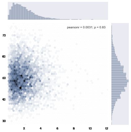
# 下面用使用真实一点的数据作个dmeo
import pandas as pd
from pandas import read_csv

df = read_csv("test.csv", index_col='index')
df[:2]| department | typecity | product | credit | ddate | month_repay | apply_amont | month_repay_real | amor | tst_amount | salary_net | LTI | DTI | pass | deny | |
|---|---|---|---|---|---|---|---|---|---|---|---|---|---|---|---|
| index | |||||||||||||||
| 13652622 | gedai | ordi | elite | CR8 | 2015/5/29 12:27 | 2000 | 40000 | 1400.90 | 36 | 30000 | 1365.30 | 21.973193 | 0.610366 | 1 | 0 |
| 13680088 | gedai | ordi | xinxin | CR16 | 2015/6/3 18:38 | 8000 | 100000 | 3589.01 | 36 | 70000 | 3598.66 | 19.451685 | 0.540325 | 1 | 0 |
clean_df = df[df['salary_net'] < 10000]


sub_df = pd.DataFrame(data=clean_df, columns=['salary_net', 'month_repay'] )

with sns.axes_style("dark"):
    sns.jointplot('salary_net', 'month_repay', data=sub_df, kind="hex")
    plt.ylim([0, 10000])
plt.xlim([0, 10000]) 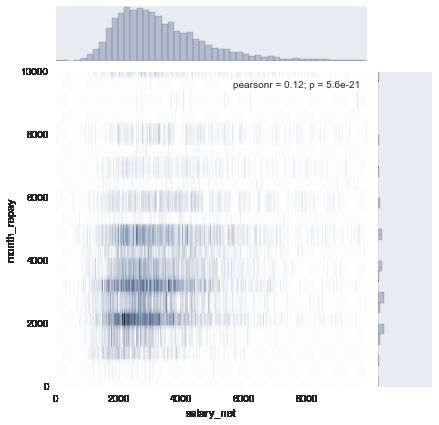
注: jointplot除了作图, 还会给出x, y的相关系数(pearson_r) 和r = 0 的假设检验p值.
下面学习新的图形: kdeplot, rugplot
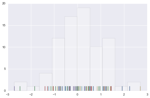
# rugplot
# rugplot 是比Histogram更加直观的 "Histogram"
data = randn(80)
plt.hist(data, alpha=0.3, color='#ffffff')
sns.rugplot(data)
# example
# 下面的图看上去复杂, 不过也很好理解, 从一个样本点生成一个bell-curve
# 这样看bell集中的地方就是数据最密集的地方.

sns.rugplot(data, color='indianred')
xx = np.linspace(-4, 4, 100)
# 计算bandwidth
bandwidth = ( ( 4*data.std() ** 5)/(3 *len(data))) ** .2
bandwidth = len(data) ** (-1. /5)

#0.416276603701     print bandwidth

kernels = []
for d in data:
    # basis function as a gaussian PDF
    kernel = stats.norm(d, bandwidth).pdf(xx)
    kernels.append(kernel)

    # Scale for plotting
    kernel /= kernel.max()
    kernel *= .4

    plt.plot(xx, kernel, "#888888", alpha=.18)

plt.ylim(0, 1)


0.416276603701


(0, 1) 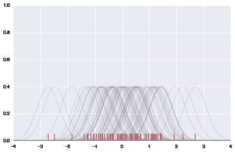
# example 2
# set-Up
f, (ax1, ax2) = plt.subplots(2, 1, sharex=True)
# color_palette 就是要画图用的 "调色盘"
c1, c2 = sns.color_palette("husl", 3)[:2]

# summed kde
summed_kde = np.sum(kernels, axis=0)
ax1.plot(xx, summed_kde, c=c1)
sns.rugplot(data, c=c1, ax=ax1)
ax1.set_title("summed basis function")
# density estimate
scipy_kde = stats.gaussian_kde(data)(xx)
ax2.plot(xx, scipy_kde, c=c2)
sns.rugplot(data, c=c2, ax=ax2)
ax2.set_yticks([]) # no ticks of y
ax2.set_title("scipy gaussian_kde")
f.tight_layout() 
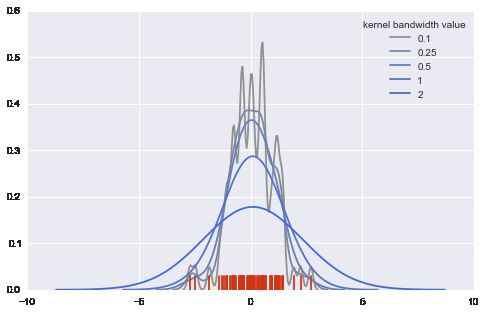
有了上面的知识, 就能理解kdeplot的作用了.
sns.kdeplot(data, shade=True)

# 比较bw(bandwidth) 作用

pal = sns.blend_palette([sns.desaturate("royalblue", 0), "royalblue"], 5)
bws = [.1, .25, .5, 1, 2]

for bw, c in zip(bws, pal):
    sns.kdeplot(data, bw=bw, color=c, lw=1.8, label=bw)

plt.legend(title="kernel bandwidth value")
sns.rugplot(data, color="#CF3512")
# 比较不同的kernels
kernels = ["biw", "cos", "epa", "gau", "tri", "triw"]

for k, c in  zip(kernels, pal):
    sns.kdeplot(data, kernel=k, color=c, label=k)
plt.legend()

# cut, clip 参数用于对outside data ( data min左, max右) 的预测 填充
with sns.color_palette('Set2'):
    f, (ax1, ax2) = plt.subplots(2, 1, figsize=(8, 8), sharex=True)
    for cut in[4, 3, 2]:
        sns.kdeplot(data, cut=cut, label=cut, lw=cut*1.5, ax=ax1)

    for clip in[1, 2, 3]:
sns.kdeplot(data, clip=(-clip, clip), label=clip, ax=ax2) 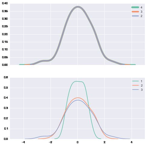
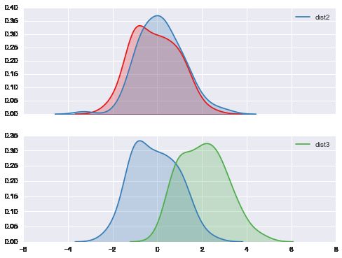
# 利用kdeplot来确定两个sample data 是否来自于同一总体
f, (ax1, ax2) = plt.subplots(2, 1, sharex=True, figsize=(8, 6))
c1, c2, c3 = sns.color_palette('Set1', 3)

dist1, dist2, dist3 = stats.norm(0, 1).rvs((3, 100))
dist3 = pd.Series(dist3 + 2, name='dist3')

# dist1, dist2是两个近似正态数据, 拥有相同的中心和摆动程度
sns.kdeplot(dist1, shade=True, color=c1, ax=ax1)
sns.kdeplot(dist2, shade=True, color=c2, label='dist2', ax=ax1)

# dist3 分布3 是另一个近正态数据, 不过中心为2.
sns.kdeplot(dist1, shade=True, color=c2, ax=ax2)
sns.kdeplot(dist3, shade=True, color=c3, ax=ax2)
# kdeplot是密度图.
# 对概率密度统计熟悉的人还会想到的是累积密度图

# kdeplot 参数 cumulative
with sns.color_palette("Set1"):
    for d, label in zip(data, list("ABC")):
sns.kdeplot(d, cumulative=True, label=label) 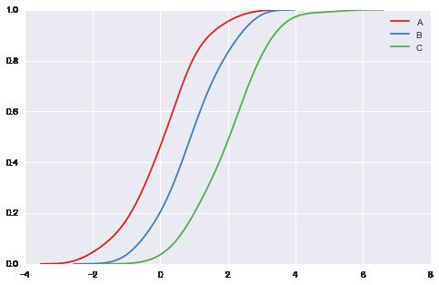
# vertical 参数 把刚才的图形旋转90度
plt.figure(figsize=(4, 8))
data = stats.norm(0, 1).rvs((3, 100)) + np.arange(3)[:, None]

with sns.color_palette("Set2"):
    for d, label in zip(data, list("ABC")):
        sns.kdeplot(d, vertical=True, shade=True, label=label)

# plt.hist(data, vertical=True)
# error vertical不是每个函数都具有的 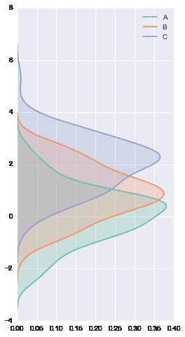
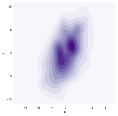
多维数据的kdeplot
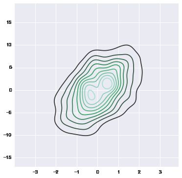
data = np.random.multivariate_normal([0, 0], [[1, 2], [2, 20]], size=1000)
data = pd.DataFrame(data, columns=["X", "Y"])
mpl.rc("figure", figsize=(6, 6))


sns.kdeplot(data)
# 更多的还是用来画二维数据的density plot
sns.kdeplot(data.X, data.Y, shade=True, bw="silverman", gridsize=50, clip=(-11, 11))

# gridsize参数用来指定grid尺寸
# cut clip 参数类似之前提到过的
# cmap则是用来color map映射, 相当于一个color小帽子(mask)
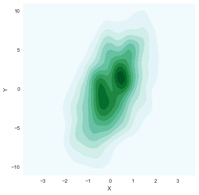
sns.kdeplot(data.X, data.Y, shade=True, bw="silverman", gridsize=50, clip=(-11, 11),  cmap="BuGn_d")
sns.kdeplot(data.X, data.Y, shade=True, bw="silverman", gridsize=50, clip=(-11, 11),  cmap="Purples")
好了. 那再让我来回来想想jointplot
之前jointplot用了 kind=hex, 那么当见过了kde核函数分布图后, 可以把这二者结合到一起.
with sns.axes_style('white'):
sns.jointplot('X', 'Y', data, kind='kde') 
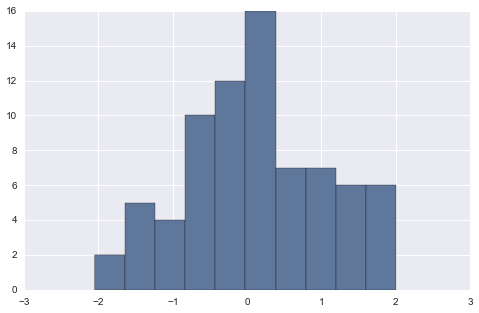
hist增强版 - distplot
# distplot 简版就是hist 加上一根density curve
sns.set_palette("hls")
mpl.rc("figure", figsize=(9, 5))
data = randn(200)
sns.distplot(data)
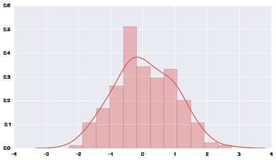
# 当然慢慢地就发现distplot的功能, 远比hist强大.
sns.distplot(data, kde=True, rug=True, hist=True)
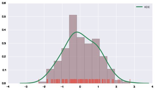
# 更细致的, 来用各kwargs来指定 (参数的参数dict)
sns.distplot(data, kde_kws={"color": "seagreen", "lw":3, "label" : "KDE" },
hist_kws={"histtype": "stepfilled", "color": "slategray" })
好了. 下面的图很熟悉, boxplot 与 violinplot
boxplot, 连续数据的另一种分布式描述. 以five - figures作为大概的集中趋势, 离散趋势的统计量.
violinplot是与之类似, 它是在boxplot基础上增加了density curve (也就是"小提琴"的两侧曲线)
A violin plot is a method of plotting numeric data. It is a box plot with a rotated kernel density plot on each side.[1]
more info at wiki
# first 先来看boxplot
sns.set(rc={"figure.figsize": (6, 6)})
data = [randn(100), randn(120) + 1.5]
plt.boxplot(data)
# 这是一个简单版"dataframe", 由两列不等长的series(array)组成, 没有index columns所以在图中默认用1,2,3代替


{'boxes': [,
  ],
 'caps': [,
  ,
  ,
  ],
 'fliers': [,
  ],
 'means': [],
 'medians': [,
  ],
 'whiskers': [,
  ,
  ,
]} 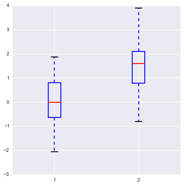
# 上面的图形是mpl module画出来的, 比较"ugly"
# 来看看seaborn画出来的样貌
sns.boxplot(data)
# ... 可能只是两种不同的风格吧!

# 当然, 如果可以, 最好我们能指定两组分布更多的信息
sns.boxplot(data, names=['left', 'right'], whis=np.inf, color='indianred')

# 其它参数demo
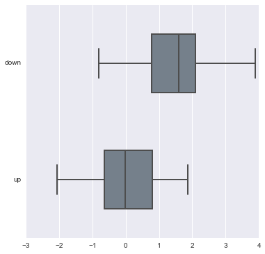
sns.boxplot(data, names=['down', 'up'],linewidth=2, widths =.5, vert=False, color='slategray')
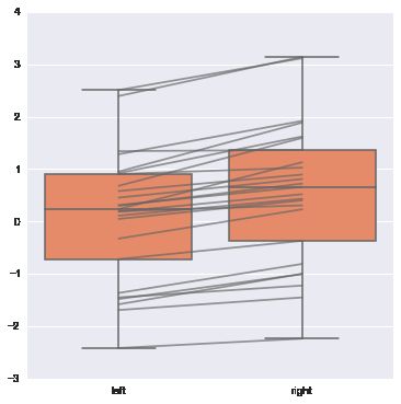
# join_rm 参数 rm 是指 repeated-measures data 重复观测
# 为了彰显重复观测的效应, 可使用join_rm参数==True
pre = randn(25)
post = pre+ np.random.rand(25)
sns.boxplot([pre, post], names=["left", "right"], color="coral", join_rm =True)
# 下面介绍violinplot, 而且是从boxplot开始讲起.
# 这也是非常喜欢这个module(作者)的原因, 很合我的味口
d1 = stats.norm(0, 5).rvs(100)
d2 = np.concatenate([stats.gamma(4).rvs(50), -1 * stats.gamma(4).rvs(50) ])
data = pd.DataFrame(dict(d1=d1, d2=d2))

sns.boxplot(data, color="pastel", widths=.5)
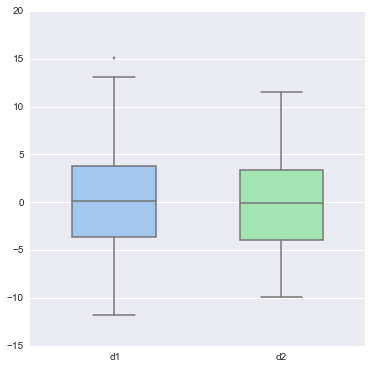
# 看上面两个boxplot 分布是很接近的, 但有多像? 无法定量
# 简单的boxplot是定性的描述, 用来比较时更不能定量比较相似程度

sns.violinplot(data, color="pastel")
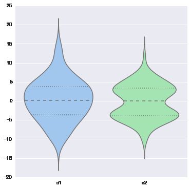
# 这个时候 2个sample分布就不像了...
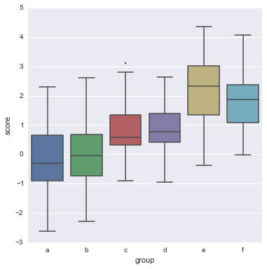
# boxplot violinplot 常常用来 比较 一个分组(离散) X 一个连续变量的各组差异
# 因此若有DataFrame结构, 要尽量学着使用groupby操作.
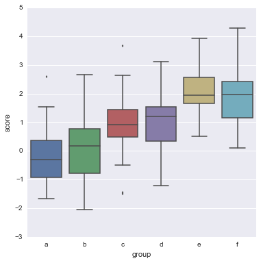
y = np.random.randn(200)
g = np.random.choice(list('abcdef'), 200)
for i, l in enumerate('abcdef'):
y[g == l] += i // 2
df = pd.DataFrame(dict(score=y, group=g))
sns.boxplot(df.score, df.group)
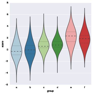
# 到最后, 我看到了作者用到了我特别喜欢的一个词 tune
# violinplot 就相当于是对boxplot一个tuning的过程, 哦, 想到了老罗.
sns.violinplot(df.score, df.group, color="Paired", bw=1)
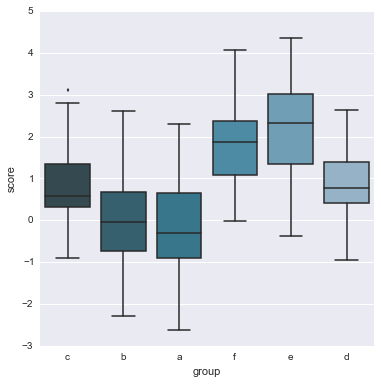
# 关于names(组名称list), 默认的画图顺序是 array顺序, 也能额外用order参数指定
order = list('cbafed')
sns.boxplot(df.score, df.group, order=order, color='PuBuGn_d')
在复杂的violinplot基础上再tune一点
# 使用参数 inner
# inner : {‘box’ | ‘stick’ | ‘points’}
# Plot quartiles or individual sample values inside violin.
y = np.random.randn(200)
g = np.random.choice(list("abcdef"), 200)
for i, l in enumerate("abcdef"):
    y[g == l] += i // 2
df = pd.DataFrame(dict(score=y, group=g))
sns.boxplot(df.score, df.group);