Python模块 matplotlib功能与使用方法大全
- 目录
- 一.简介
- 二.文档
- 三.食用方法
- 1.基础折线图绘制
- 2.修改折线图的颜色/线的形状
- 3.只输入一维数据的情形
- 4.list与array的区别
- 5.在一张图中显示多条曲线
- 6.绘制标准函数曲线:sin()与cos()
- 7.显示网格线
- 8.增加标注:x,y轴文字/标题/图内文字/箭头指示
- 9.设置文本属性
- 10.设置曲线属性
- 11.解决中文乱码
- 12.修改坐标轴刻度
- 13.绘制图形:圆形/矩形/椭圆
- 14.绘制直方图-标准正态分布
- 15.绘制散点图
- 16.显示多个图表
- 17.调整子图间隔
- 18.绘制柱状图
一. 简介
matplotlib.pyplotis a collection of command style functions that make matplotlib work like MATLAB. Each pyplot function makes some change to a figure: e.g., creates a figure, creates a plotting area in a figure, plots some lines in a plotting area, decorates the plot with labels, etc.
In matplotlib.pyplotvarious states are preserved across function calls, so that it keeps track of things like the current figure and plotting area, and the plotting functions are directed to the current axes (please note that “axes” here and in most places in the documentation refers to the axes part of a figure and not the strict mathematical term for more than one axis).
Note
the pyplot API is generally less-flexible than the object-oriented API. Most of the function calls you see here can also be called as methods from an Axes object.
二.文档
Pyplot入门教程及本文实例参考 Pyplot tutorial
本文章最后更新时间:2018.12.07
三.食用方法
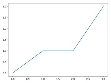
1.基础折线图绘制
绘制(0,0),(1,1),(2,1),(3,3)四个点连成的折线
import matplotlib.pyplot as plt
x=[0,1,2,3]
y=[0,1,1,3]
plt.plot(x,y)
plt.show()
2.修改折线图的颜色/线的形状
plt.plot(x,y,'r')   # 修改颜色,rgb=红绿蓝,默认为蓝
plt.plot(x,y,'--')  # 修改线的形状为虚线,默认为折线'-',另外'o'为点,'^'为三角
plt.plot(x,y,'g--') # 一起修改为绿色虚线
plt.axis([1,6,0,5]) # 修改坐标轴x刻度显示

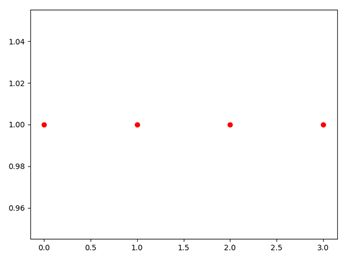
3.只输入一维数据的情形
plt.plot(x,y)接受点集(x,y),当只输入一维数据的时候当作y轴处理,x轴默认生成[0,1,2,…]
例如,绘制4个独立的点(0,1),(1,1),(2,1),(3,1)
y=[1,1,1,1]
plt.plot(y,'ro')
plt.show()
4.list与Arrays
教程原文
If matplotlib were limited to working with lists, it would be fairly useless for numeric processing. Generally, you will use numpy arrays. In fact, all sequences are converted to numpy arrays internally.
考虑到性能问题,意味着所有的序列(包括list等)会在内部转换为numpy.array
t1=[1,5,1,5] #list会被转换为t2的类型
t2=np.array([5,1,5,1]) #numpy.array
plt.plot(t1)
plt.plot(t2)
plt.show()
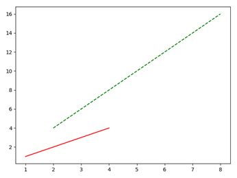
5.在一张图中显示多个图表
在4中,分别使用了两次plt.plot()载入t1和t2,也可以用一条语句
plt.plot(t1,'b--',t2,'r--')
对于两组(x,y)坐标,如下
x1=[1,2,3,4]
y1=[1,2,3,4]
x2=[2,4,6,8]
y2=[4,8,12,16]
plt.plot(x1,y1,'r-',x2,y2,'g--')
plt.show()
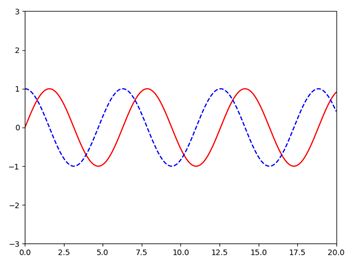
6.绘制标准函数曲线:sin()与cos()
绘制f(x)=sin(x) 和g(x)=cos(x) 在x∈[0,20]中的图像
x = np.arange(0, 20, 0.01)
plt.plot(x, np.sin(x), 'r-', x, np.cos(x), 'b--')
plt.axis([0,20,-3,3])
plt.show()
7.显示网格线
x = np.arange(0, 20, 0.01)
plt.plot(x, x**2)
plt.grid(True)  # 设置网格线
plt.show()

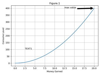
8.增加标注
以7中的函数图像为例.注意,输入中文会出现方块乱码.
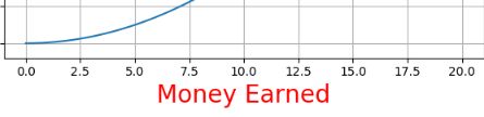
(1)增加x,y轴文字
plt.xlabel("Money Earned")
plt.ylabel("Consume Level")
(2)增加标题
plt.title("Figure.1")
(3).图内文字
指定首字出现的x轴,y轴,文字本身
plt.text(2.5,100,"TEXT1")
(4)箭头指示
指定文字,箭头指向的坐标,文字显示的坐标,箭头的属性
plt.annotate('max value', xy=(20, 400), xytext=(12.5, 400),
             arrowprops=dict(facecolor='black', shrink=0.05),
             )
(5)综合结果图
9.设置文本属性
对text(),xlabel(),ylabel(),title(),annotate()等可使用参数设置文本属性
例如
plt.xlabel("Money Earned",color="r",fontsize=20)
可选参数如下,这里只列出常用属性,更多属性请查阅
https://matplotlib.org/api/text_api.html#matplotlib.text.Text
| 参数 | 描述 |
|---|---|
| color | 颜色 |
| fontfamily | 字体系列 ‘serif’, ‘sans-serif’, ‘cursive’, ‘fantasy’, ‘monospace’ |
| fontname | 字体名 Simsun SimHei |
| fontsize/size | 字体大小 {size in points, ‘xx-small’, ‘x-small’, ‘small’, ‘medium’, ‘large’, ‘x-large’, ‘xx-large’} |
| fontstretch | 伸缩变形 {a numeric value in range 0-1000, ‘ultra-condensed’, ‘extra-condensed’, ‘condensed’, ‘semi-condensed’, ‘normal’, ‘semi-expanded’, ‘expanded’, ‘extra-expanded’, ‘ultra-expanded’} |
| fontstyle | 字体样式 {‘normal’, ‘italic’, ‘oblique’} |
| fontvariant | 字体大写 {‘normal’, ‘small-caps’} |
| fontweight | 字体粗细 {a numeric value in range 0-1000, ‘ultralight’, ‘light’, ‘normal’, ‘regular’, ‘book’, ‘medium’, ‘roman’, ‘semibold’, ‘demibold’, ‘demi’, ‘bold’, ‘heavy’, ‘extra bold’, ‘black’} |
| horizontalalignment | 对齐方式 {‘center’, ‘right’, ‘left’} |
| linespacing | 行距 float (multiple of font size) |
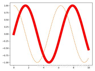
10.设置曲线属性
plt.plot()返回matplotlib.lines.Line2D,可以通过变量获得并修改曲线Line2D的属性
x=np.arange(0,10,0.01)
line1,line2=plt.plot(x,np.sin(x),'-',x,np.cos(x),'--') #line1得到2D Lines
plt.setp(line1,color='r',linewidth='11.0') #设置曲线的宽度
plt.show()
11.解决中文乱码
利用9中修改字体为中文字体就能轻松解决乱码
(1)指定为文件目录中的字体
from matplotlib.font_manager import FontProperties
font = FontProperties(fname=r"c:\windows\fonts\simsun.ttc")
plt.xlabel("中文文本", fontproperties=font)
(2)指定为系统字体
plt.xlabel("中文文本",fontname='SimHei',size=20)
#或者
plt.xlabel("中文文本",fontproperties='SimHei',fontsize=20)#size要放在后面,否则会被覆盖
(3)全局设置
font = {'family' : 'SimHei',
        'weight' : '50',
        'size'   : '30'}
plt.rc('font', **font)
plt.xlabel("中文文本")
12.修改坐标轴刻度
(1)指定刻度范围
plt.axis([0,6,1,5]) #设定x轴刻度在(0,6) y轴刻度在(1,5)
plt.axis('off')  #关闭刻度
(2)子图的刻度修改
axes[0,0].set_xticks([0,250,750,1000]) #设置x轴
axes[0,0].set_xticklabels(['one','two','three'],rotation=30) #将数值改为标签,并旋转30度显示
(3)使用刻度函数
以教程例子为例
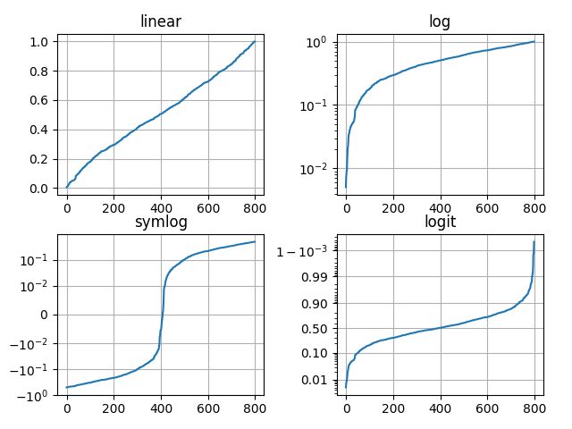
四种不同的刻度
plt.yscale('linear')
plt.yscale('log')
plt.yscale('symlog')
plt.yscale('logit')
上述四图的例子代码如下
from matplotlib.ticker import NullFormatter  # useful for `logit` scale

# Fixing random state for reproducibility
np.random.seed(19680801)

# make up some data in the interval ]0, 1[
y = np.random.normal(loc=0.5, scale=0.4, size=1000)
y = y[(y > 0) & (y < 1)]
y.sort()
x = np.arange(len(y))

# plot with various axes scales
plt.figure(1)

# linear
plt.subplot(221)
plt.plot(x, y)
plt.yscale('linear')
plt.title('linear')
plt.grid(True)


# log
plt.subplot(222)
plt.plot(x, y)
plt.yscale('log')
plt.title('log')
plt.grid(True)


# symmetric log
plt.subplot(223)
plt.plot(x, y - y.mean())
plt.yscale('symlog', linthreshy=0.01)
plt.title('symlog')
plt.grid(True)

# logit
plt.subplot(224)
plt.plot(x, y)
plt.yscale('logit')
plt.title('logit')
plt.grid(True)
# Format the minor tick labels of the y-axis into empty strings with
# `NullFormatter`, to avoid cumbering the axis with too many labels.
plt.gca().yaxis.set_minor_formatter(NullFormatter())
# Adjust the subplot layout, because the logit one may take more space
# than usual, due to y-tick labels like "1 - 10^{-3}"
plt.subplots_adjust(top=0.92, bottom=0.08, left=0.10, right=0.95, hspace=0.25,
                    wspace=0.35)

plt.show()
13.绘制图形:圆形/矩形/椭圆
import matplotlib.pyplot as plt
import matplotlib.patches as patches

fig = plt.figure()
ax1 = fig.add_subplot(111,aspect='equal') #1x1一张图中的第1张,equal为等宽显示
rec=patches.Rectangle((0, 0), 8, 4) #顶点坐标(0,0)  宽w=8 高h=4
cir=patches.Circle((8,8),2)  #圆心坐标(8,8) 半径r=1
ell=patches.Ellipse((2,8),6,3) #椭圆左顶点坐标(2,8) 长轴c1=6 短轴c2=3
ax1.add_patch(rec) #插入patch图像
ax1.add_patch(cir)
ax1.add_patch(ell)
plt.plot() #显示多个
plt.show()
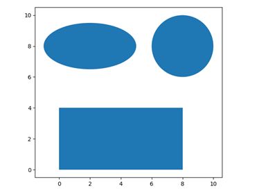
patches中还有许多种图形,例如各种箭头,箭,多边形等.
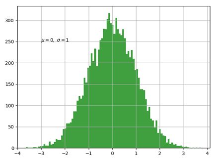
14.绘制直方图-标准正态分布
plt.hist()用于绘制直方图
| 常用参数 | 描述 |
|---|---|
| arr | 需要计算的一维数组 |
| bins | 直方图的柱数,默认为10 |
| normed | 是否将得到的直方图向量归一化 |
| facecolor | 直方图颜色 |
| edgecolor | 直方图边框颜色 |
| alpha | 透明度 |
| histtype | 直方图类型 {‘bar’, ‘barstacked’, ‘step’, ‘stepfilled’} |
| 返回值 | 描述 |
|---|---|
| n | 直方图向量,是否归一化由参数normed设定 |
| bins | 返回各个bin的区间范围 |
| patches | 以list形式返回每个bin里面包含的数据 |
标准正态分布又称为μ分布,是以均数μ=0、标准差σ=1的正态分布,记为N(0,1)
代码如下
mu, sigma = 0,1
x = np.random.normal(mu,sigma,10000)
n, bins, patches = plt.hist(x,bins=100,facecolor='g', alpha=0.75)
plt.text(-3, 250, r'$\mu=0,\ \sigma=1$')
plt.grid(True)
plt.show()
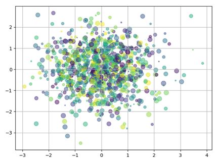
15.绘制散点图
plt.scatter()用于绘制散点图
| 参数 | 描述 |
|---|---|
| x | 坐标x轴集合 |
| y | 坐标y轴集合 |
| c | 散点的颜色数目,默认为纯色 |
| s | 散点的大小数目 |
| alpha | 透明度 |
例:绘制正态分布随机1000个点的位置分布
x = np.random.normal(0, 1, 1000)  # 1000个点的x坐标
y = np.random.normal(0, 1, 1000) # 1000个点的y坐标
c = np.random.rand(1000) #1000个颜色
s = np.random.rand(100)*100 #100种大小
plt.scatter(x, y, c=c, s=s,alpha=0.5)
plt.grid(True)
plt.show()
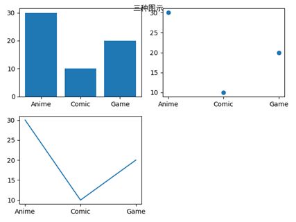
16.显示多个图表
names = ['Anime', 'Comic', 'Game']
values = [30, 10, 20]
plt.subplot(221)  #构建2x2张图中的第1张子图
plt.bar(names, values) #统计图
plt.subplot(222)
plt.scatter(names, values) #散点图
plt.subplot(223)
plt.plot(names, values) #折线图
plt.suptitle('三种图示',fontname='SimHei')
plt.show()
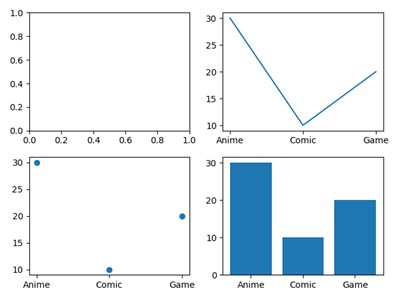
上述是每次构造一个子图,然后在子图中绘制.也可以先构造所有的子图,再通过下标指定在哪张子图中绘制
fig,axes=plt.subplots(2,2) #构造2x2的子图
axes[0,1].plot(names, values) #通过下标访问
axes[1,0].scatter(names, values)
axes[1,1].bar(names, values)
plt.show()
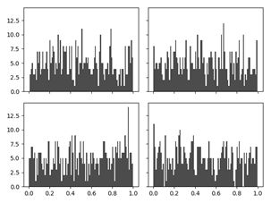
17.调整子图间隔
fig,axes=plt.subplots(2,2,sharex=True,sharey=True) #构造2x2的子图,子图共享x,y轴
for i in range(2):
    for j in range(2):
        axes[i,j].hist(np.random.rand(500),bins=100,alpha=0.7,color='k')
plt.subplots_adjust(hspace=0,wspace=0) #修改内部的宽,高间距为0
plt.show()
(在python3.7中无法得到和书中一致的结果,即实现没有内部子图间隔的数据可视化)
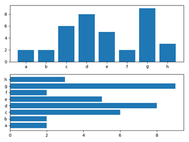
18.绘制柱状图
垂直柱状图plt.bar(name,values)
水平柱状图plt.barh(name,values)
x=np.random.randint(1,10,8)
label=list('abcdefgh')
plt.subplot(211)
plt.bar(label,x)
plt.subplot(212)
plt.barh(label,x)
plt.show()
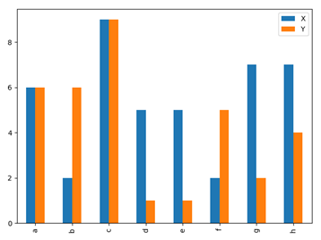
两组数据比较的垂直柱状图
这里不再使用plt.bar(),而是使用pd.DataFrame.plot.bar()
x=np.random.randint(1,10,8)
y=np.random.randint(1,10,8)
data=pd.DataFrame([x,y],index=['X','Y'],columns=list('abcdefgh'))
>>> data
data
   a  b  c  d  e  f  g  h
X  6  2  9  5  5  2  7  7
Y  6  6  9  1  1  5  2  4
data.plot.bar()
plt.show()
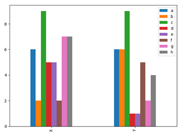
得到以index为分类,columns为数据的柱状图
两组数据交叉比较的垂直柱状图,只需交换index和columns即可
data.transpose().plot.bar() #data.transpose()转置
plt.show()